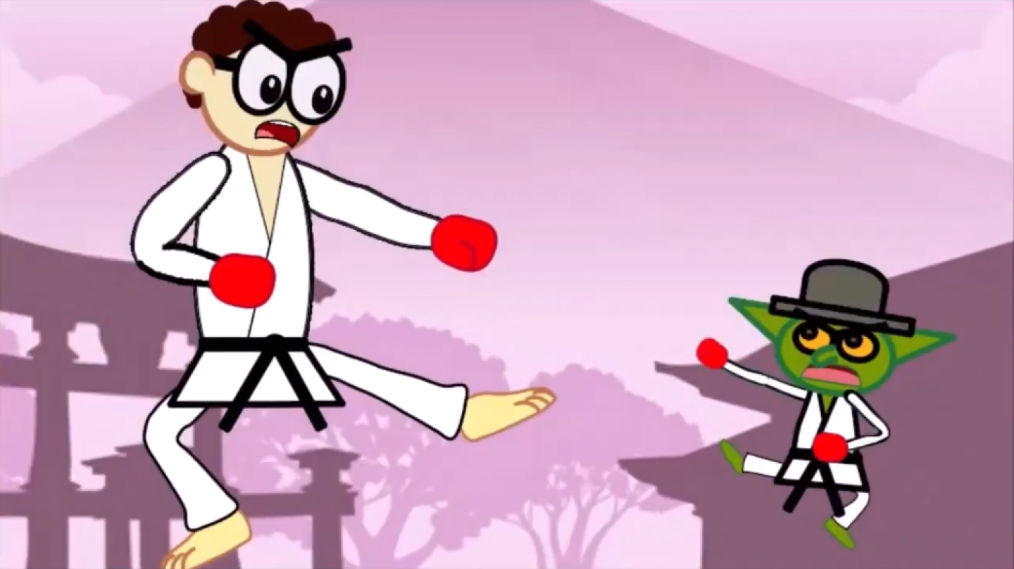
In October 2024, I began studying for my Level 3 Foundation diploma in Art, Design and Media at the Online College of Art and Design. My first project for the course was World Photography Project: How Photographers Documented their World. In it, I researched the photographers Josef Sudek,[1][2][3] Edward Weston,[4][5] Ori Gersht,[6][7][8] Olivia Parker,[9][10][11] Wolfgang Tillmans,[12] Bruce Gilden,[13][14][15][16][17] Hellen van Meene,[18][19][20][21][22][23] August Sander,[24][25][26] Diane Arbus,[27][28][29][30][31] Dorothea Lange,[32][33] Henri Cartier-Bresson,[34][35][36][37][38][39] Martin Parr,[40][41][42] Ansel Adams,[43][44][45] Jérôme Sessini,[46][47][48] Andreas Gursky,[49][50][51][52][53][54] Richard Hamilton,[55] thenatchdl,[56] and Nick Church,[57] and learned about contact sheets, meaningful view, depth of field, still life, taking in the moment, and looking back at life. The only genres and terms that I already knew of before the project were portrait and landscape. After researching the photographers, I was influenced by Parker and Gursky to make use of colour in my still life photographs and take the position of a central object placement.[9][10][50][51] Then I took my portrait photographs in the moment like Gilden, with the subject as the focal point.[13][17] For some of my meaningful view photographs, I took inspiration from Parr’s photographs. They were taken at unusual angles and drew the viewer’s attention to objects, activity and composition elements.[40][41] I enjoyed going to different locations to take my photographs. The biggest challenge in the project was analysing the photographs and choosing which ones from my contact sheet to edit in Adobe Photoshop. I had to point out the details and structures to explain how they match my interests, and why I chose the photographs.
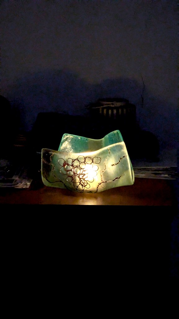
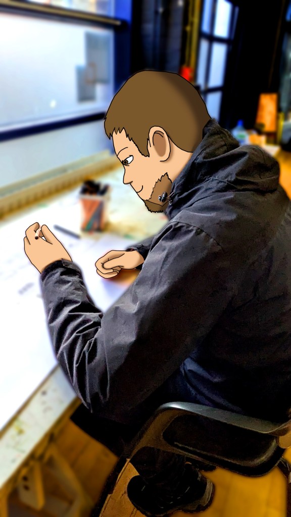
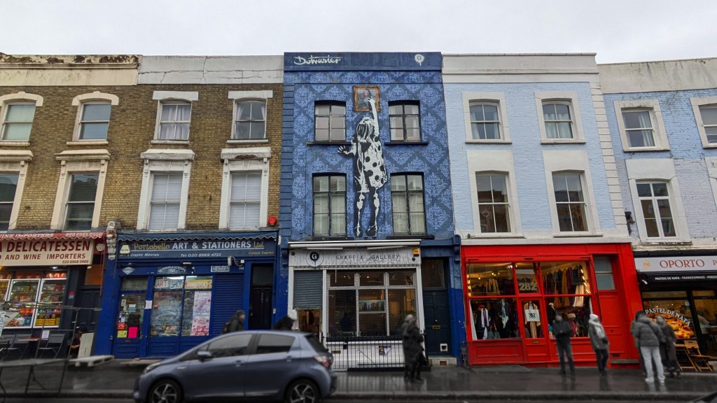
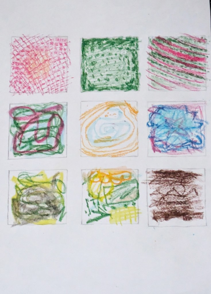
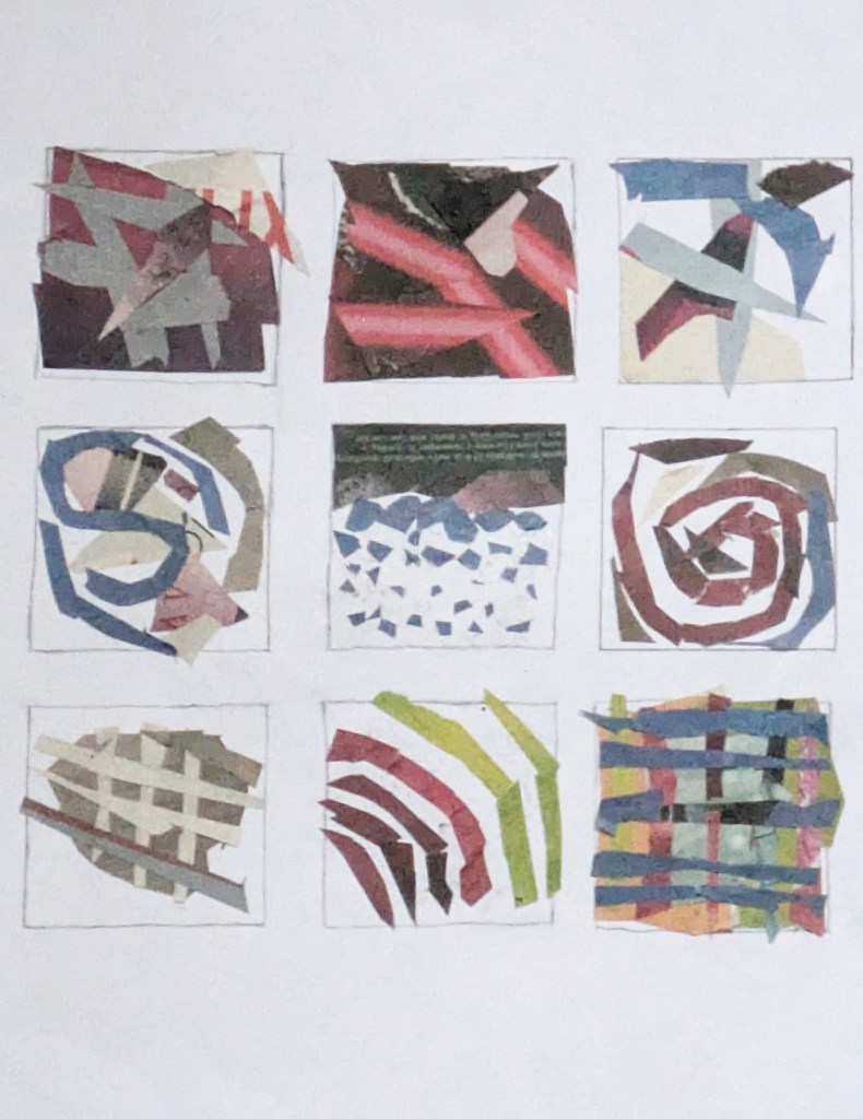
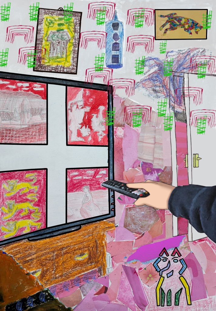
Next, I did a Fine Art project with the theme of what “home” means to artists and people in general. I went to the Folkestone Museum, where I took photographs and analysed historical art, including: Folkestone, 1790 by Richard Kerr,[42] Victoria Leaving Boulogne by Charles Brooke Farrar,[43] The Landing of the Belgian Refugees by Fredo Franzoni,[44][45] North Street Folkestone by Elijah Albert Cox,[46] Sinking of the Bienvenue by Victor Sebastian Foley,[47] Dogfish Season by Charles Padday,[48][49] and The Folkestone Boat Train by Bertram Priestman.[50] Then I went to the studio of local artist Shane Record to photograph and analyse contemporary art.[51] Record told me that he dislikes doing art of places that “do not mean anything to [him]”, and that he includes the theme of home in his art because art “is [his] life”. It “means something to [him]; [his] home in Folkestone”. Looking at the artists’ work in person and through secondary sources helped me understand the brief for the project more clearly. It also inspired me when considering what home means to me and different ways that I could communicate this visually. At home, I researched the artists Willem de Kooning,[52][53][54][55][56][57] Cy Twombly,[58][59][60][57] Robert Mapplethorpe,[61][62][63][57] Bernard Cohen,[64][65][66][57] Mark Wallinger,[67][68][69][57] Harold Cohen,[70][71][72][57] Edward Hopper,[73][74][75][76][77][78] George Shaw,[79][80][81][82][83][84] Johannes Vermeer,[85][86] [87][88][89] Pierre Bonnard,[90][91][92][93][94][95] Chris Ofili,[96][97][98] Rachel Whiteread,[99][100][101][102][103][104] Nan Goldin,[105][106][107][108][109][110] Bill Viola,[111][112][113][114][115] Gillian Wearing,[116][117][118][119][120] Peter Doig,[121][122][123][124][125][126][127] Ger van Elk,[128][129][130][131] Carl Holsøe,[132][133][134][135][136] Aline Gaiad,[137][138][139] Gerald Laing,[140][141][142] Edvard Munch,[143][144][145][146] Kehinde Wiley,[147][148][149][150] Njideka Akunyili Crosby[151][152][153] and Patrick Caulfield.[151][152] Through my research, I learned about techniques such as cross hatch, patterns, abstract art, collage, angles, mark making, monoprinting,[153] self-expression, and the history of painting. Next I created a moodboard of things that matter to me, such as my family, toys and video games. I initially had issues creating a mind map because I drew it on paper, so I made another one digitally and spaced the images and categories out. I then developed ideas and patterns for my final piece, and experimented with oil pastel, cutouts, clippings, acrylic and watercolour paint. The experiments and artist research were the parts that I enjoyed, with the former helping me to explore different possibilities and compositions for my final piece.
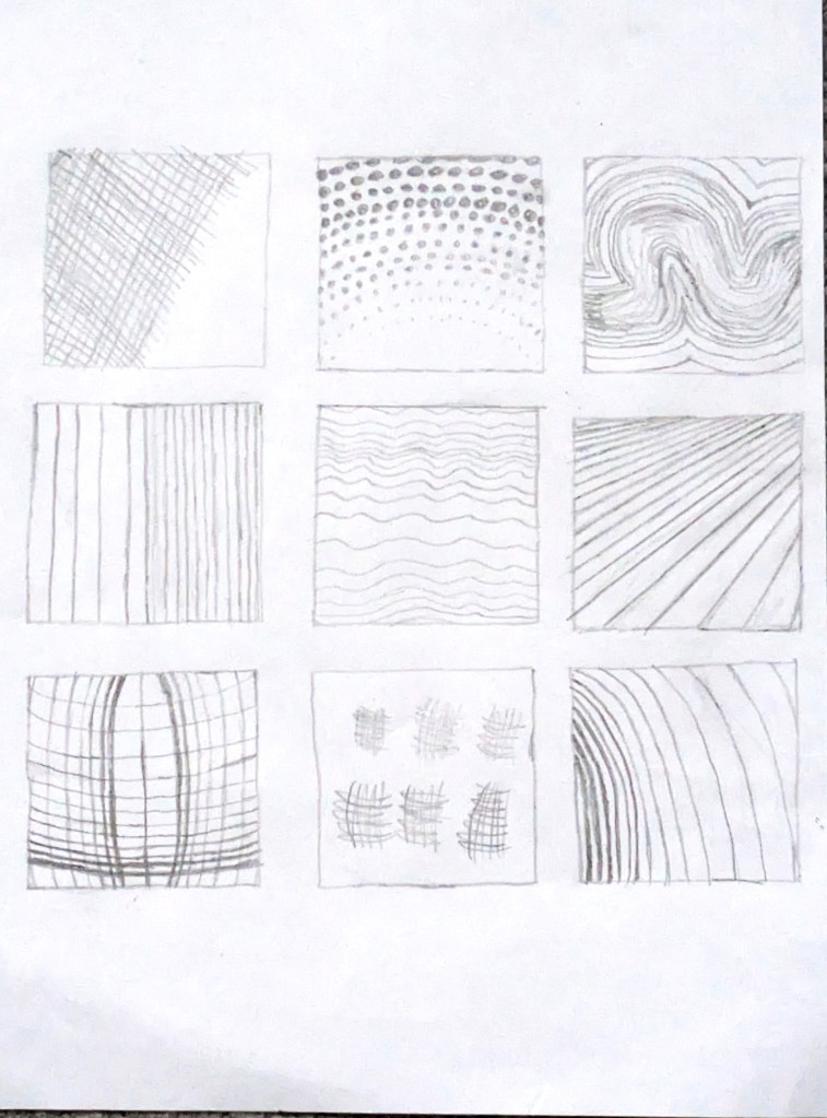
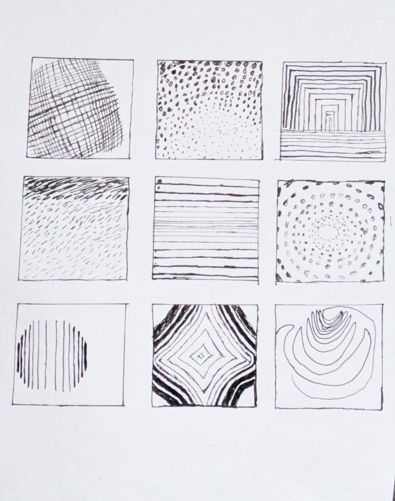
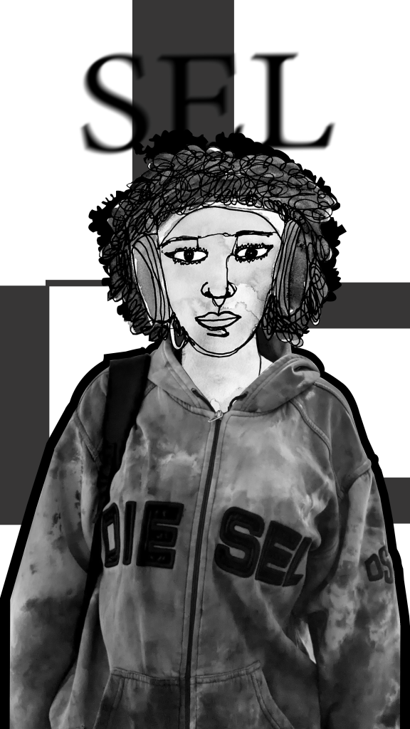
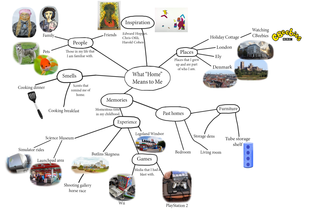
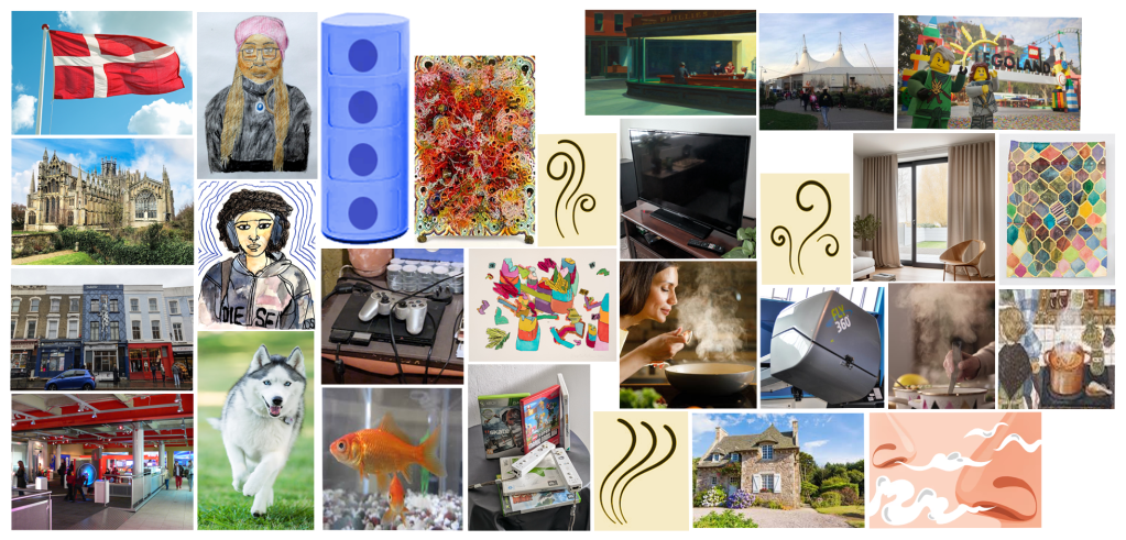
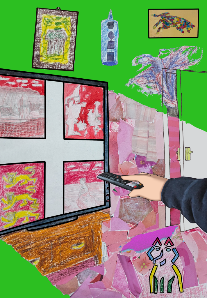
When creating my final piece, I was inspired by Hopper to draw diagonal lines for my television at an odd angle. Wanting to create a balance in contrast of atmosphere similar to Hopper, I concentrated on the balance of warm, light colours and cold, dark colours regarding the television’s light. Following this, I made an oil pastel cottage painting based on Ofili, and added custom-made Scribble Hatch patterns to the living room door. Ofili’s Nigerian patterns and mark making reminded me of my Nigerian heritage. I then produced circular patterns inspired by Wiley, Caulfield and my laptop’s bubble screensaver, and initially added them to the wall. I looked at Harold Cohen’s computer art, which inspired me to draw and paint two abstract dogs, based on a photograph of my pet dog. One was made entirely of shapes, and the other was divided into coloured sections with acrylic paint in a portrait, located above the door. Inspired by Crosby, I cut out textured magazine clippings in different shades of pink and glued them in, placing them in an area where the television’s light would be in the foreground. To make the television, the Danish flag (with the coat of arms of England), the cottage painting, and the dog portrait stand out, I drew thick, black outlines over them, inspired by Caulfield. Working on this project led to a new perspective in art. I now saw it as a captured documentation of life and time. It also indicates the artists’ effort to communicate an idea or feeling through the subject of the painting, and the materials and techniques used in it. I created six versions of the art, but had problems choosing one for my final piece. I eventually settled on the fourth one. Regarding improvements, I could have taken my time and not rushed through the tasks. If I had the chance, I might have explored more mediums and elements in paintings and portraiture.
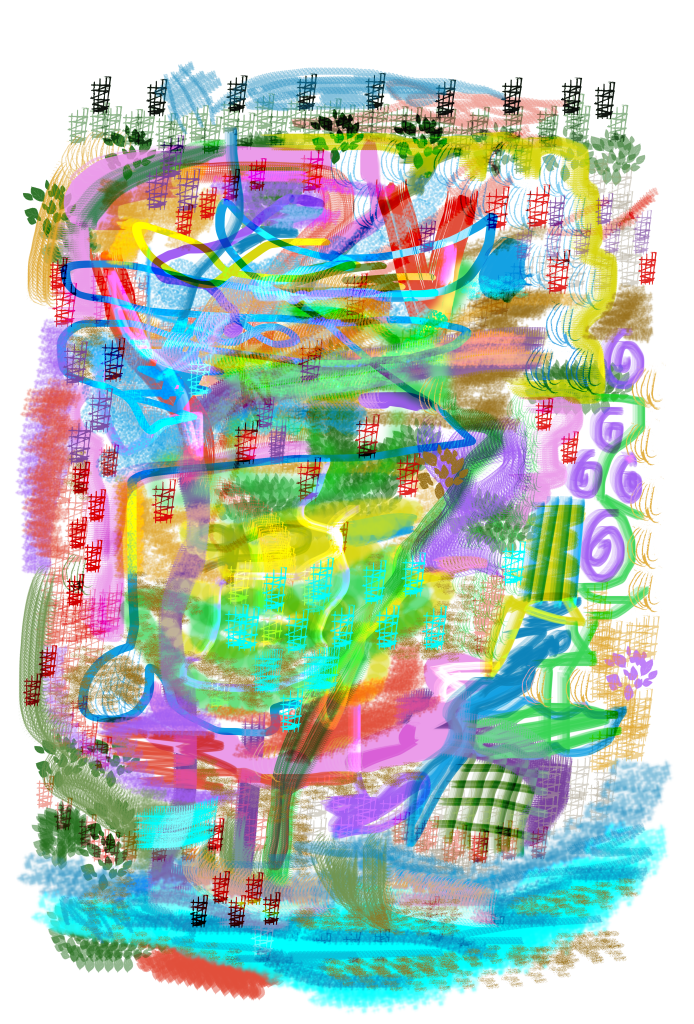
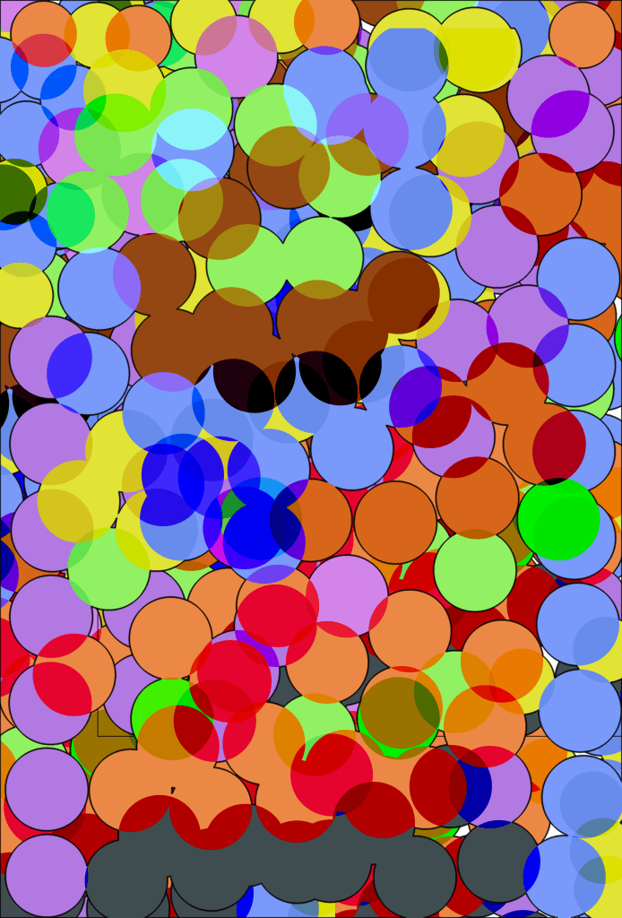
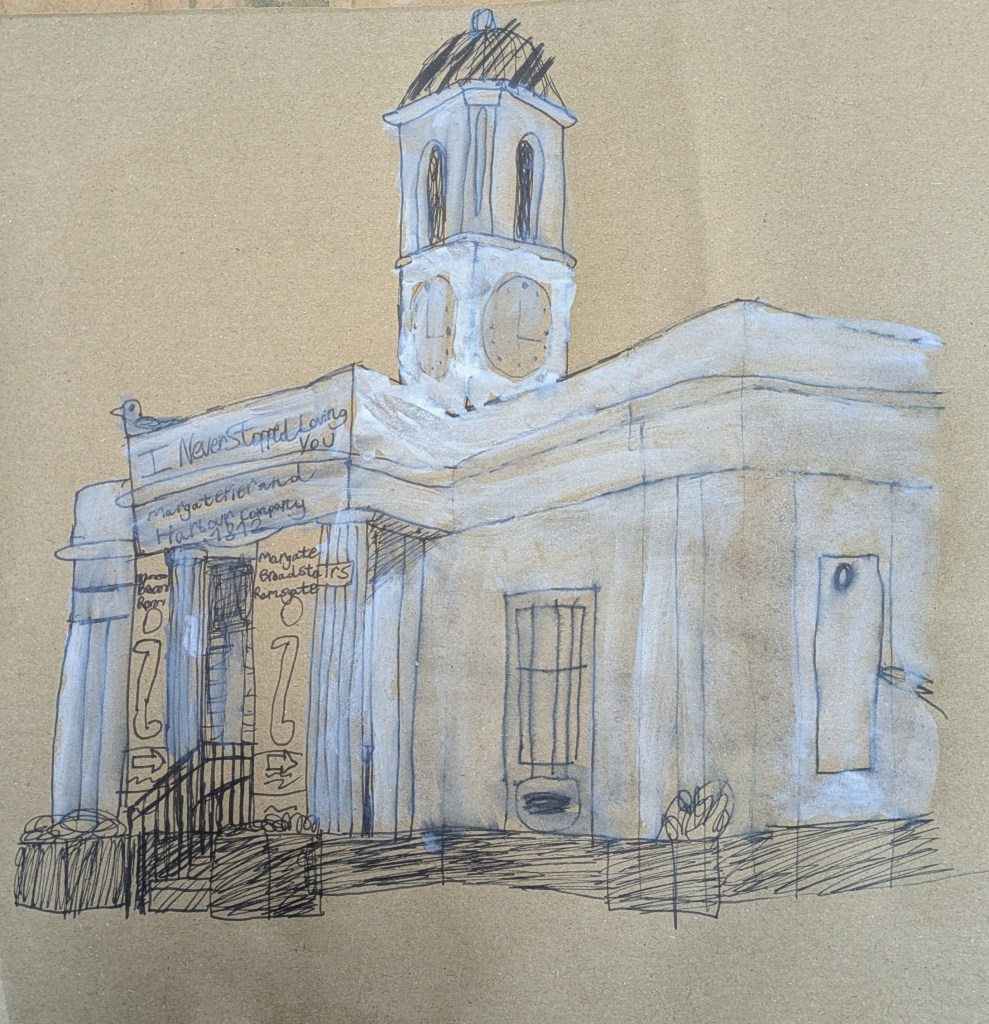
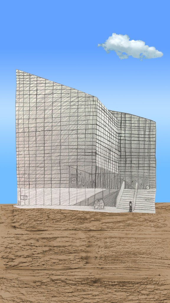
The next project was Urban Sounds Night and Day: Introduction to Illustration in Animation. I began my research for the project by watching and analysing The Birds by Alfred Hitchcock[154][155][156][157][158] and Ice Merchants by João Gonzalez.[159] This area of the project worked for me, as I was learning about how they used contrast, lighting, perspective and sound effects in their work to create a sense of drama and give the viewer a broader sense of realism and empathy. It inspired me to go for a walk in the urban environment of Deal, and later Margate. During the walks, I used my phone’s camera and sound recorder to take photographs and record sounds in real time. Hitchcock’s use of perspective and angles to create drama in The Birds and Vertigo[160] were major inspirations for the environments that I chose to take the photographs. The buildings that I photographed were Serpentine South (when I was in London),[161] Turner Contemporary[162][163] and the Droit House.[164][165][166][167][168][169][170] Following the walks, I experimented in mark making and used various tools to produce a series of colour and black-and-white drawings in response to the urban sounds, inspired by Gonzalez’s illustration style (complete with textured backgrounds). The tools included pencil, brushes, inks, watercolour paint, oil pastel, toothbrush-flicking and masking fluid. The drawings were then compiled into a concertina sketchbook.
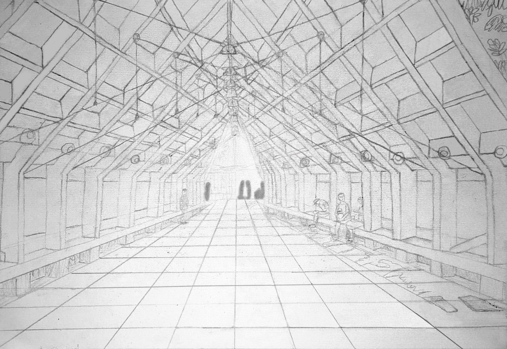
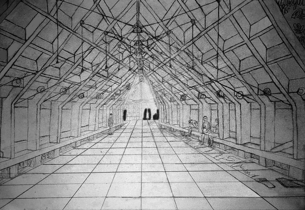
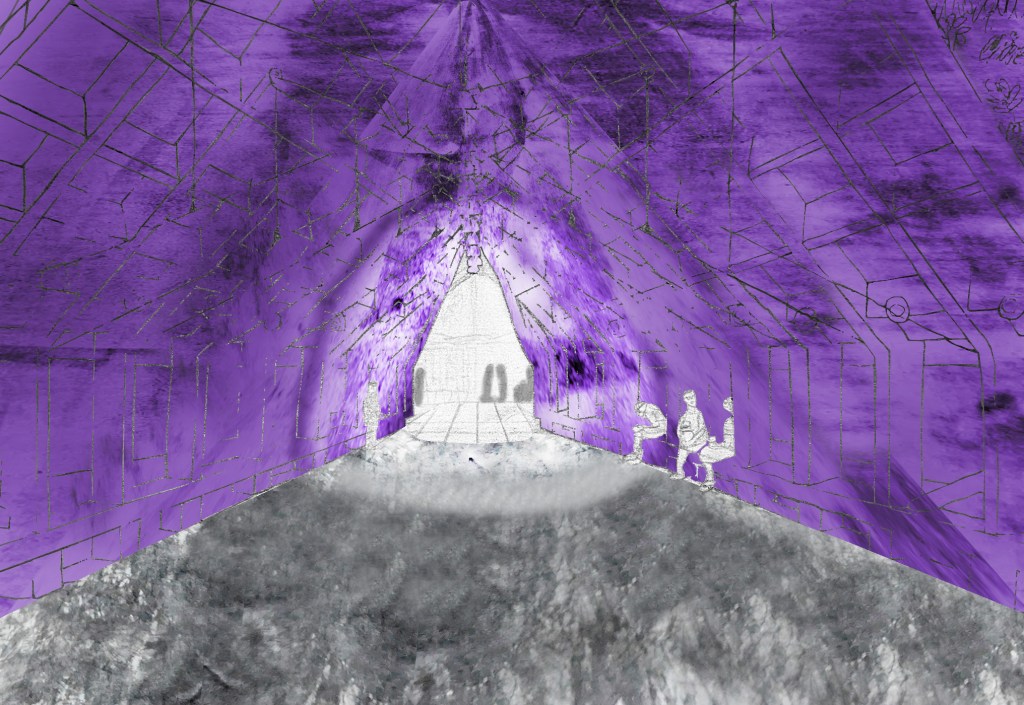
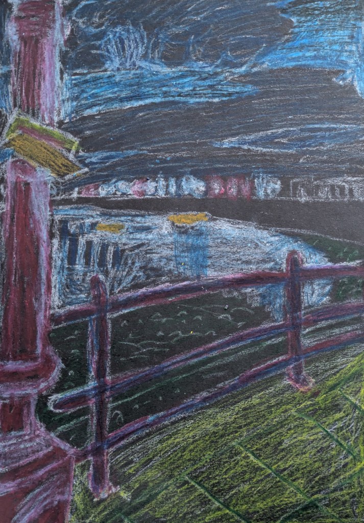
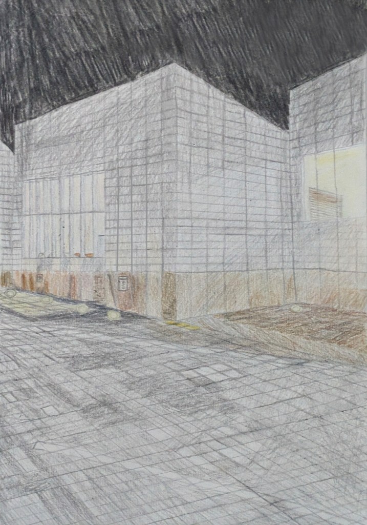
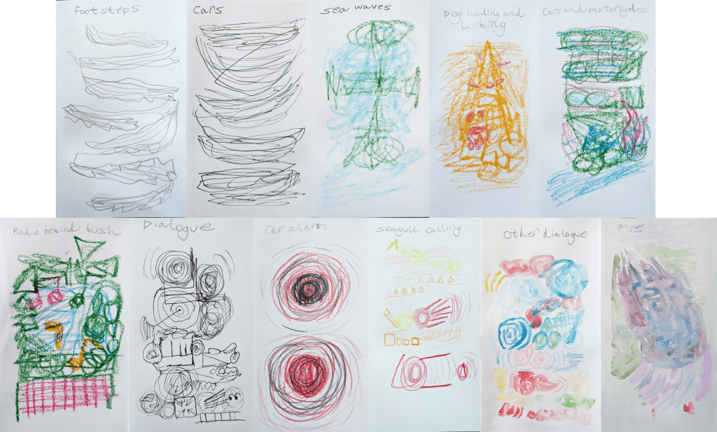
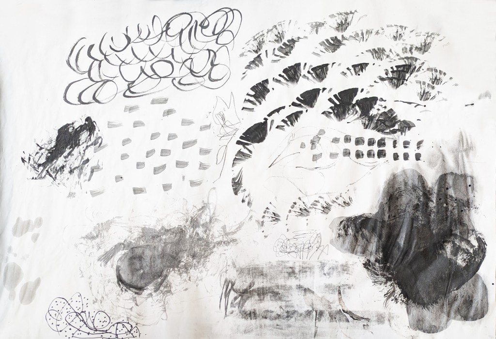
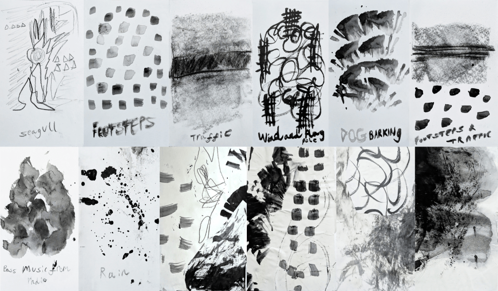
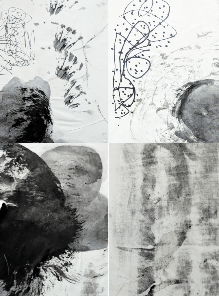
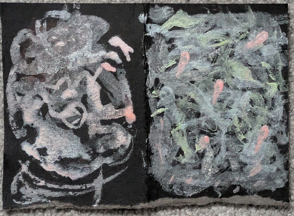
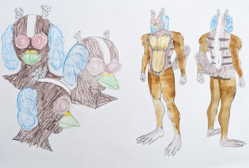
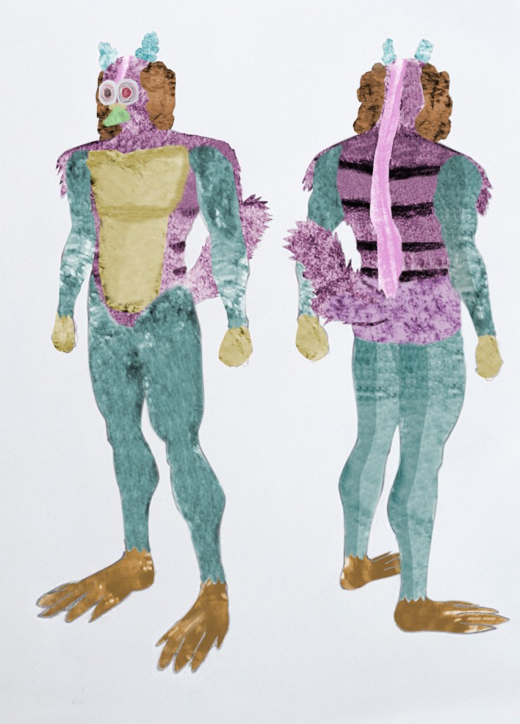
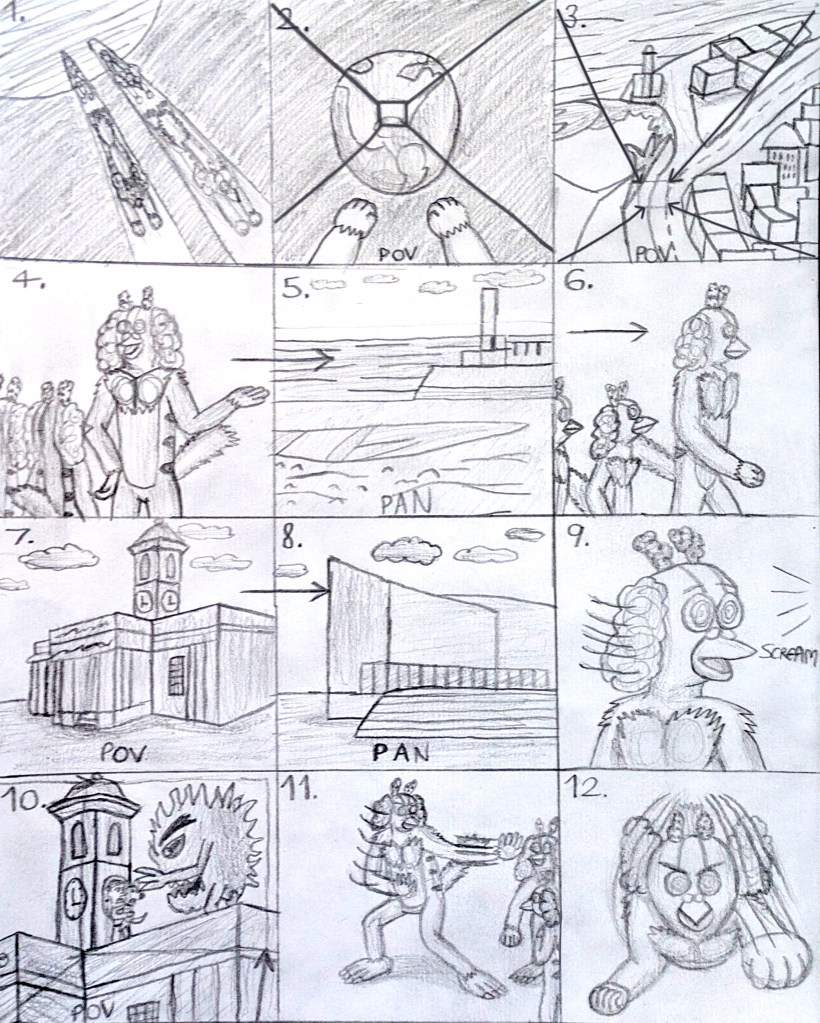
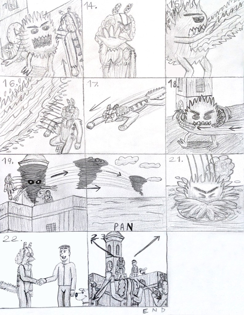
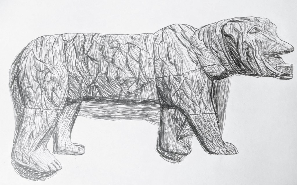
To identify the materials that Gonzalez used in Ice Merchants, I experimented with monoprints (with different results). One of my strengths was that I used Photoshop to digitally edit, manipulate and combine monoprints and hand-made concertina marks and play around with colours. Another was learning from mistakes since I made a new monoprint of the Kent Fire and Rescue Service after I left an older one in the sun. Next, I made a moodboard of animal images, using them and my visualised sound and mark making textures to create a concept character, the Squirgeon. The concept of combining human and animal features in the character design was influenced by Bibo Bergeson’s storyboards for A Monster in Paris. Harold Michelson’s storyboards for The Birds included thick arrows to indicate direction, close-up and point-of-view shots, and different tones of grey, black and white.[171][172][173][174] Bergeson’s boards had lots of lines to show movement.[175] Taking inspiration from the two artists, I initially did a rough storyboard in pencil on paper, with action lines to keep the same energy as Bergeson, then did another, larger, refined one in HB pencil (for tones and shadows) and 2B pencil (to make the outlines stand out) on white cartridge paper. These processes showed some of my other strengths, such as using my imagination and developing my storytelling skills. Prior to doing the storyboards, I also researched Saul and Elaine Bass,[176][177][178] Sam Hudecki and Darryl Henley,[179][180] Butch Hartman,[181][182][183][184] and Hayao Miyazaki.[185][186][187][188][189][190]
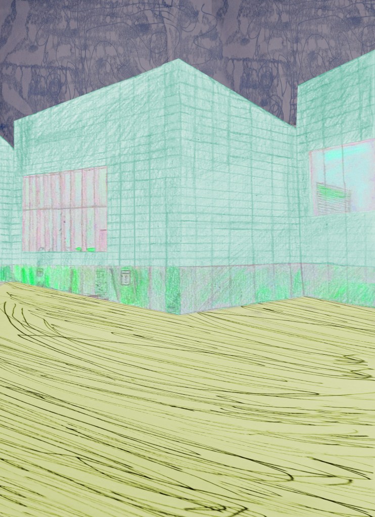
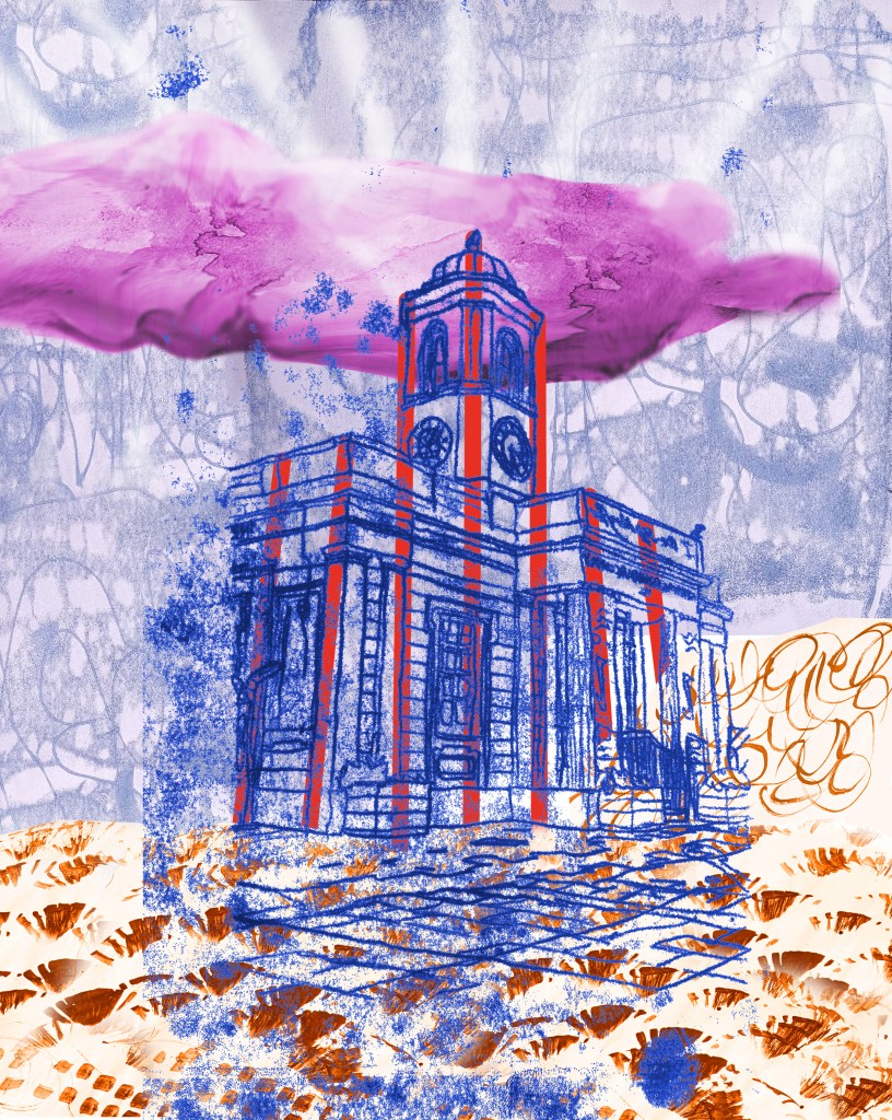
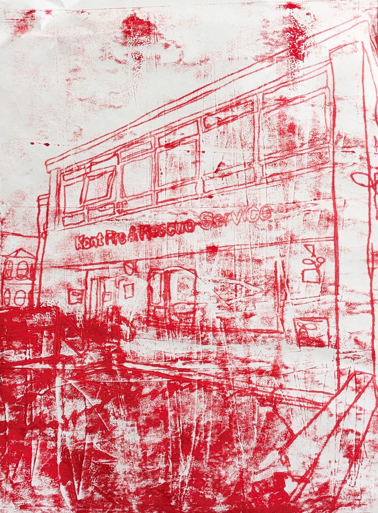
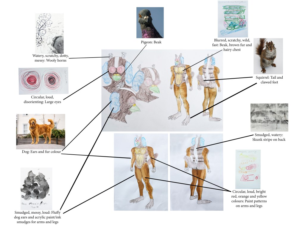
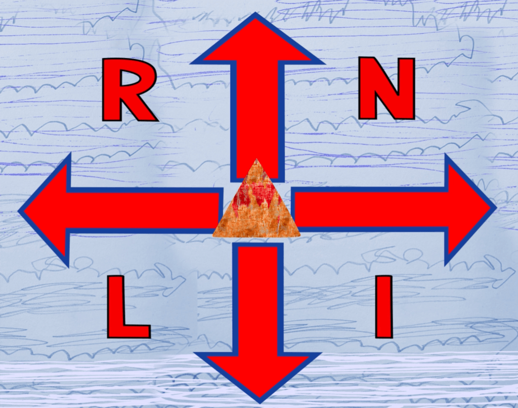
Near the end of my Urban Sounds project, I produced an animation using Adobe After Effects to submit to Young Creatives x RNLI to be put on display at the Turner Contemporary.[191] When I think of force, I think of strength and nature. My work brings together the physical movement and strength of nature and the sea, as well as that of the RNLI crew. The seaside of Deal inspired my mark making sketches based on the waves’ motions and sounds. This animation was inspired by the RNLI flag; I thought about how I could bring these elements together to illustrate the idea of force. By layering the mark making, I created the rhythm of the waves, and used different shades of blue for a textured background to communicate the force of the sea. In physics, arrows are associated with the movement and magnitude of force. The RNLI flag was adapted using arrows to reinforce the idea of motion. Shapes in nature gave me inspiration to add moving shapes, which I animated in different directions. To give the shapes weight, I added naturalistic textures (fire, sun, water, earth and sky, which are forces on their own). “Waves Breaking on a Lee Shore at Margate” by JMW Turner influenced my watercolour painting of the sky and sea, which was used for one of my shapes. Finally, I added a drop sound effect to the movement of the shapes, and added wave sounds in the background. This all reinforces the power of the sea, and the strength and impact of the RNLI crew in our community.
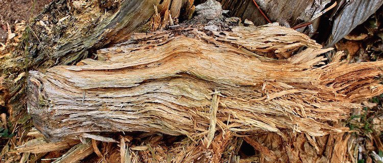
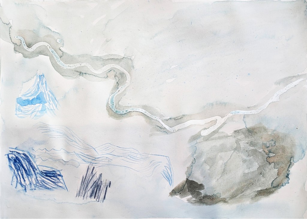
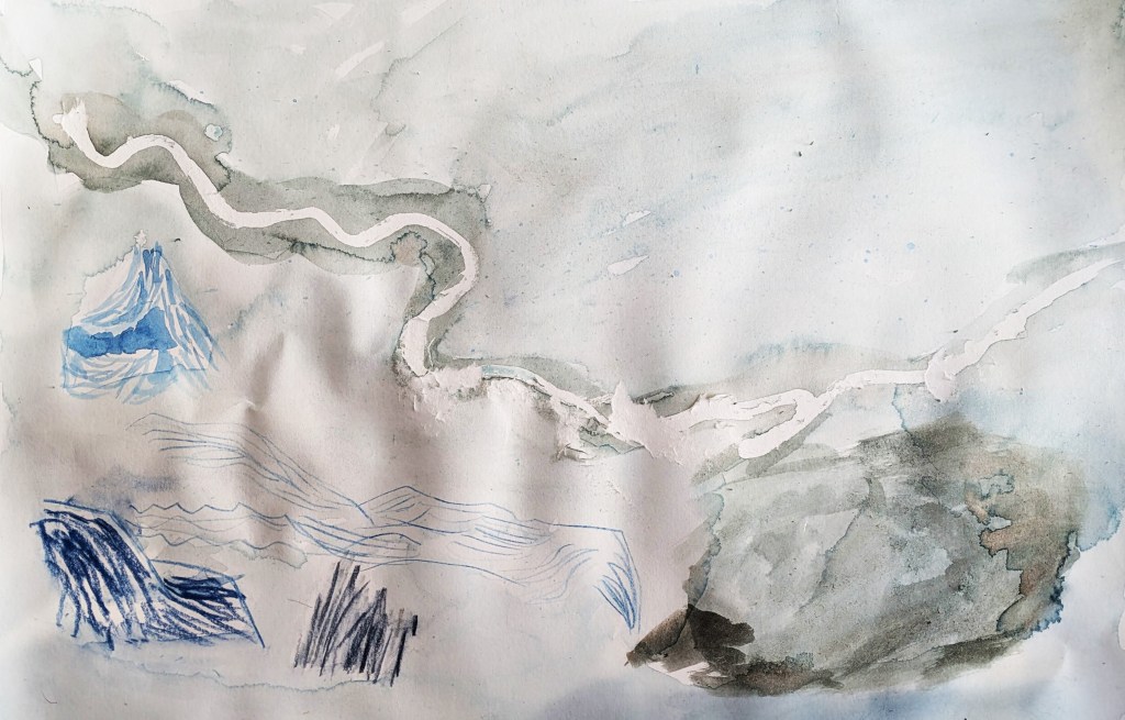
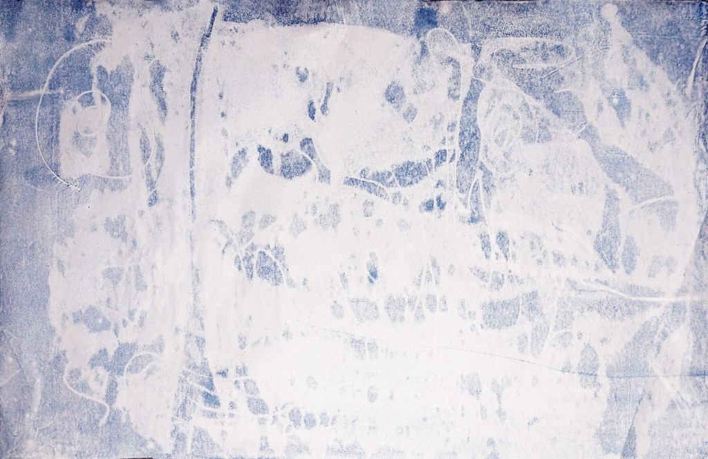
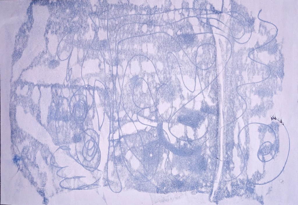
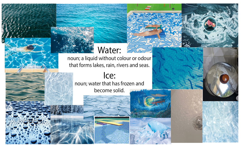
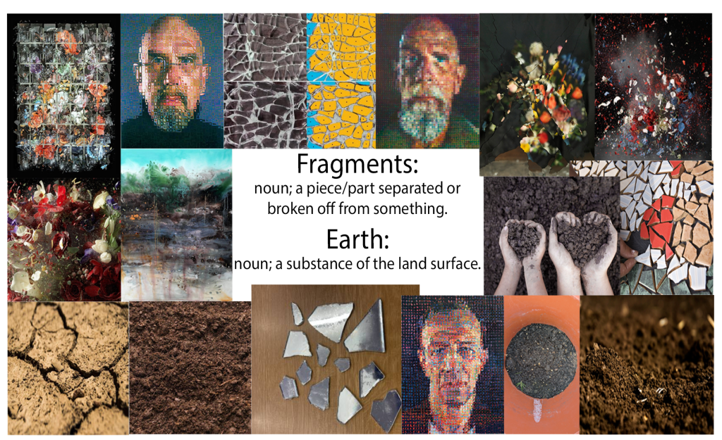
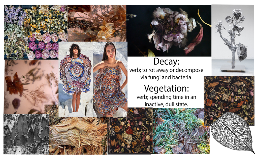
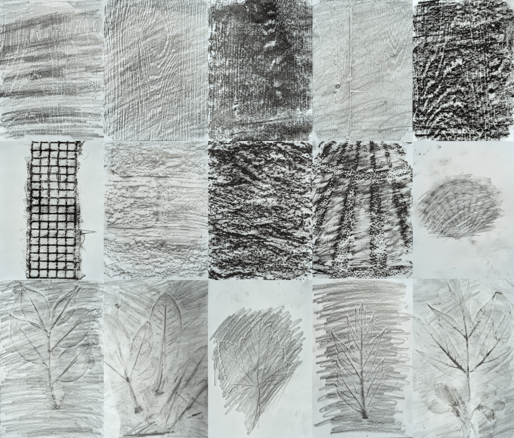
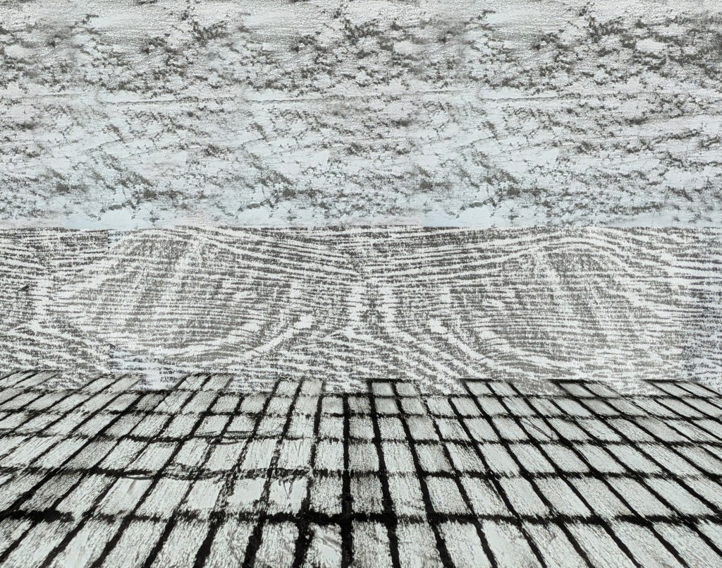
After my Urban Sounds project was the Textures and Layers project. I selected five words (water/ice, fragments/earth, decay/vegetation, clouds, hidden/obscured) to construct my moodboards, using different images and paintings by artists like Hayao Miyazaki, David Hockney (whom my mother thought was a young adult, when he was actually 87 years old), Ori Gersht and Berndnaut Smilde. Then I researched Max Ernst[192][193][194][195][196] and Jane Dixon,[197][198][199][200][201][202][203][204][205][206][207][208] which is where I learned about the technique of frottage (pioneered by Ernst).[192] I noted the similarities and differences between the two frottage artists in terms of colour and composition, then made frottages using 6B graphite stick (1-2, 7, 10-11, 13-14), charcoal (3), graphite putty (4, 12, 15), and black oil pastel (5-6, 8-9) on surfaces and materials indoors and outside in the garden, including wooden tables (1-5), ceramic tiles (6), brick walls (7), paved ground (8), parasol bases (9), shells (10) and leaves (11-15). I also made two frottages in Photoshop, one being a plant forest inspired by Ernst’s fantasy landscapes, and the other being the sea and docks, influenced by Dixon. Next, I took a look at Susan Derges,[209][210][211][212][213][214] Ori Gersht[215][6] and Berndnaut Smilde.[216][217][218][219][220][221][222][223] The artists’ processes (Derges using natural elements and photographic paper to make photographs without a camera, Gersht capturing destruction of man-made objects and natural forms in real time, and Smilde using contrast of natural form and urban settings to create fantastical elements) inspired me to make two contact sheets of photographs of water, fragments and clouds in Photoshop, where I changed the hues and removed any distracting elements. The interiors in some of my cloud photographs were taken at the Turner Contemporary.
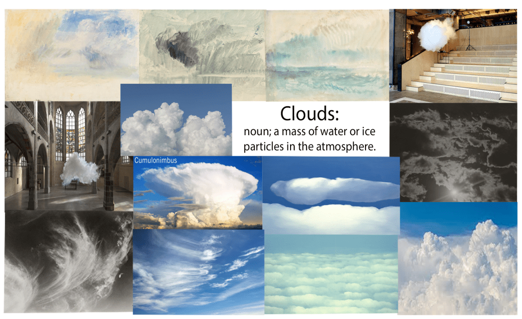
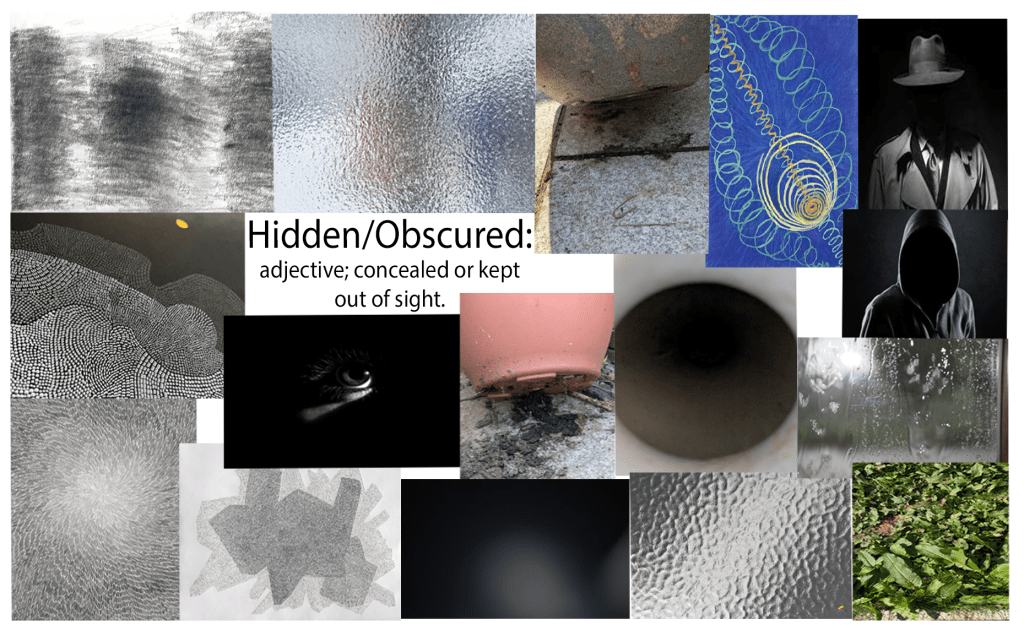
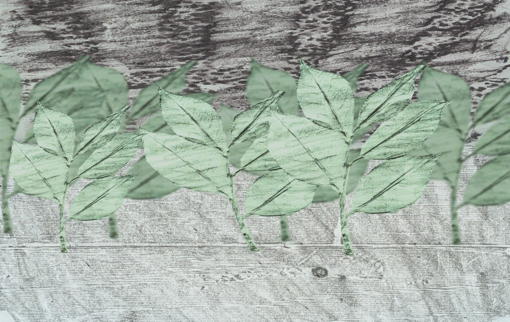
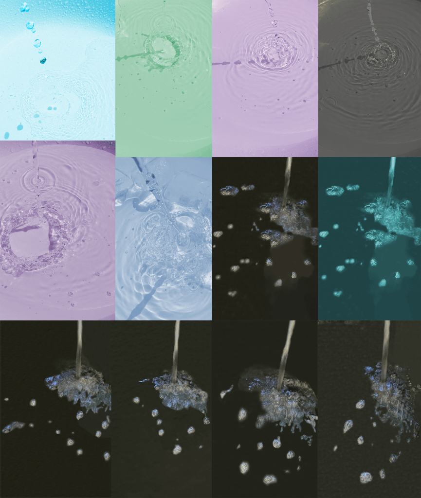
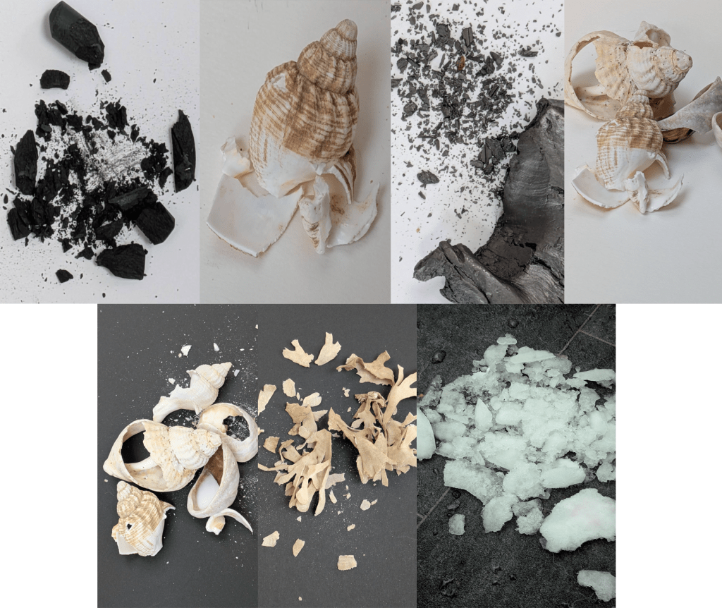
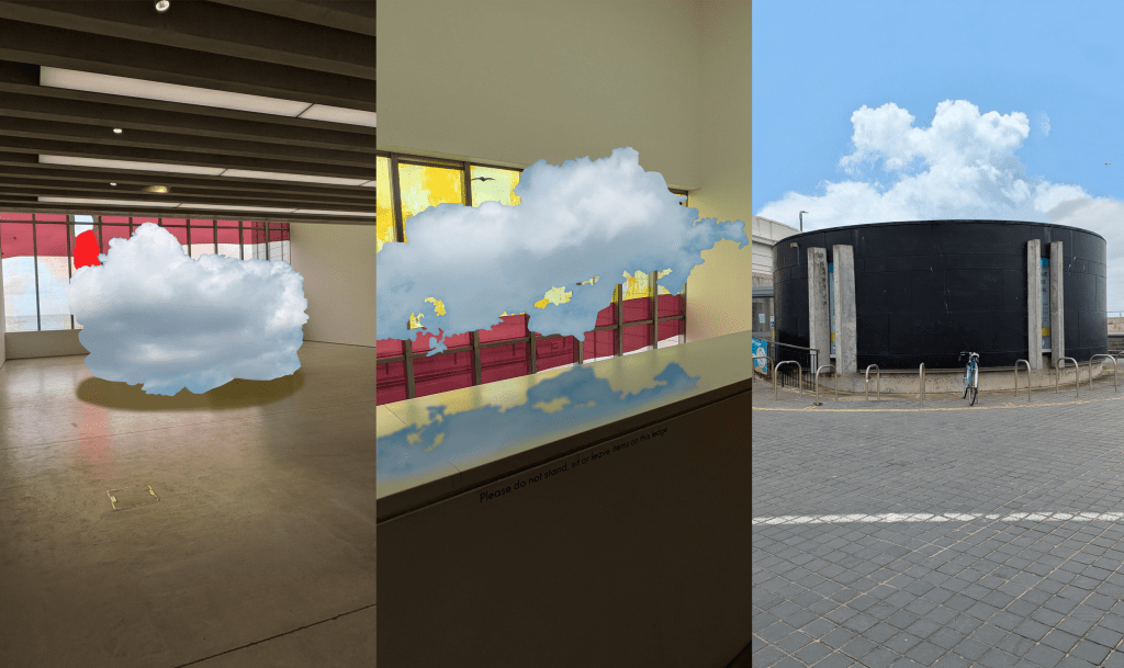
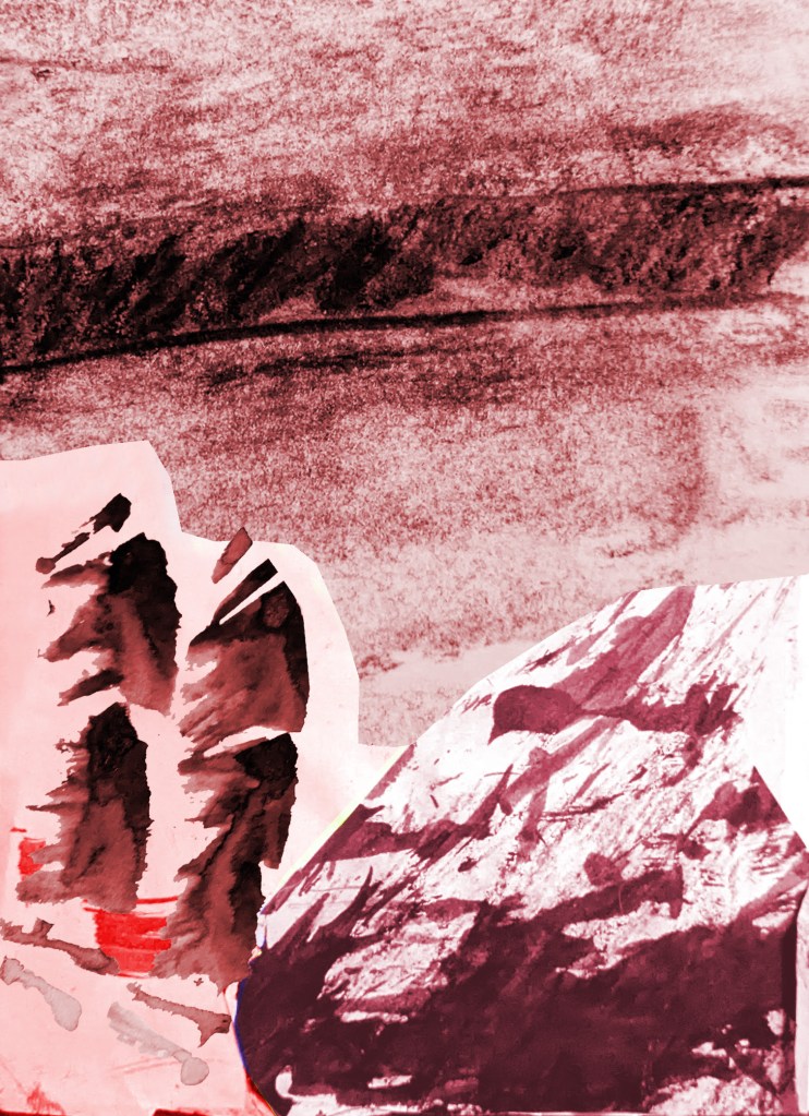
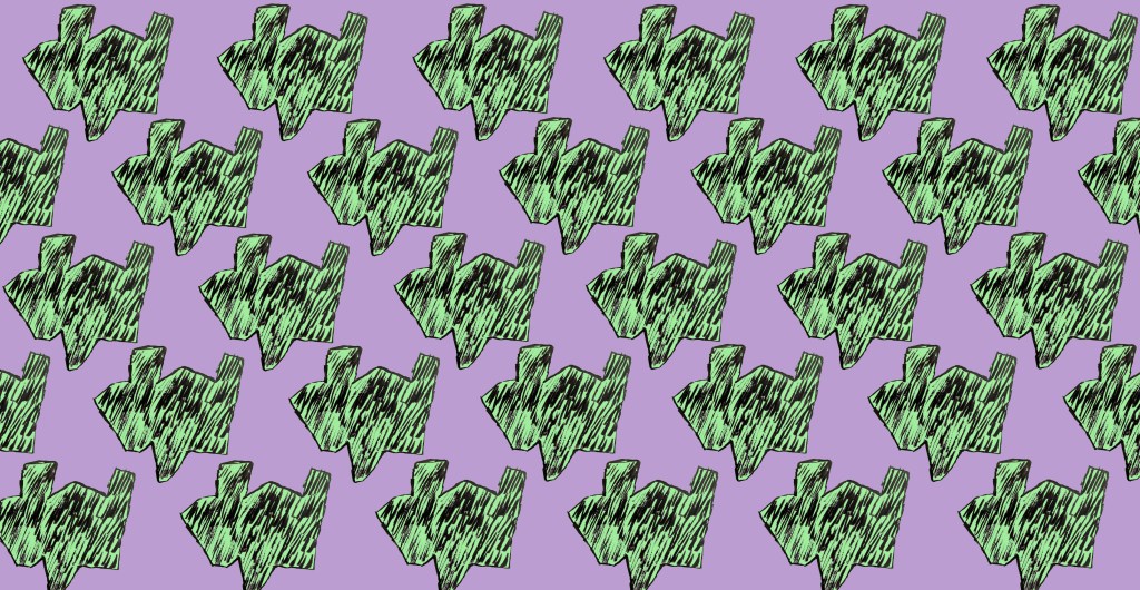
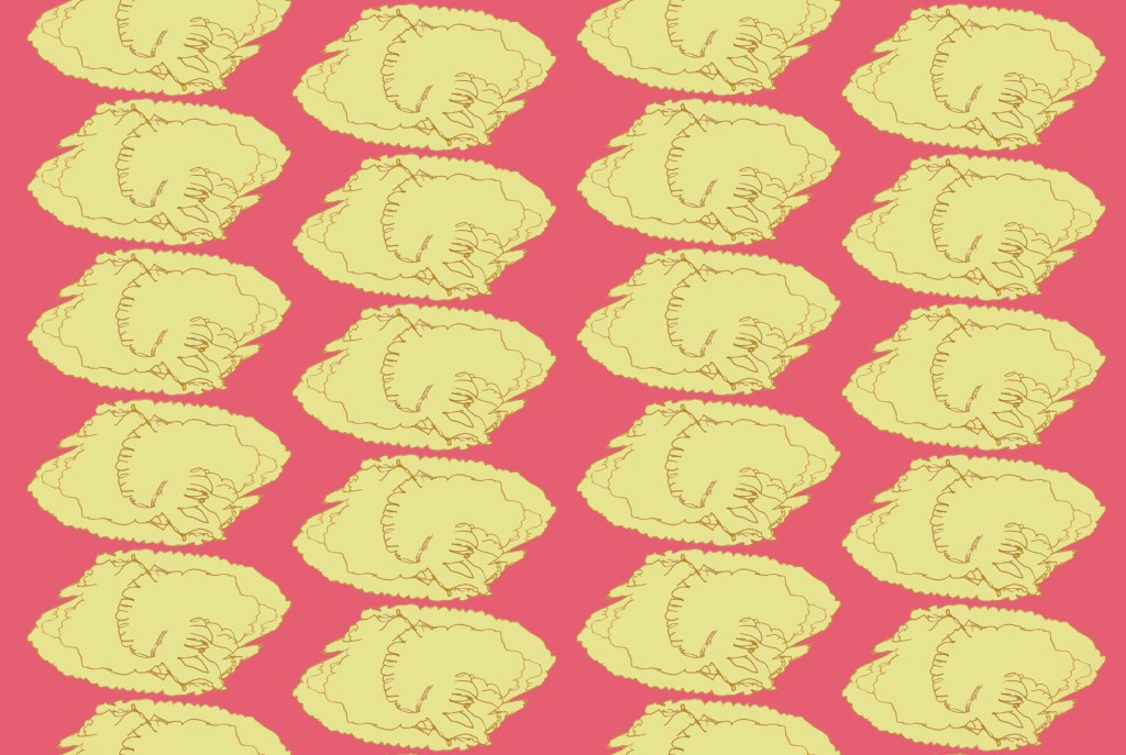
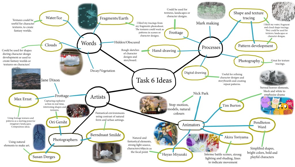
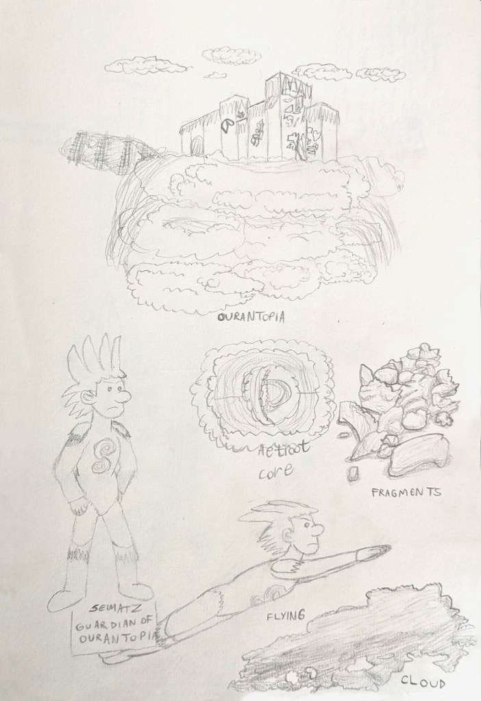
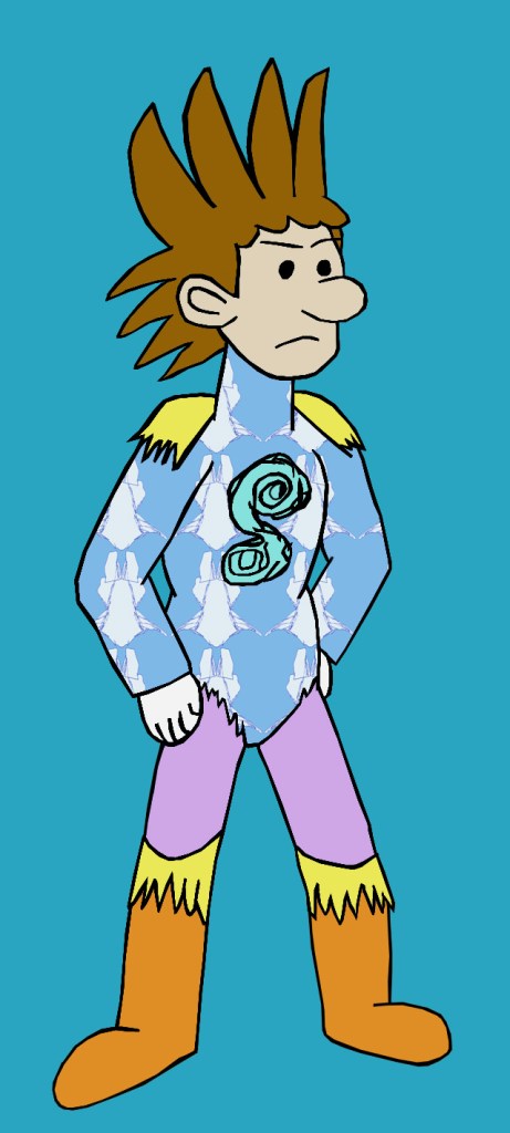
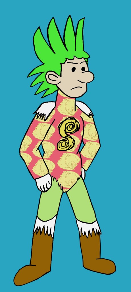
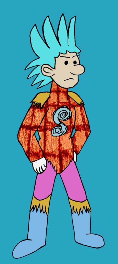
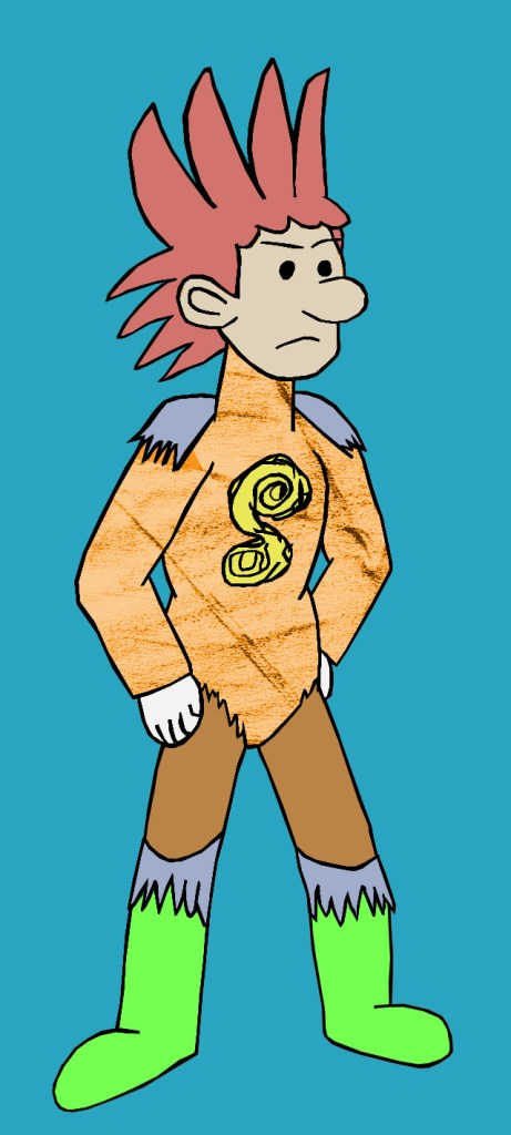
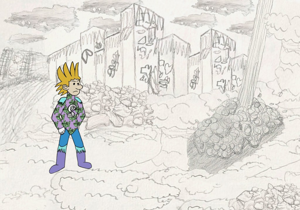
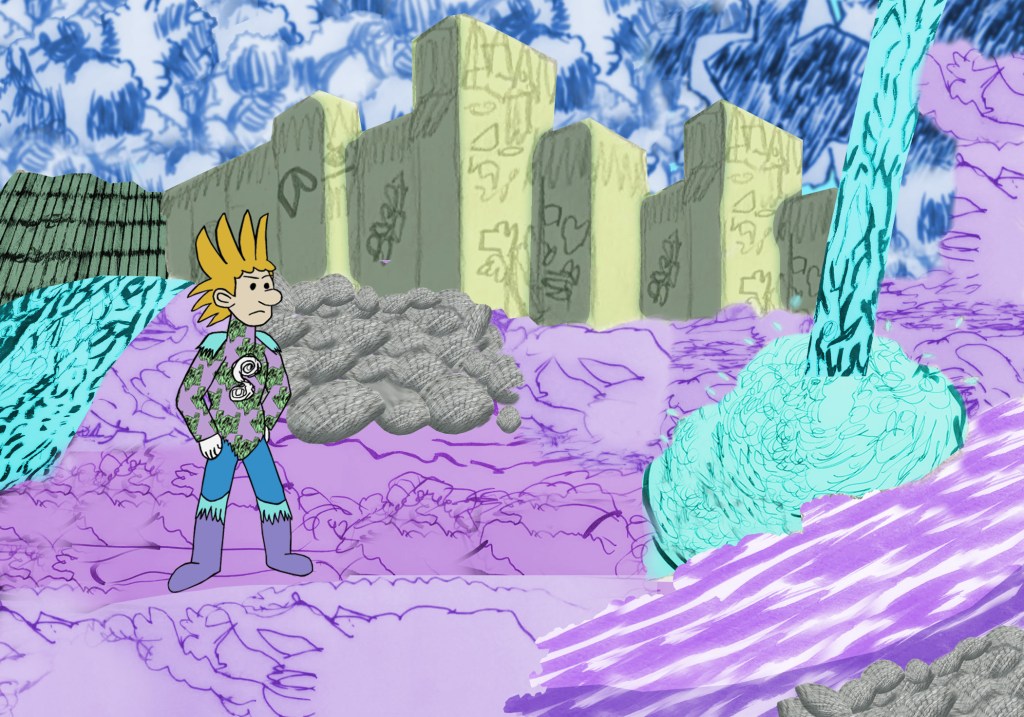
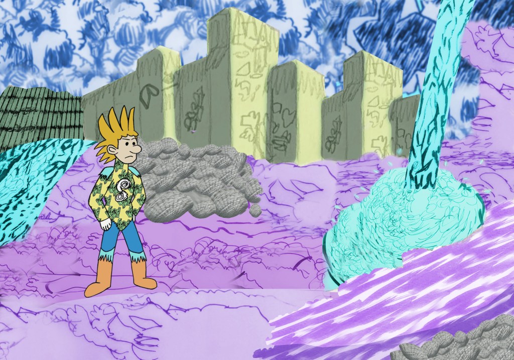
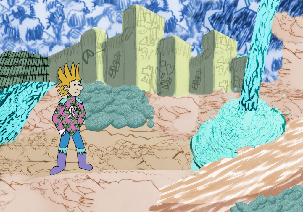
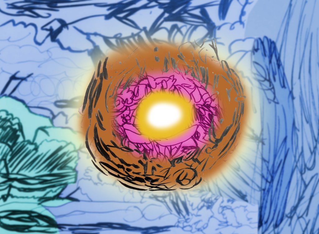
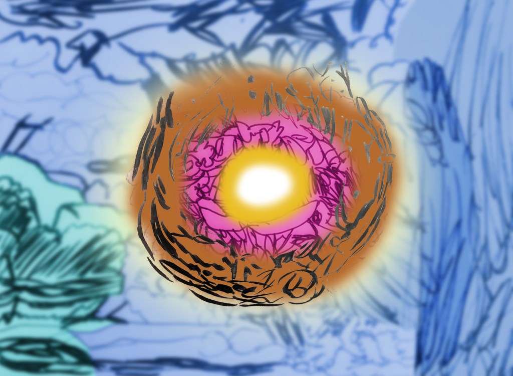
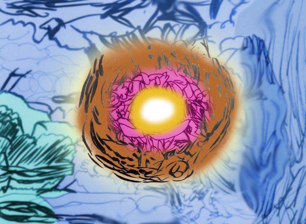
Next, I learned about tracing shapes and adding/creating repeat patterns. I printed some of my photographs and images from my clouds and hidden/obscured moodboards, and used the tracing and repeating processes to capture their form and textures, making them feel a little dramatic and have a sense of movement. I then researched Tim Burton,[224][225][226][227][228][229] Hayao Miyazaki,[230][231][232][233][234] Akira Toriyama,[235][236][237][238][239] Pendleton Ward[240][241][242][243][244][245][246][247][248][249] and Nick Park,[250][251][252][253][254][255][256] and drew a mind map referring to my previous work for the project. This work served as early ideas for my character designs and landscape designs (influenced by Miyazaki, Ward and Toriyama), including my character Seimatz and the world Ourantopia. During this process, I played around with the colour palettes to see which one worked in the sense of the character and landscape standing out from each other, and created textures from my frottages and shape tracings to use for the landscapes. After that, I made concept art of Ourantopia’s core Aertroot. The process involved combining the shape tracings and frottages, changing them to different shades of blue, turquoise (background), brown and yellow (core), adding a yellow light behind the core to make it stand out, and slightly blurring the background and smudged some of the edges to give it a soft, fluffy texture similar to a cloud. Finally, I took photographs of my own hands, and used them as reference for my character’s hands, therefore developing my hand-drawing skills. Shading was added to give him a more three-dimensional look.
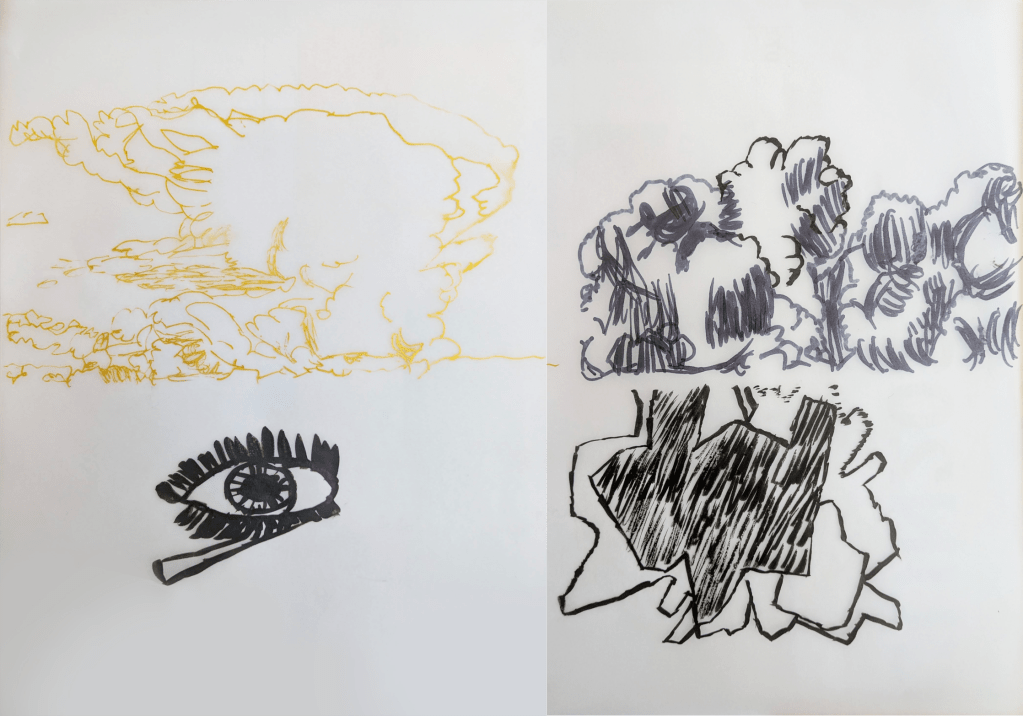
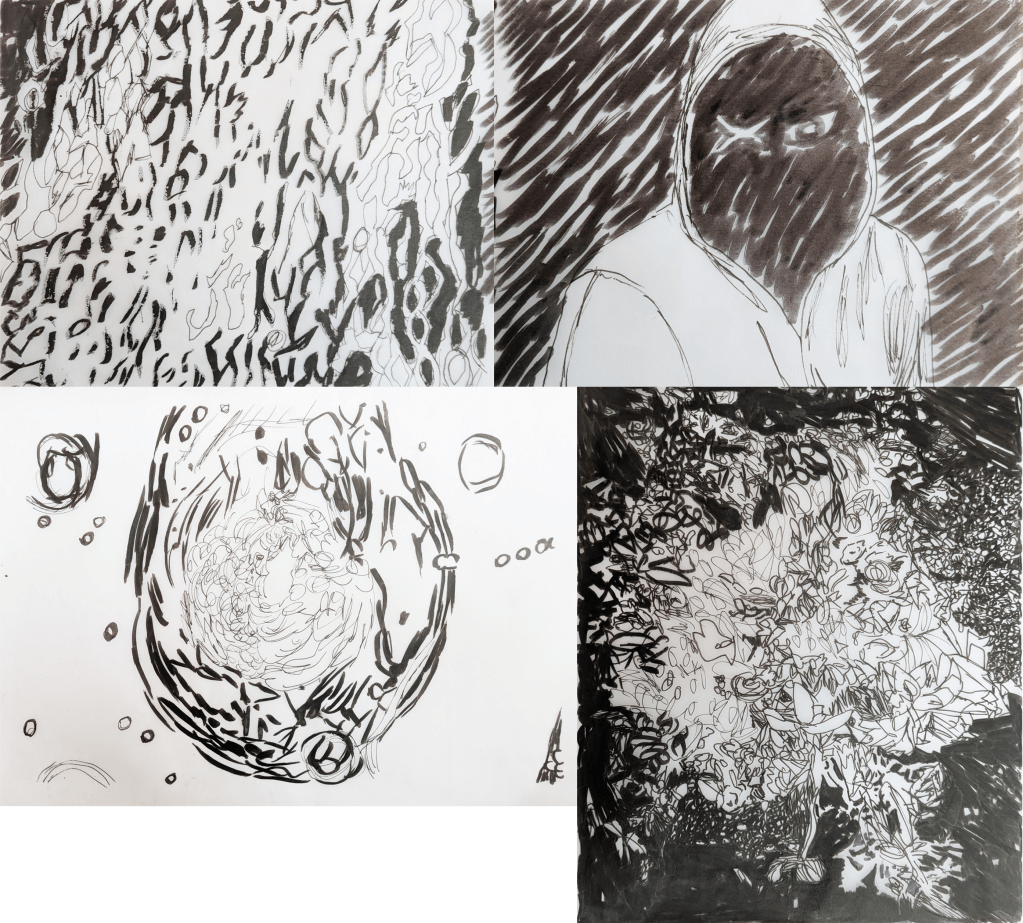
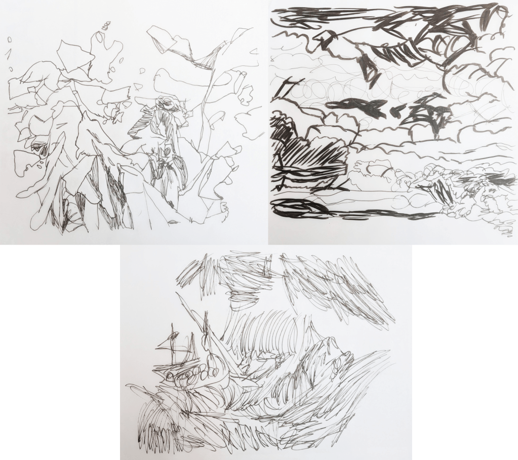
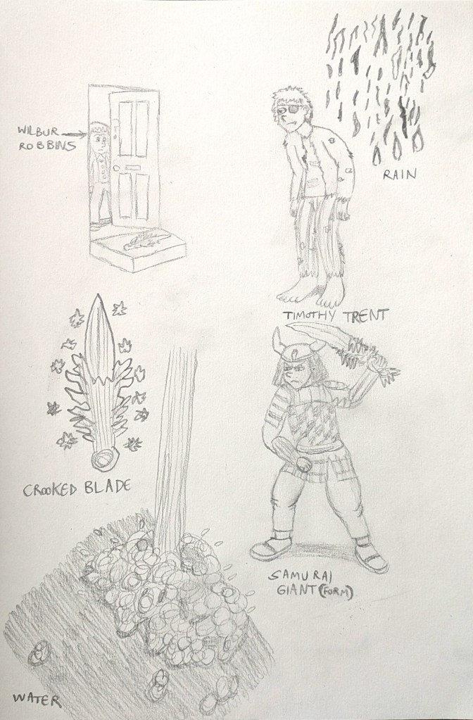
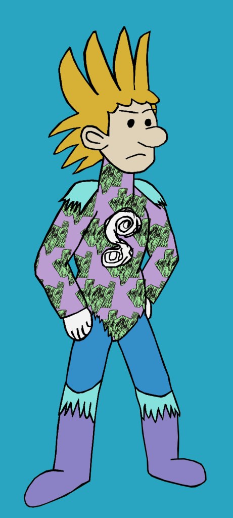
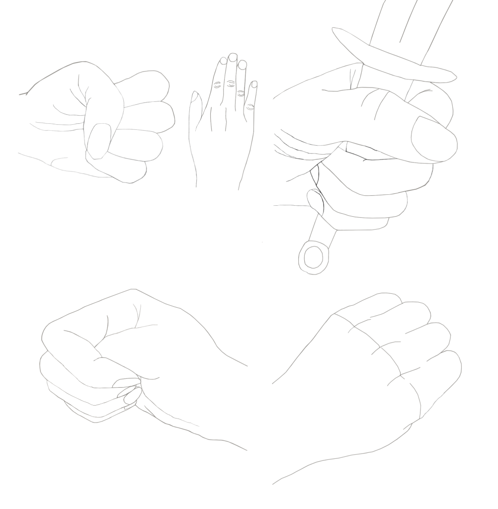
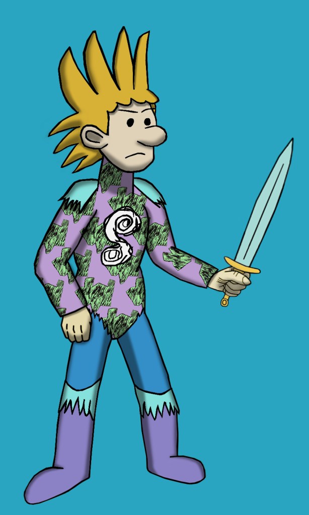
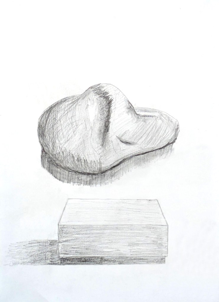
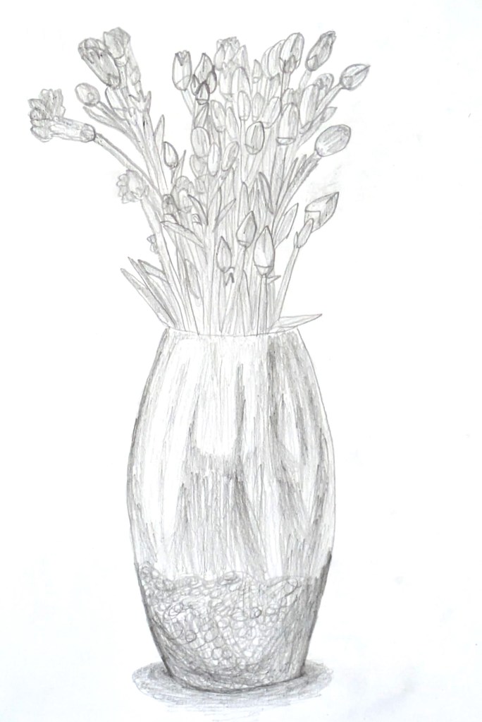
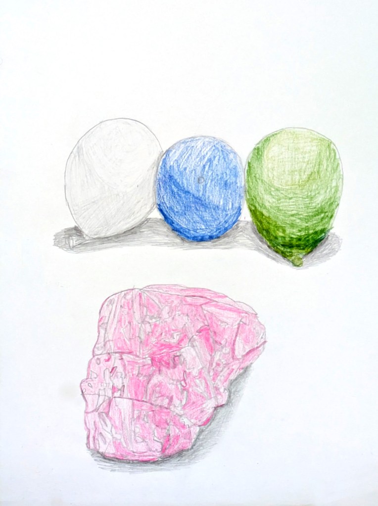
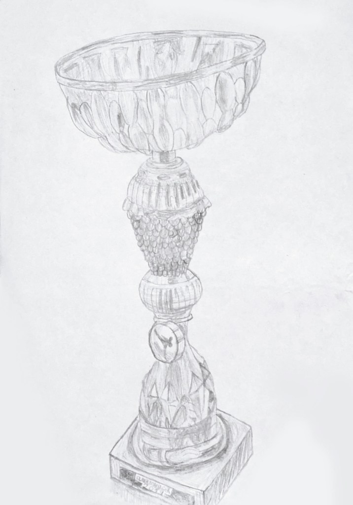
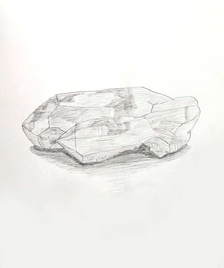
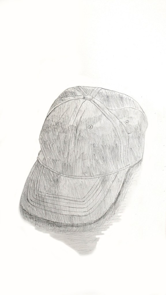
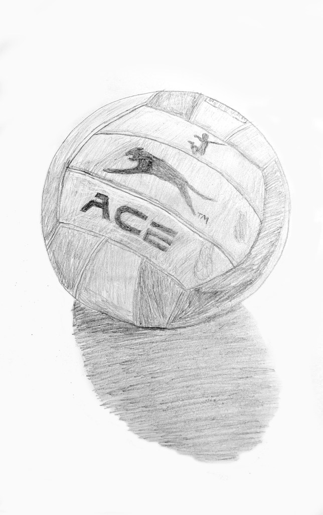
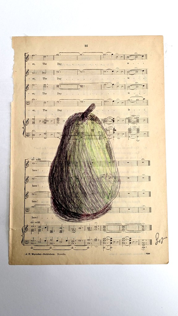
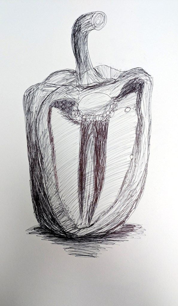
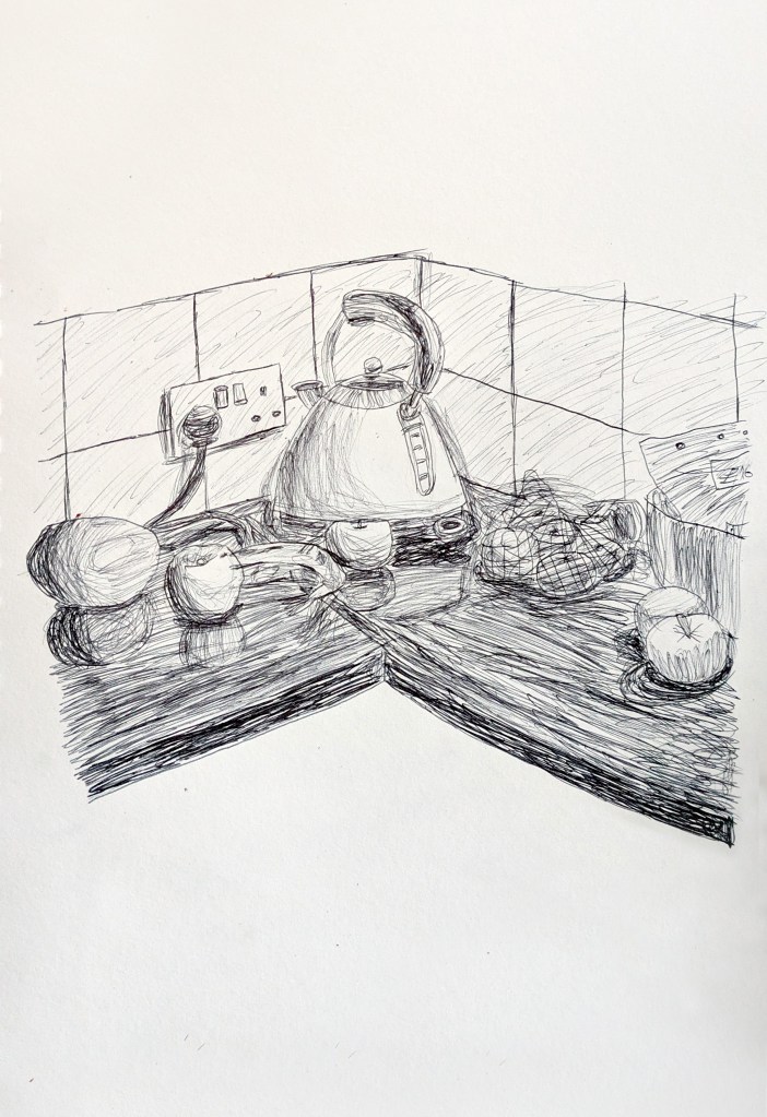
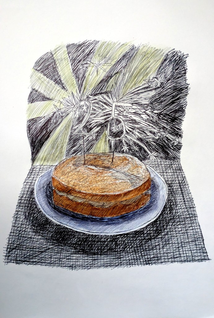
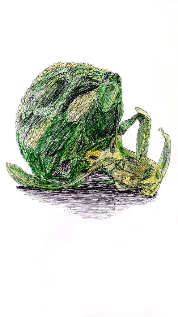
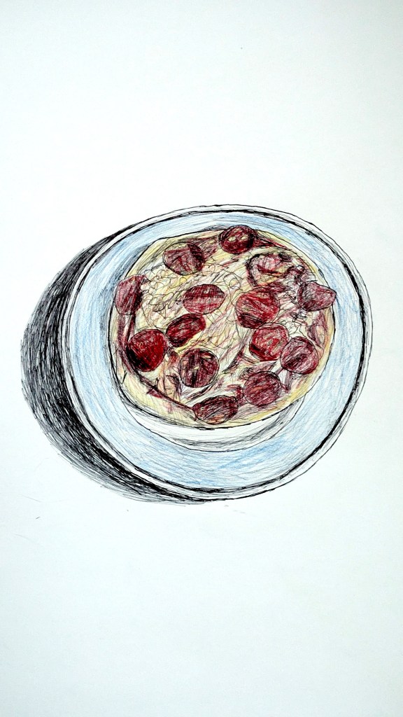
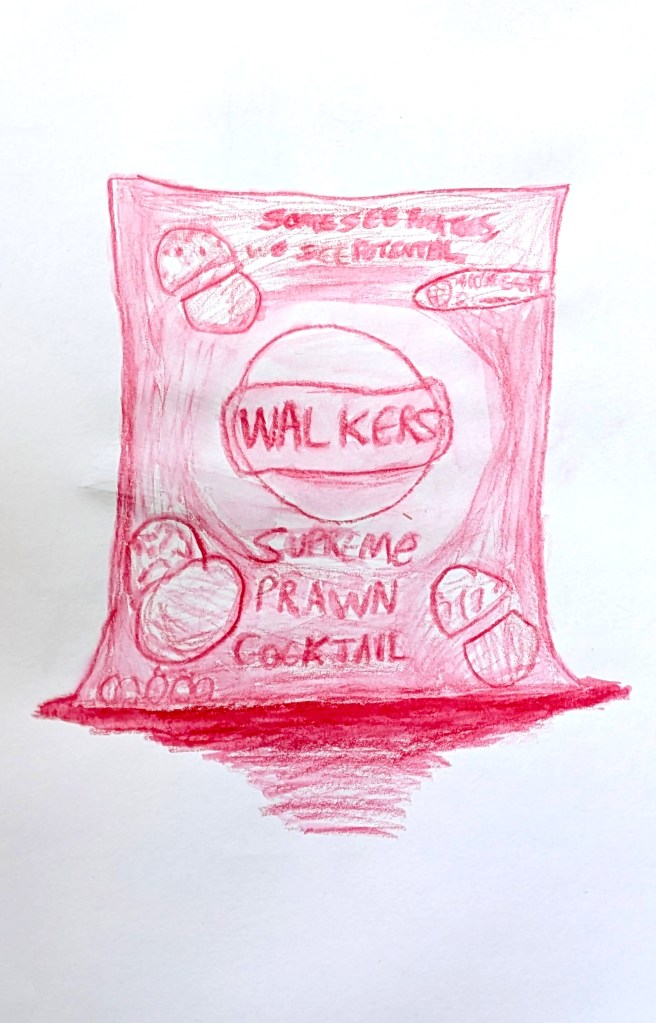
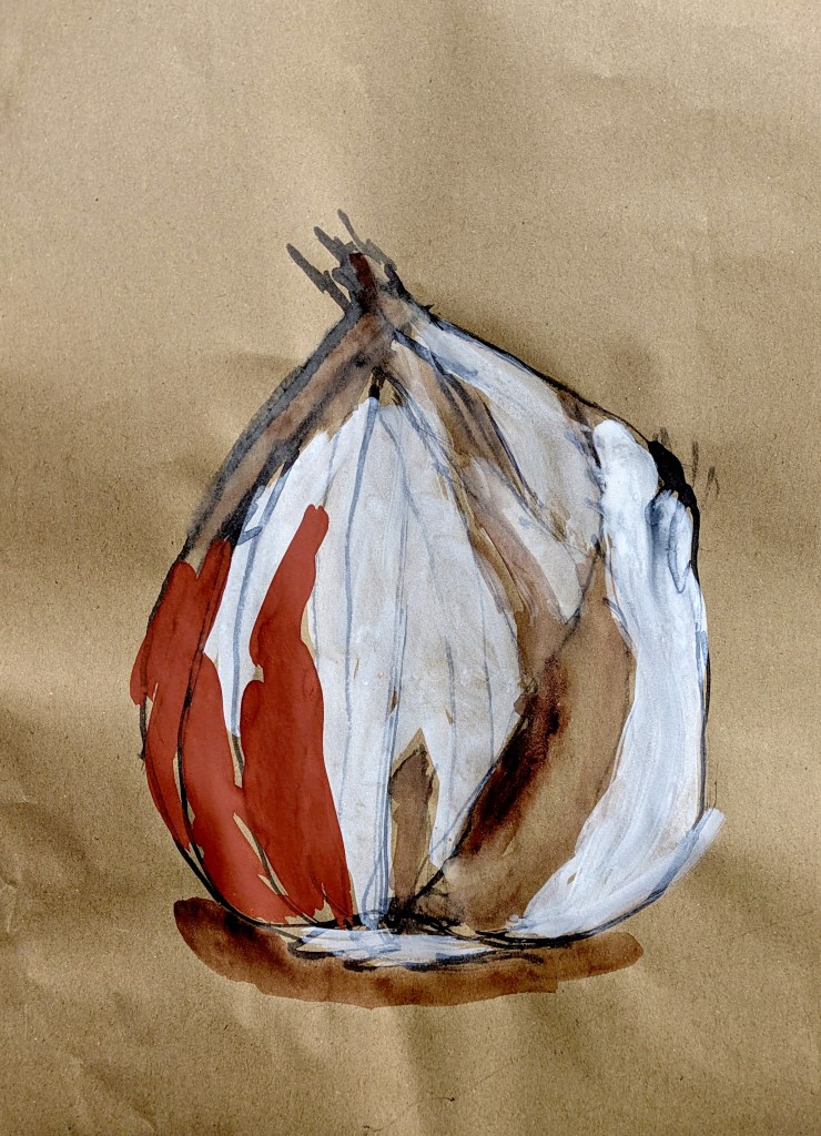
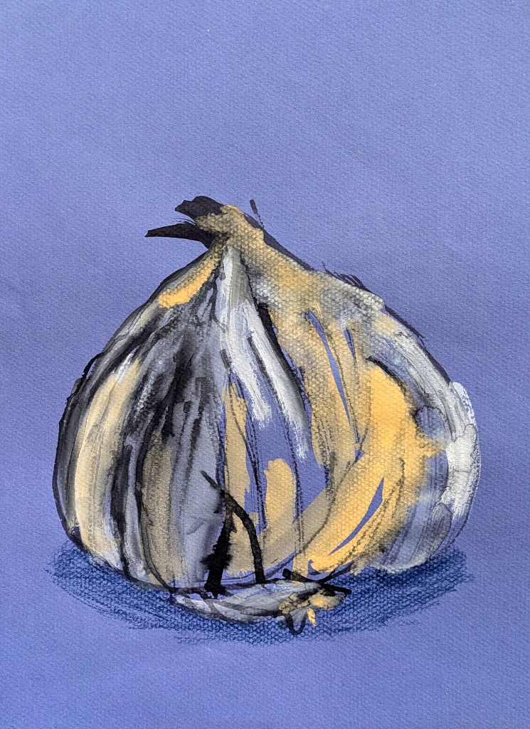
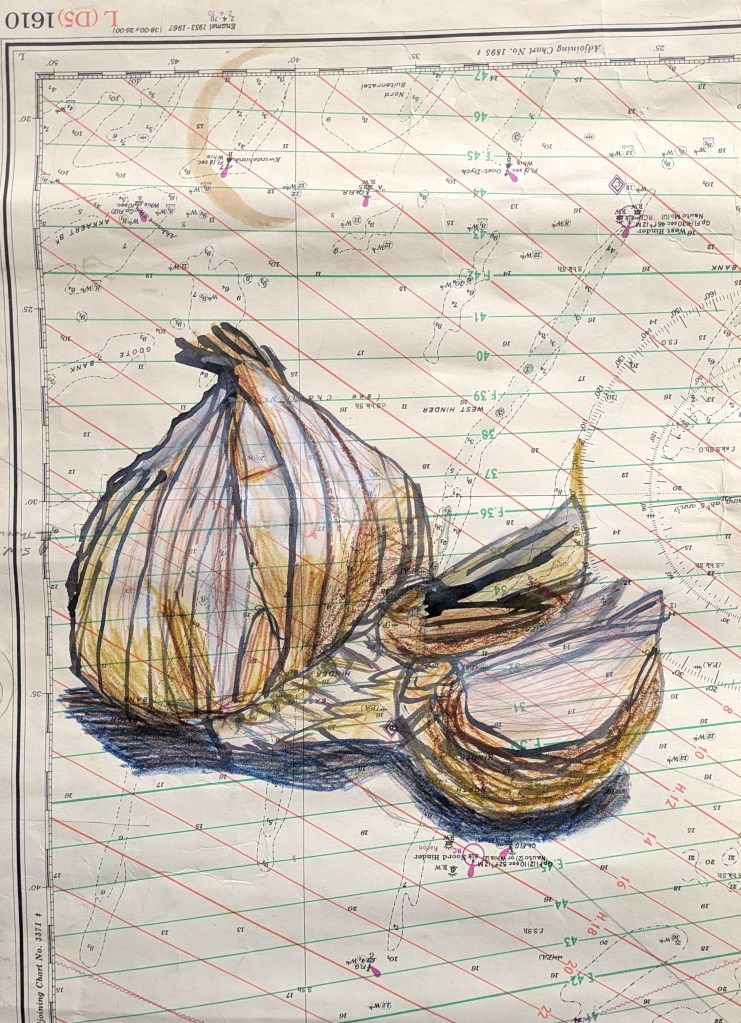
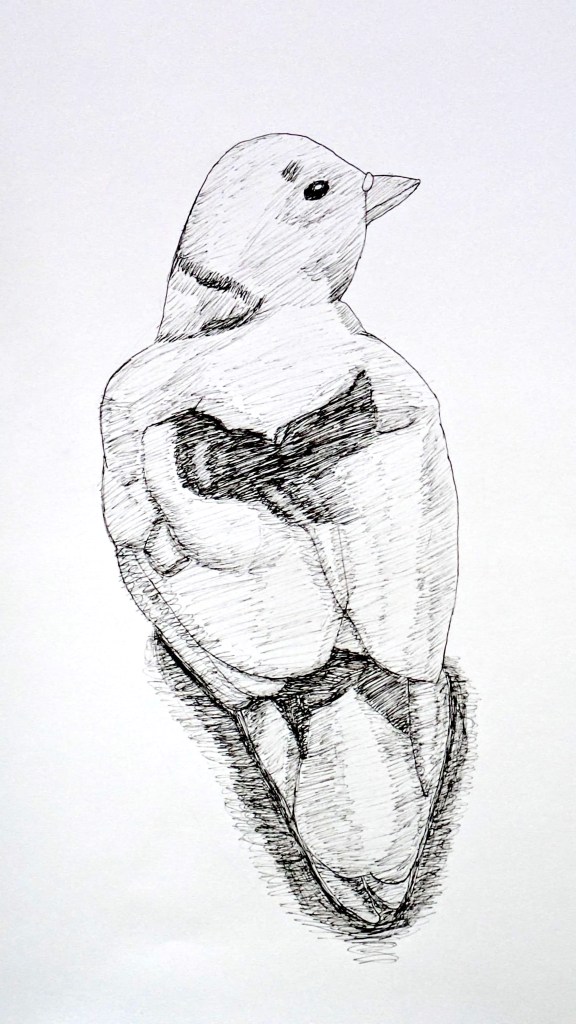
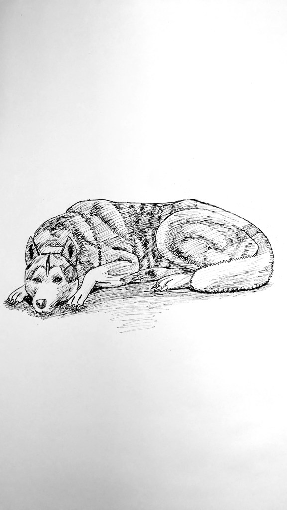
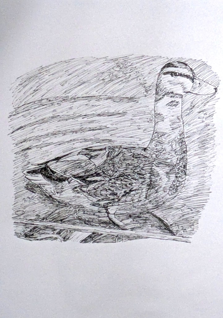
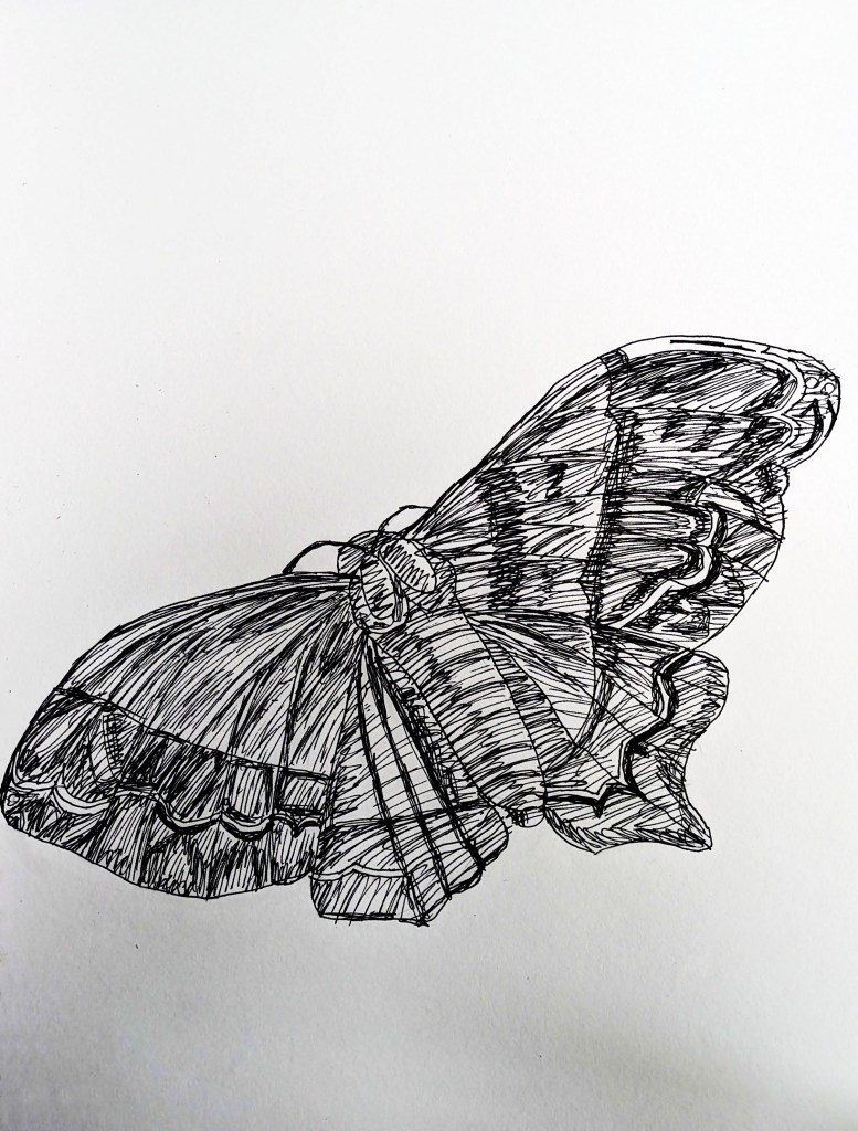
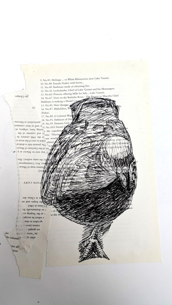
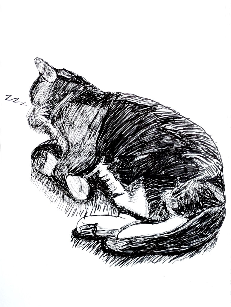
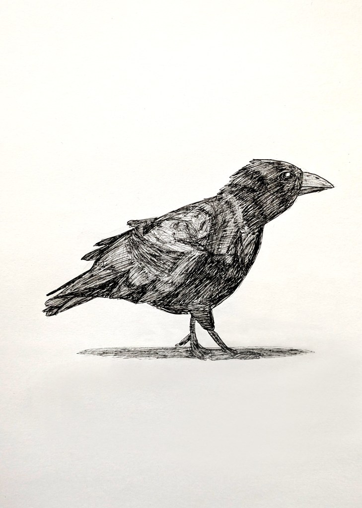
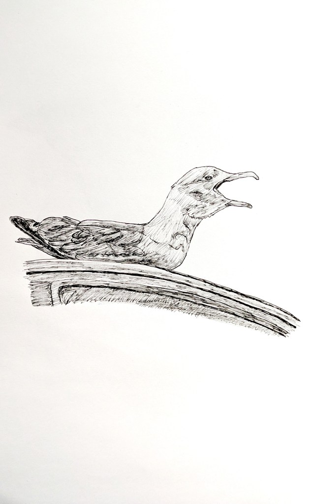
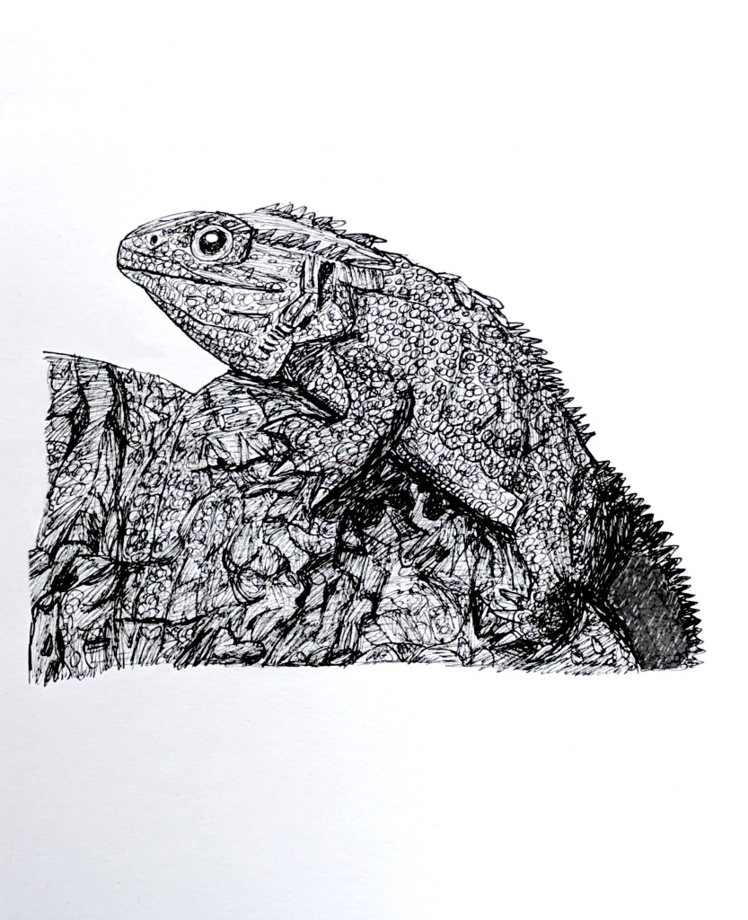
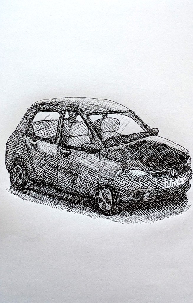
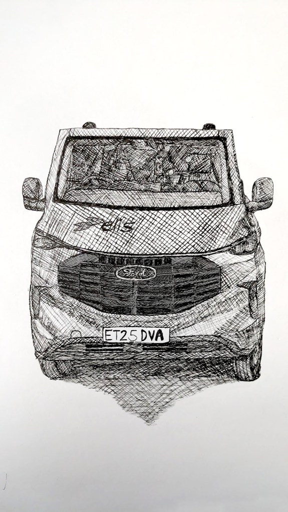
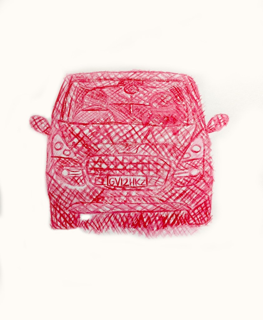
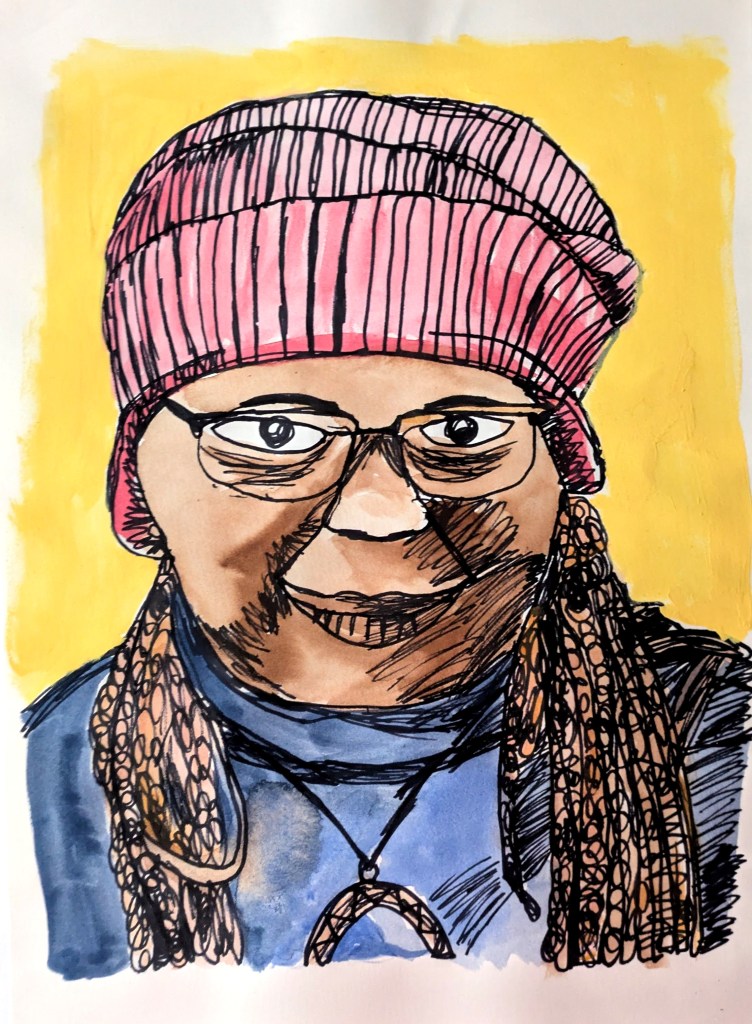
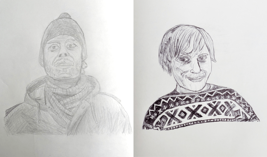
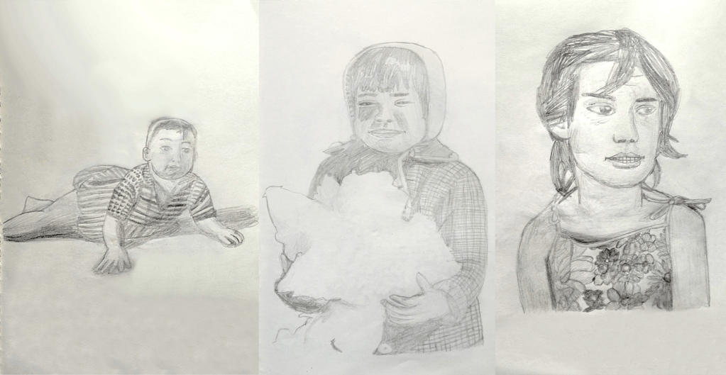
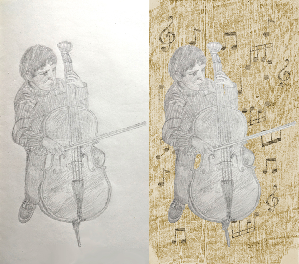
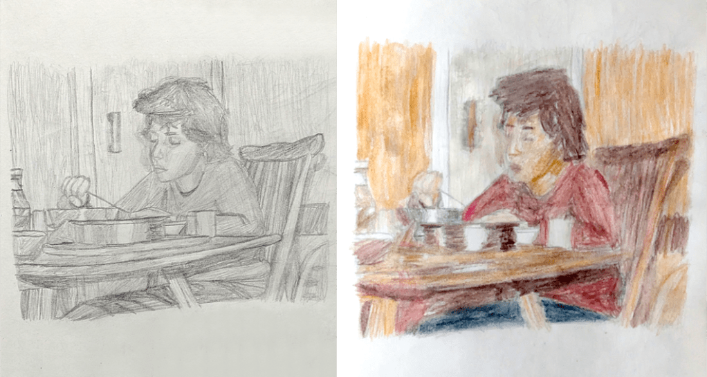
In September 2025, I decided to research artists and their sketchbooks. Artists draw concepts and ideas in sketchbooks to practice their skills and develop them over time. Thus, the sketchbook is the starting point for an artist’s career.[257] The artists that I researched included Leonardo da Vinci,[257] J.M.W. Turner,[258][259] Grayson Perry,[260][261][262] David Hockney[263][264][265] [257] and Mark Powell.[266][267] Following the research, I was inspired by Leonardo, Perry and Hockney to do 51 out of 70 sketches, experimenting with materials such as Graphite HB, 8B Wash, Caran Dache colouring pencils, Global biro, edding 1880 Drawliner 07, GALAXY fineliners, et cetera. What made this project successful for me was that I had a wide range of materials to make as many drawings as I could. The subjects included objects, food, buildings, animals, birds, people, and organic forms.


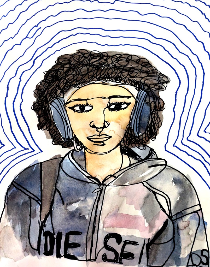
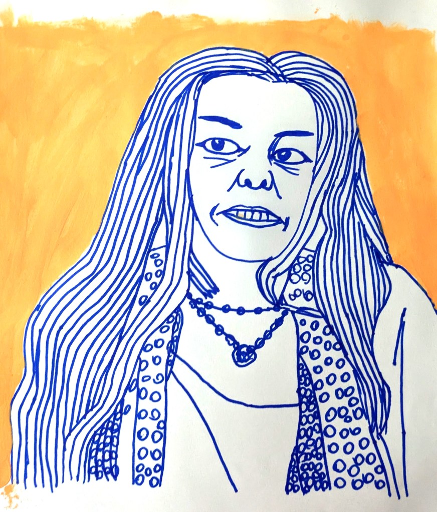
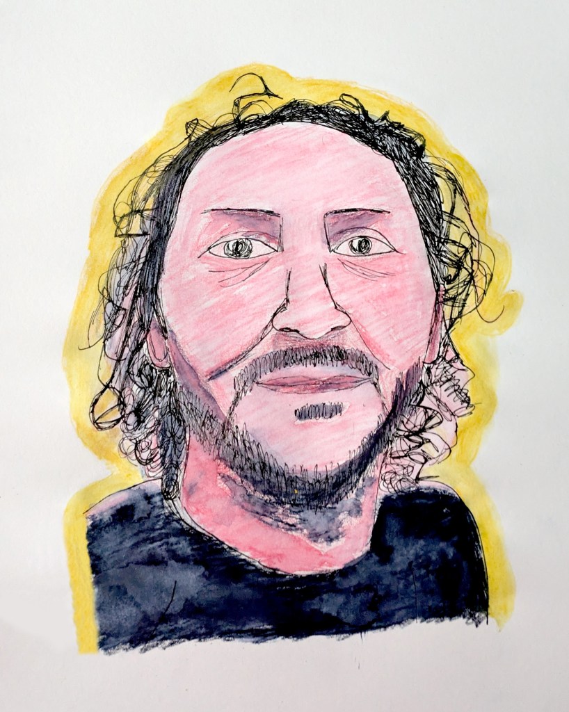

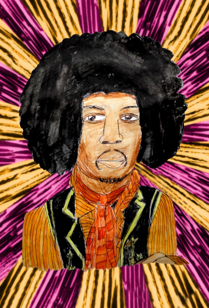

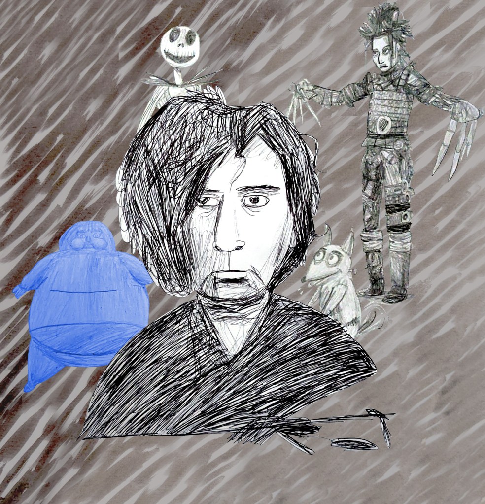
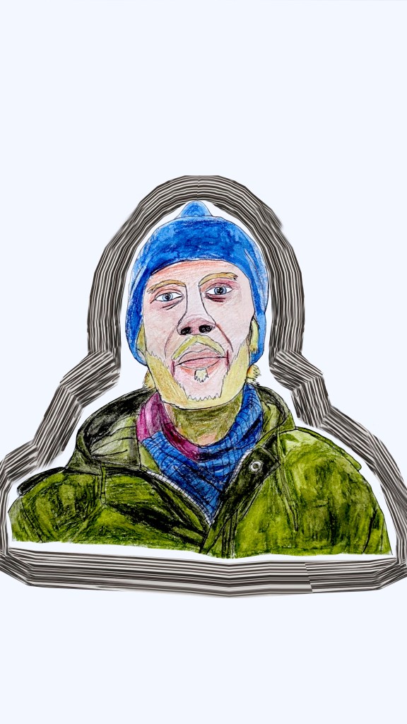
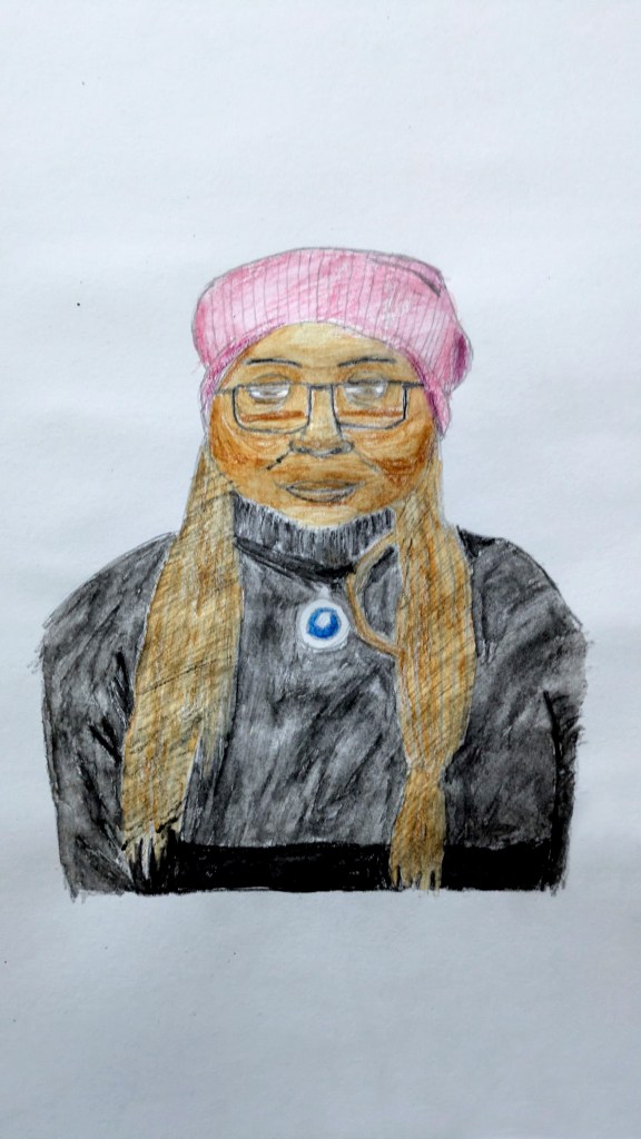

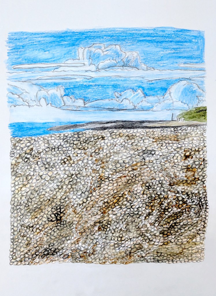
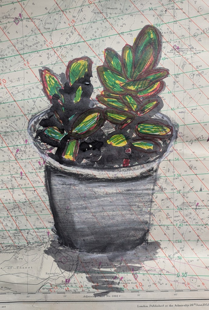
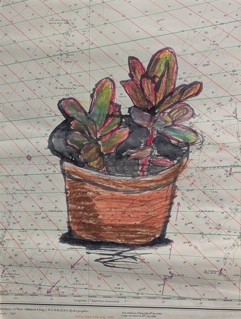
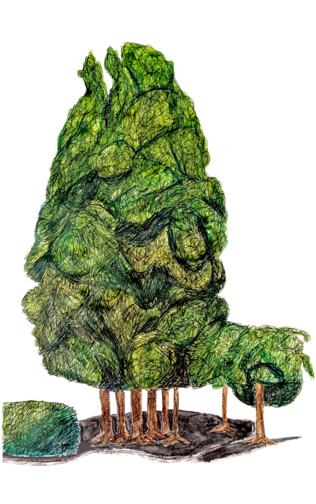
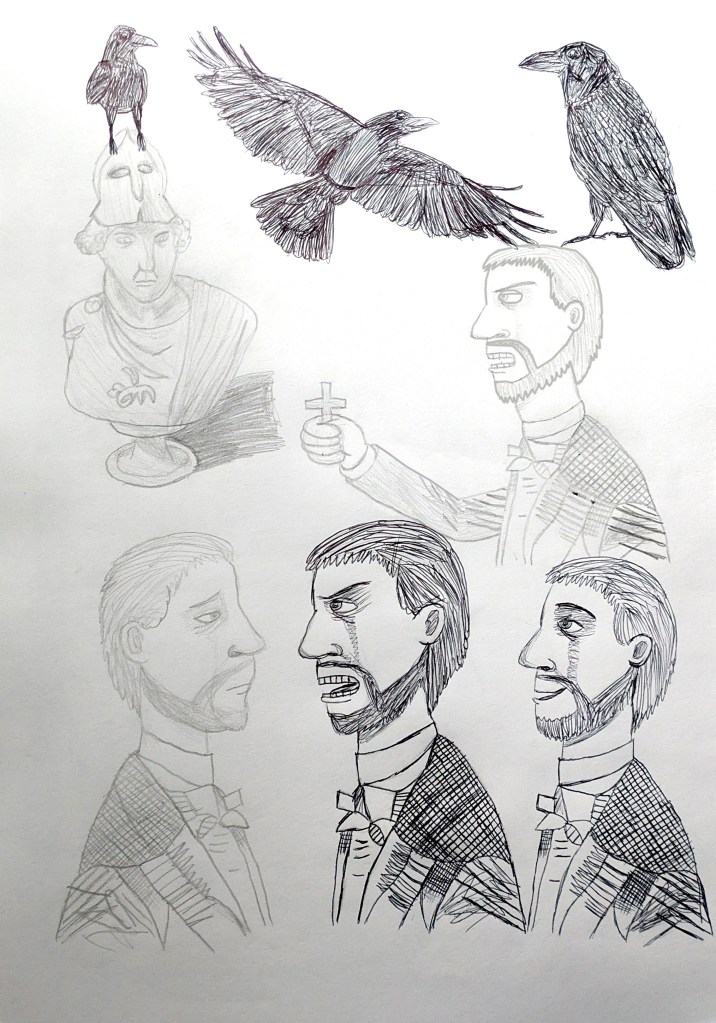
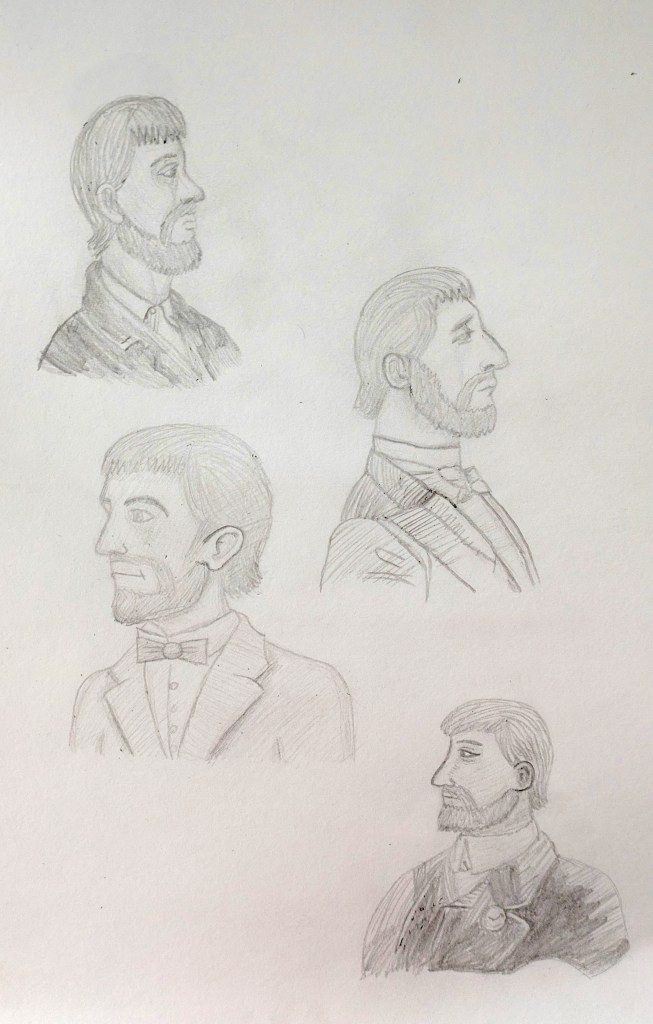
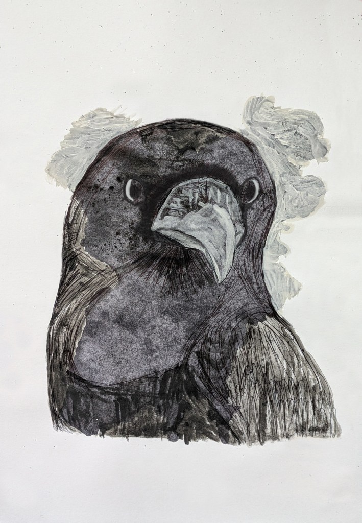
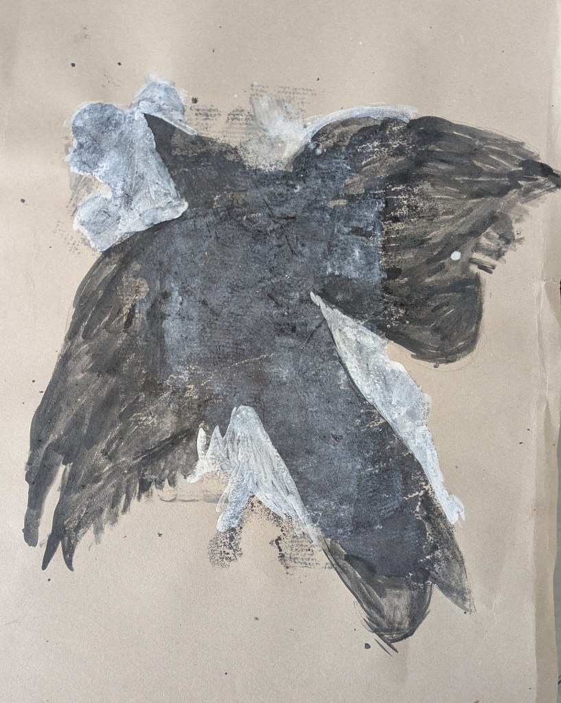
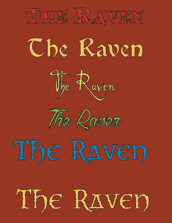
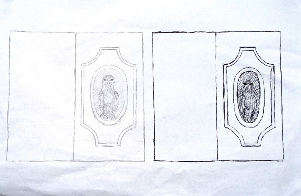
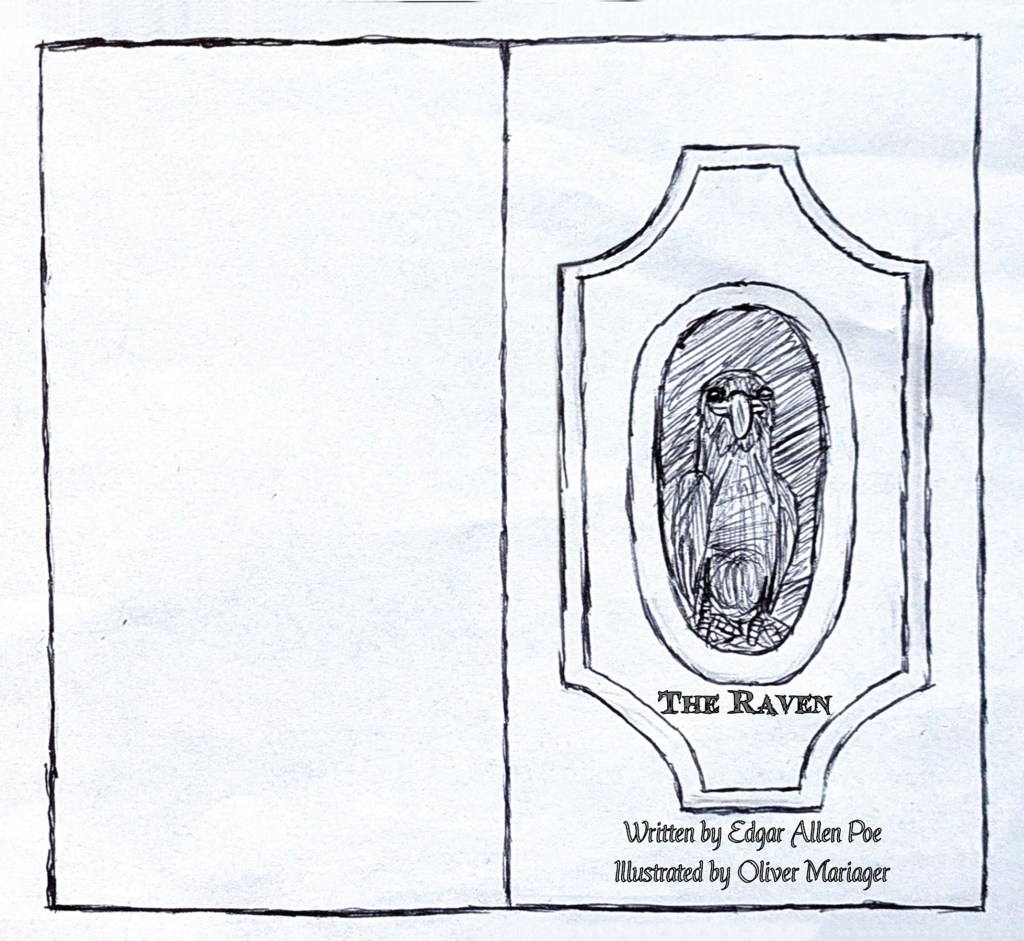
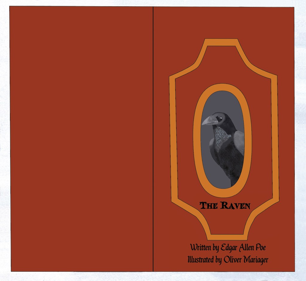
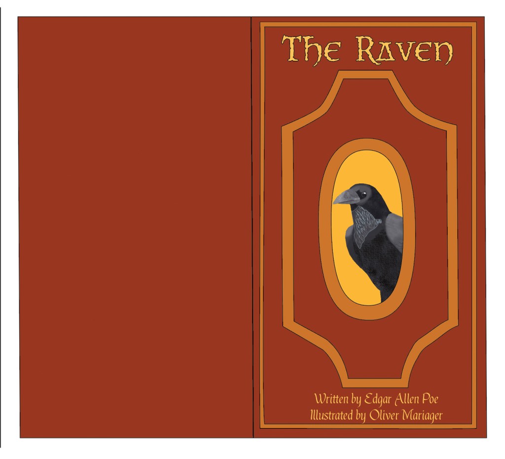
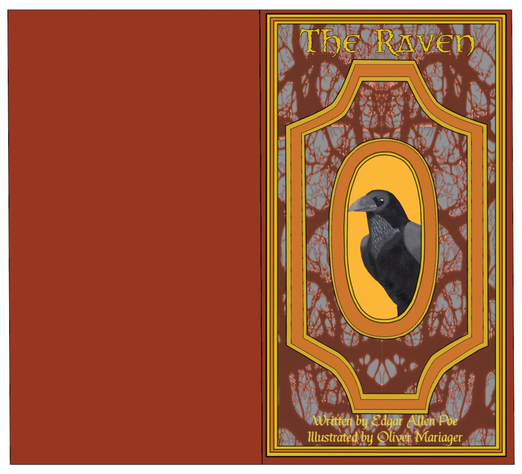
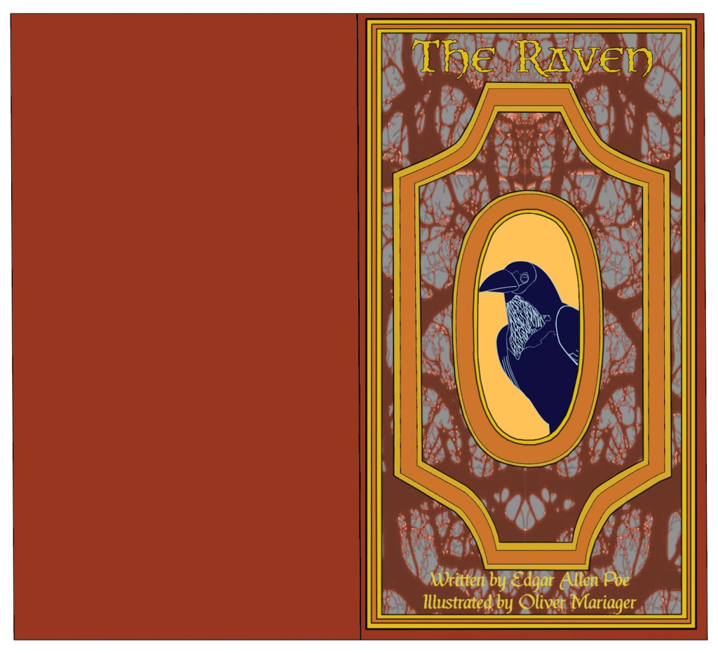
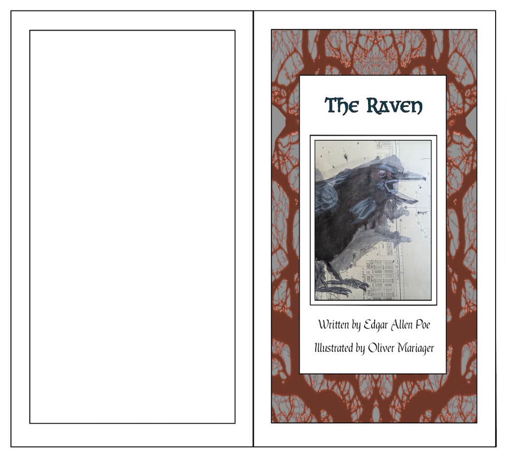
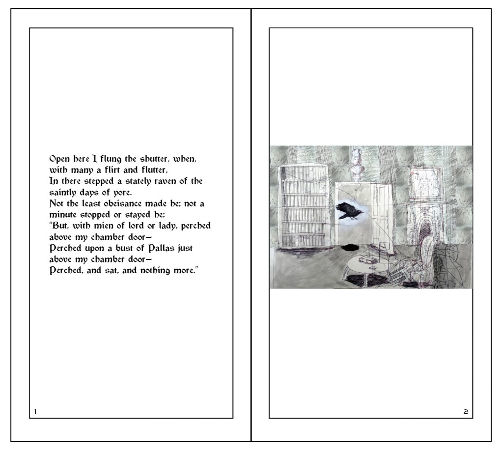
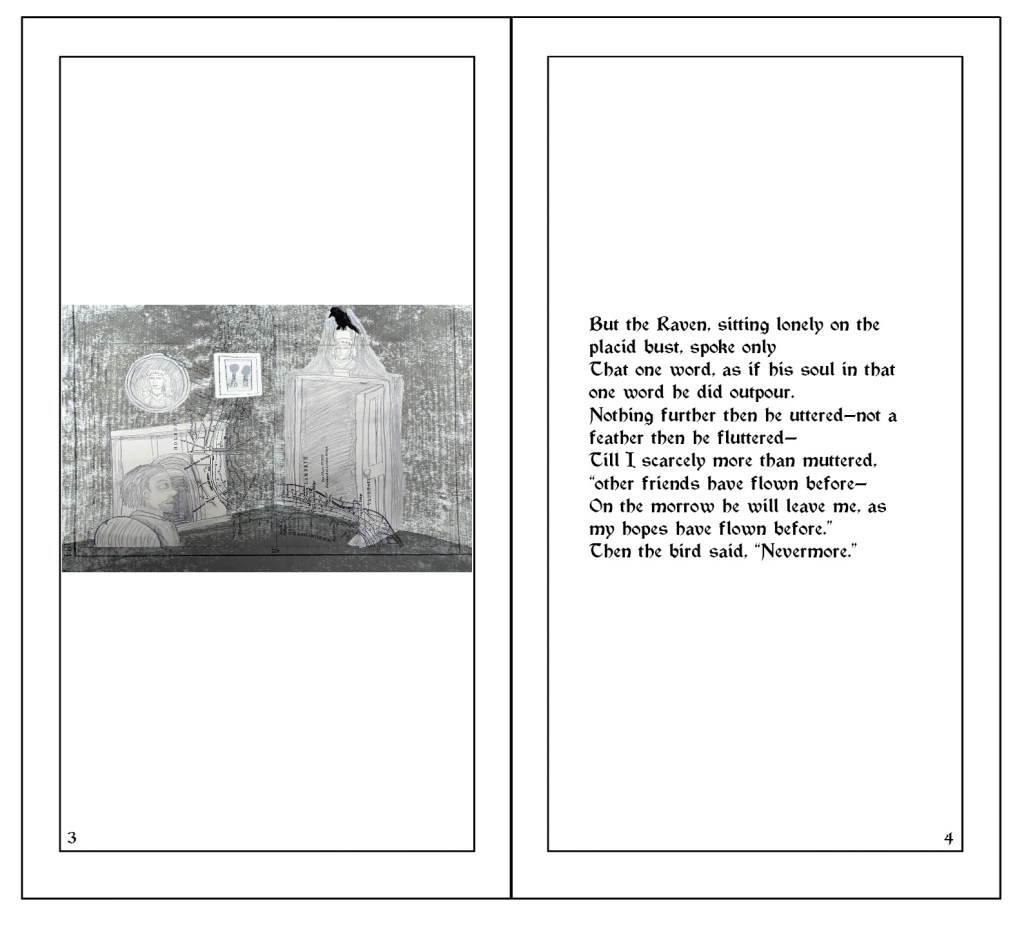
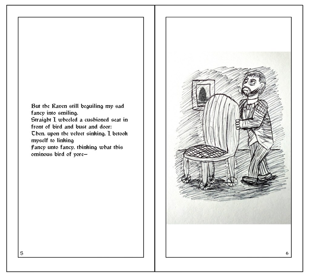
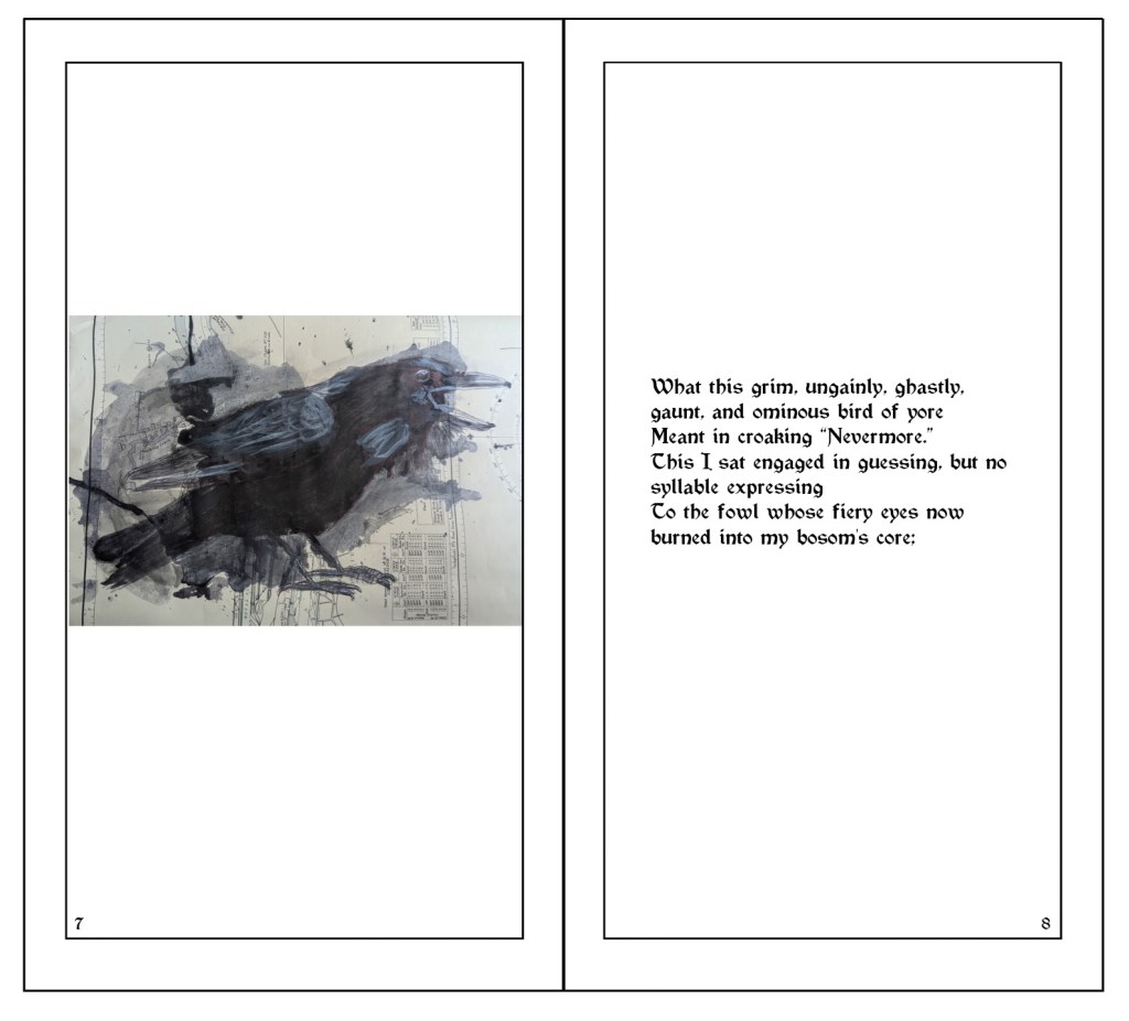
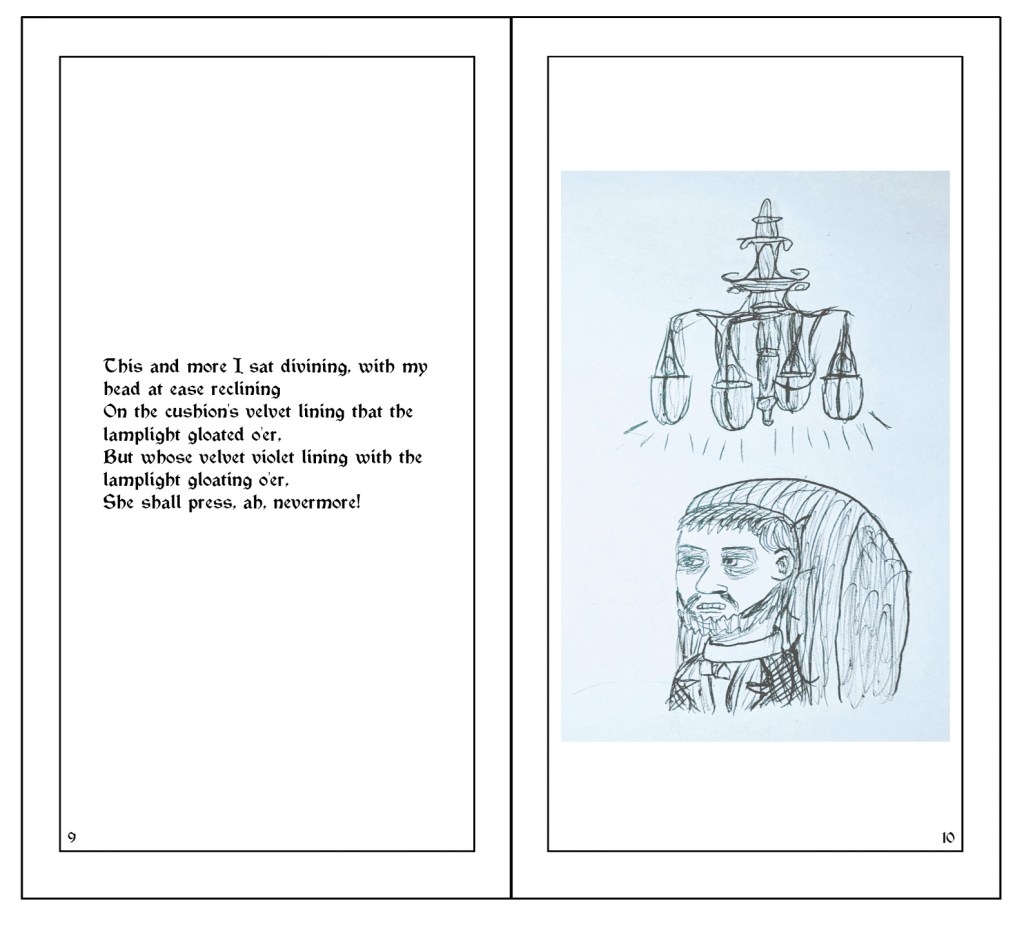
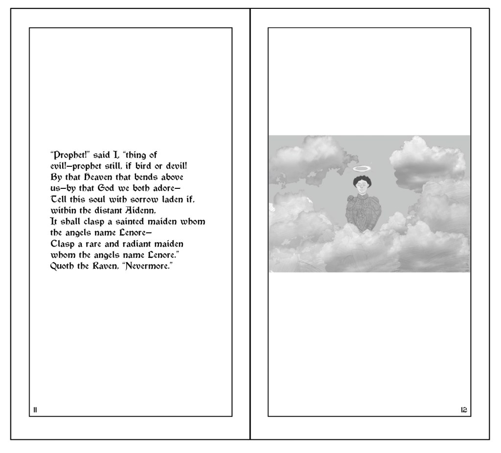
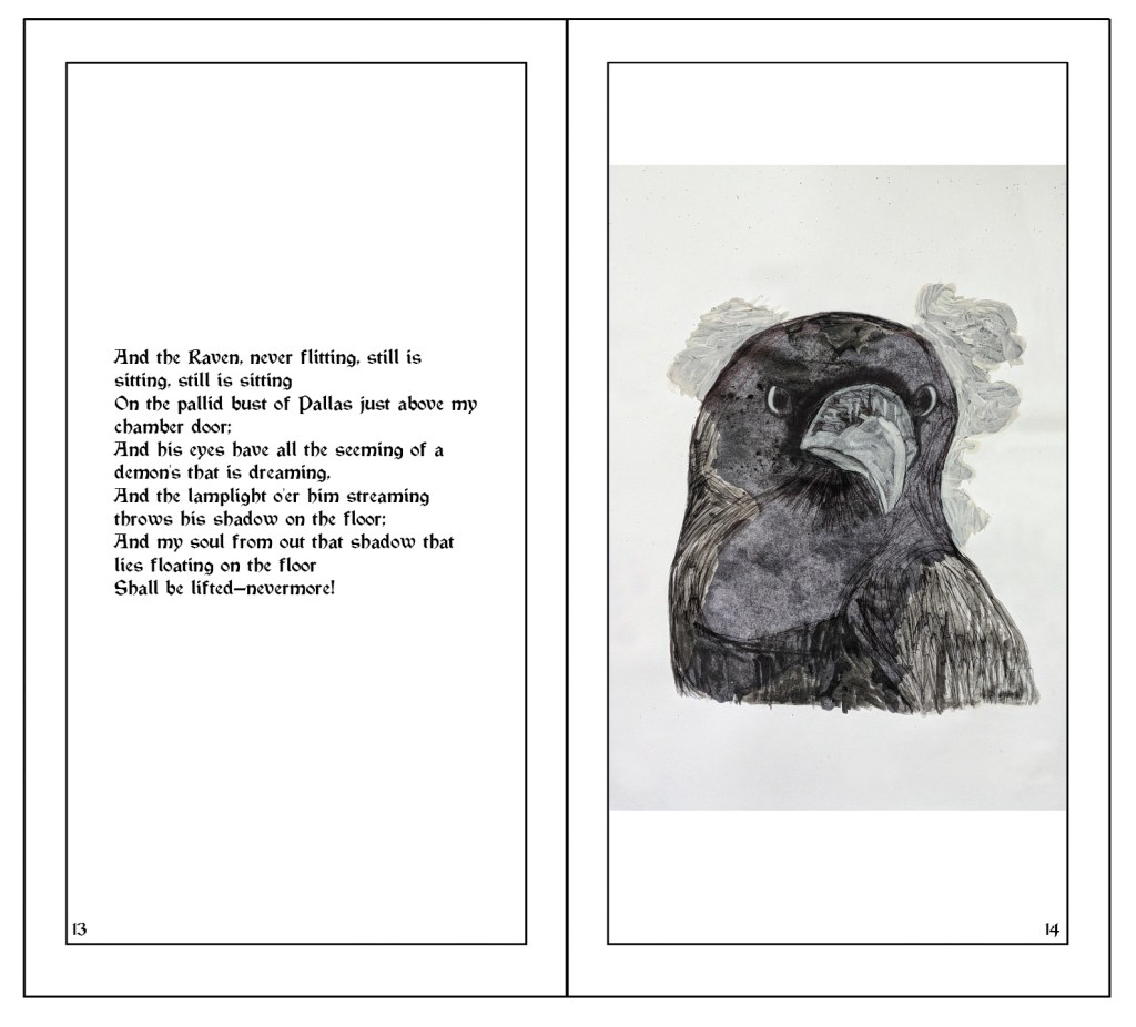
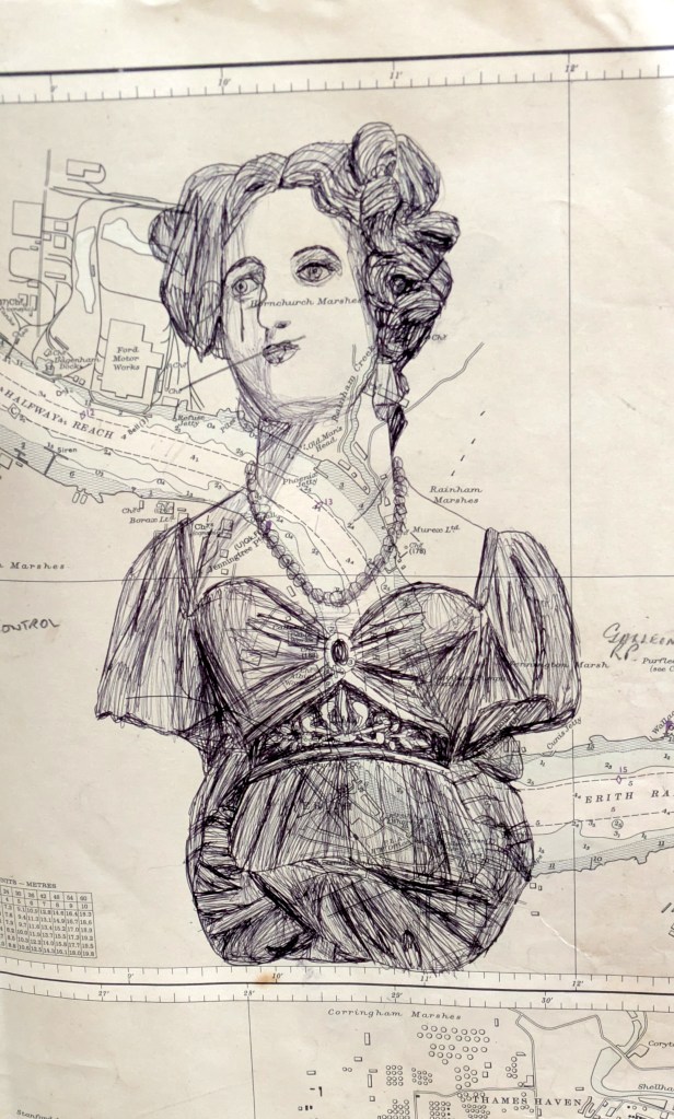
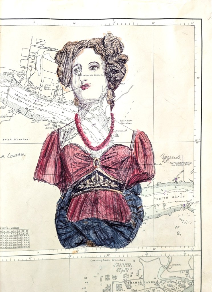
Then there was my Illustrations for Poems project. I researched Ellie Lee,[268][269] William Kentridge,[270][271][272][273] Jim Woodring,[274][275][276] Lynda Barry,[277][278][279][280][281][282] Paul Glabicki[283][284] and Satyajit Ray.[285][286][287][288][289][290][291][292][293][294] Using materials like gouache, Victorian maps, ink, squirters, sponges, fineliners, pencils, paper cutouts, et cetera, I produced different concept art and illustrations for Edgar Allen Poe’s The Raven.[295] I experimented and played around with different elements to make them stand out and/or tie into the poem’s Gothic horror theme. For example, I painted the titular raven with black ink and added shading, lighting and details using layers of black ink and some white ink, changed the levels of the floor and walls in Photoshop, and added frottage textures and lowered their opacity to make the map visible. I also researched Victorian book cover designs and typefaces and created early and finalised book covers and pages in Photoshop and Adobe Illustrator, and linked my illustrations to sentences from the poem. I found creating the page layouts (with the illustration and text on different reflecting pages) difficult, so I had to make three drafts and choose the one that was the most accurate.
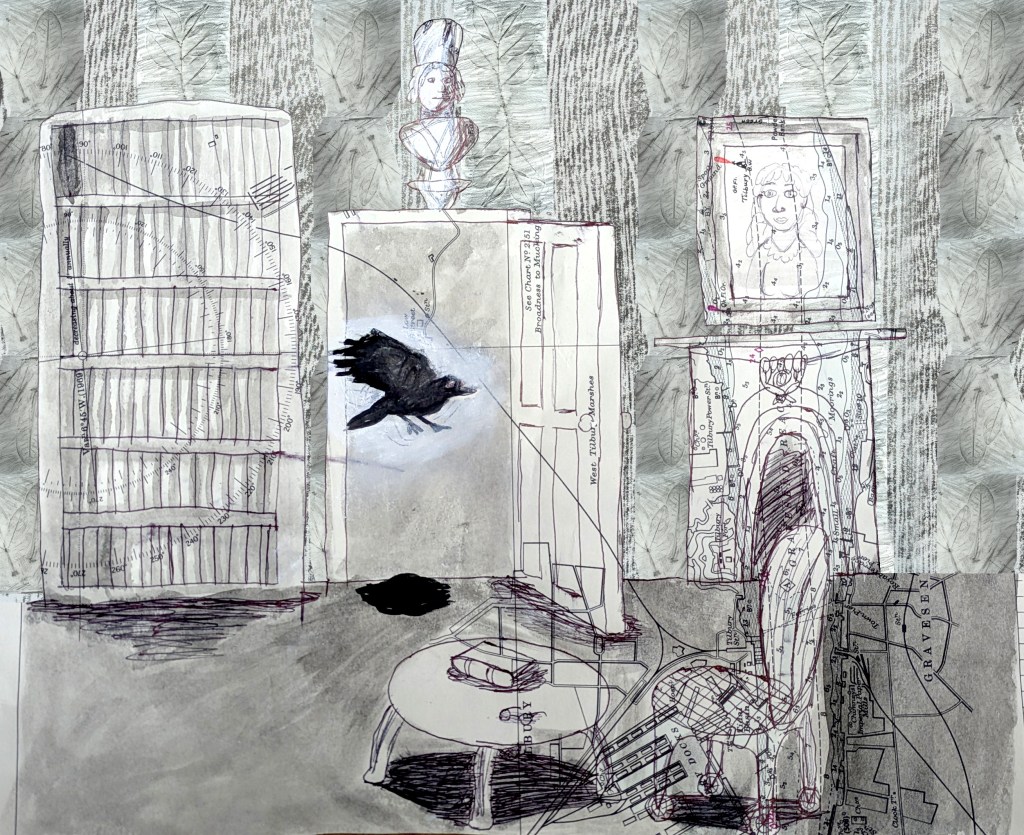
In there stepped a stately raven of the saintly days of yore.
Not the least obeisance made he; not a minute stopped or stayed he;
But, with mien of lord or lady, perched above my chamber door—
Perched upon a bust of Pallas just above my chamber door—
Perched, and sat, and nothing more.”
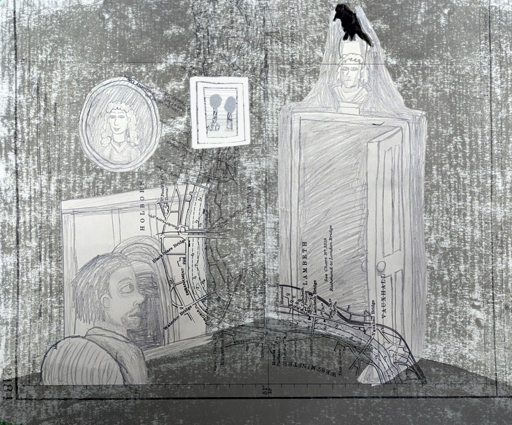
That one word, as if his soul in that one word he did outpour.
Nothing further then he uttered—not a feather then he fluttered—
Till I scarcely more than muttered, “other friends have flown before—
On the morrow he will leave me, as my hopes have flown before.”
Then the bird said, “Nevermore.””
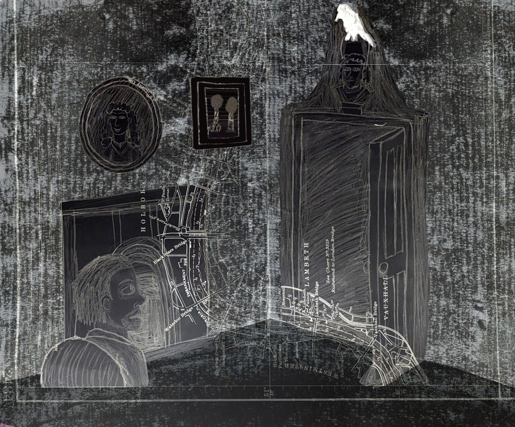
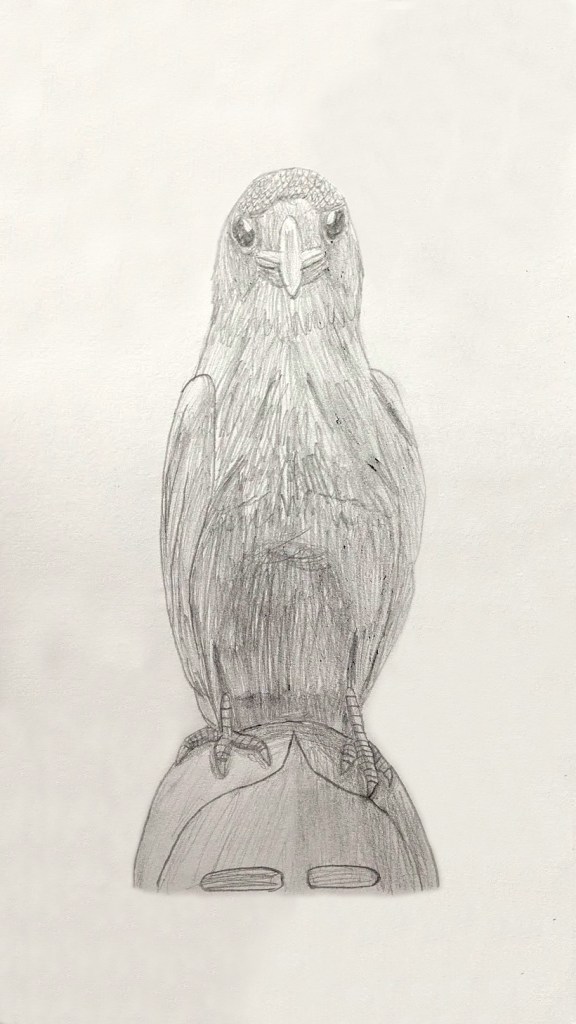
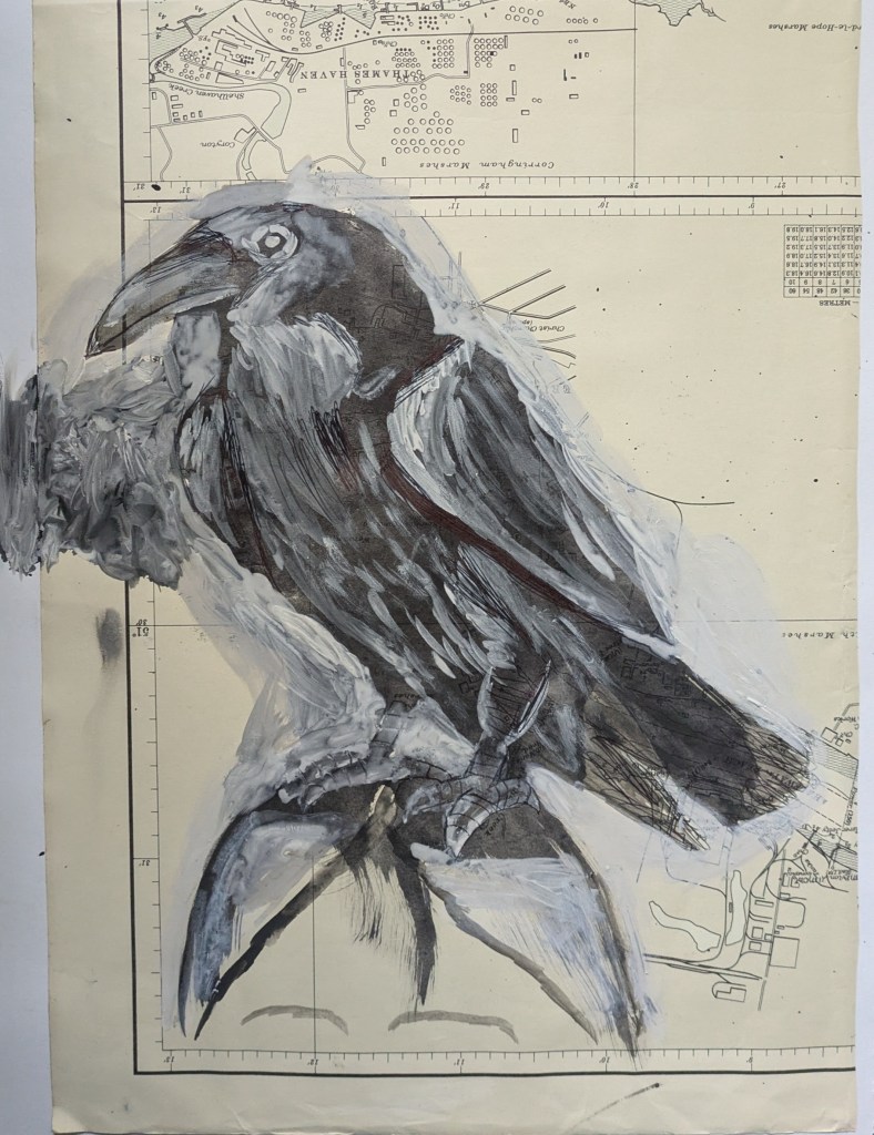
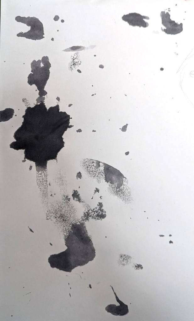
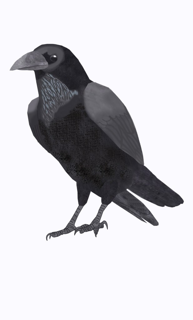
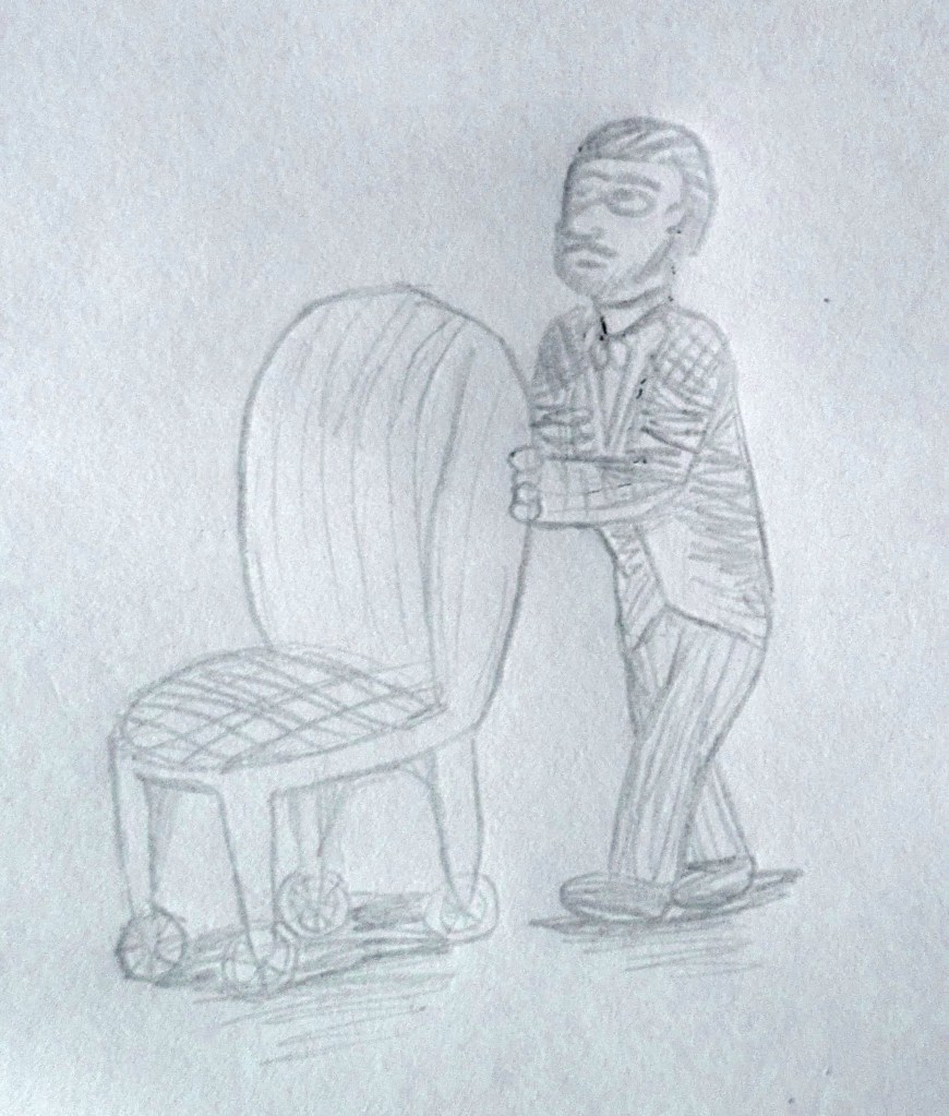
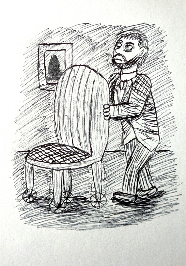
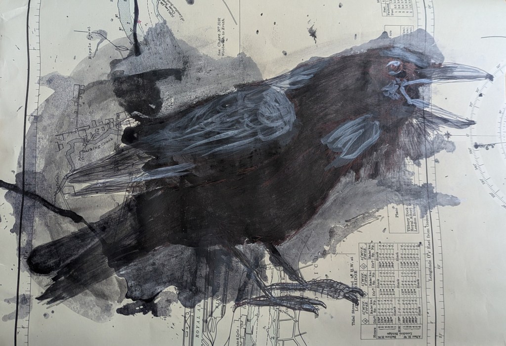
To the fowl whose fiery eyes now burned into my bosom’s core…”
(Made with ink, gouache paint and biro, inspired by William Kentridge and referenced from photograph by AlexSava.)
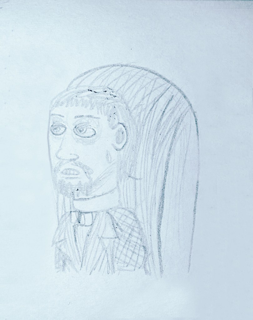
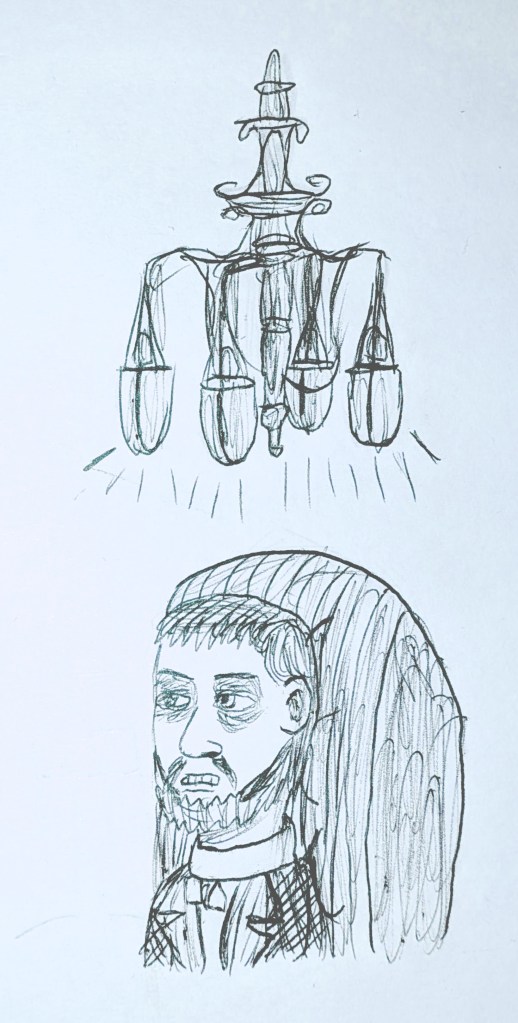
On the cushion’s velvet lining that the lamplight gloated o’er…”
(Ceiling lamp referenced from image by LASSCO.)
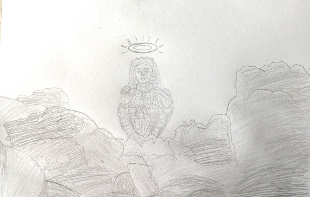
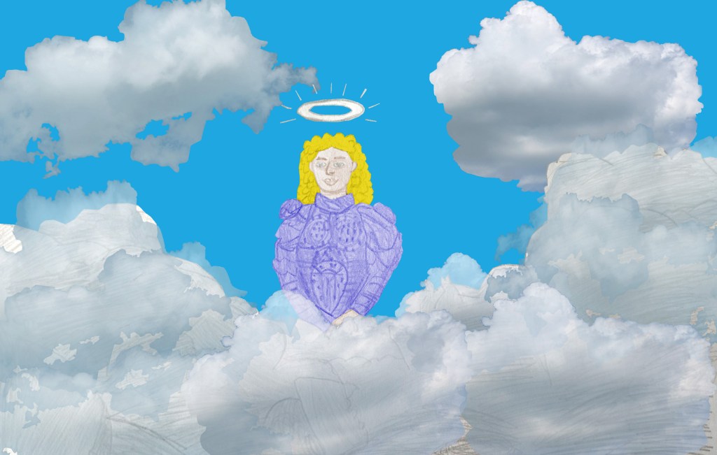
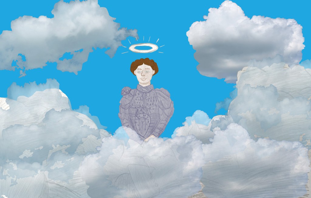
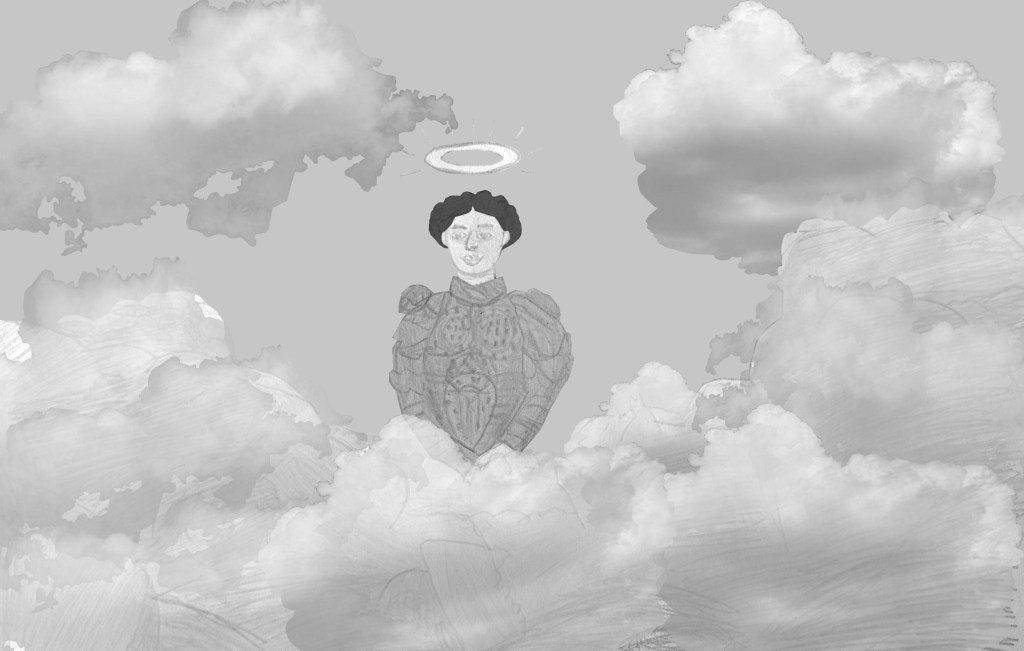
Clasp a rare and radiant maiden whom the angels name Lenore.”
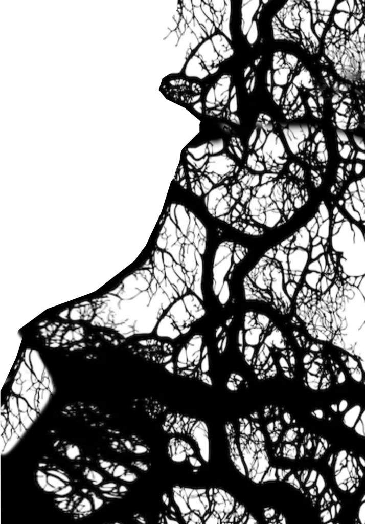
And the lamplight o’er him streaming throws his shadow on the floor…”
(Made with paint/ink, gouache and watercolour paint and biro, and referenced from photograph by The Urban Nature Enthusiast.)
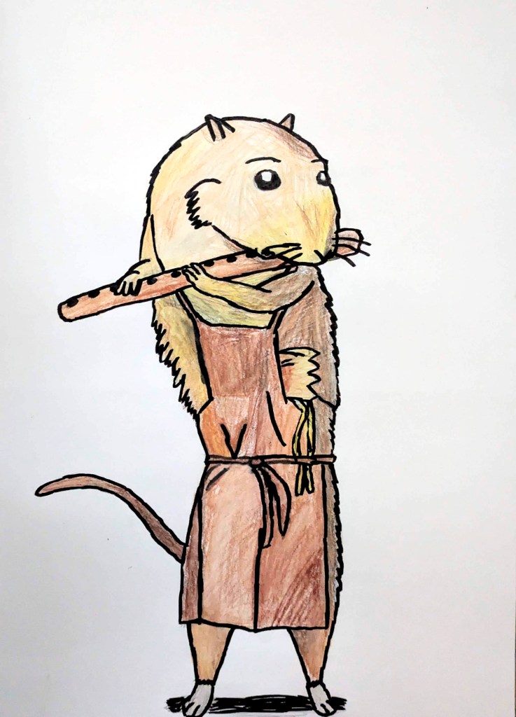
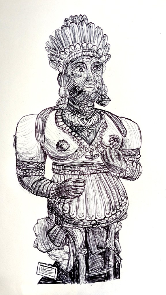
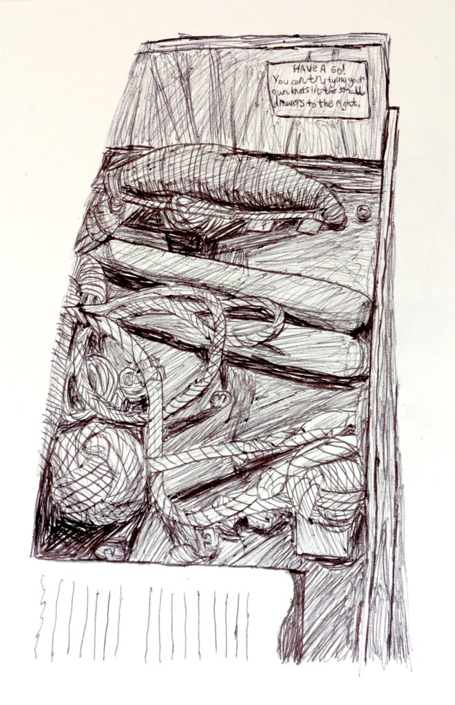
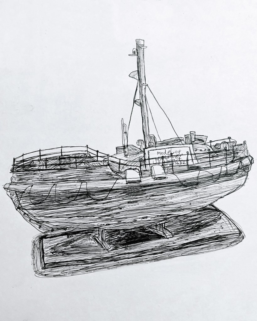
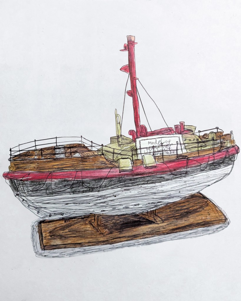
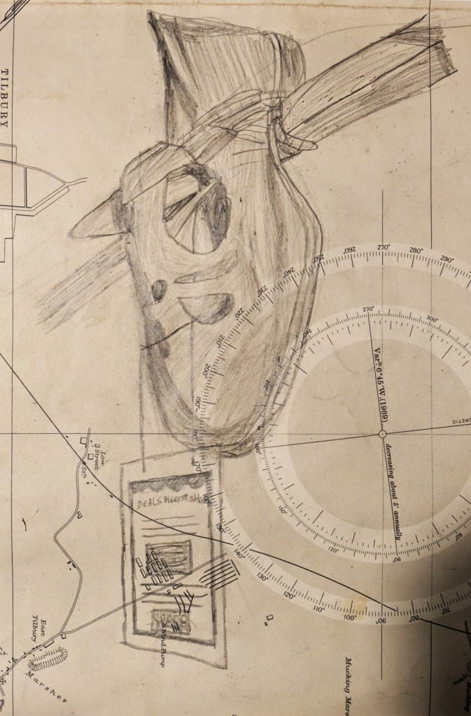
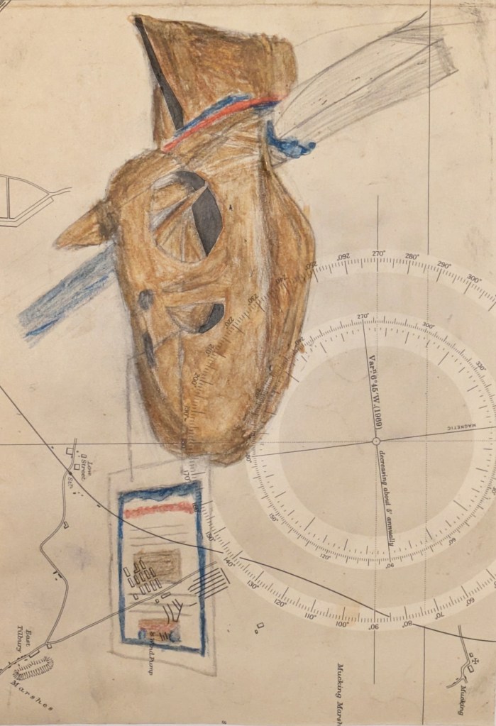
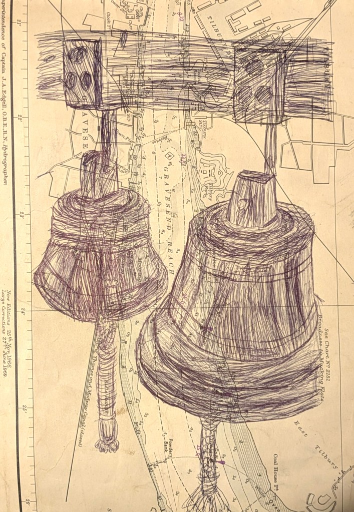
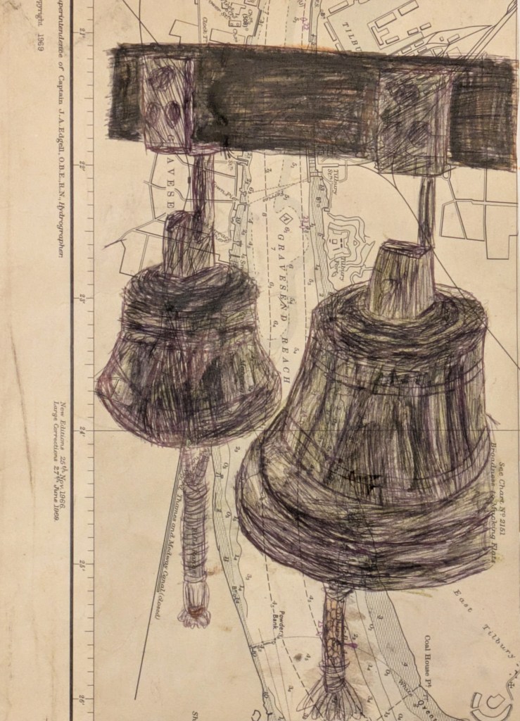
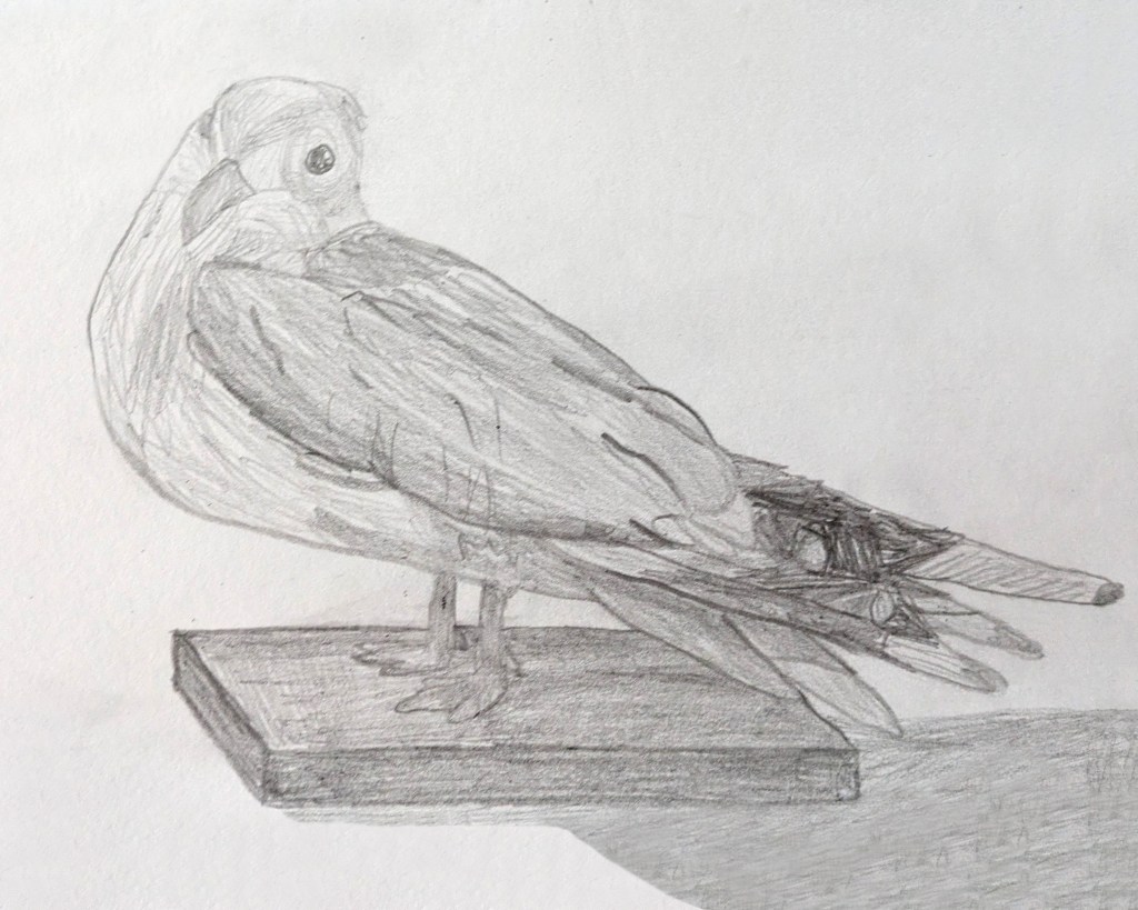
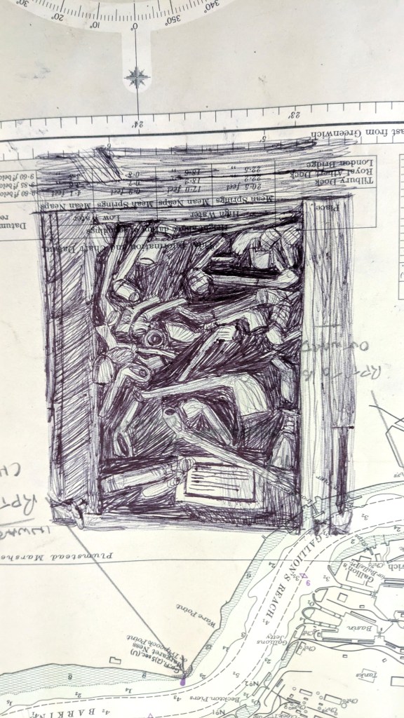
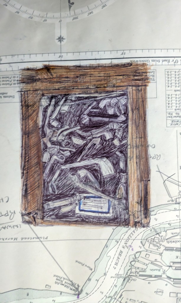
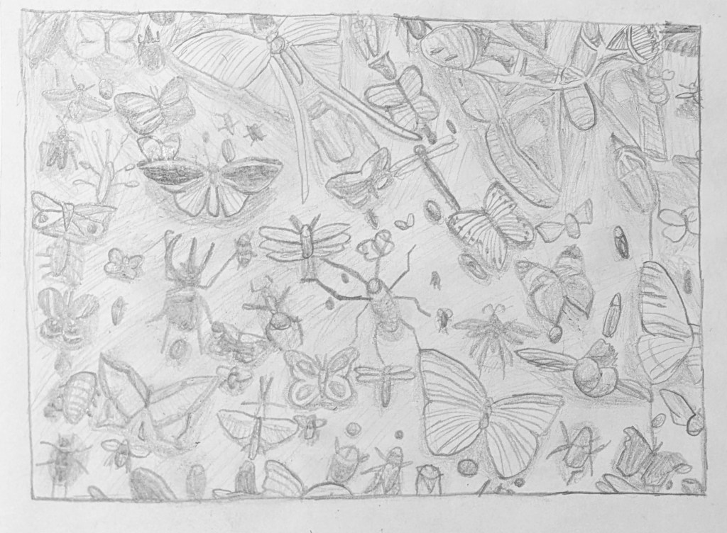
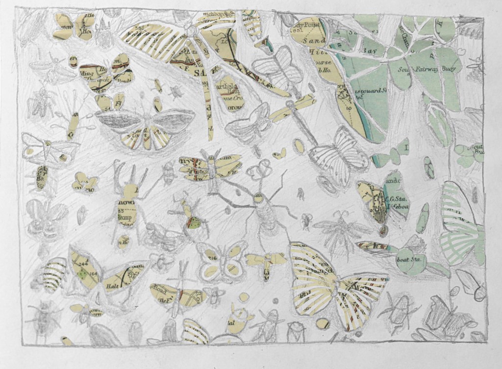
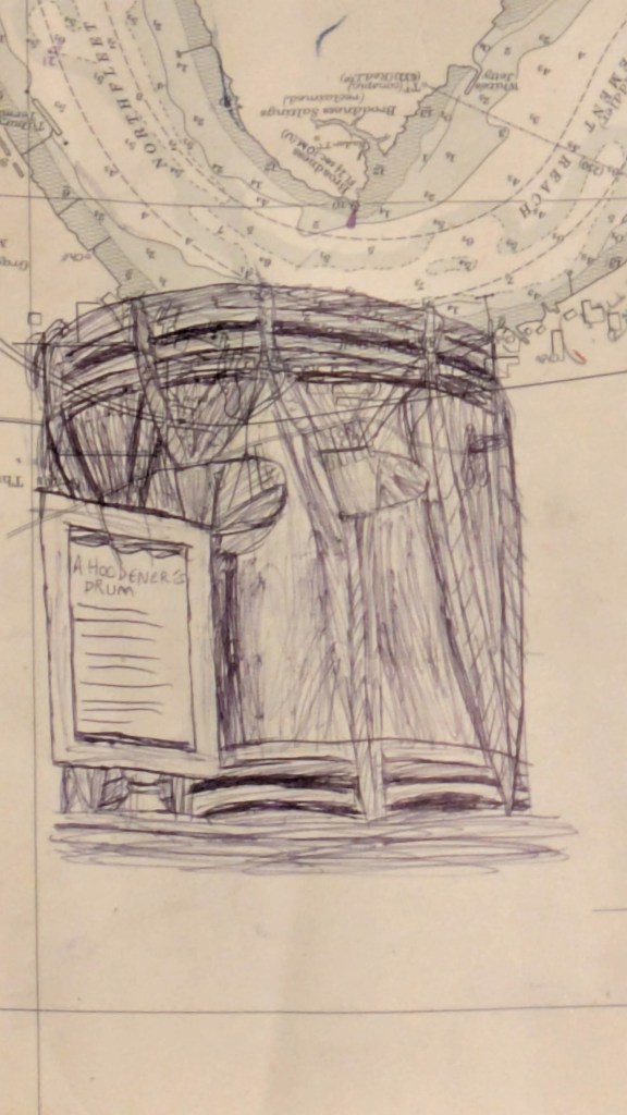
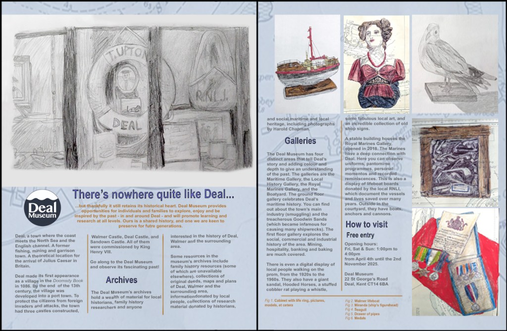
Finally I did my Collections project. I looked at a list of museums that I could visit, eventually choosing to visit the Deal Museum. I learned that the museum contained layers of historical resources, archives and collections. The items in the collections ranged from vintage models (for example, typewriters, compasses and boats), plans and maps of the Deal and Walmer areas, photographs, H.M. Royal Marine uniforms, and timeline boards describing events in the town’s history (for example, pirates and smugglers). I visited the museum in September, and took photographs of most of the objects. The only object that I both photographed and drew was the stuffed taxidermy cobbler rat, Ratty. I used a uni PIN 01 Fine Line drawing pen and Mogyann Brush/Fine pen to draw the rat in real time in 20 minutes, then coloured him in with Stabilo Aquatico watercolour pencils. This process allowed me to capture the texture of the fur. Two months later, I learned about the cabinet of curiosities and what inspired its creation.[296][297][298][299] I researched collections at art galleries and museums, including the Deal Museum, the Victoria and Albert Museum,[300][301][302][303][304][305] the British Museum,[306][307][308] the Pitt Rivers Museum,[309] The Museum of Palazzo Poggi,[310] the Oxford University Museum of Natural History,[311] and the Ashmolean Museum.[312] Following this, I was introduced to Joseph Cornell’s boxed assemblages[313][314] and Domineco Remps’ Trompe-l’œil paintings.[315][316] I enjoyed looking at Cornell’s work, and his utilisation of collage and maps in the box interiors inspired me to use maps in my backgrounds, because I felt that they added colour, texture and a sense of place. This fitted well with the museum. Remps’ paintings drew my attention with their realism, and I wanted to try to capture this in my own sketches.
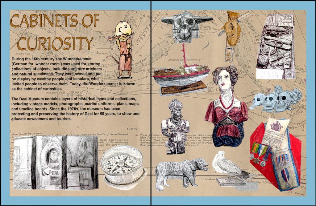
In November, I visited the Deal Museum again to take some more photographs from an observational perspective, basing most of my sketches on these primary sources. They were drawn in pencil, biro, fineliner pen, Zebra Z-Grip biro, BIC biro, and watercolour pencils on sketchbook pages and vintage maps of Deal. I also chose to use Ratty for my double-page spread. Then, I used printscreens from Finder and Photoshop to make contact sheets with green circles around the sketch photographs that I would use in my double-page spread. When it came to making the spread itself, I used magazine templates[317][318][319][320] as secondary references to properly construct four magazine layouts for Deal Museum, and inserted the sketches, removing the background from some of them in one layout. This was the part of doing the collections layouts that I enjoyed, more so than the poem book layouts. I could incorporate the techniques that I had learned into my final project.
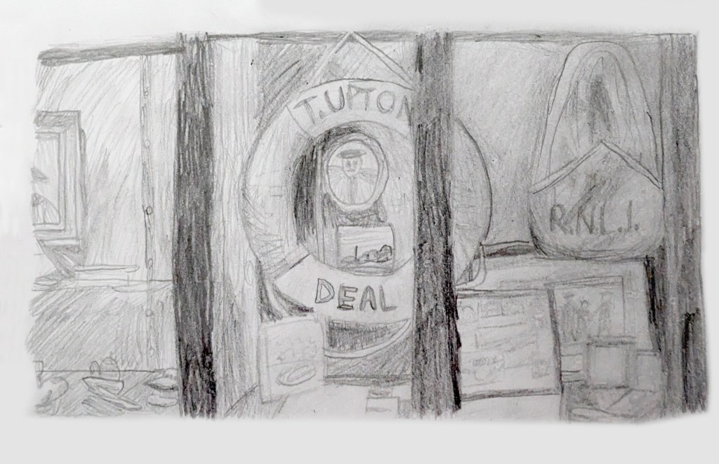
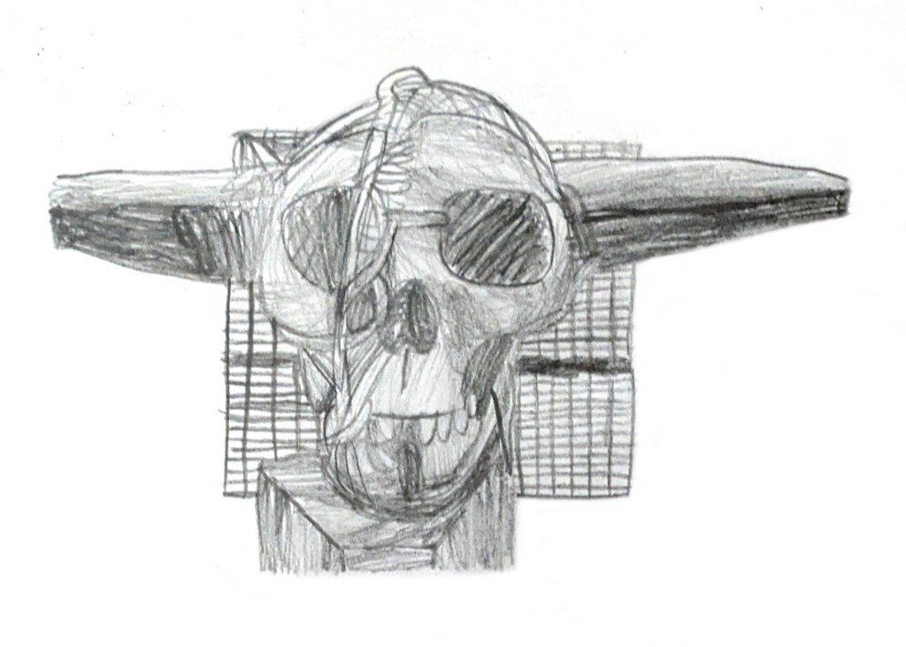
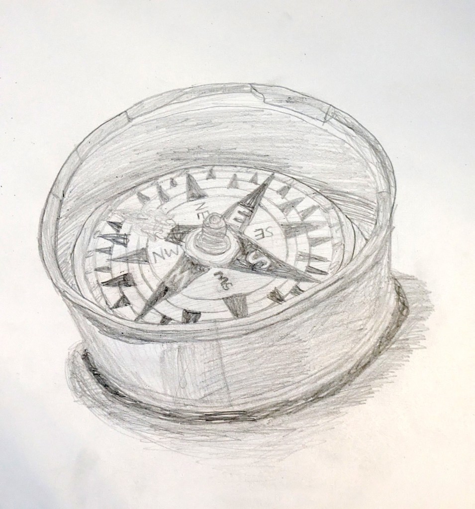
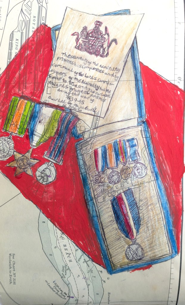
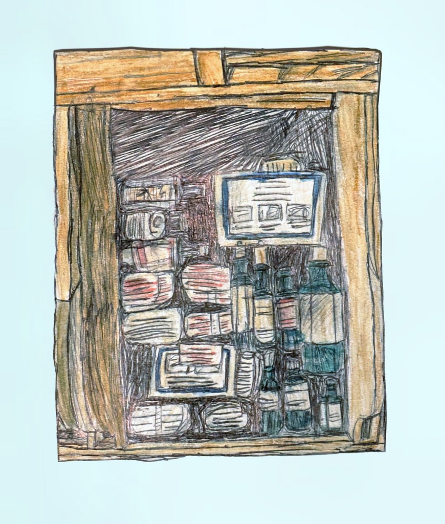
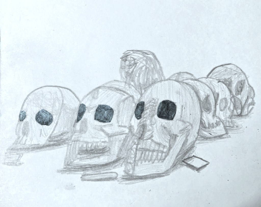
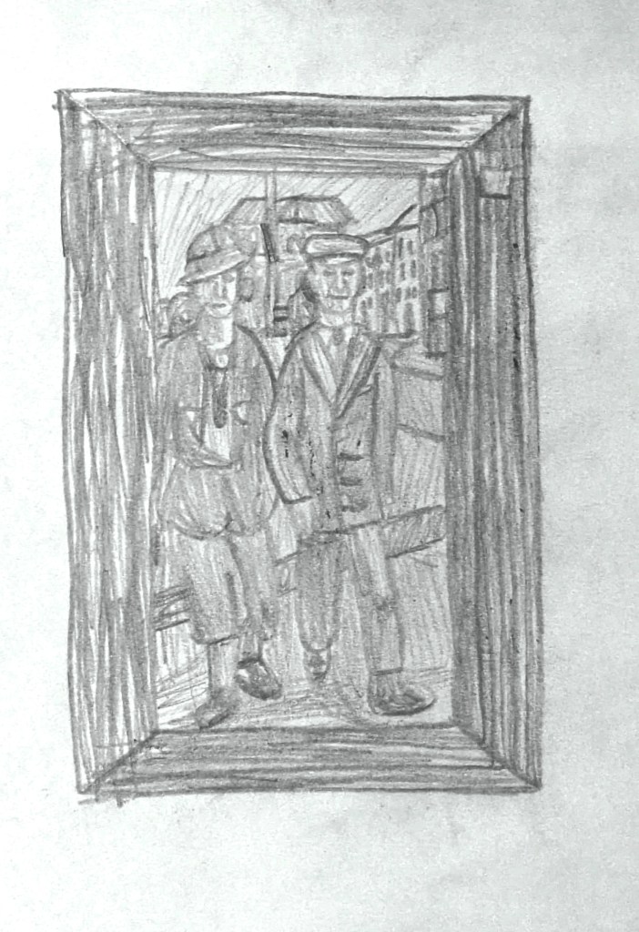
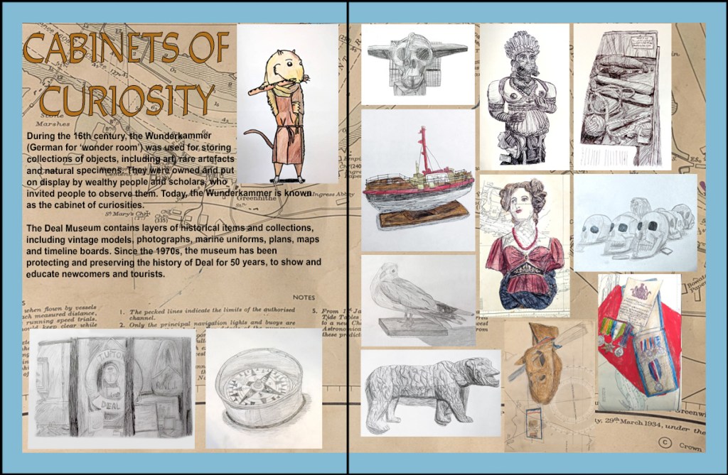
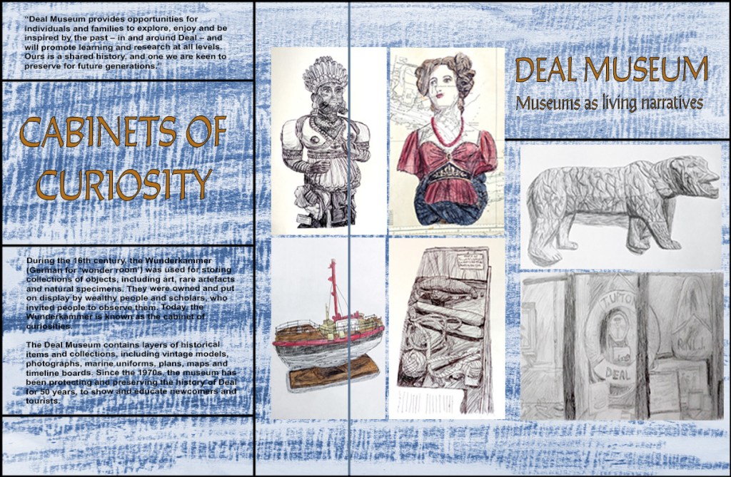
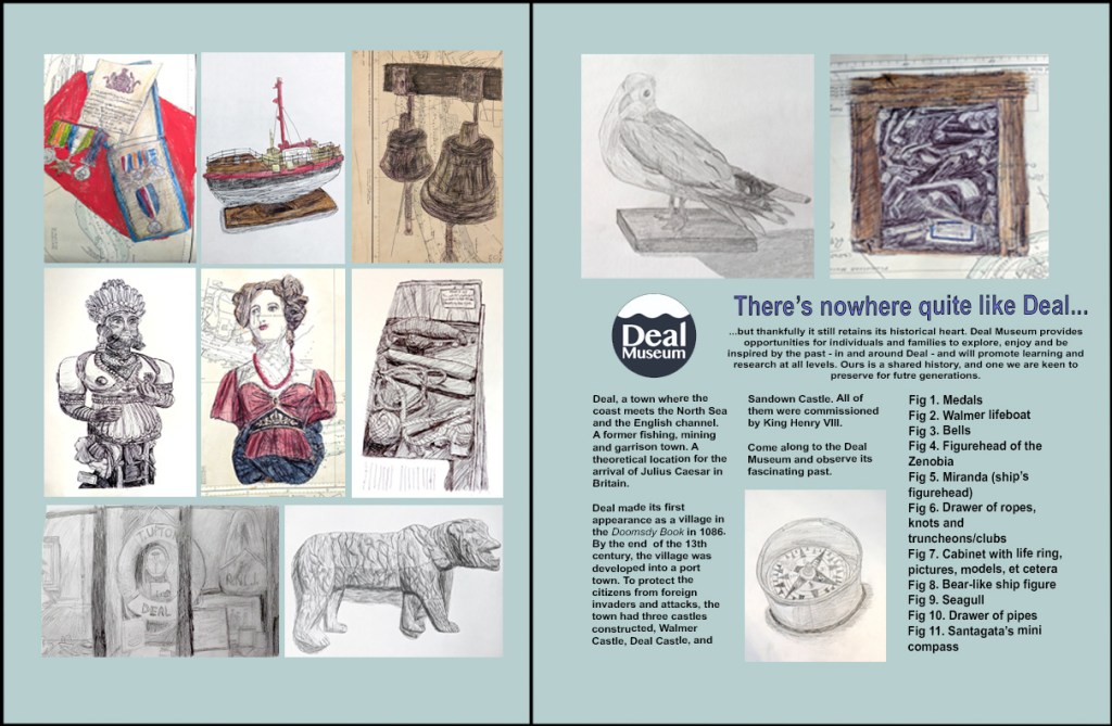
After I had explored four different layouts for the final double-page spread, I decided to develop the first idea further. I already liked the layout of the sketches and the use of a map, adding texture to the background, but I had problems making the sketches stand out. In order to make this work, I added a beige rectangle layer under the map and turned its opacity down 65%. This enabled me to reduce the contrast between the linear elements of the map and its background, helping it to recede in the composition. Next, I adjusted the contrast levels of each sketch, knowing that bigger contrast would help them stand out. Finally, I felt that the sketches would have a much greater impact if I varied the scale of some of them, in order to draw people’s attention to the bigger ones. Out of the four layouts, I liked this developed first one as it felt the least corporate-looking and the most creative, which I felt reflected the feeling of the Deal Museum.
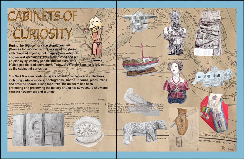
My strengths for this project include my improving digital computer art skills (working in Photoshop and Illustrator) and doing observational sketches in pencil. I explored a wide range of materials, techniques and surfaces. Thus, this helped to improve and expand my illustration skills and use of materials and techniques, and develop my observational drawing skills to a higher standard. This has led to more interesting outcomes within an illustration pathway. I learned about new drawing techniques like ink and stick and gouache, developing and matching an illustration style to match a brief, and book and magazine layouts.
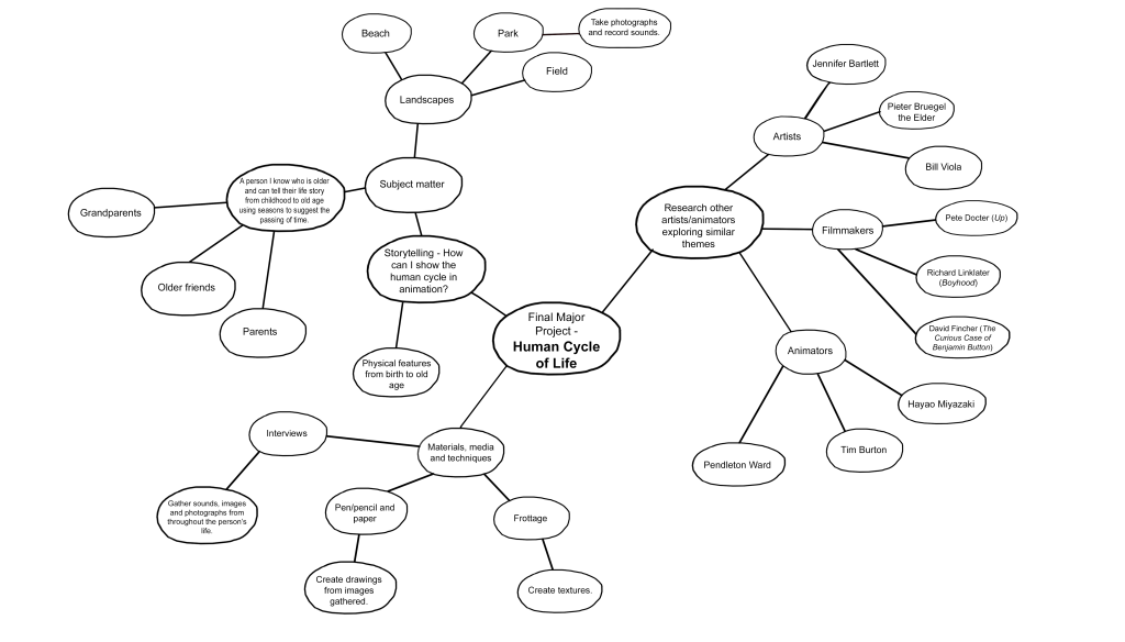
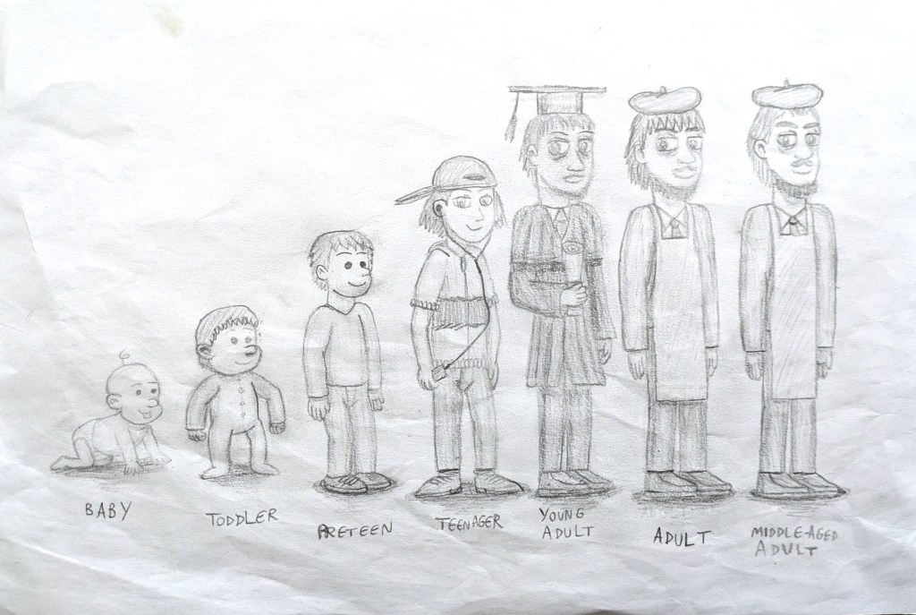
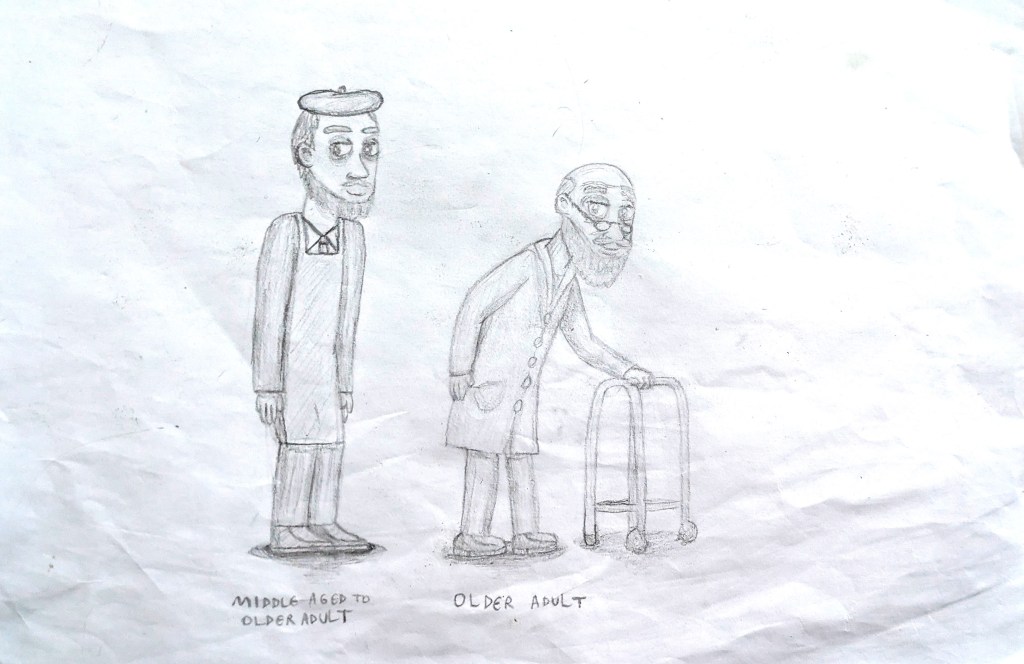
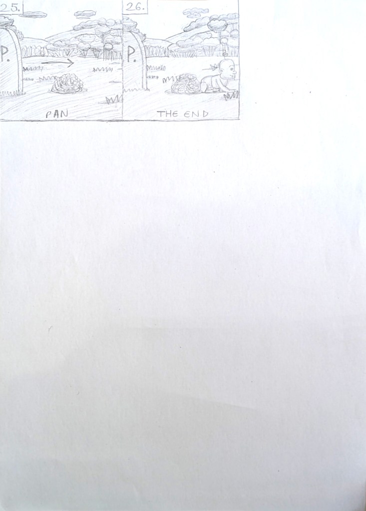
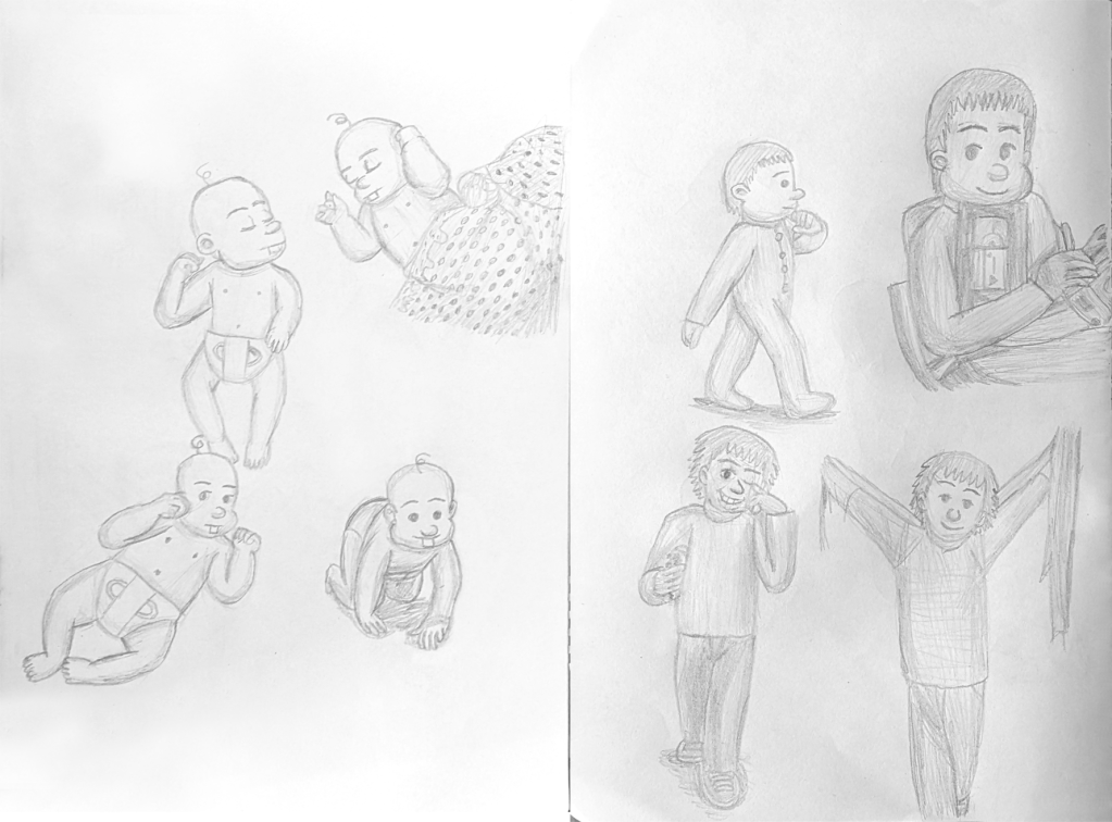
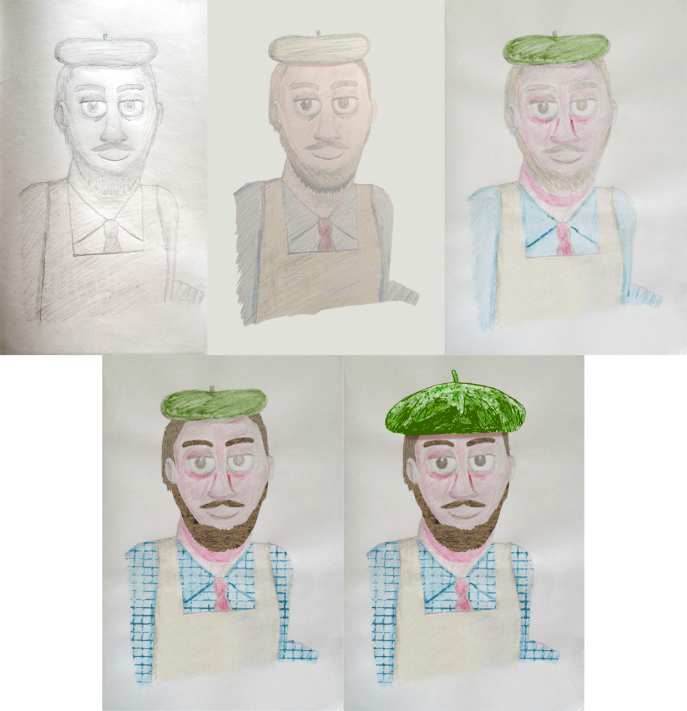
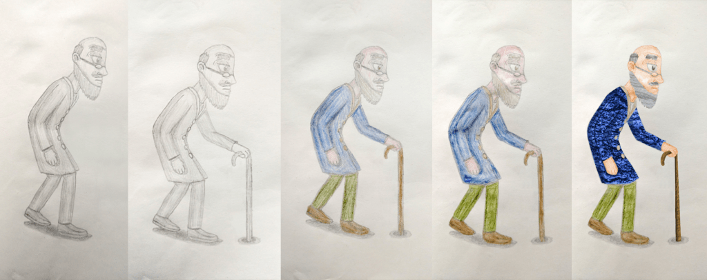
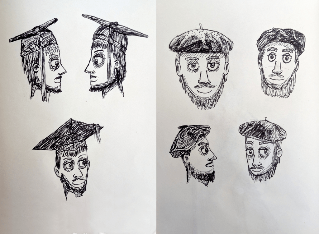
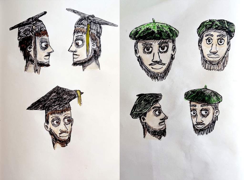
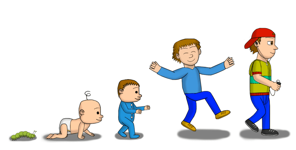
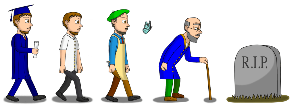
In December 2025, I chose to make an animated short film about the theme of aging and seasons for my Final Major Project. I called it Of Seasons and Skin, naming it in reference to John Steinbeck’s Of Mice and Men, which was referenced in cartoons, particularly Looney Tunes and Tex Avery. I researched other animators, artists and filmmakers who also tackled these themes, gathering information about their processes and methods. They included Pete Docter,[321][322] Richard Linklater,[323] Hayao Miyazaki,[324] F. Scott Fiztgerald and David Fincher,[325][326][327][328] Jennifer Bartlett,[329] and Bill Viola.[330] After analysing their work, I was inspired to develop a storyboard and character designs for a central character walking through the seasons as they age. I based the simplified facial features of the baby, toddler and preteen on Pendleton Ward, the design of the teenager on Hayao Miyazaki, and the young, mature and older adult designs on both Tim Burton and Miyazaki. I did a rough storyboard, researched age groups to understand their appearances and movements,[331][332][333][334][335][336][337][338][339][340][341] and did an interview with my older friends about their stages of life for inspiration on the character’s life events. This helped me identify the stages of life that I wanted to include. Even though I did not create the young adult’s design without the graduation hat and gown for the character design lineup, I included the design in the storyboard itself. Interestingly, on the day that I finished my initial storyboard (28 March 2026), the British weather in real life was changing constantly (from windy to cold to sunny to raining to hailing).[342][343][344][345] It felt like my project was coming to life in real time, even though I had not begun animating it yet.
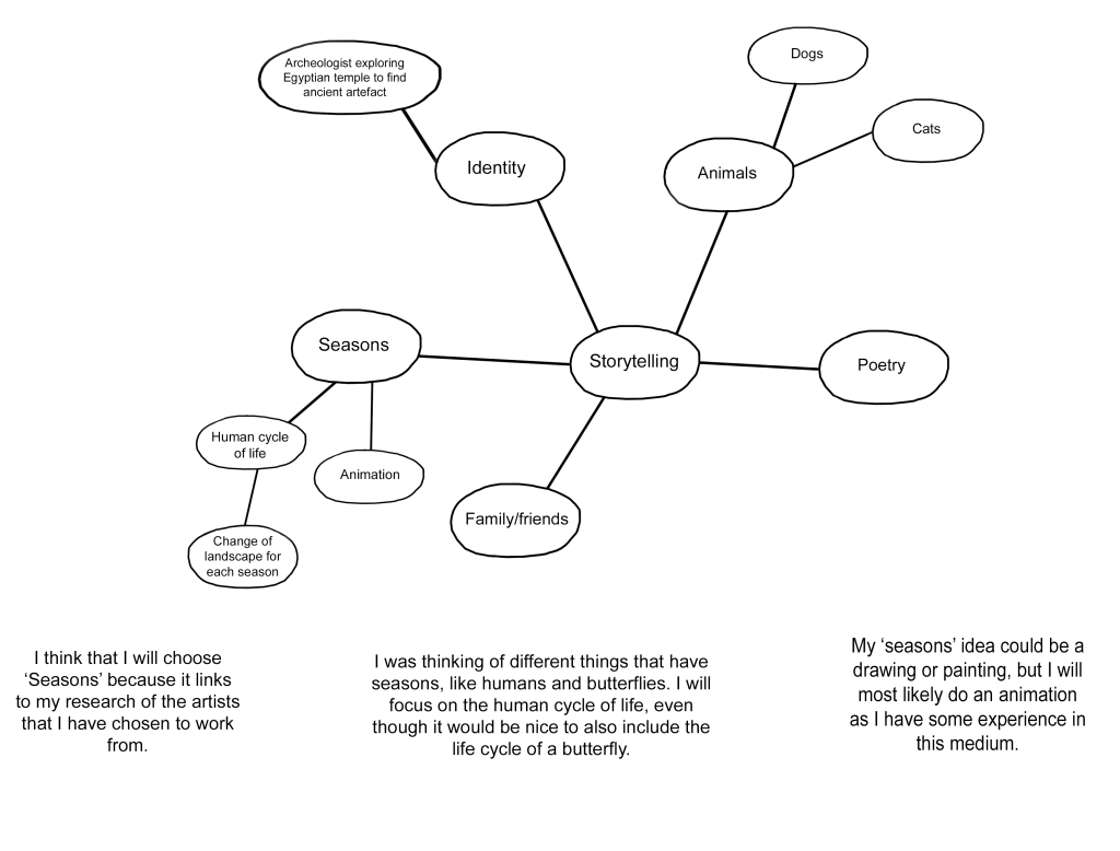
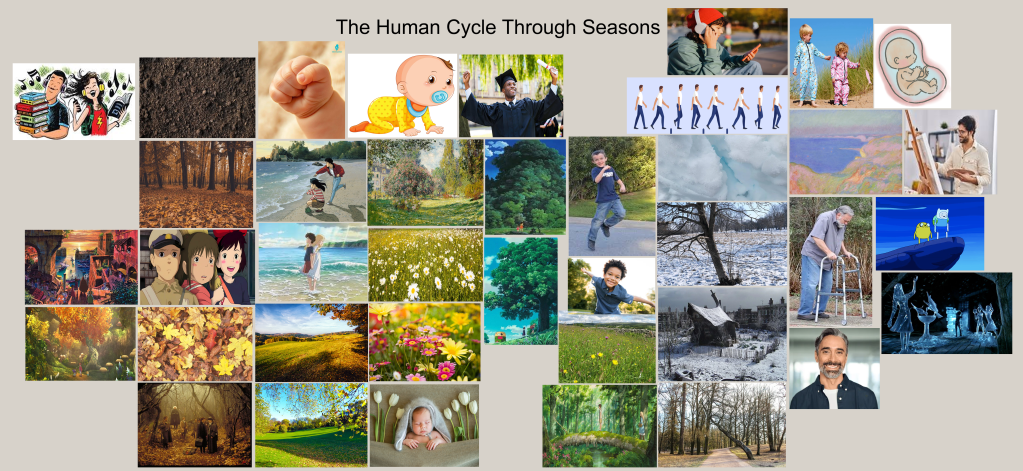
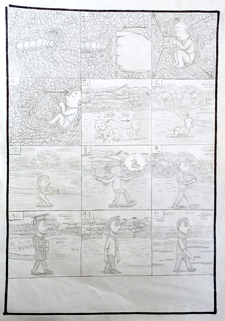
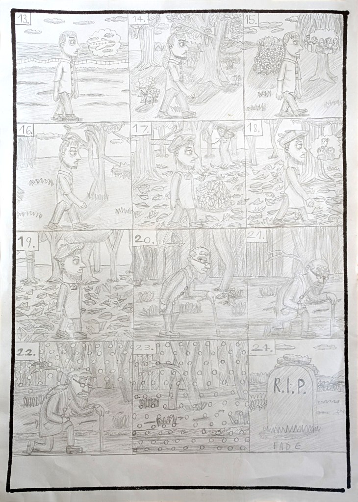
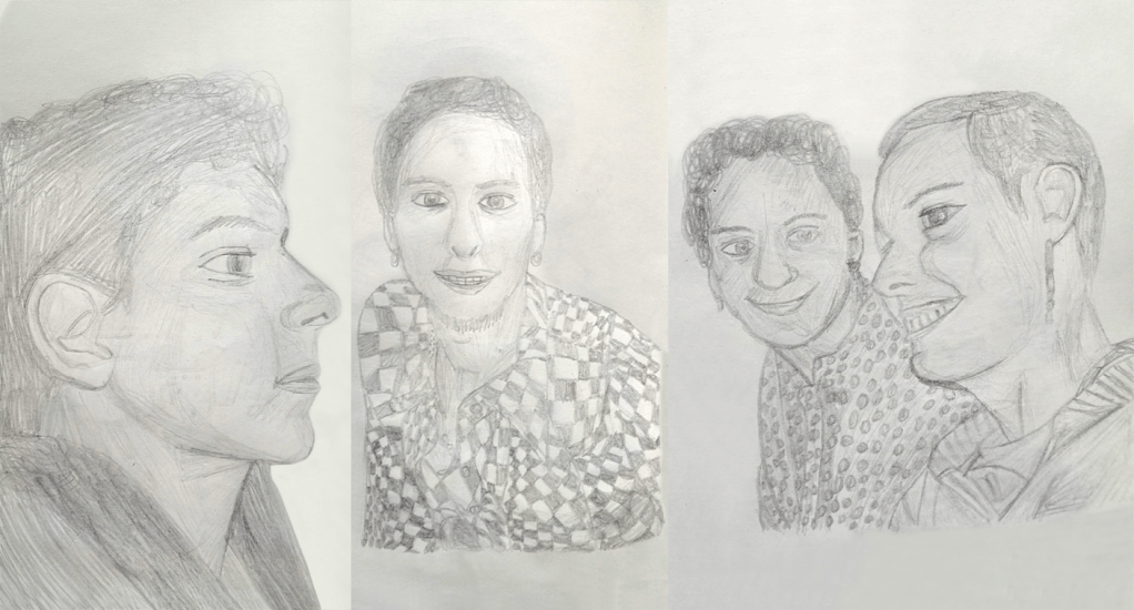
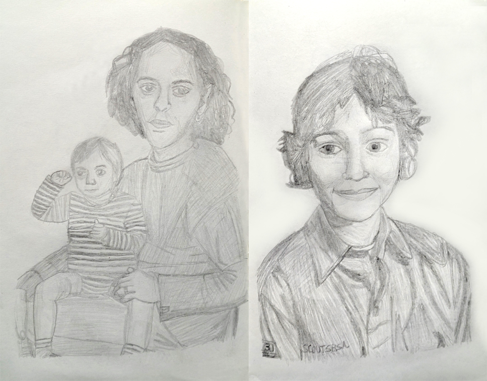
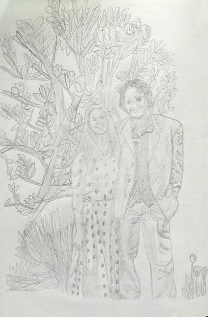
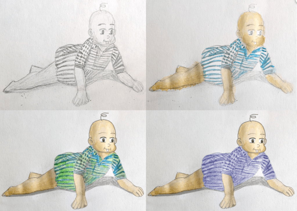
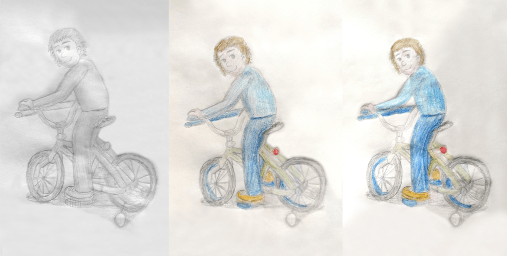
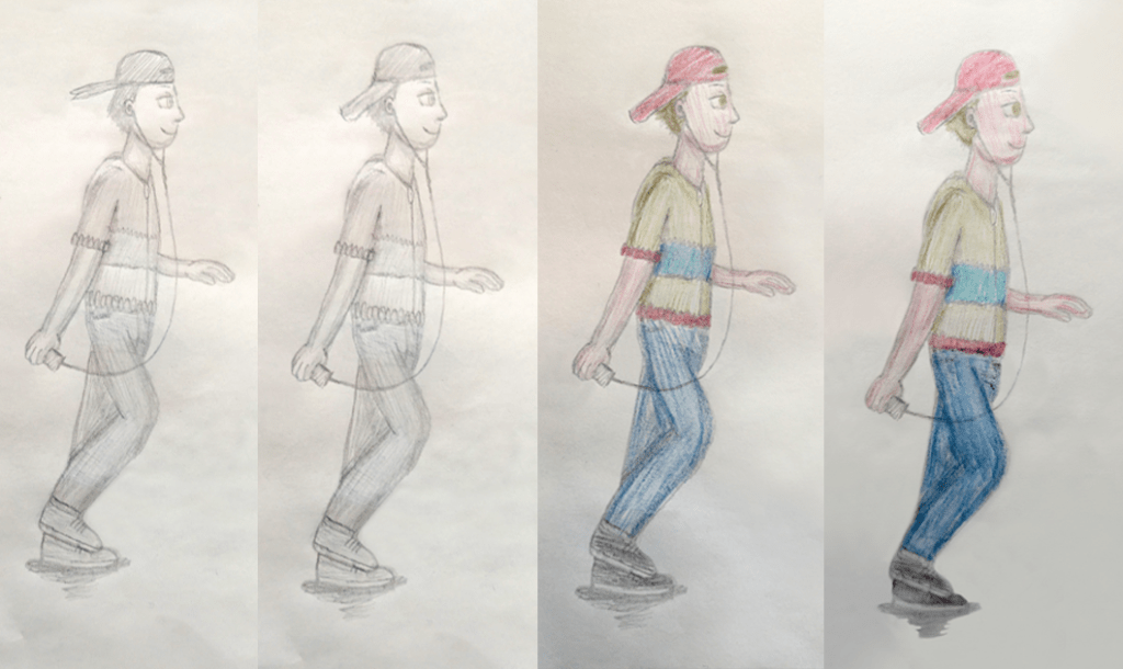
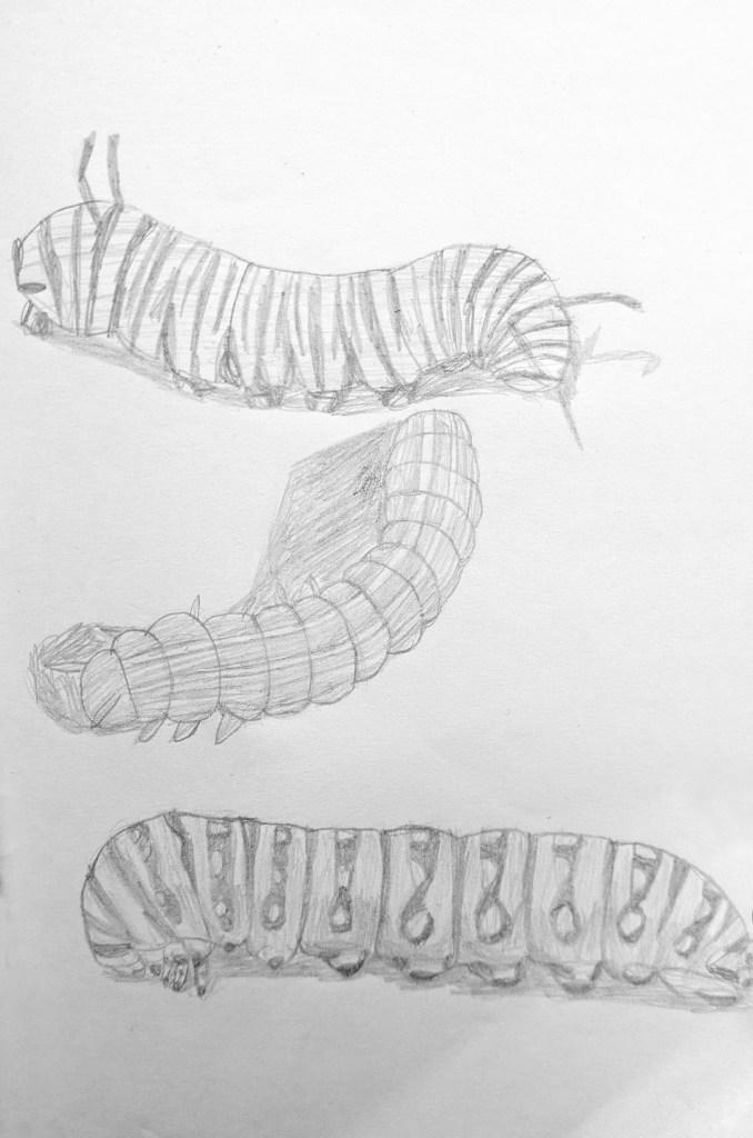
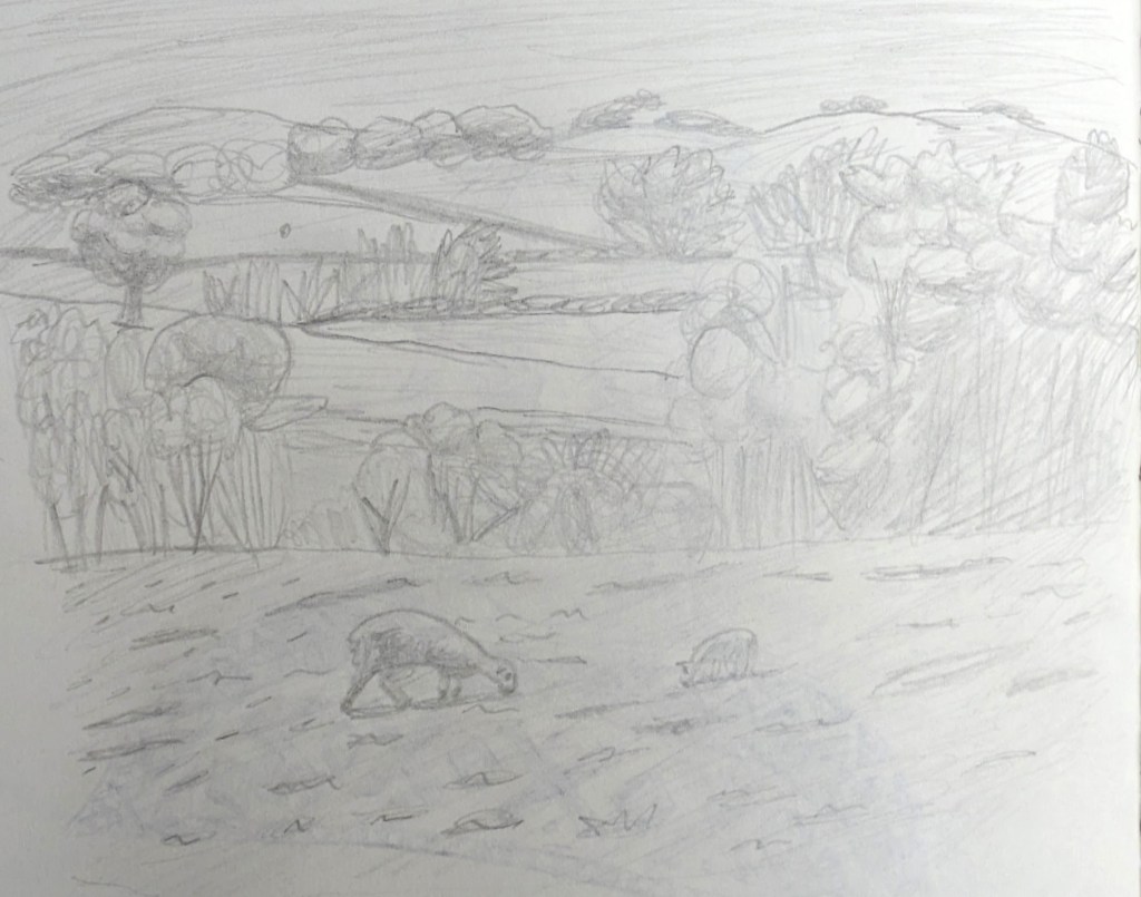
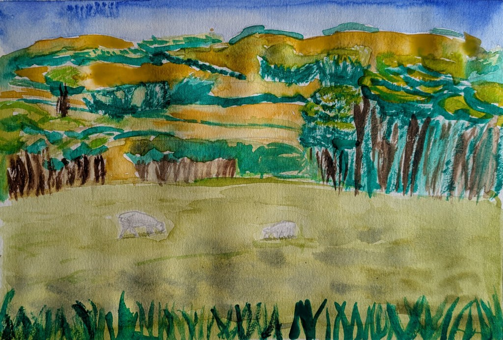
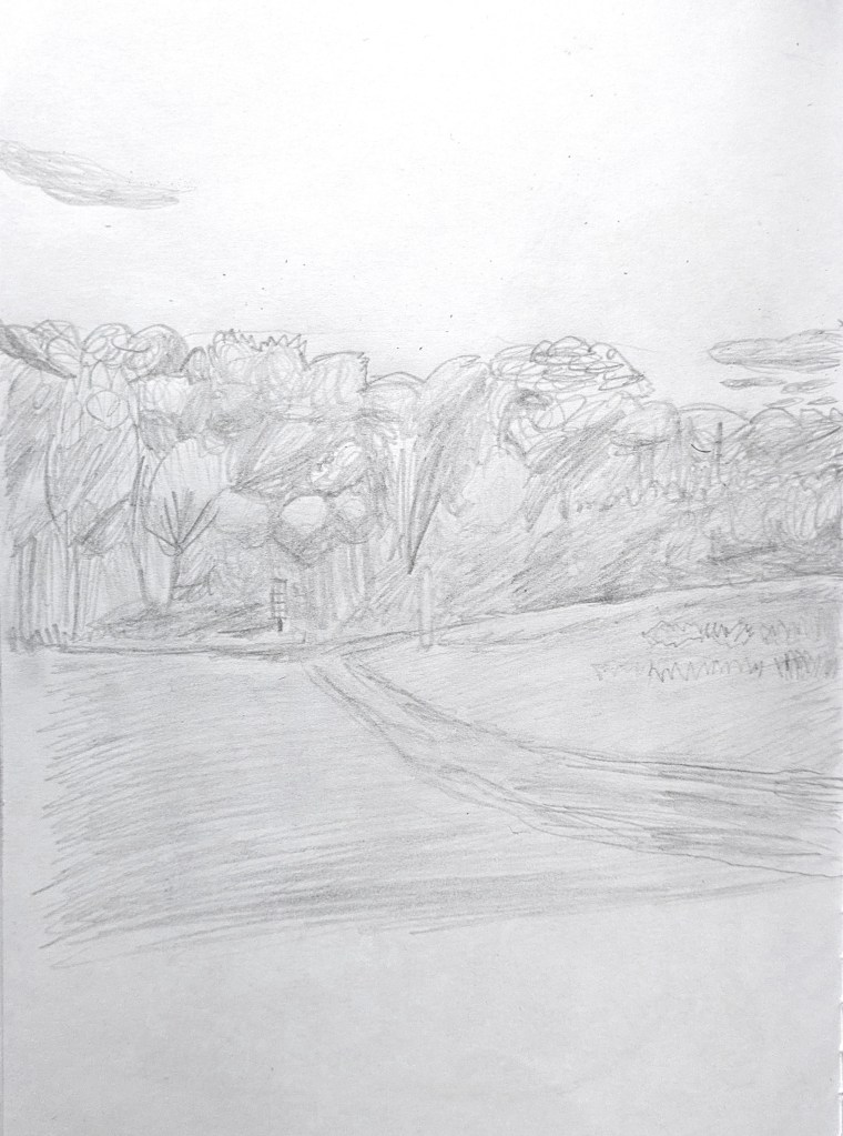
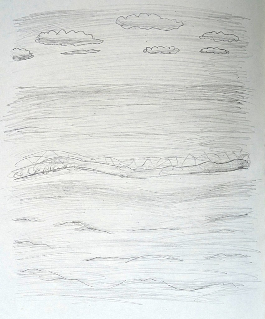
For the seasonal landscapes, I researched Pieter Bruegel the Elder,[346][347] Claude Monet,[348][349][350][351][352][353] Miyazaki,[354][355][356] Burton,[357][358][359] and Ward.[360][361][362] This gave me valuable insights on colour, texture and subject matter, which later helped to inform my own sketches developed from primary resource photographs, including ones taken during a walk at Betteshanger County Park. Although not mentioned in my Statement of Intent, I also researched another favourite artist of mine, David Hockney.[363][364][365][366] I drew inspiration from his landscapes and decided to use frottage textures. Adding the textures into the landscapes completely transformed the look of the scenes, giving them greater visual depth. In iPad drawing No. 2 from The Arrival of Spring in Woldgate, Hockney used an iPad to digitally draw the landscape, and created layers of colourful marks and textures, capturing a sense of light.[363] I created my winter landscape in the same manner, but with a colder colour scheme instead of warm, vibrant colours.
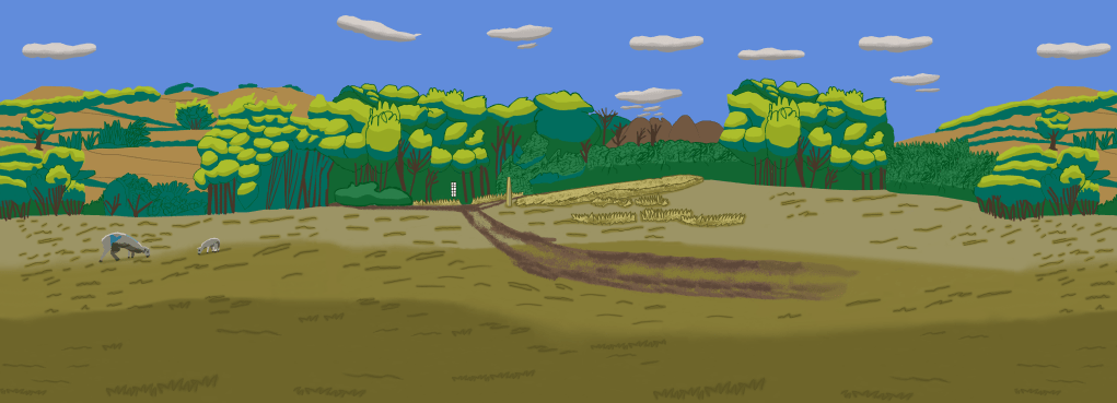
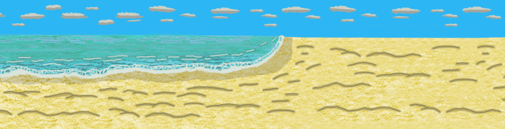
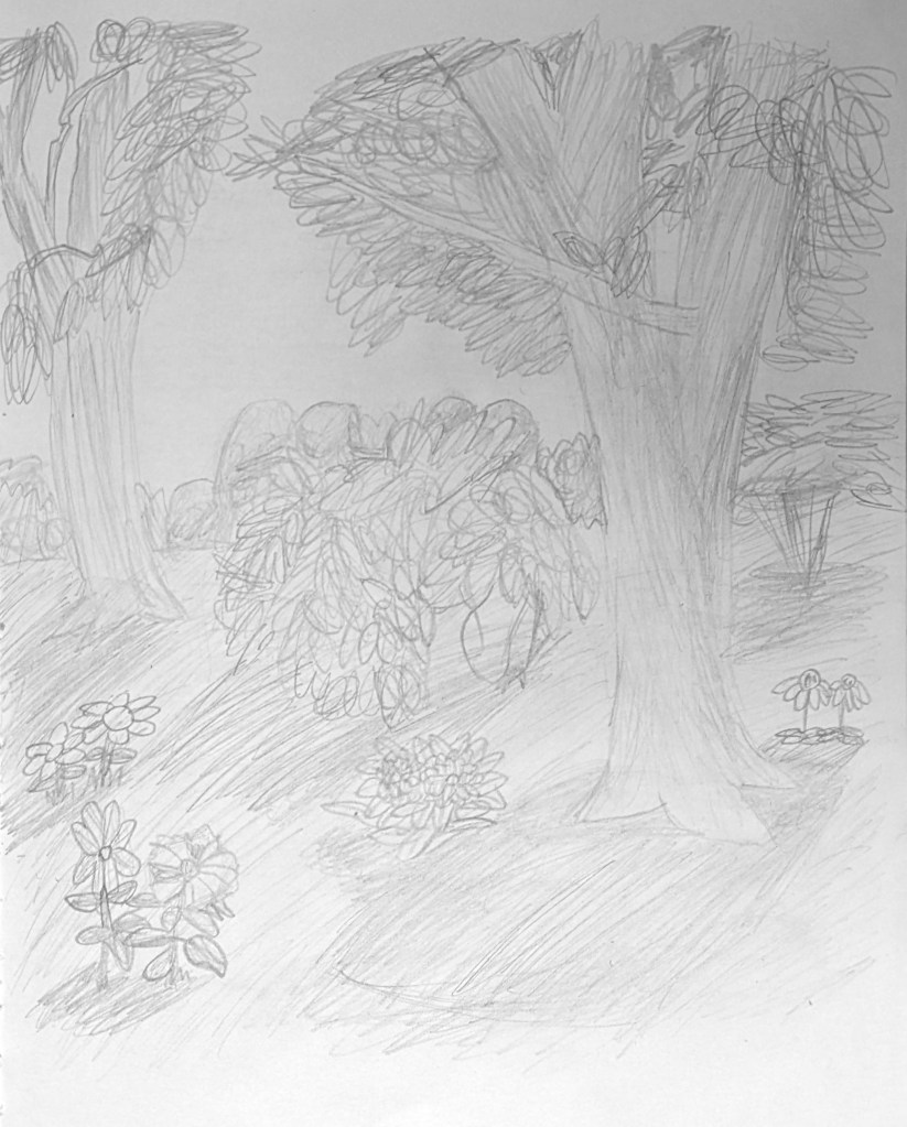
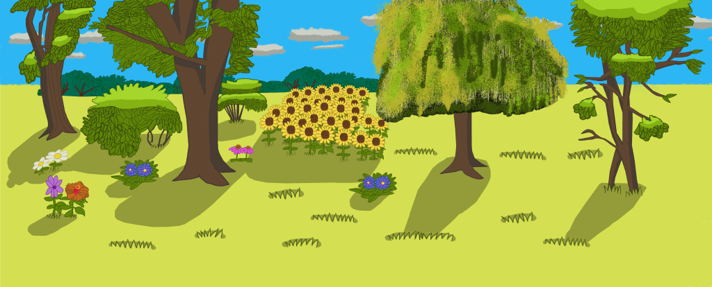
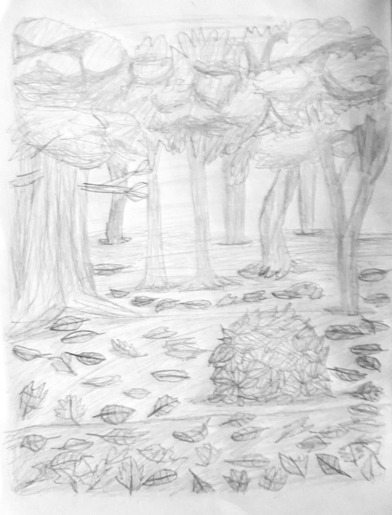

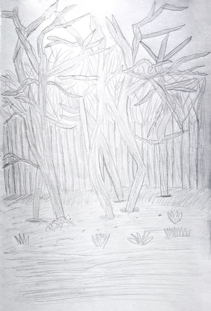
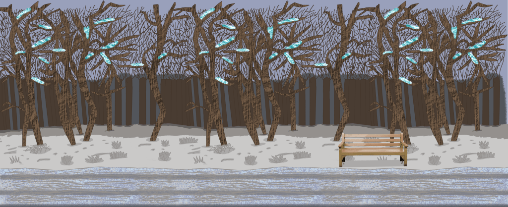
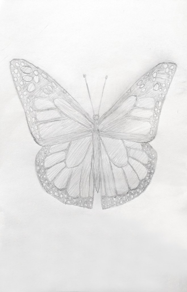
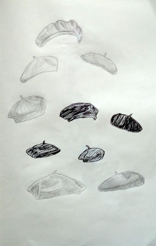
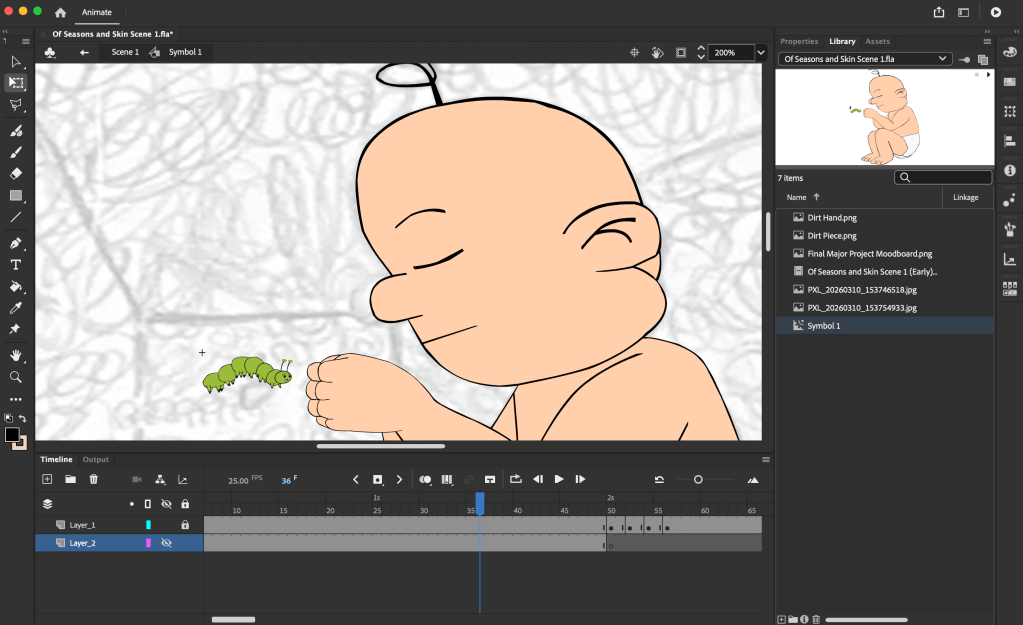
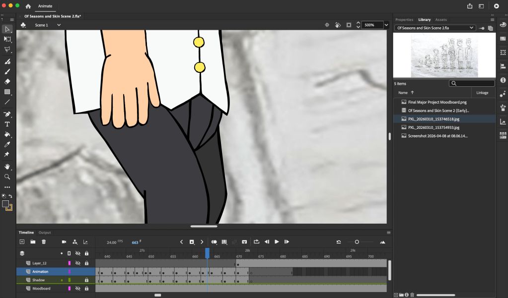
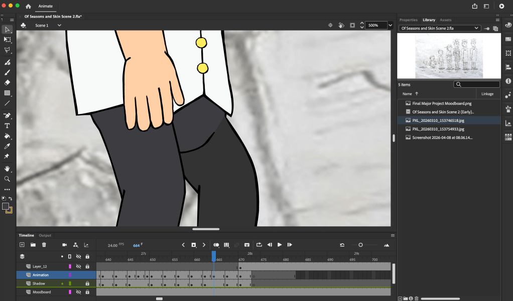
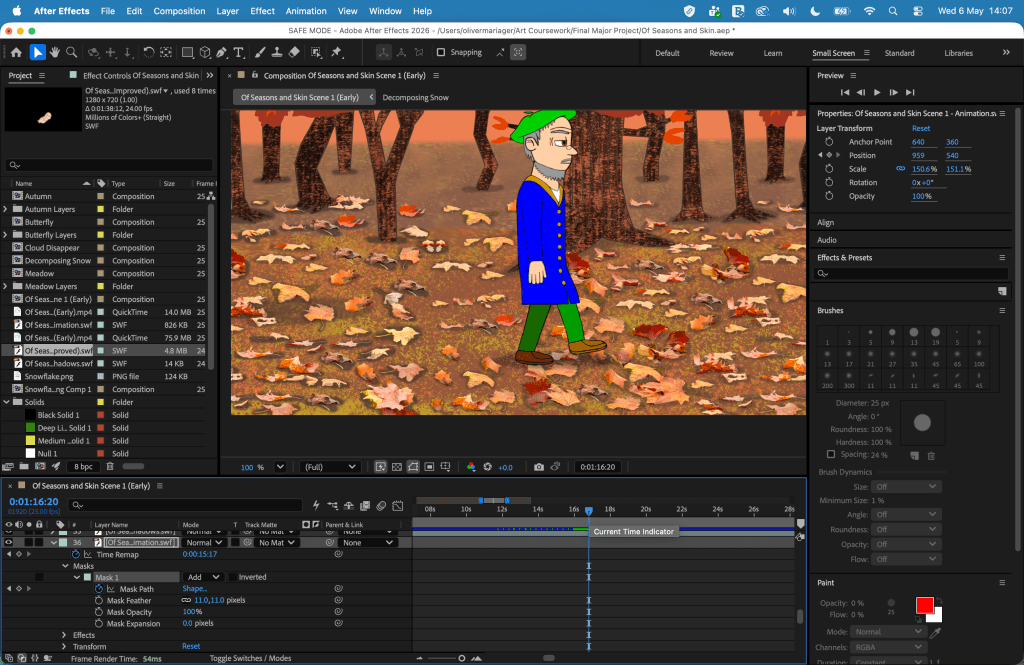
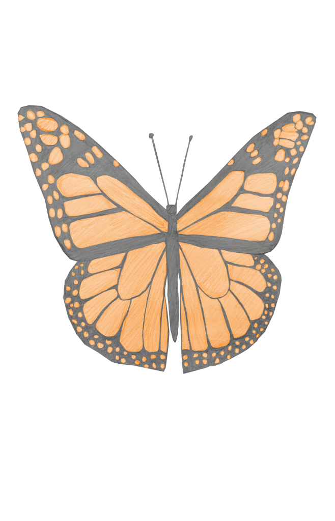
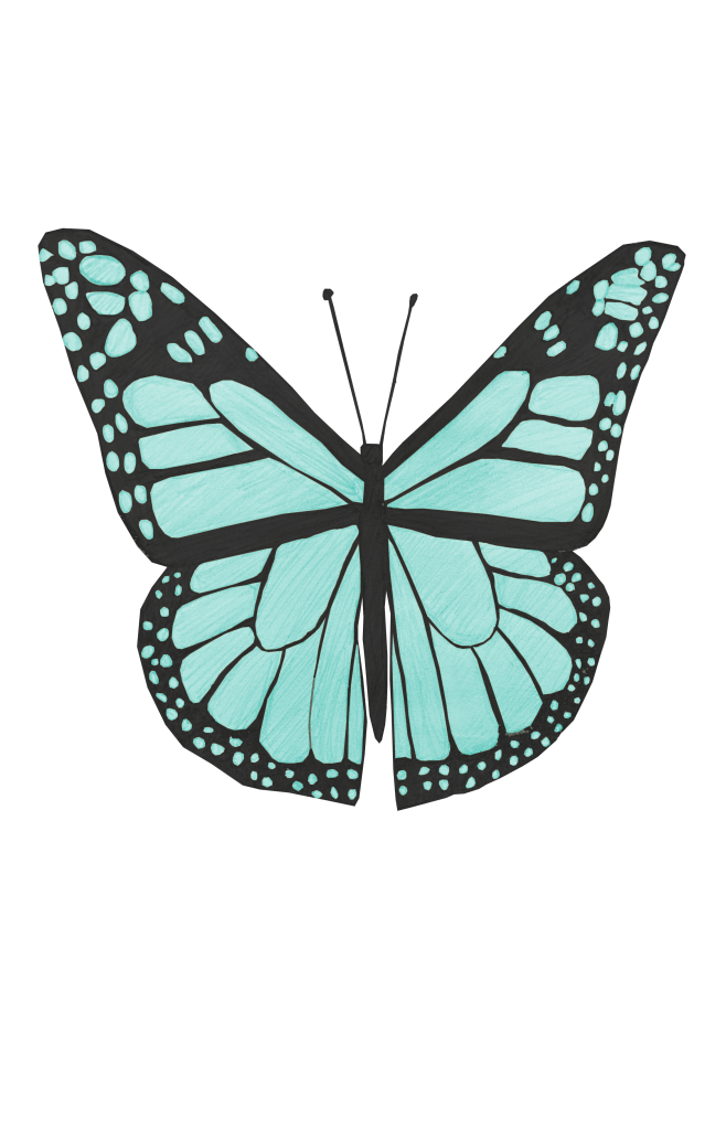
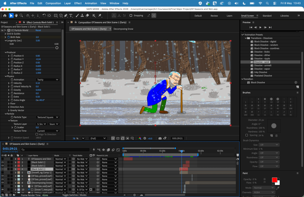
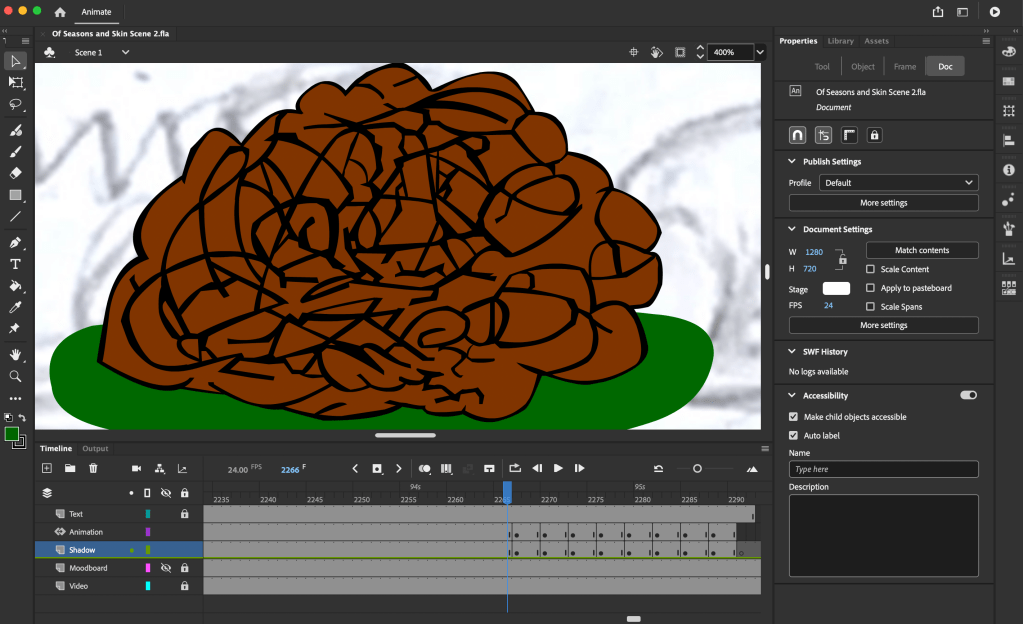
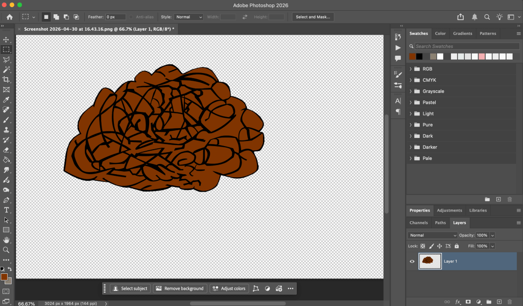
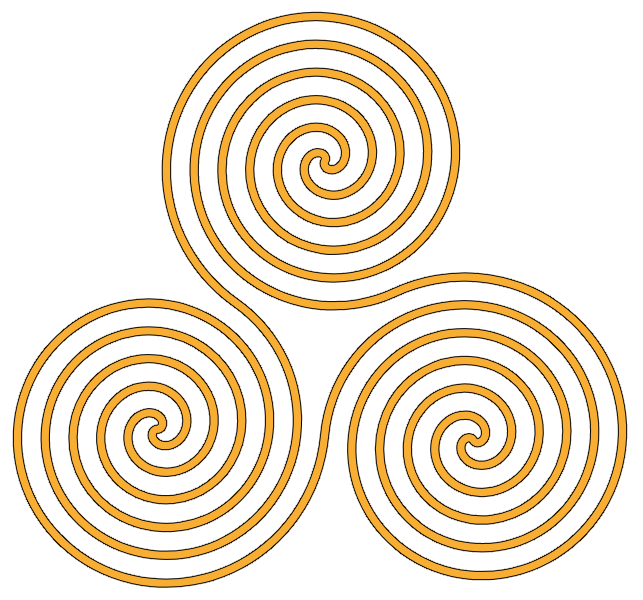
I used Adobe Animate to produce the project. Throughout the project, I encountered different challenges in the animation process. I had to refine some of my character designs. This included more research, which led to me adapting the baby’s face to look younger and removing the codpiece-like fly from the young adult’s trousers. I further researched berets in order to draw the mature adult’s one accurately, and gradually slowed down the transformation from a mature adult to an older adult. I changed the colour of the butterfly from orange to blue to make it stand out from the autumn landscape. I encountered a problem with Animate crashing three times; the first time this involved a heavy amount of strokes on soil. I printscreened the soil, created and exported a transparent .png file of said soil from Photoshop, and imported the file into Animate to prevent any future issues. Editing and special effects were done in After Effects and Adobe Premiere Pro. In After Effects, I added a text layer for the project’s title, using the font “Snell Roundhand” against a frottage earth texture, and added the “Dissolve – Sand” effect to make it appear and disappear. I chose this effect because the project’s opening scene takes place in earth soil. I watched a tutorial on title animations by Smertimba Graphics,[367] which inspired me to create animation effects and the position for my director credit. I later added a triskelion symbol in the background for the end credits, because in my family, it is thought to represent the cycle of life.
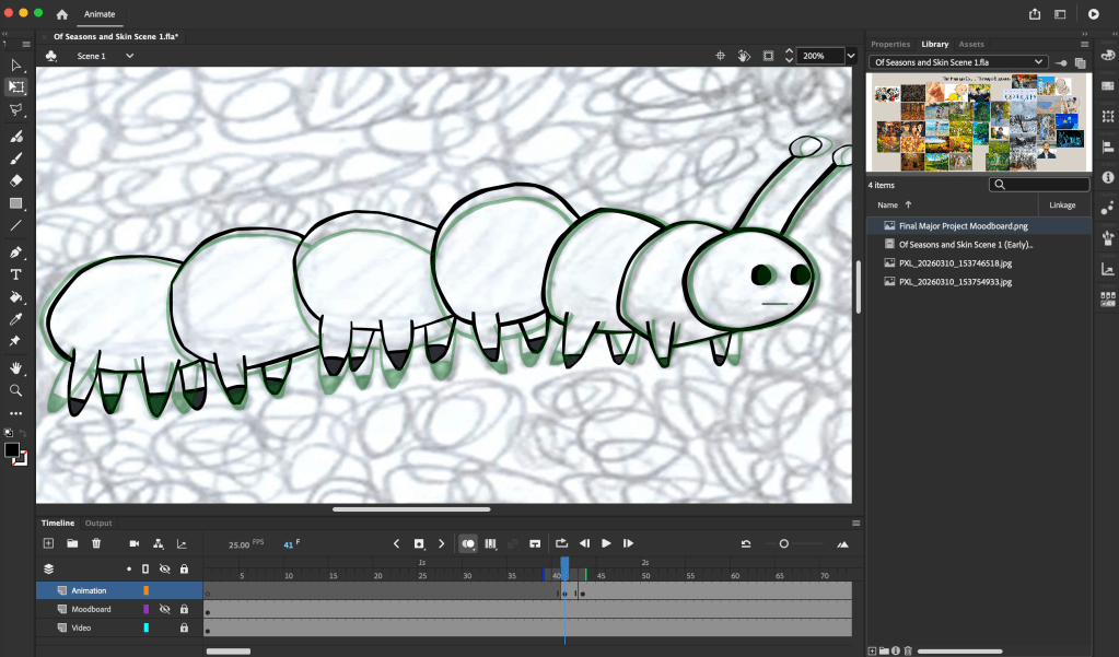
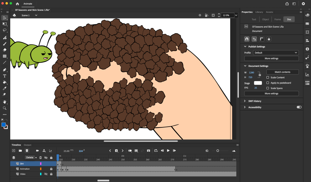
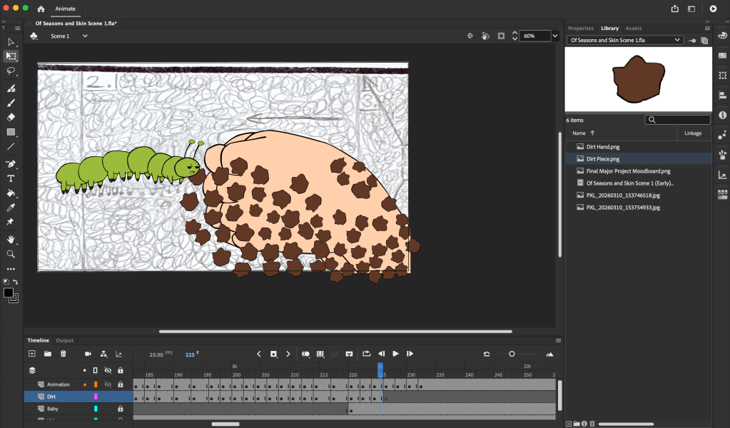
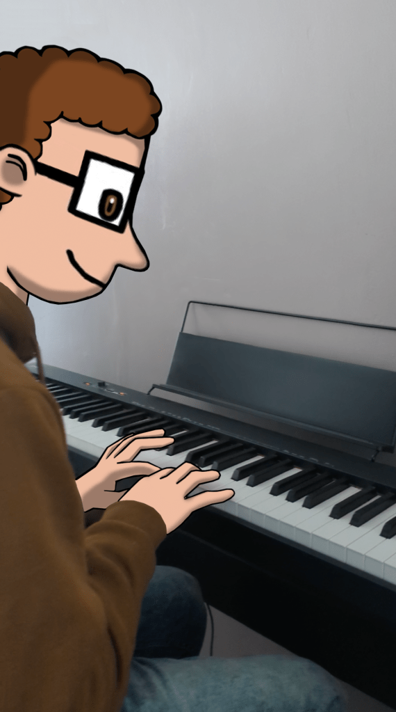
When it came to the soundtrack and sound design, I wanted to use this to further illustrate my idea of seasonal changes. I made recordings of what the footsteps would sound like in different conditions, and combined this with sound recordings of me playing the keyboard/piano, alongside my custom-made electronic music tracks. This was successful since it enhanced the ambience of the different seasons.
I had a good understanding of how to use animation software and produced my own short animated films (Sensory Chaos, Hunger Pains, Breathe, Real Take) before I started this course. During the past two years on the course, I have expanded my repertoire of different media, refined my observation skills, learned how to analyse the work of others, and used this research to make decisions on how to develop my own personal ideas. I have also learned how to manage my time to develop my ideas in answer to a brief and a set deadline. I completed everything that I committed to in my Statement of Intent on time. During the planning phase, I broke down my tasks into a framework that I was able to manage and reflect on every week. By analysing my work weekly, I was able to address any feedback and issues with timing and consistently find effective solutions to the design development of the characters and the seasonal landscapes. The final look of the characters and landscapes demonstrates my commitment and the level of development involved in my project from the initial pencil-sketched ideas in the research phase through to the finished product.
Overall, the film was intended to run for one minute, but ended up running for two minutes and 20 seconds. This longer duration is a testament to my original aim to broaden my understanding of storytelling through animation. I have demonstrated this understanding in my thorough research of the human aging process, including stance and movement. The medium of animation allowed for the visual storytelling, which involved adding more frames, and therefore more time to the film. I am happy with the final outcome; I showed it to different test audiences at different stages in its development, to which they gave positive feedback. They immediately understood the themes of the project and enjoyed it. I also had the pleasure of seeing and watching projects by some of the other OCAD students, including Bo Burnham, MeiyiOtaku, Joanne McKeown, Beatrix Finch, et cetera. If I had more time, I could have developed the musical score further, taking inspiration from my research on “The Four Seasons” by Antonio Vivaldi.[368] As the deadline was short, I made the right decision to focus my time on the visual storytelling of the theme within the time parameters, completing the project on time and to a high standard. My favourite scene was the autumn scene, because it encapsulated everything that I wanted to visually achieve in perfect harmony with the storytelling of the theme. Going through this process has reinforced my love of animation and has inspired a further study in illustration, which I hope to embark on at Falmouth University. To celebrate my graduation from OCAD and the completion of my project, my mother and I went on holiday to Crete, Greece for a week. After the holiday, I joined OCAD’s End of Year Summer Show on 3 July 2026, where we entered a virtual exhibition.[369] My project was on display at the exhibition (1:12), and after we watched it, Matt Theodore praised the film. He described the film and the amount of work that I had put into it as “amazing, really fantastic work” and “a huge undertaking, a project of that size and incredibly ambitious and beautifully produced”. On 27 July 2026, I got my Diploma in Art and Design results. It was a Distinction, which gets me into university. I would not learn of this until 10 August 2026.
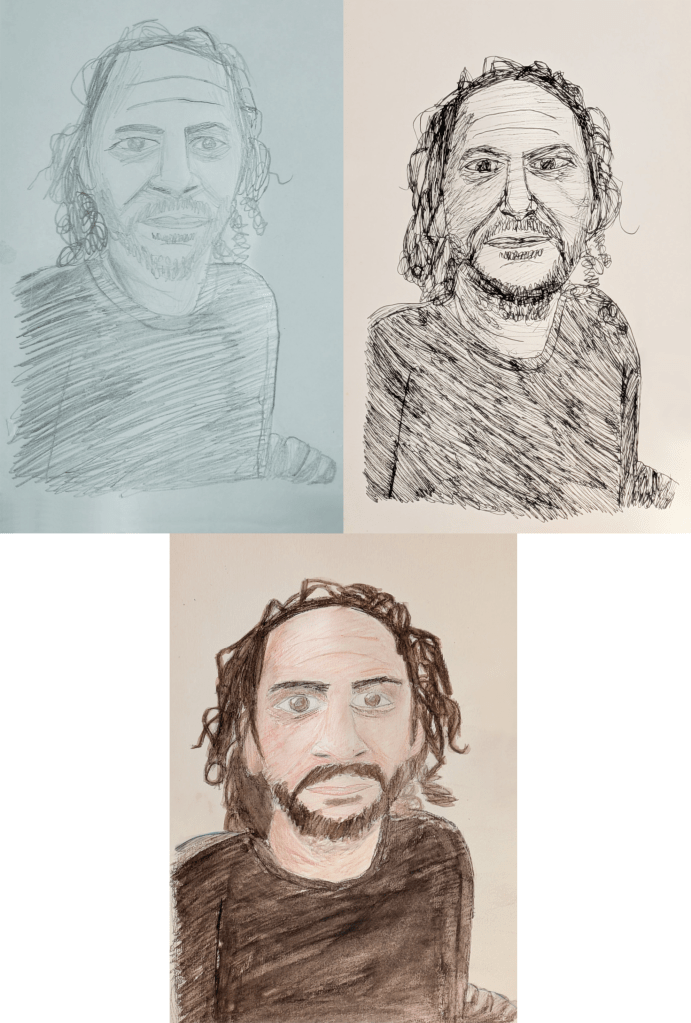
I had a personal bereavement this week, because one of my grandfathers, Kjeld (18 March 1942-3 August 2026[370][371]), died in peace after my father visited him in his care home in Denmark. Kjeld was a local historian and author who documented the cultural, architectural, and environmental history of the cities of Aalborg and Nørresundby.[372][373][374][375][376][377] He wrote the 1999 book Det grønne Aalborg: Historien gennem 200 år (The Green Aalborg: The History Through 200 Years),[372] and hosted slideshow presentations in the North Jutland Region.[375] When I was a child, I would always mistakenly think that Kjeld was much younger, with brown hair and a moustache and beard, and imagined him as such. His death reminded my father of a scene in my project, where my character dies as an older adult before the cycle of life begins anew in spring.
In memory of Kjeld, my grandfather, and David Hockney, who passed away one month after I completed my project.