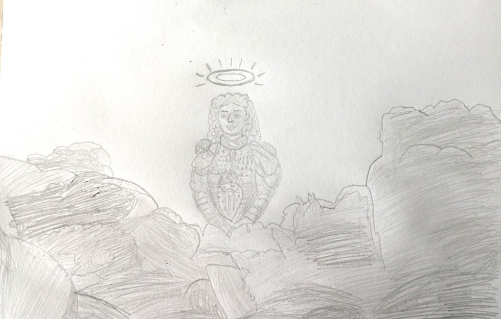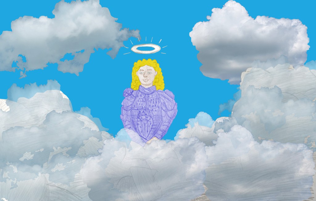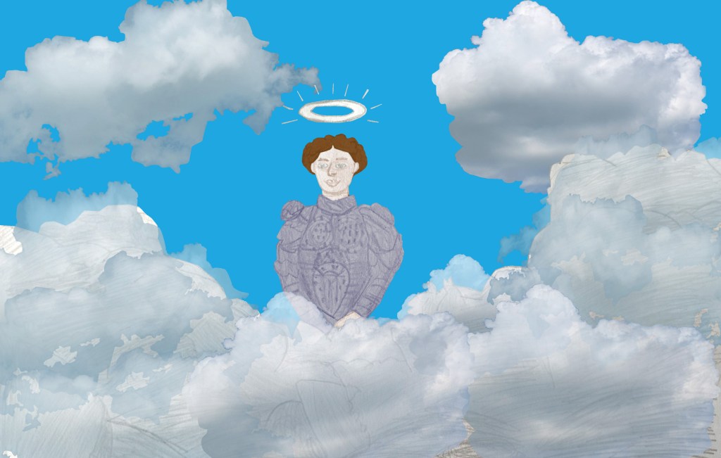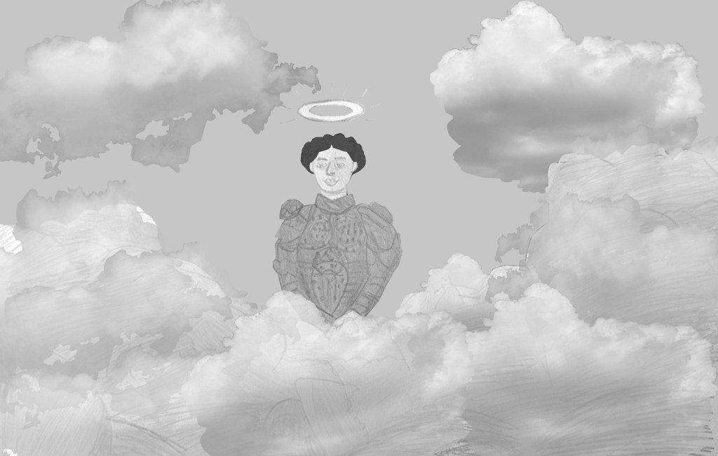
Online College of Art and Design

In October 2024, I began studying for my Level 3 Foundation diploma in Art, Design and Media at the Online College of Art and Design. My first project for the course was World Photography Project: How Photographers Documented their World. In it, I researched the photographers Josef Sudek,[1][2][3] Edward Weston,[4][5] Ori Gersht,[6][7][8] Olivia Parker,[9][10][11] Wolfgang Tillmans,[12] Bruce Gilden,[13][14][15][16][17] Hellen van Meene,[18][19][20][21][22][23] August Sander,[24][25][26] Diane Arbus,[27][28][29][30][31] Dorothea Lange,[32][33] Henri Cartier-Bresson,[34][35][36][37][38][39] Martin Parr,[40][41][42] Ansel Adams,[43][44][45] Jérôme Sessini,[46][47][48] Andreas Gursky,[49][50][51][52][53][54] Richard Hamilton,[55] thenatchdl,[56] and Nick Church,[57] and learned about contact sheets, meaningful view, depth of field, still life, taking in the moment, and looking back at life. The only genres and terms that I already knew of before the project were portrait and landscape. After researching the photographers, I was influenced by Parker and Gursky to make use of colour in my still life photographs and take the position of a central object placement.[9][10][50][51] Then I took my portrait photographs in the moment like Gilden, with the subject as the focal point.[13][17] For some of my meaningful view photographs, I took inspiration from Parr’s photographs. They were taken at unusual angles and drew the viewer’s attention to objects, activity and composition elements.[40][41] I enjoyed going to different locations to take my photographs. The biggest challenge in the project was analysing the photographs and choosing which ones from my contact sheet to edit in Adobe Photoshop. I had to point out the details and structures to explain how they match my interests, and why I chose the photographs.
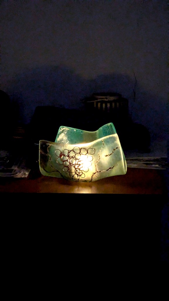
My final edited still life photograph of a glass candle holder, made by my grandmother.
My final edited portrait photograph of Paddy from Young Animators Club.
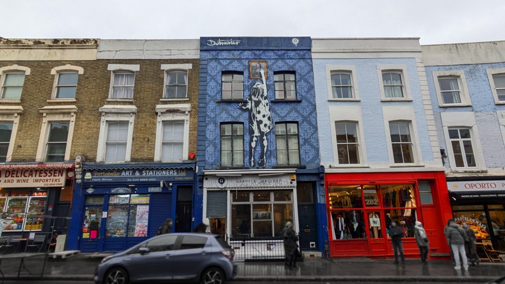
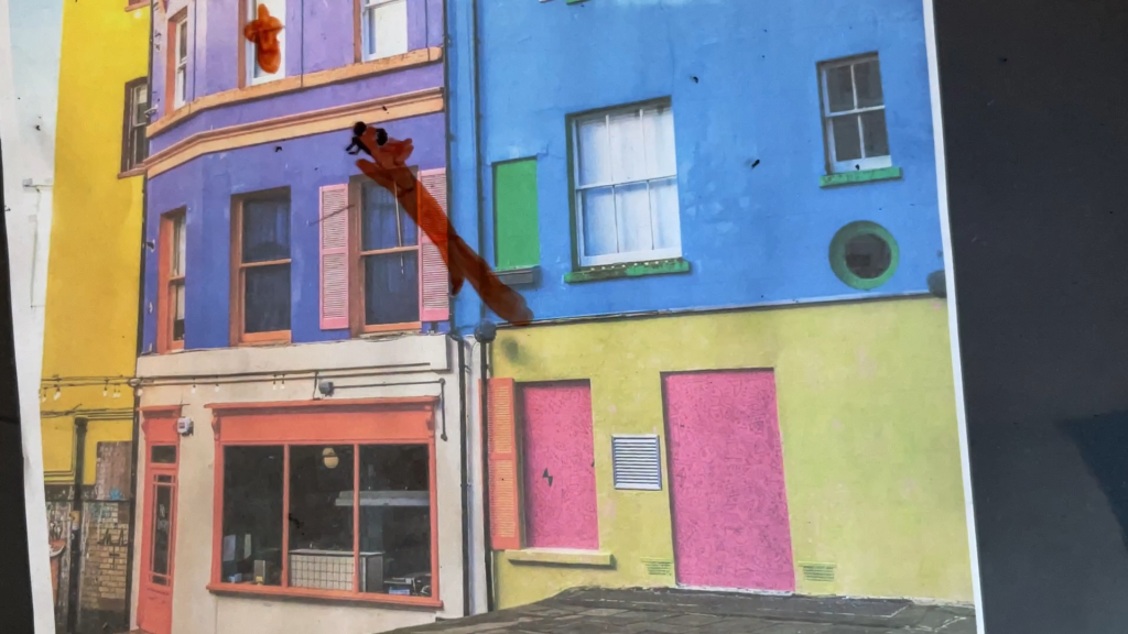
My final edited meaningful view photograph of Portobello Art and Stationers and Graffik Gallery.

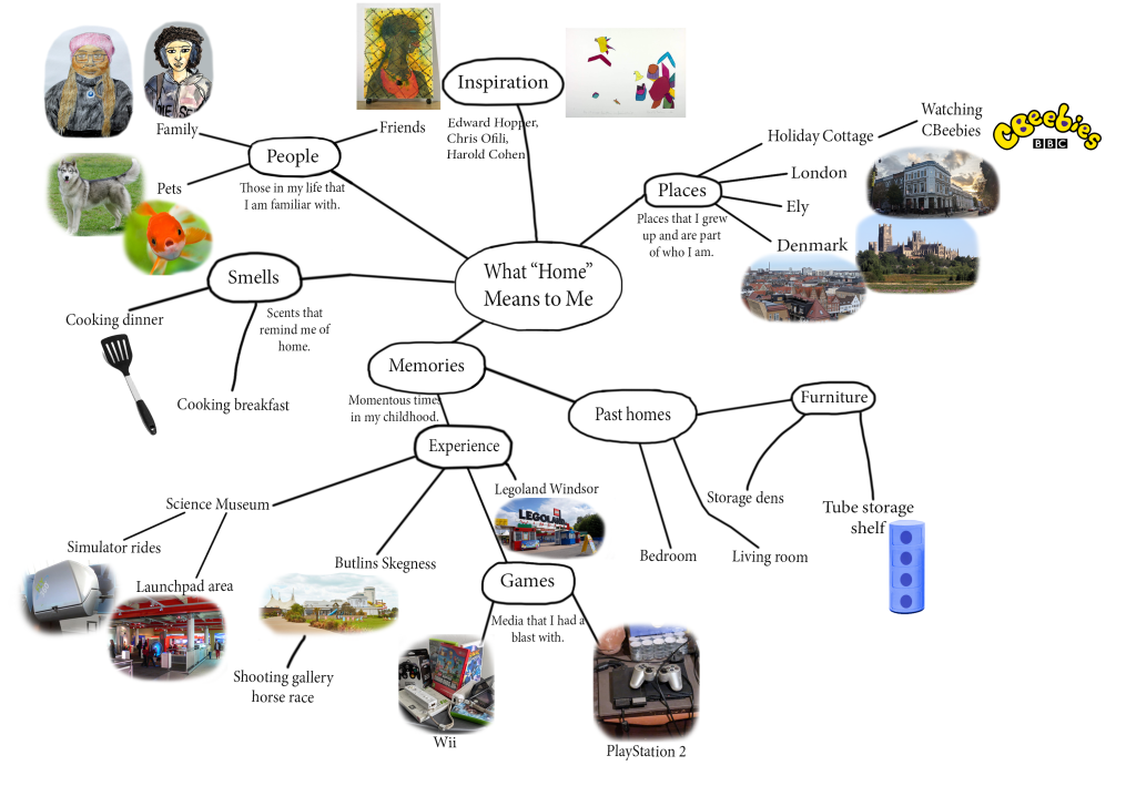
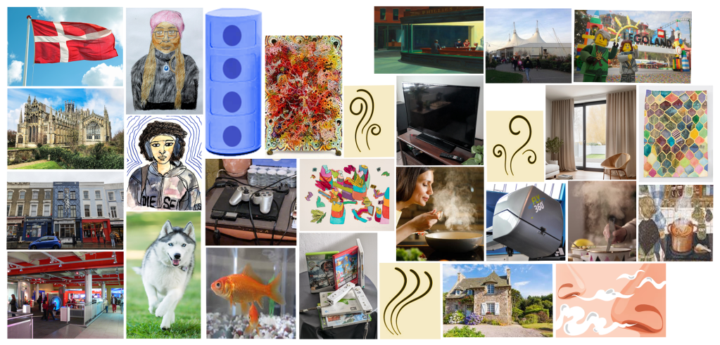
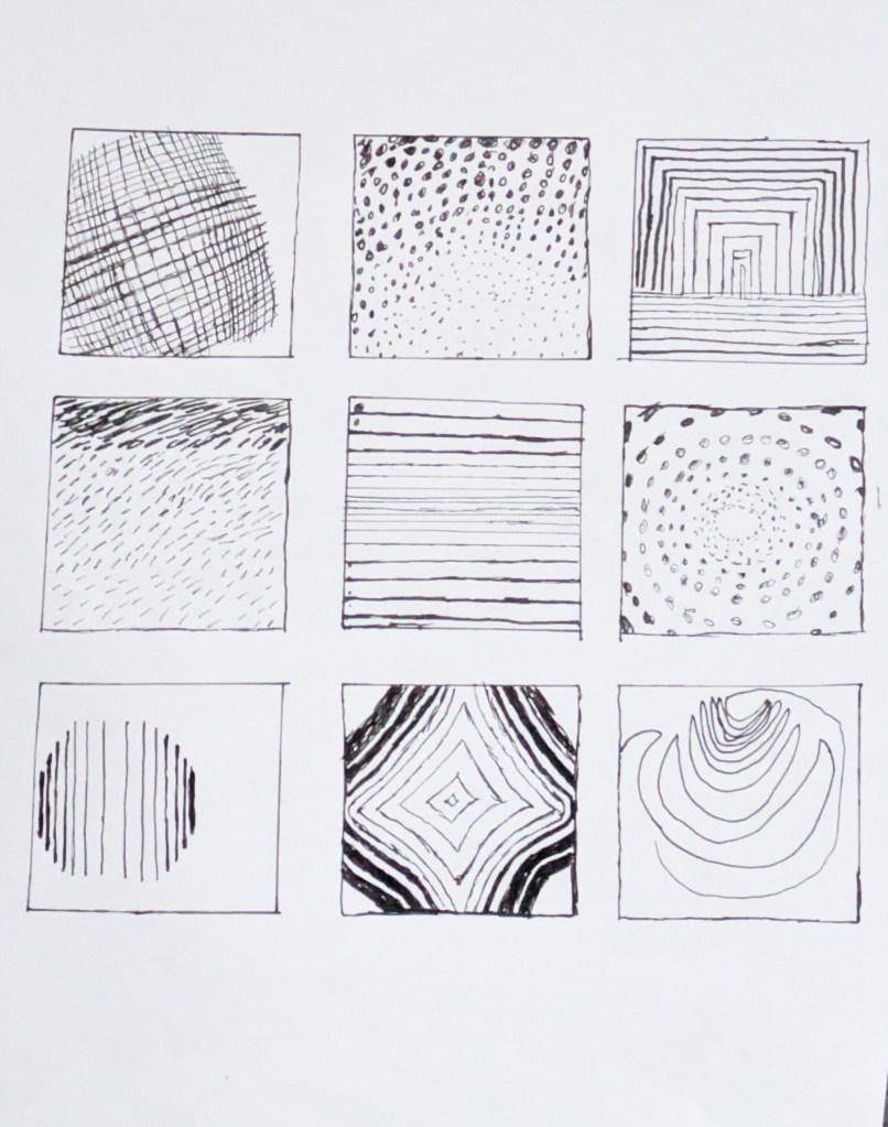
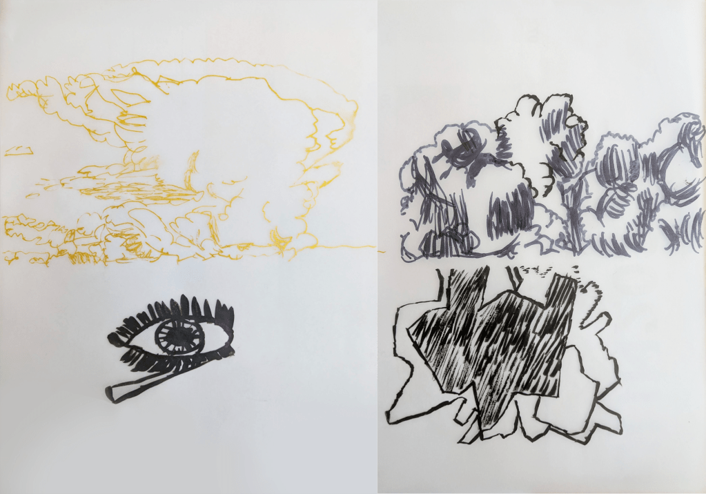
Next, I did a Fine Art project with the theme of what “home” means to artists and people in general. I went to the Folkestone Museum, where I took photographs and analysed historical art, including: Folkestone, 1790 by Richard Kerr,[42] Victoria Leaving Boulogne by Charles Brooke Farrar,[43] The Landing of the Belgian Refugees by Fredo Franzoni,[44][45] North Street Folkestone by Elijah Albert Cox,[46] Sinking of the Bienvenue by Victor Sebastian Foley,[47] Dogfish Season by Charles Padday,[48][49] and The Folkestone Boat Train by Bertram Priestman.[50] Then I went to the studio of local artist Shane Record to photograph and analyse contemporary art.[51] Record told me that he dislikes doing art of places that “do not mean anything to [him]”, and that he includes the theme of home in his art because art “is [his] life”. It “means something to [him]; [his] home in Folkestone”. Looking at the artists’ work in person and through secondary sources helped me understand the brief for the project more clearly. It also inspired me when considering what home means to me and different ways that I could communicate this visually. At home, I researched the artists Willem de Kooning,[52][53][54][55][56][57] Cy Twombly,[58][59][60][57] Robert Mapplethorpe,[61][62][63][57] Bernard Cohen,[64][65][66][57] Mark Wallinger,[67][68][69][57] Harold Cohen,[70][71][72][57] Edward Hopper,[73][74][75][76][77][78] George Shaw,[79][80][81][82][83][84] Johannes Vermeer,[85][86] [87][88][89] Pierre Bonnard,[90][91][92][93][94][95] Chris Ofili,[96][97][98] Rachel Whiteread,[99][100][101][102][103][104] Nan Goldin,[105][106][107][108][109][110] Bill Viola,[111][112][113][114][115] Gillian Wearing,[116][117][118][119][120] Peter Doig,[121][122][123][124][125][126][127] Ger van Elk,[128][129][130][131] Carl Holsøe,[132][133][134][135][136] Aline Gaiad,[137][138][139] Gerald Laing,[140][141][142] Edvard Munch,[143][144][145][146] Kehinde Wiley,[147][148][149][150] Njideka Akunyili Crosby[151][152][153] and Patrick Caulfield.[151][152] Through my research, I learned about techniques such as cross hatch, patterns, abstract art, collage, angles, mark making, monoprinting,[153] self-expression, and the history of painting. Next I created a moodboard of things that matter to me, such as my family, toys and video games. I initially had issues creating a mind map because I drew it on paper, so I made another one digitally and spaced the images and categories out. I then developed ideas and patterns for my final piece, and experimented with oil pastel, cutouts, clippings, acrylic and watercolour paint. The experiments and artist research were the parts that I enjoyed, with the former helping me to explore different possibilities and compositions for my final piece.
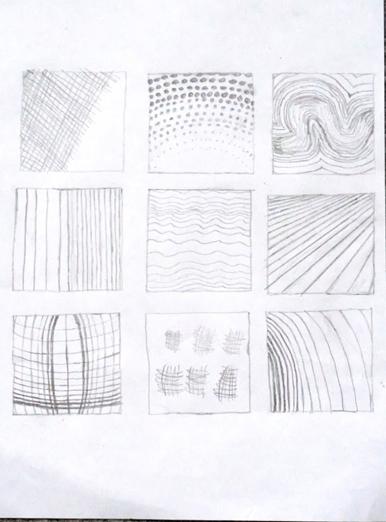
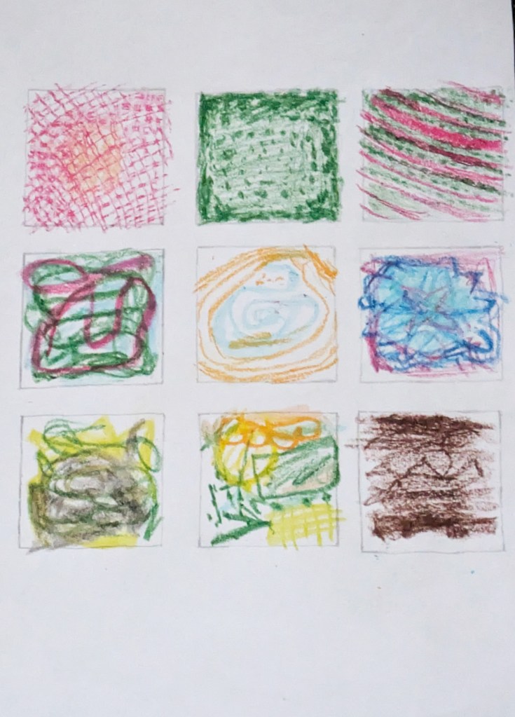
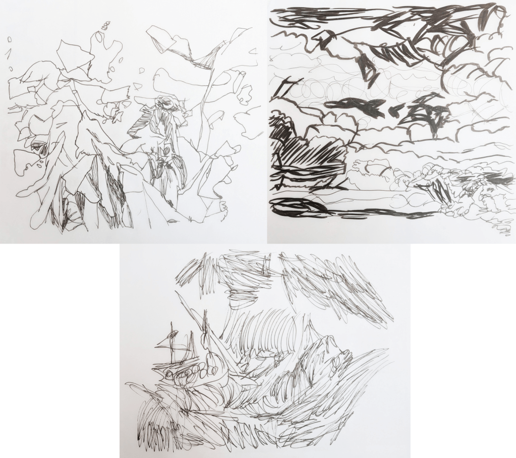
My mark making pencil experiment.
My mark making pen experiment.
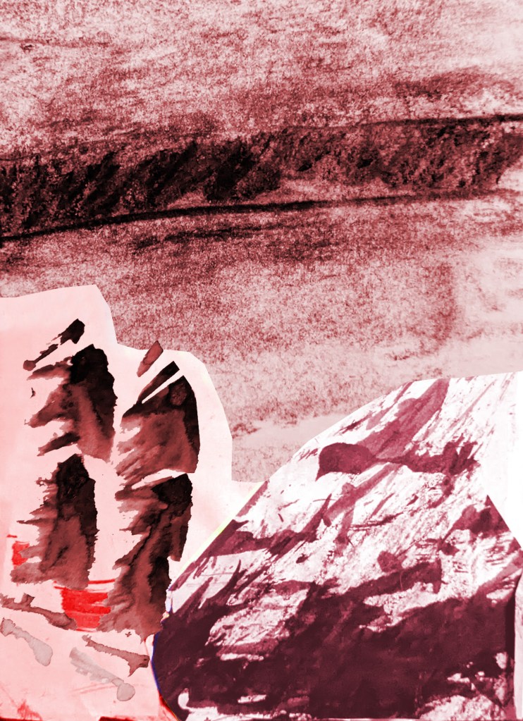
My mark making oil pastel experiment.
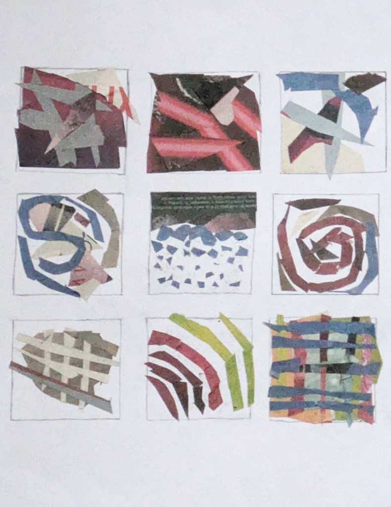
My mark making newspaper collage experiment.
My mark making transparent watercolour paint experiment.
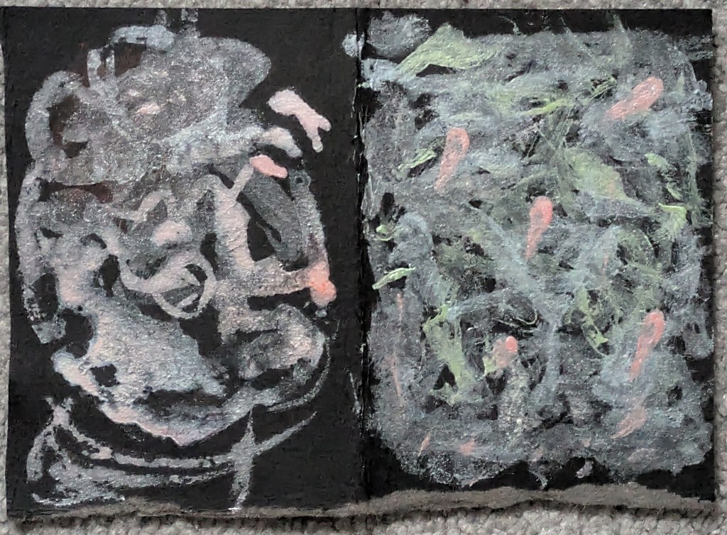
Monoprint of my sister Elyse.
Mind map for my Fine Art project. Images © Chris Ofili/Harold Cohen/BBC/Butlin’s/Merlin Entertainments.
Moodboard for my Fine Art project. Images © Edward Hopper/Chris Ofili/Harold Cohen/Natasha Tarasova/Butlin’s/Merlin Entertainments.

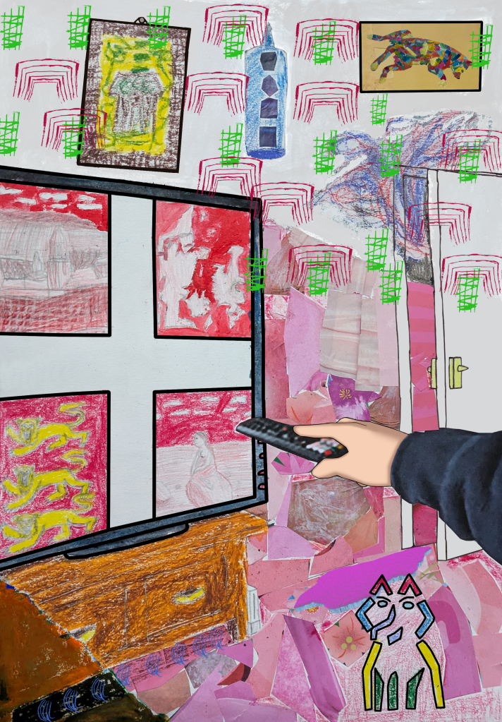
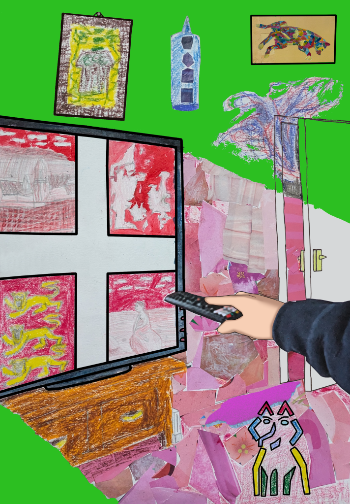
When creating my final piece, I was inspired by Hopper to draw diagonal lines for my television at an odd angle. Wanting to create a balance in contrast of atmosphere similar to Hopper, I concentrated on the balance of warm, light colours and cold, dark colours regarding the television’s light. Following this, I made an oil pastel cottage painting based on Ofili, and added custom-made Scribble Hatch patterns to the living room door. Ofili’s Nigerian patterns and mark making reminded me of my Nigerian heritage. I then produced circular patterns inspired by Wiley, Caulfield and my laptop’s bubble screensaver, and initially added them to the wall. I looked at Harold Cohen’s computer art, which inspired me to draw and paint two abstract dogs, based on a photograph of my pet dog. One was made entirely of shapes, and the other was divided into coloured sections with acrylic paint in a portrait, located above the door. Inspired by Crosby, I cut out textured magazine clippings in different shades of pink and glued them in, placing them in an area where the television’s light would be in the foreground. To make the television, the Danish flag (with the coat of arms of England), the cottage painting, and the dog portrait stand out, I drew thick, black outlines over them, inspired by Caulfield. Working on this project led to a new perspective in art. I now saw it as a captured documentation of life and time. It also indicates the artists’ effort to communicate an idea or feeling through the subject of the painting, and the materials and techniques used in it. I created six versions of the art, but had problems choosing one for my final piece. I eventually settled on the fourth one. Regarding improvements, I could have taken my time and not rushed through the tasks. If I had the chance, I might have explored more mediums and elements in paintings and portraiture.
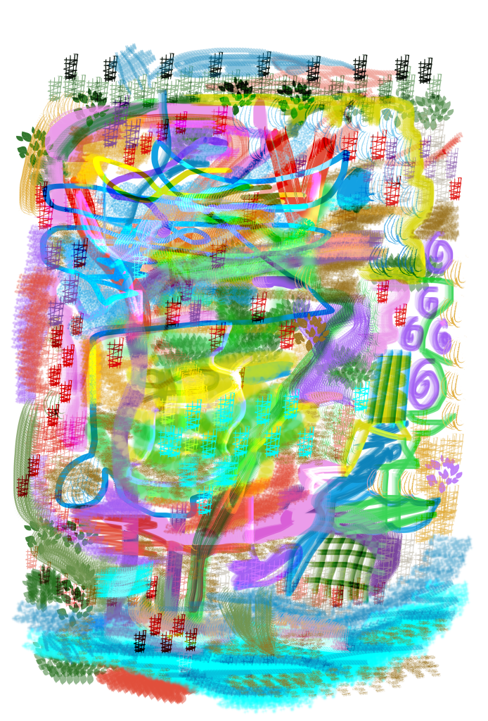
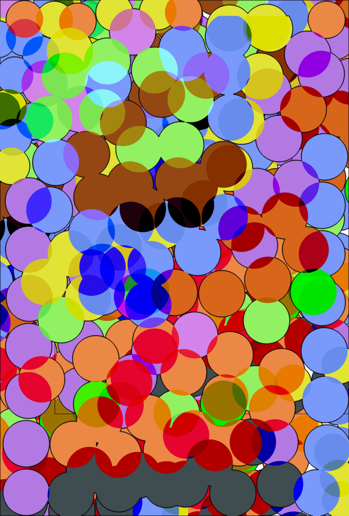
My first mark making Adobe Photoshop brush experiment.
My second mark making Adobe Photoshop brush experiment.
Chosen final piece for Fine Art project.
Alternative final outcome for Fine Art project.

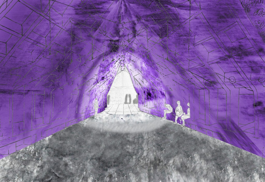
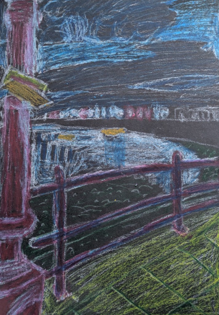
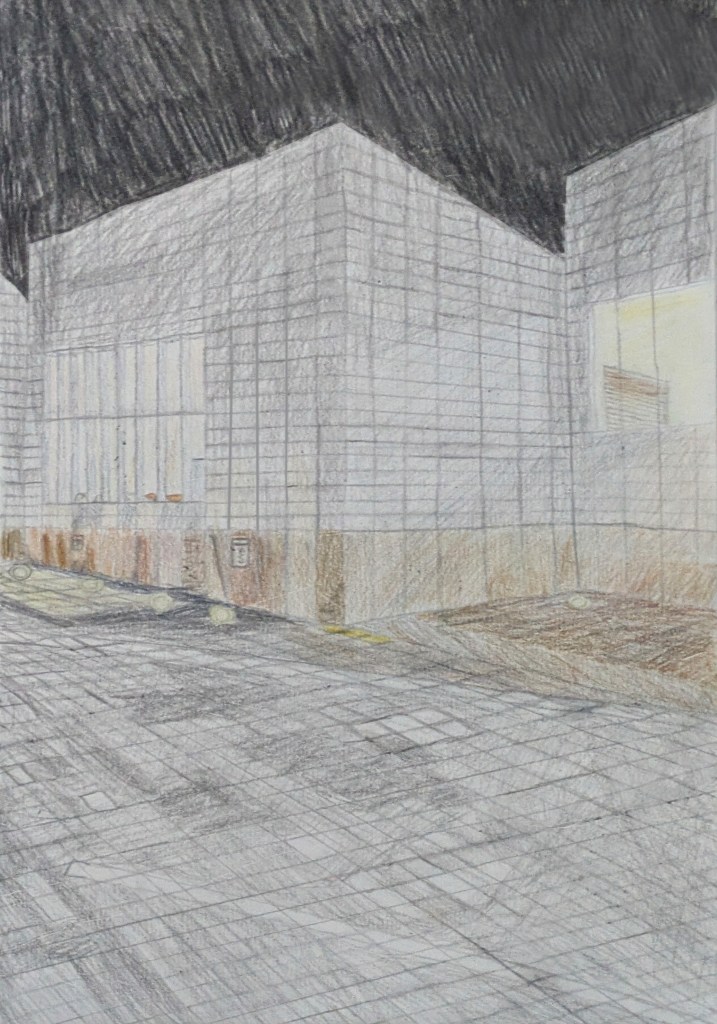
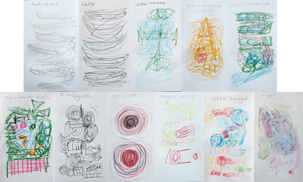
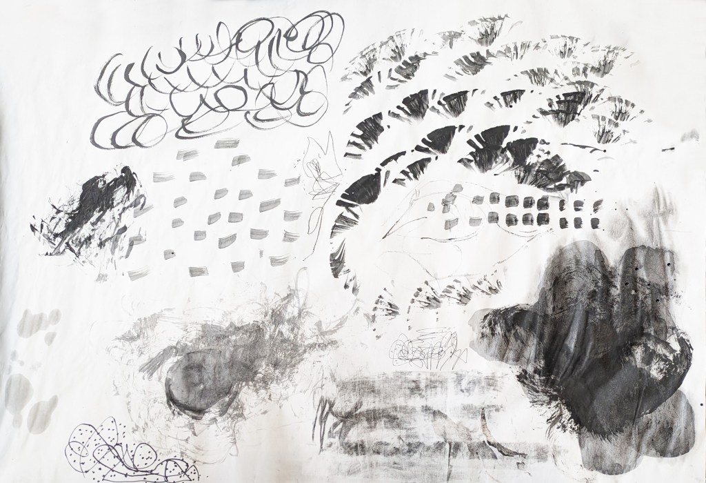
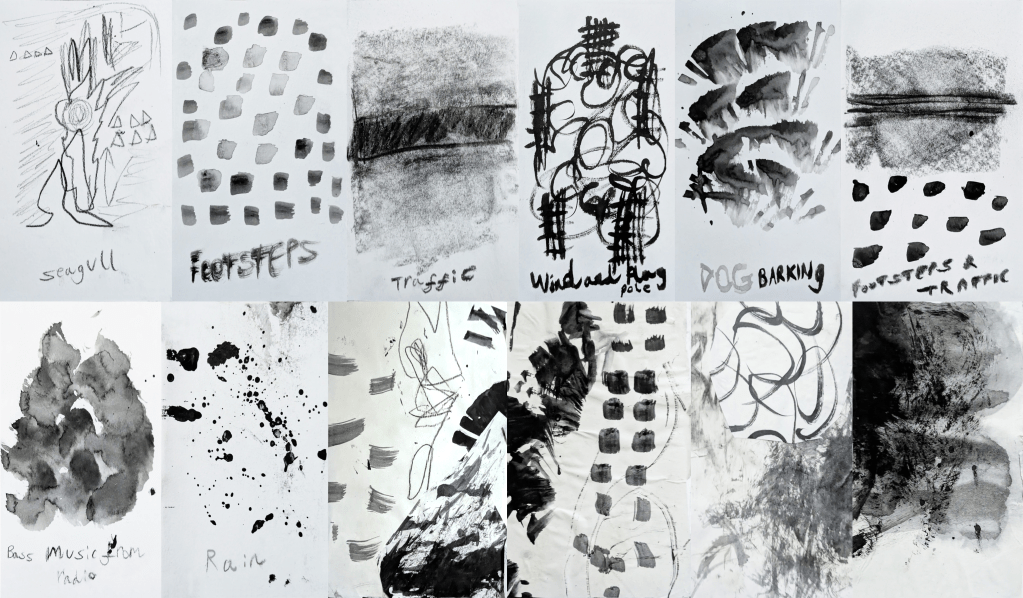
The next project was Urban Sounds Night and Day: Introduction to Illustration in Animation. I began my research for the project by watching and analysing The Birds by Alfred Hitchcock[154][155][156][157][158] and Ice Merchants by João Gonzalez.[159] This area of the project worked for me, as I was learning about how they used contrast, lighting, perspective and sound effects in their work to create a sense of drama and give the viewer a broader sense of realism and empathy. It inspired me to go for a walk in the urban environment of Deal, and later Margate. During the walks, I used my phone’s camera and sound recorder to take photographs and record sounds in real time. Hitchcock’s use of perspective and angles to create drama in The Birds and Vertigo[160] were major inspirations for the environments that I chose to take the photographs. The buildings that I photographed were Serpentine South (when I was in London),[161] Turner Contemporary[162][163] and the Droit House.[164][165][166][167][168][169][170] Following the walks, I experimented in mark making and used various tools to produce a series of colour and black-and-white drawings in response to the urban sounds, inspired by Gonzalez’s illustration style (complete with textured backgrounds). The tools included pencil, brushes, inks, watercolour paint, oil pastel, toothbrush-flicking and masking fluid. The drawings were then compiled into a concertina sketchbook.
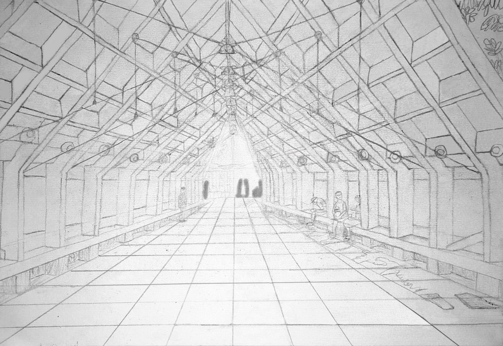
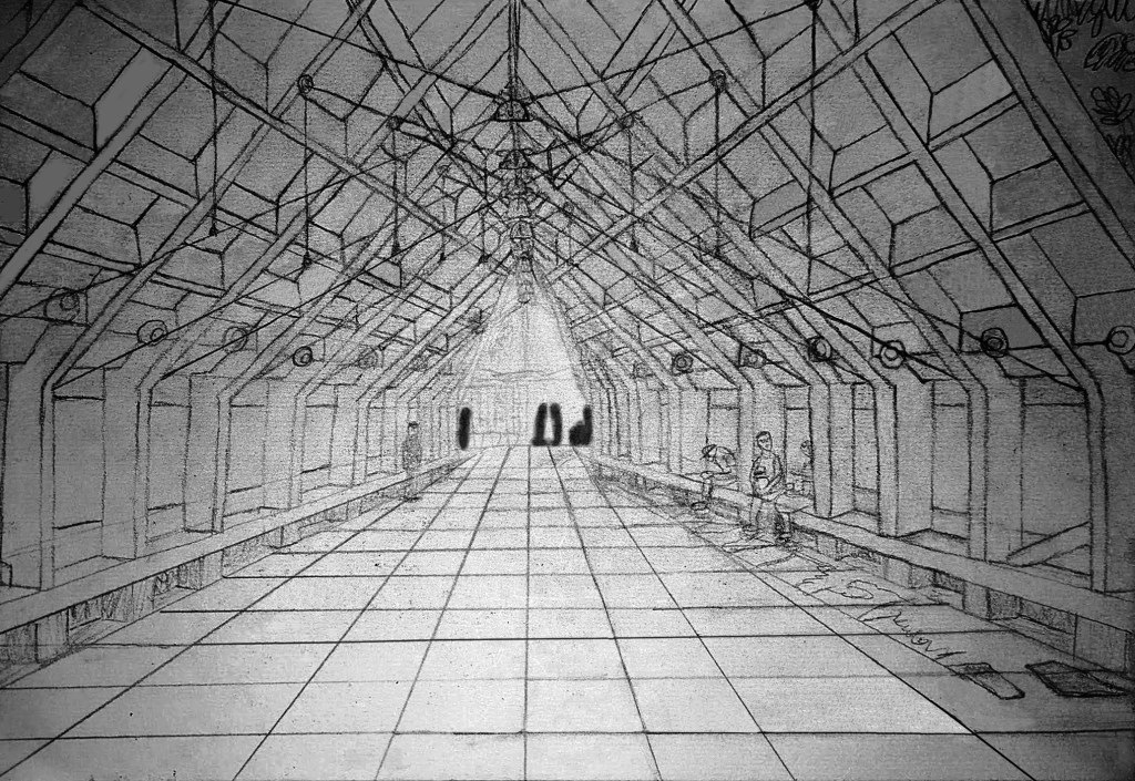
First 1-point perspective exploration art of the Pavilion at Serpentine South.
Second 1-point perspective exploration art of the Pavilion at Serpentine South (with darker brightness and heavily-silhouetted people in the background).
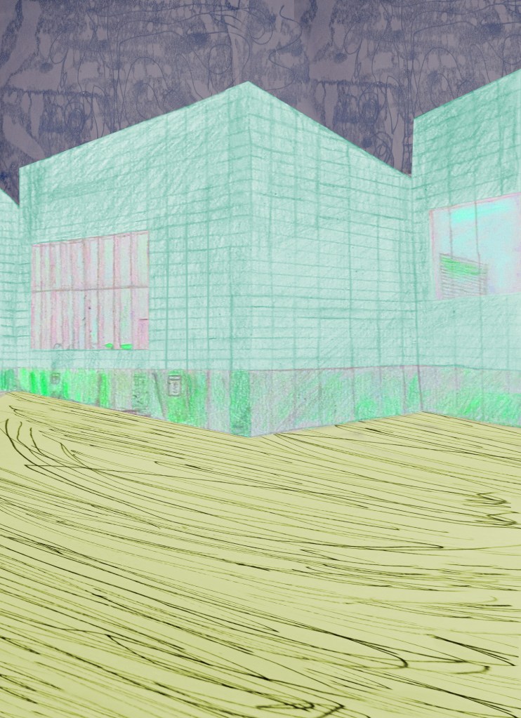
Third 1-point perspective exploration art of the Pavilion at Serpentine South (with purple and gray texture layers and “Dodge” and “Burn”-faded light areas).
My 2-point perspective Margate night oil pastel drawing.
My 3-point perspective pencil and watercolour drawing of Turner Contemporary.
My colour concertina mark making drawings based on urban sounds.
My sheet of black-and-white mark making drawings based on urban sounds.
My black-and-white concertina mark making drawings based on urban sounds.

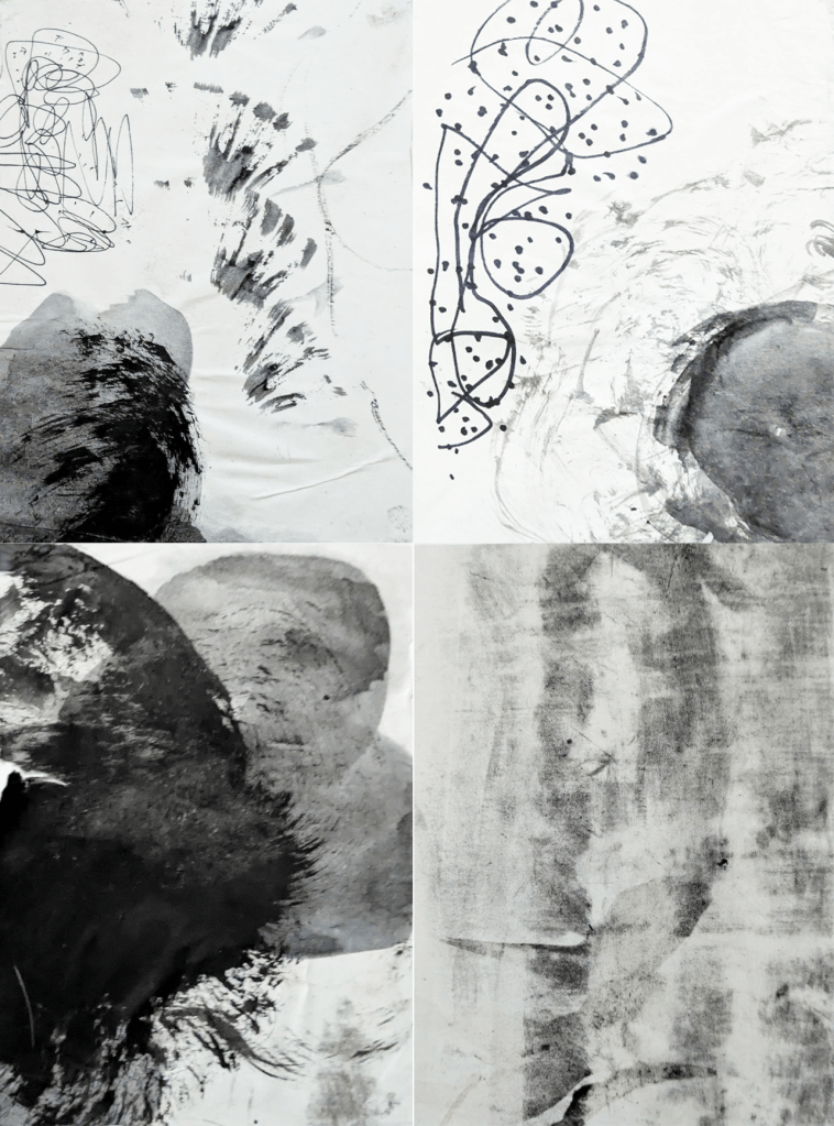
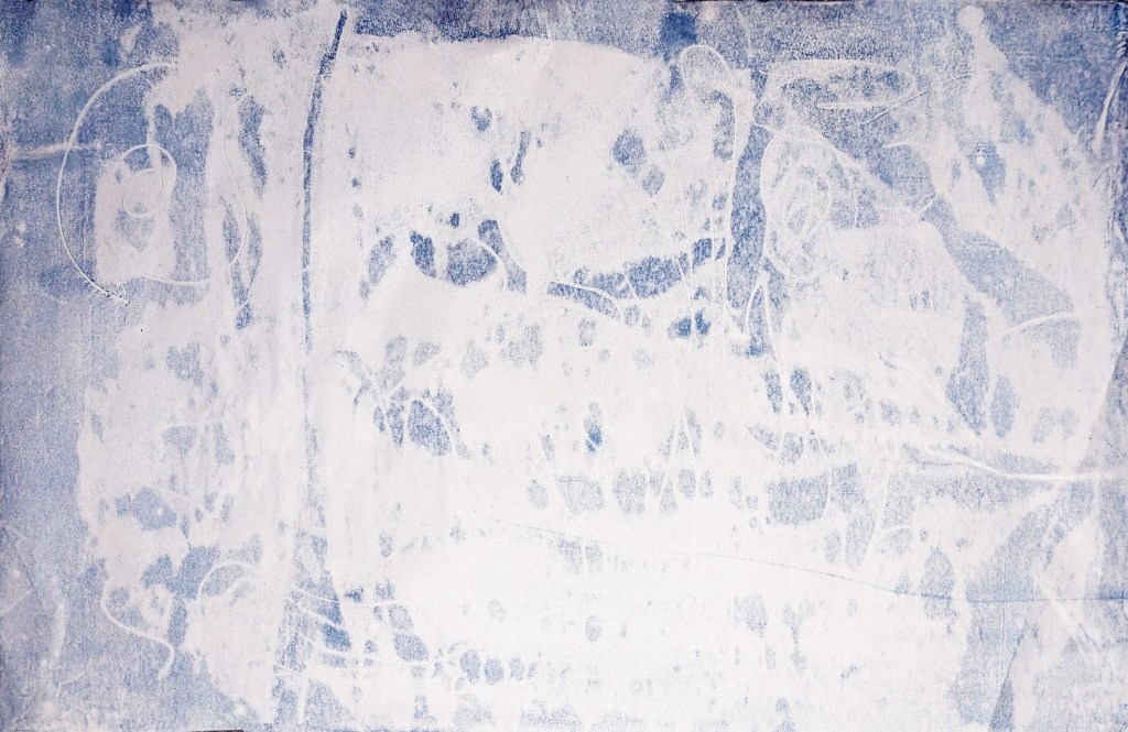
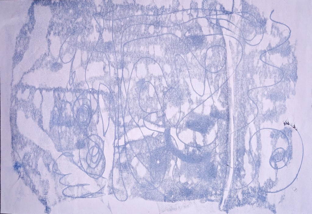
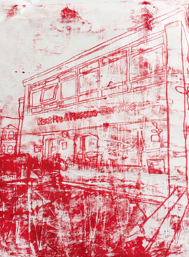
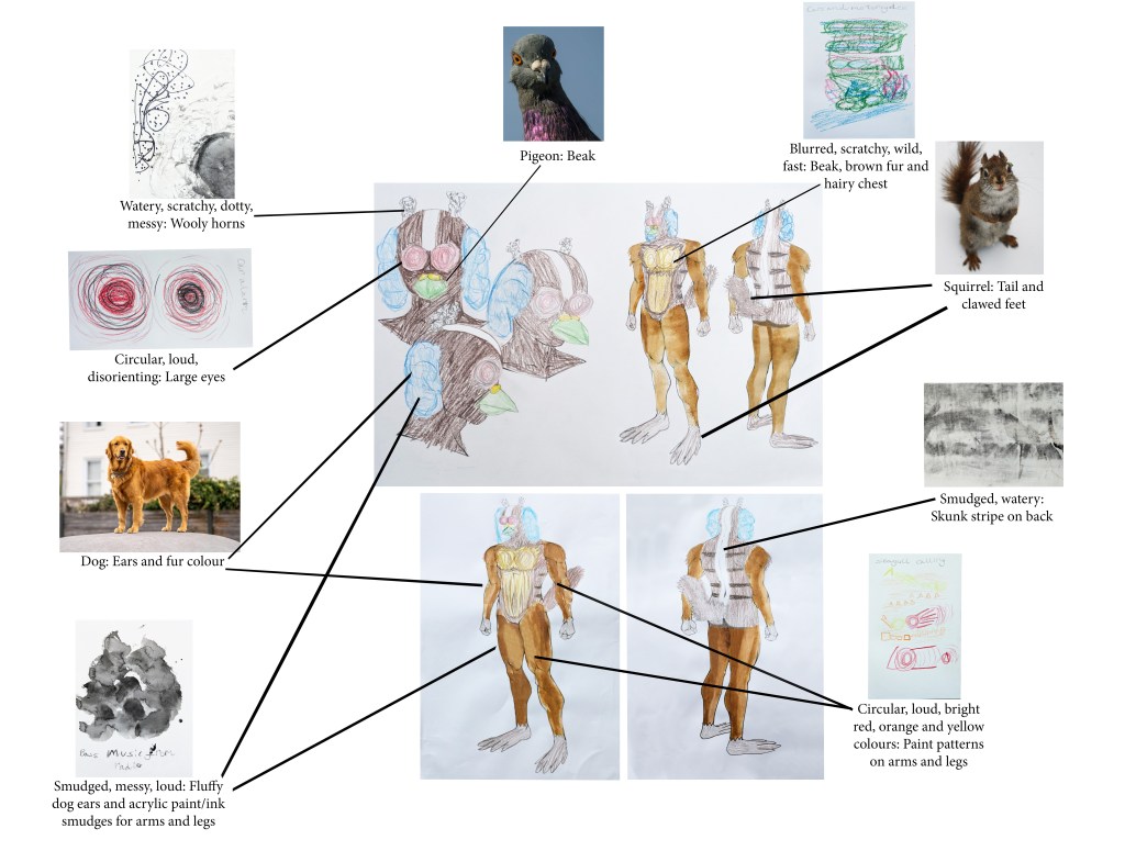
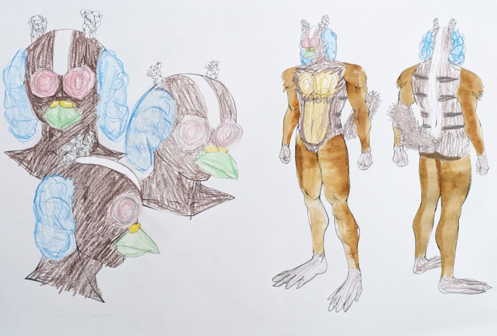
To identify the materials that Gonzalez used in Ice Merchants, I experimented with monoprints (with different results). One of my strengths was that I used Photoshop to digitally edit, manipulate and combine monoprints and hand-made concertina marks and play around with colours. Another was learning from mistakes since I made a new monoprint of the Kent Fire and Rescue Service after I left an older one in the sun. Next, I made a moodboard of animal images, using them and my visualised sound and mark making textures to create a concept character, the Squirgeon. The concept of combining human and animal features in the character design was influenced by Bibo Bergeson’s storyboards for A Monster in Paris. Harold Michelson’s storyboards for The Birds included thick arrows to indicate direction, close-up and point-of-view shots, and different tones of grey, black and white.[171][172][173][174] Bergeson’s boards had lots of lines to show movement.[175] Taking inspiration from the two artists, I initially did a rough storyboard in pencil on paper, with action lines to keep the same energy as Bergeson, then did another, larger, refined one in HB pencil (for tones and shadows) and 2B pencil (to make the outlines stand out) on white cartridge paper. These processes showed some of my other strengths, such as using my imagination and developing my storytelling skills. Prior to doing the storyboards, I also researched Saul and Elaine Bass,[176][177][178] Sam Hudecki and Darryl Henley,[179][180] Butch Hartman,[181][182][183][184] and Hayao Miyazaki.[185][186][187][188][189][190]
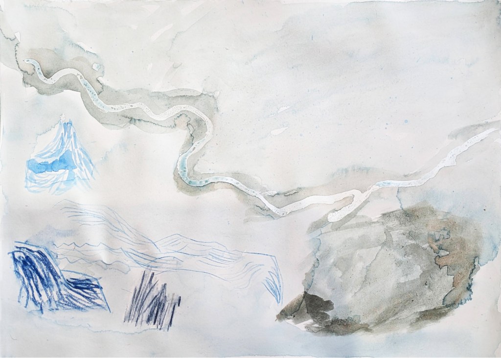
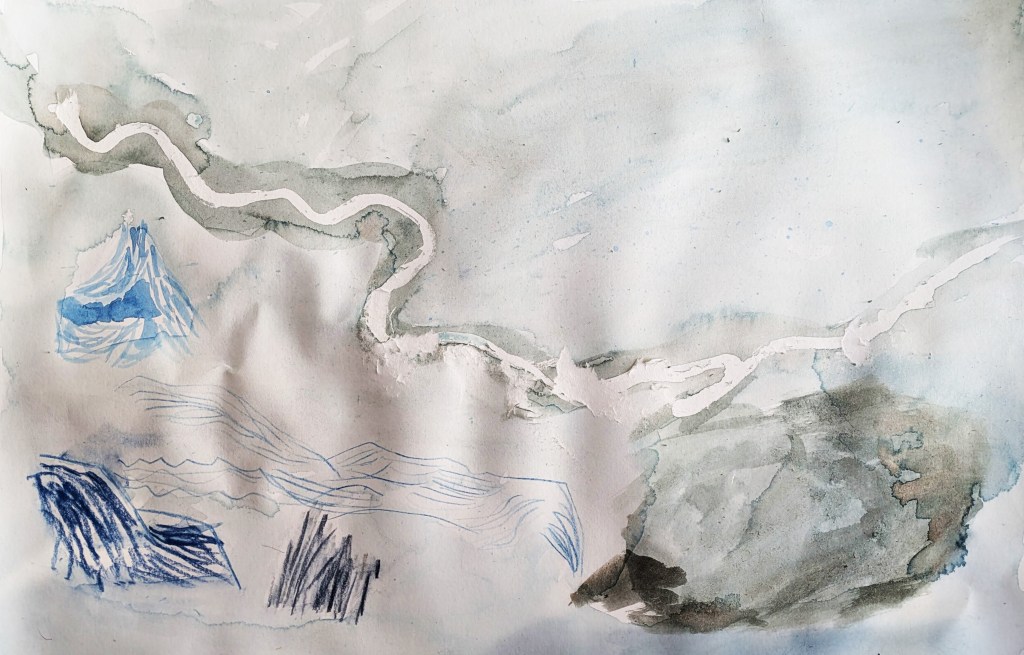
My first water-based lino ink monoprint inspired by Ice Merchants.
My first water-based lino ink monoprint inspired by Ice Merchants (with torn areas).
My second water-based lino ink monoprint inspired by Ice Merchants (back view).
My second water-based lino ink monoprint inspired by Ice Merchants (front view).
My hand-made, edited concertina mark making drawing.
My concertina mark making edit of Turner Contemporary.
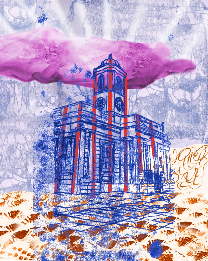
My digital 2-point perspective monoprint of the Droit House.
My water-based ink monoprint of the Kent Fire and Rescue Service.
Development drawing for the Squirgeon. Character template © MatticArts.
Concept art for the Squirgeon. Character template © MatticArts.
Concept character test design for the Squirgeon. Character template © MatticArts.
Refined Squirgeon storyboard.

Near the end of my Urban Sounds project, I produced an animation using Adobe After Effects to submit to Young Creatives x RNLI to be put on display at the Turner Contemporary.[191] When I think of force, I think of strength and nature. My work brings together the physical movement and strength of nature and the sea, as well as that of the RNLI crew. The seaside of Deal inspired my mark making sketches based on the waves’ motions and sounds. This animation was inspired by the RNLI flag; I thought about how I could bring these elements together to illustrate the idea of force. By layering the mark making, I created the rhythm of the waves, and used different shades of blue for a textured background to communicate the force of the sea. In physics, arrows are associated with the movement and magnitude of force. The RNLI flag was adapted using arrows to reinforce the idea of motion. Shapes in nature gave me inspiration to add moving shapes, which I animated in different directions. To give the shapes weight, I added naturalistic textures (fire, sun, water, earth and sky, which are forces on their own). “Waves Breaking on a Lee Shore at Margate” by JMW Turner influenced my watercolour painting of the sky and sea, which was used for one of my shapes. Finally, I added a drop sound effect to the movement of the shapes, and added wave sounds in the background. This all reinforces the power of the sea, and the strength and impact of the RNLI crew in our community.
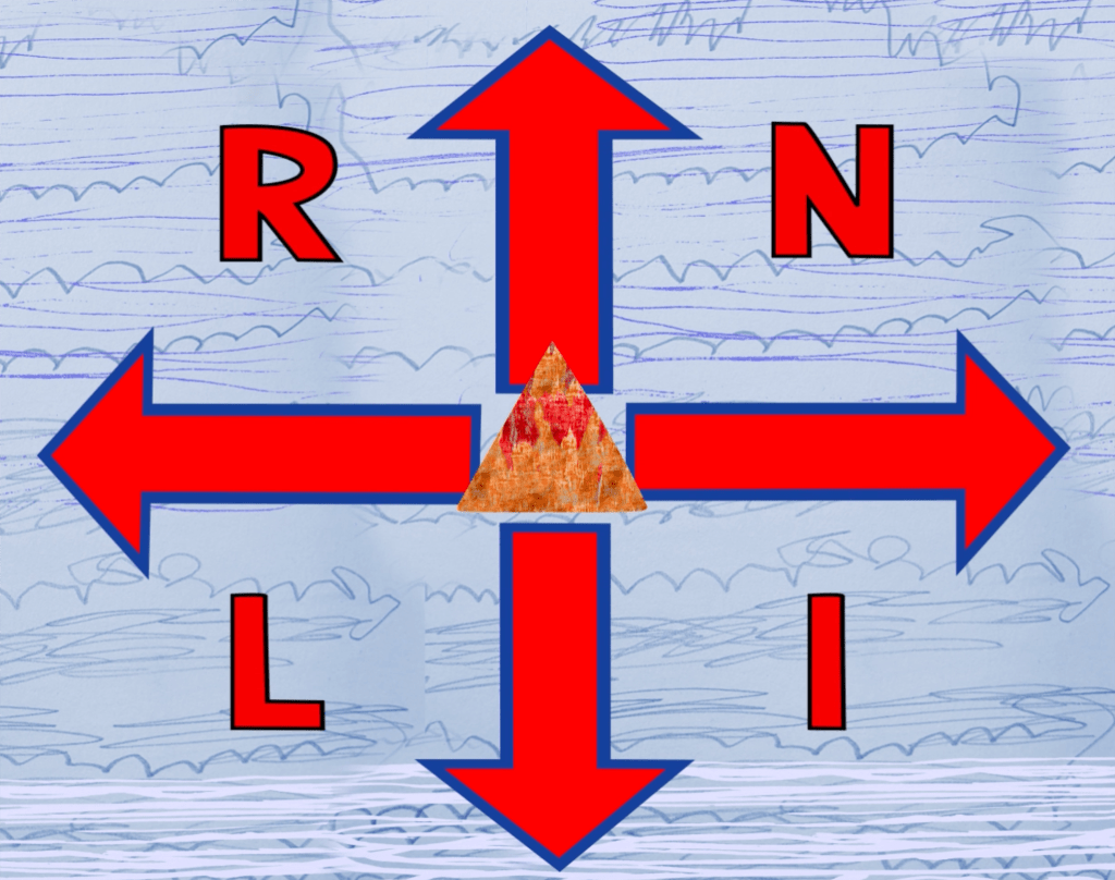
My Young Creatives x RNLI animation. Image © Oliver Mariager.

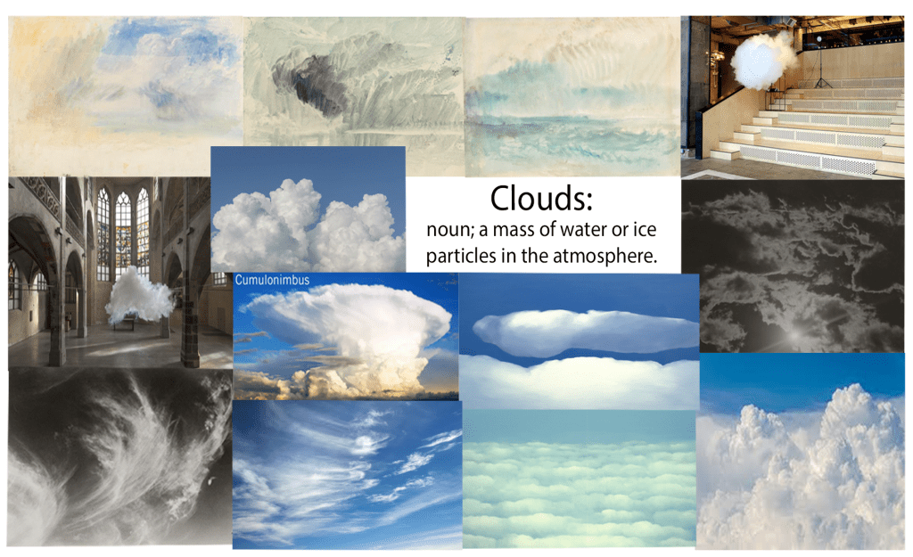
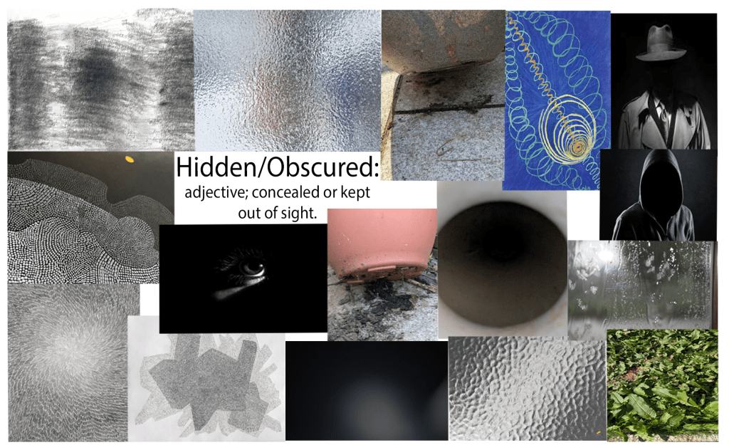
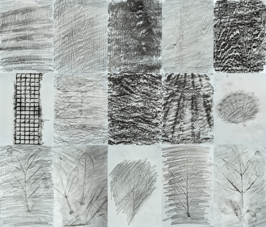
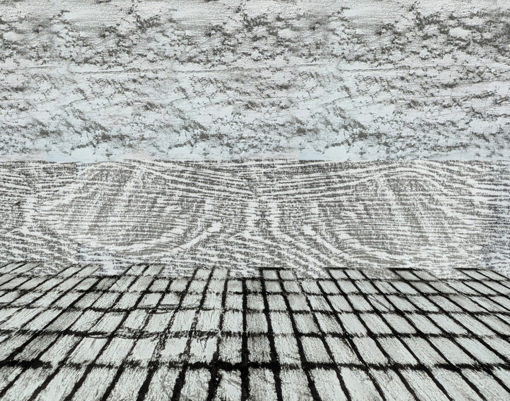
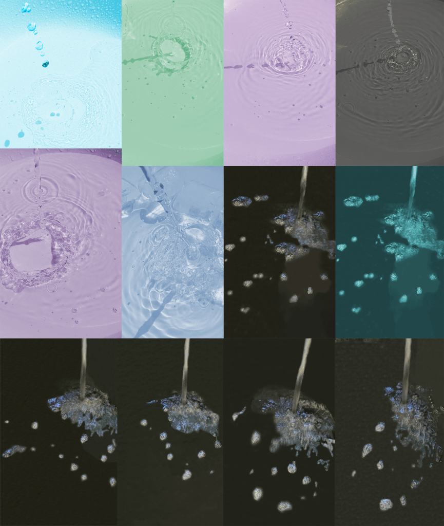
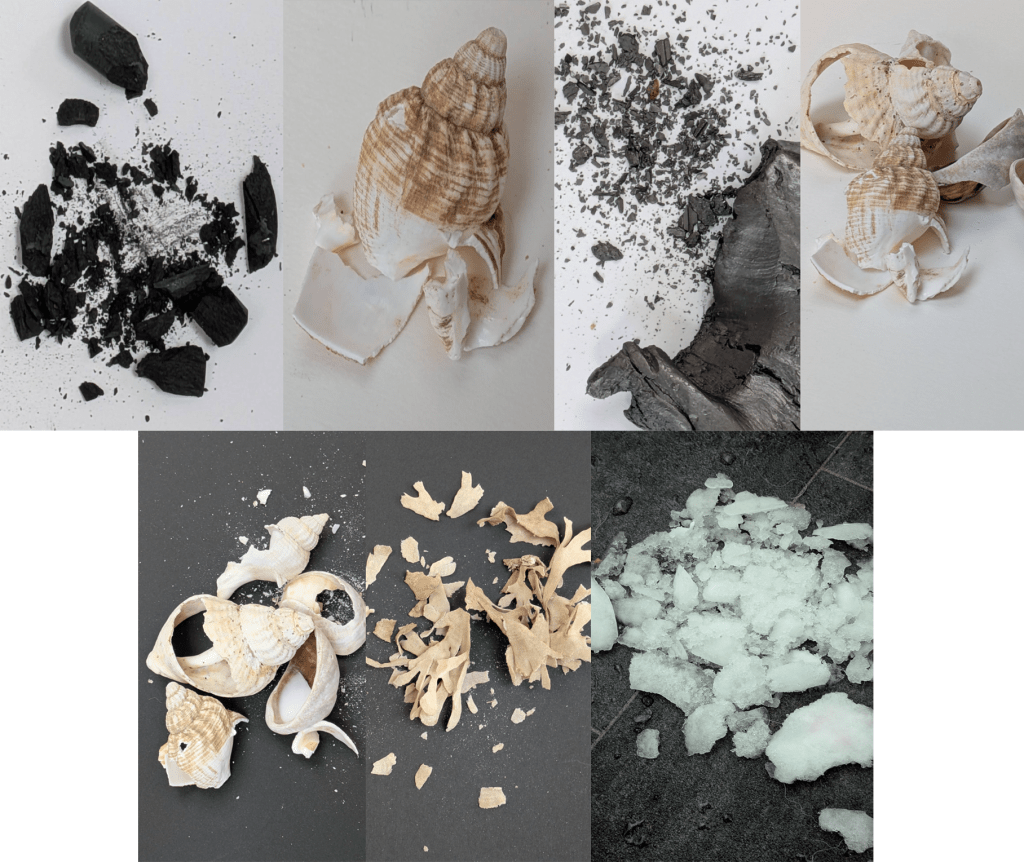
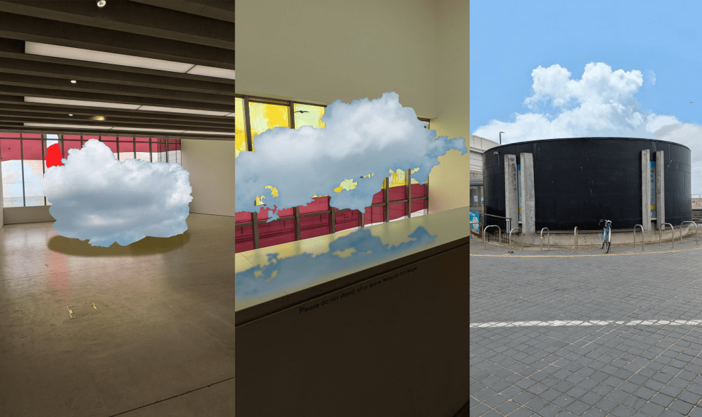
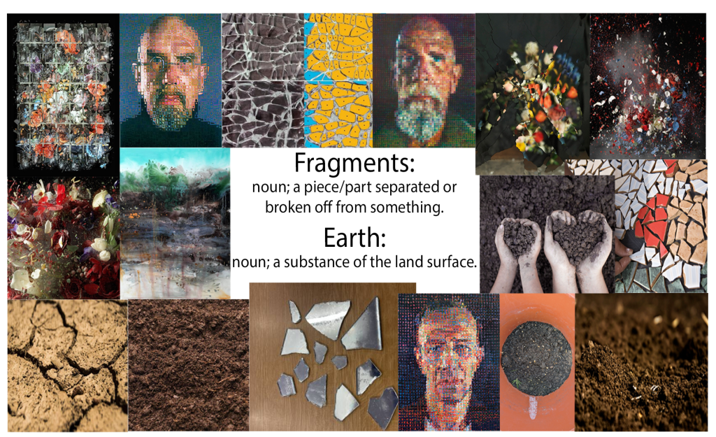
After my Urban Sounds project was the Textures and Layers project. I selected five words (water/ice, fragments/earth, decay/vegetation, clouds, hidden/obscured) to construct my moodboards, using different images and paintings by artists like Hayao Miyazaki, David Hockney (whom my mother thought was a young adult, when he was actually 87 years old), Ori Gersht and Berndnaut Smilde. Then I researched Max Ernst[192][193][194][195][196] and Jane Dixon,[197][198][199][200][201][202][203][204][205][206][207][208] which is where I learned about the technique of frottage (pioneered by Ernst).[192] I noted the similarities and differences between the two frottage artists in terms of colour and composition, then made frottages using 6B graphite stick (1-2, 7, 10-11, 13-14), charcoal (3), graphite putty (4, 12, 15), and black oil pastel (5-6, 8-9) on surfaces and materials indoors and outside in the garden, including wooden tables (1-5), ceramic tiles (6), brick walls (7), paved ground (8), parasol bases (9), shells (10) and leaves (11-15). I also made two frottages in Photoshop, one being a plant forest inspired by Ernst’s fantasy landscapes, and the other being the sea and docks, influenced by Dixon. Next, I took a look at Susan Derges,[209][210][211][212][213][214] Ori Gersht[215][6] and Berndnaut Smilde.[216][217][218][219][220][221][222][223] The artists’ processes (Derges using natural elements and photographic paper to make photographs without a camera, Gersht capturing destruction of man-made objects and natural forms in real time, and Smilde using contrast of natural form and urban settings to create fantastical elements) inspired me to make two contact sheets of photographs of water, fragments and clouds in Photoshop, where I changed the hues and removed any distracting elements. The interiors in some of my cloud photographs were taken at the Turner Contemporary.
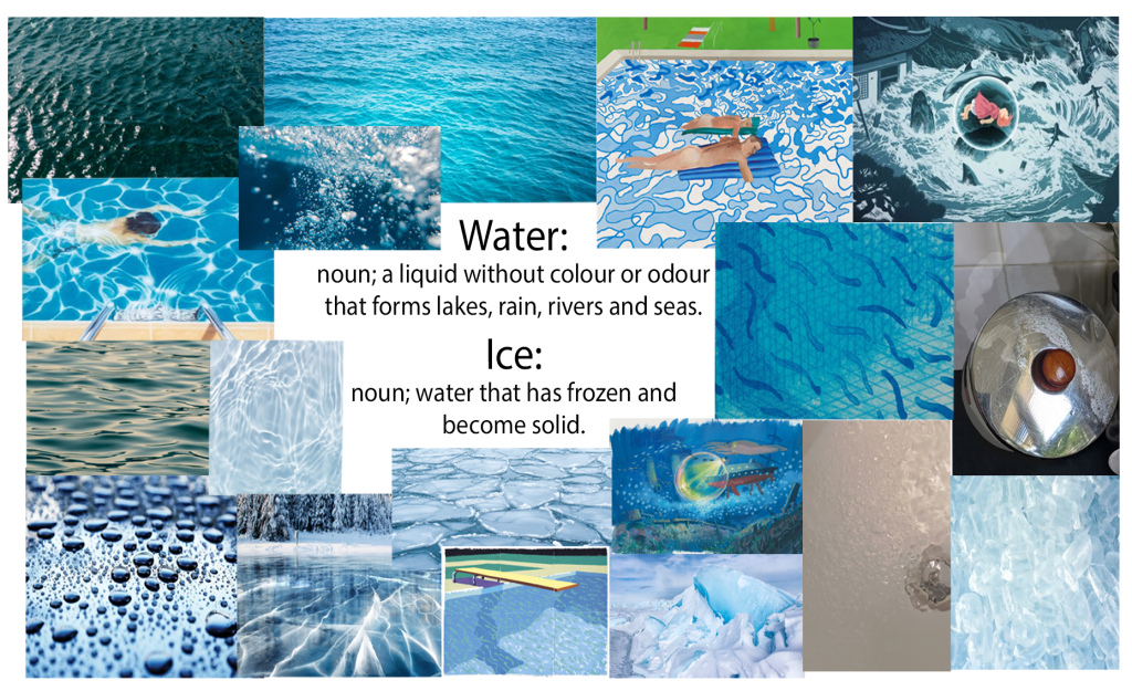
My water/ice moodboard. Images © Olena Malik/Britannica/Studio Ghibli/Hayao Miyazaki/David Hockney/Unsplash/Geoffrey Baumbach/Eos.org/Golfcuk/NaokiKim/4maksym/Myron Standret/Weizmann Compass/Tapio Haaja.
My fragments/earth moodboard. Images © Ori Gersht/Chuck Close/Supmanee Chai/Glass on Web/CC0 Public Domain/Quicksilver/GankaTt/Elizabeth Hagan/Sasiistock.
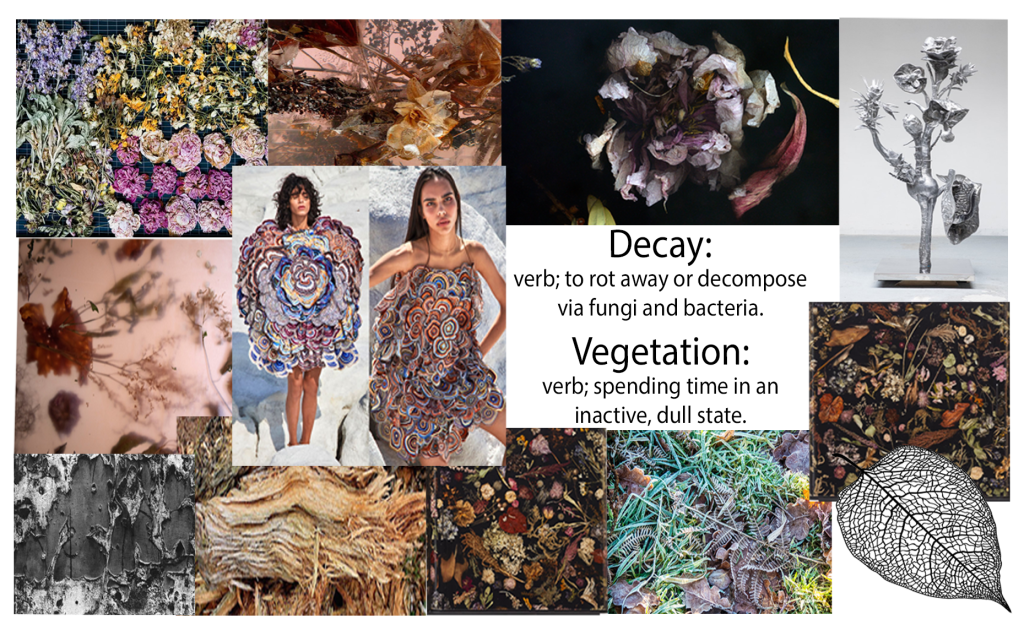
My decay/vegetation moodboard. Images © Marcin Rusak/Aaron Siskind/Nick Grossman/Rahul Mishra/Trees for Life/ScreenEasy.
My clouds moodboard. Images © Berndnaut Smilde/J.M.W. Turner/Engin Akyurt/Karen Gunderson/STM Weather/Alfred Stieglitz/Lamax/Florida Museum.
My hidden/obscured moodboard. Images © Sam Winston/Hlib Shabashnyi/Joe Contrera/Hilma af Klint/Bryan Watkins and Son Limited/Ayaan Chettiar/cyano66/Natsco.
My hand-made frottages.
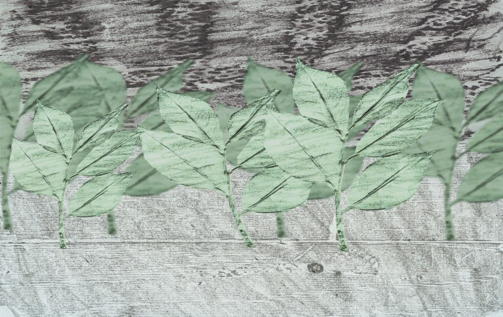
First digital frottage idea.
Second digital frottage idea.
Selected and edited water/ice photographs from my contact sheet.
Selected and edited fragments photographs from my contact sheet.
Selected and edited cloud photographs from my contact sheet (taken at Turner Contemporary and outside the Droit House).

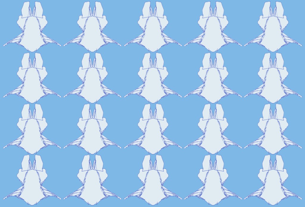
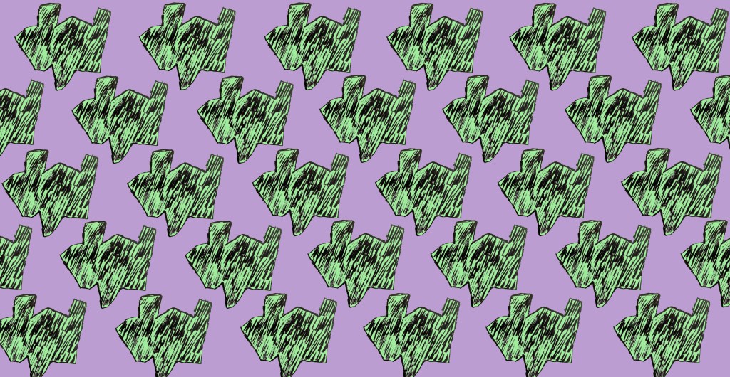
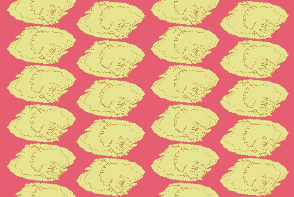
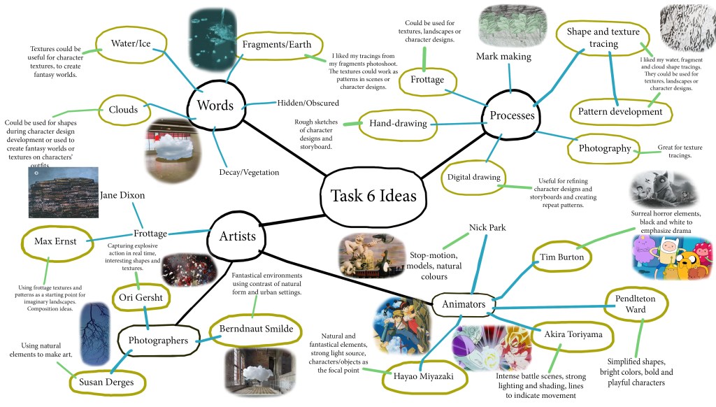
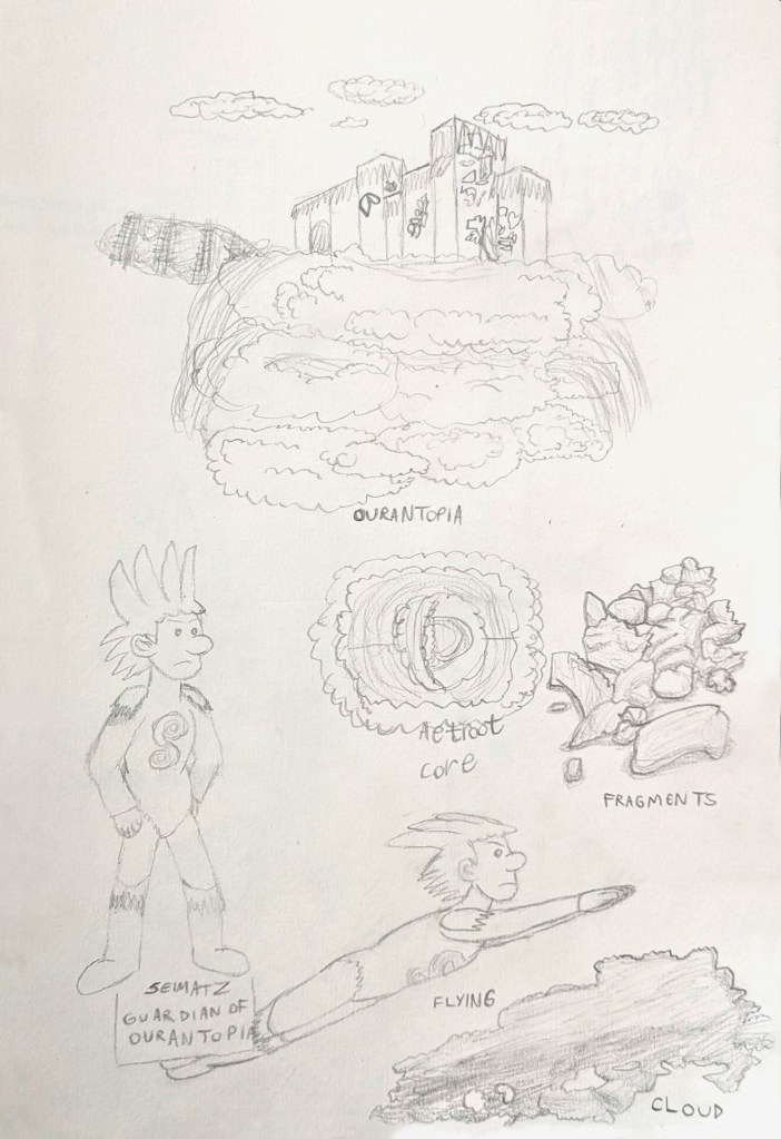
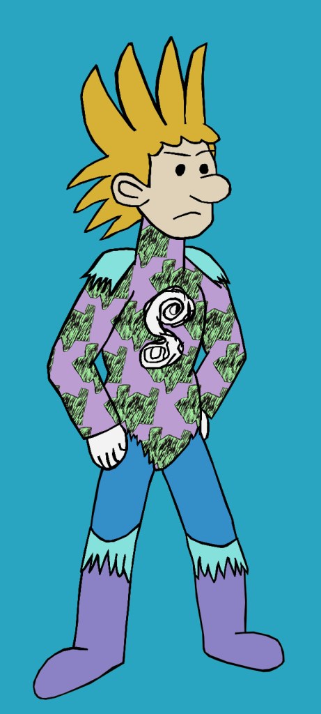
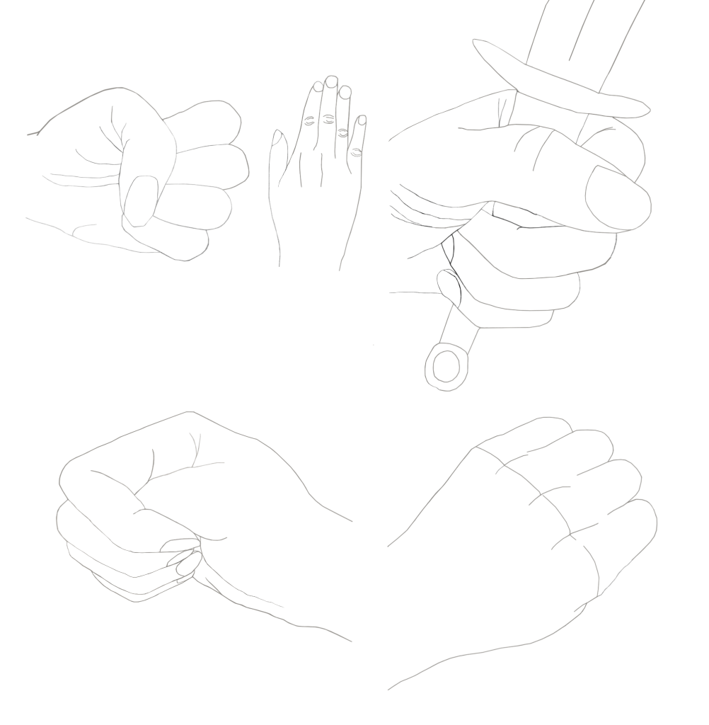
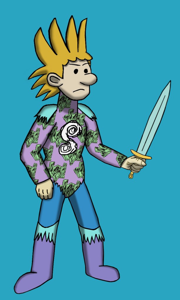
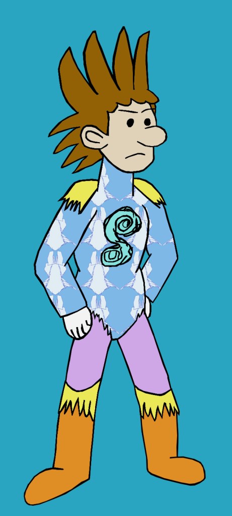
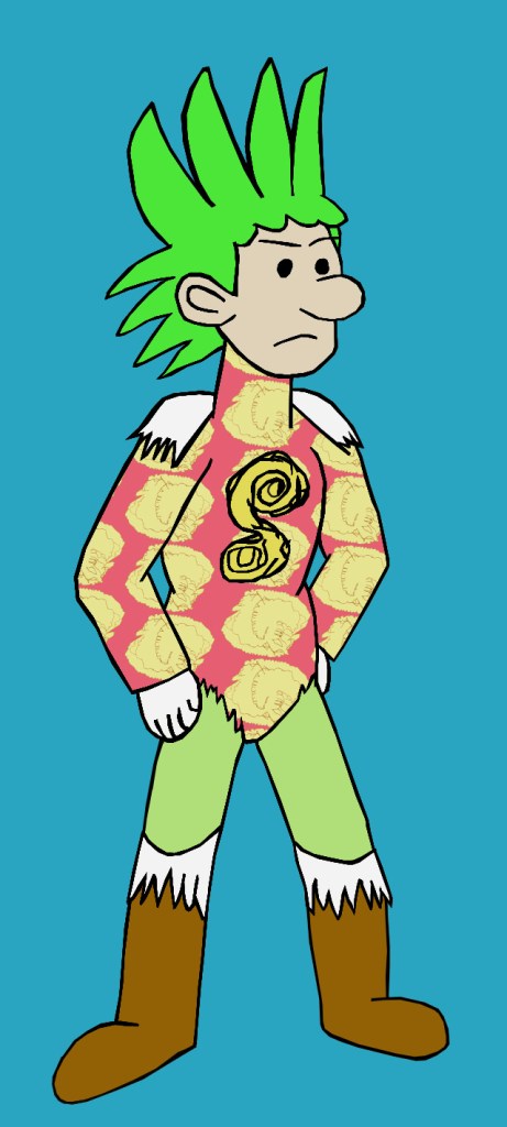
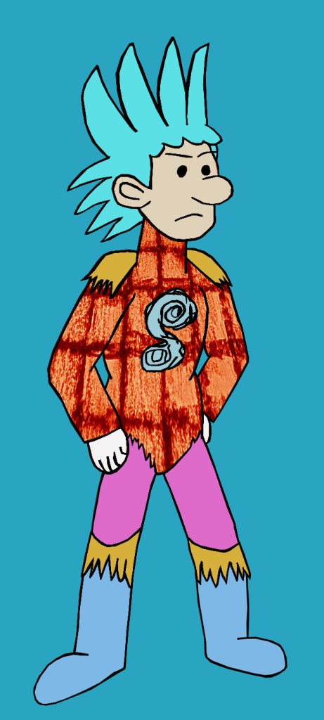
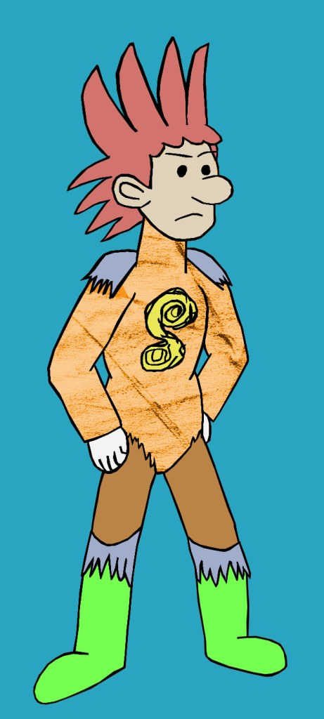
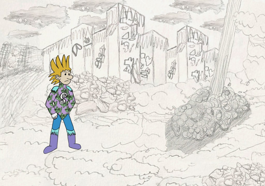
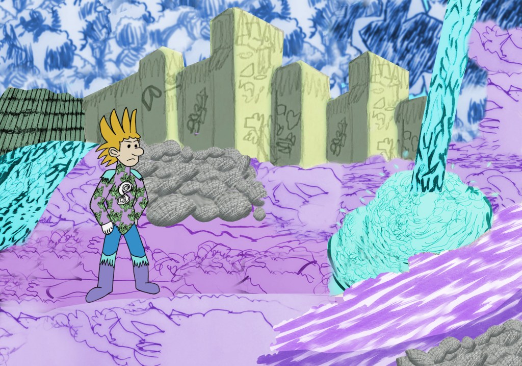
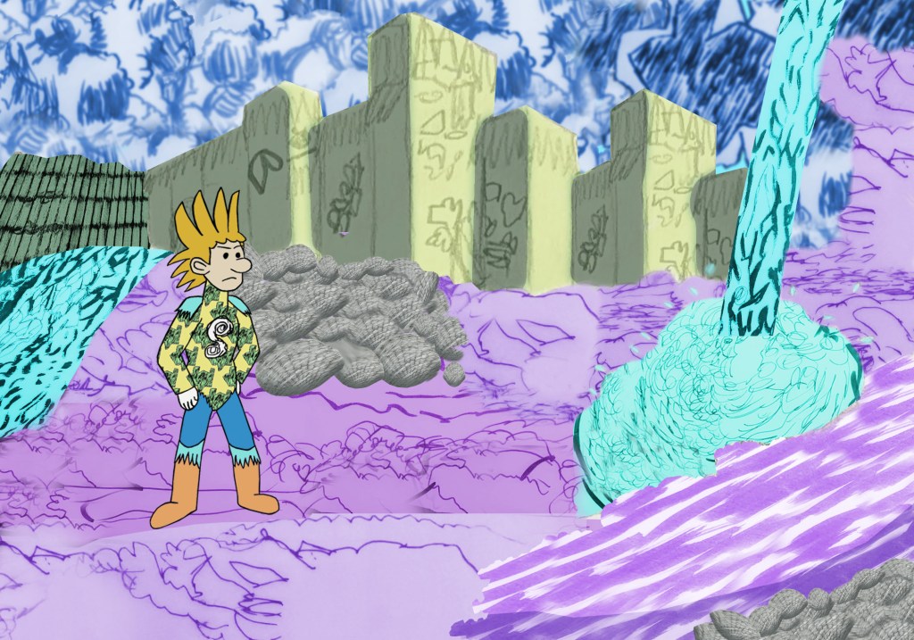
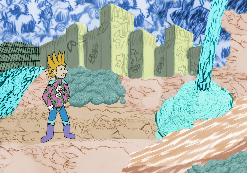
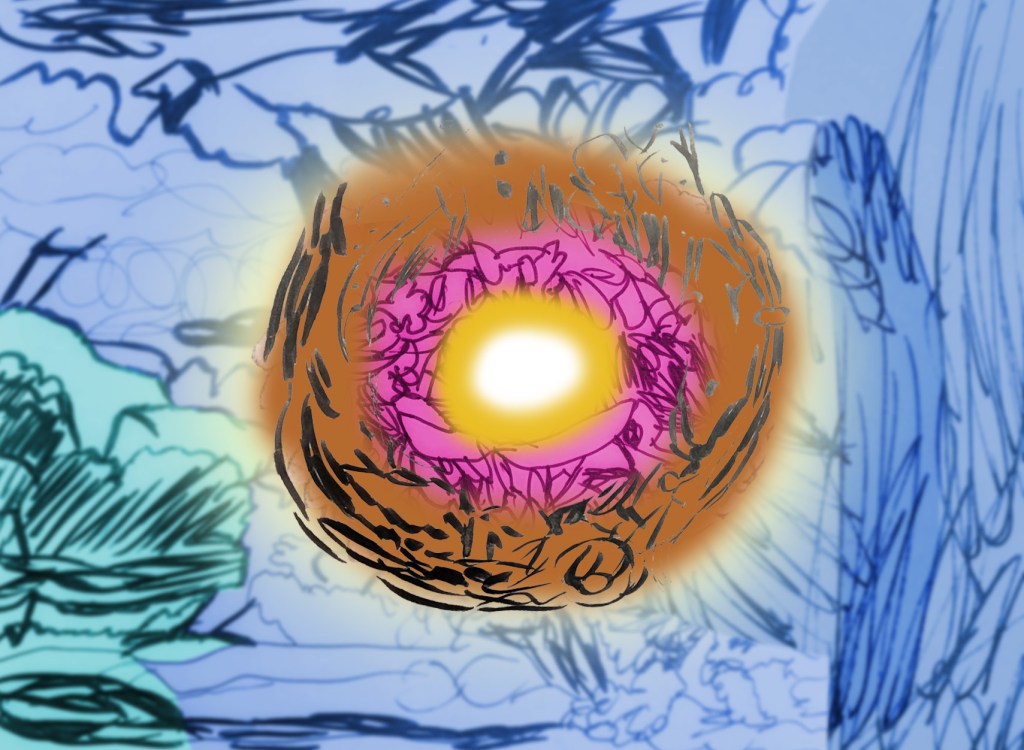
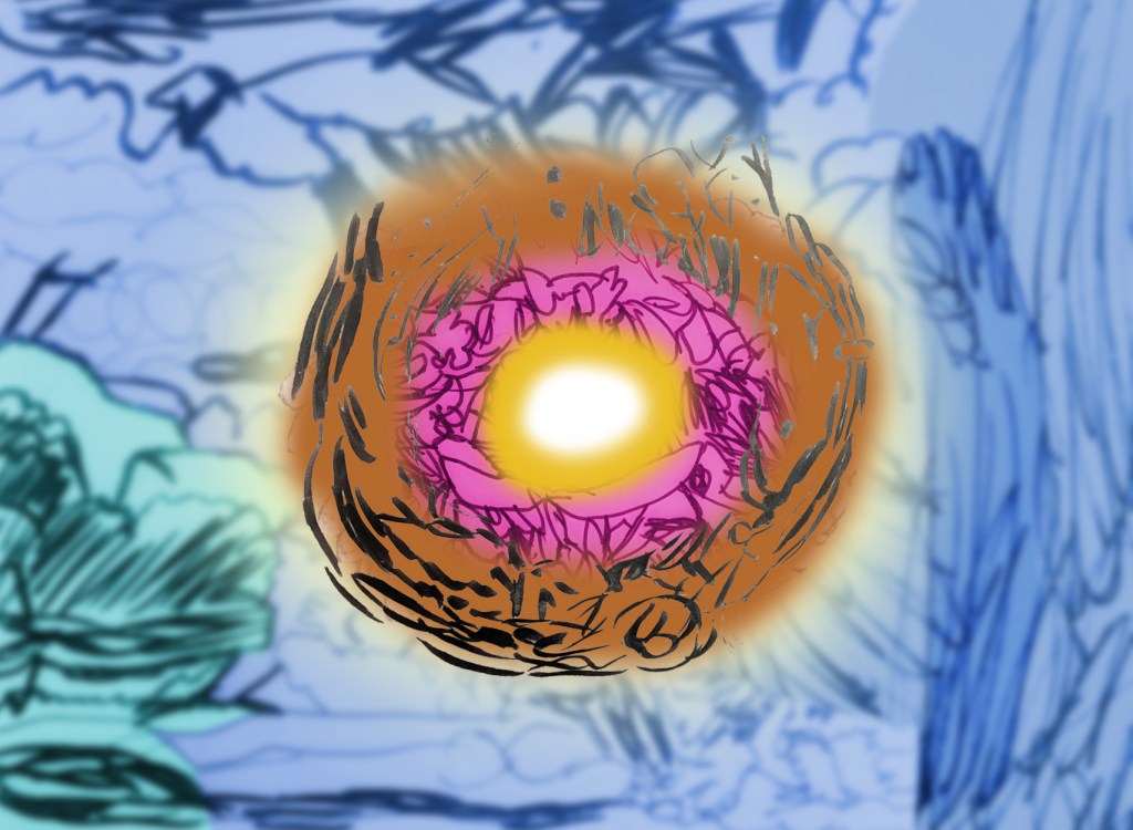
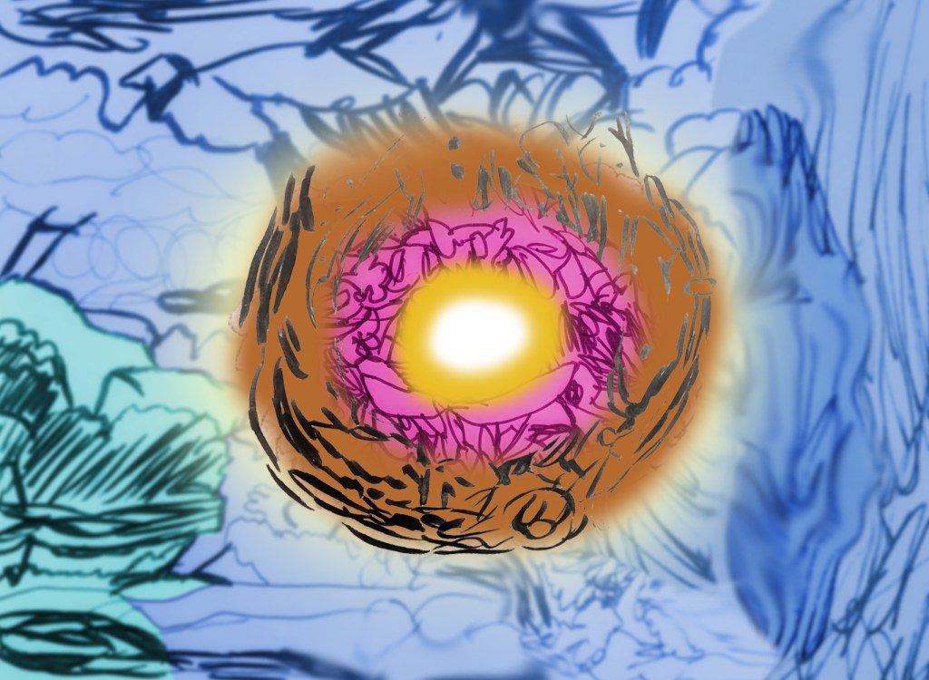
Next, I learned about tracing shapes and adding/creating repeat patterns. I printed some of my photographs and images from my clouds and hidden/obscured moodboards, and used the tracing and repeating processes to capture their form and textures, making them feel a little dramatic and have a sense of movement. I then researched Tim Burton,[224][225][226][227][228][229] Hayao Miyazaki,[230][231][232][233][234] Akira Toriyama,[235][236][237][238][239] Pendleton Ward[240][241][242][243][244][245][246][247][248][249] and Nick Park,[250][251][252][253][254][255][256] and drew a mind map referring to my previous work for the project. This work served as early ideas for my character designs and landscape designs (influenced by Miyazaki, Ward and Toriyama), including my character Seimatz and the world Ourantopia. During this process, I played around with the colour palettes to see which one worked in the sense of the character and landscape standing out from each other, and created textures from my frottages and shape tracings to use for the landscapes. After that, I made concept art of Ourantopia’s core Aertroot. The process involved combining the shape tracings and frottages, changing them to different shades of blue, turquoise (background), brown and yellow (core), adding a yellow light behind the core to make it stand out, and slightly blurring the background and smudged some of the edges to give it a soft, fluffy texture similar to a cloud. Finally, I took photographs of my own hands, and used them as reference for my character’s hands, therefore developing my hand-drawing skills. Shading was added to give him a more three-dimensional look.
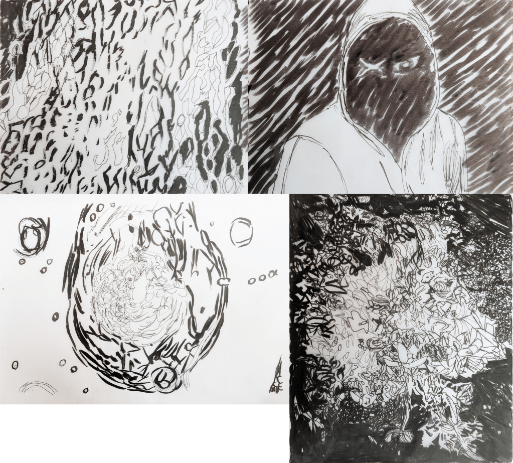
Shape tracings 1-4.
Shape tracings 5-8.
Shape tracings 9-11.
First tracing pattern (taken from shape tracing 9).
Second tracing pattern (taken from shape tracing 4).
Third tracing pattern (taken from shape tracing 1).
Mind map for my early ideas for character and landscape designs. Images © Jane Dixon/Ori Gersht/Susan Derges/Berndnaut Smilde/Aardman/Studio Ghibli/Bird Studio/Toyotarou/Shueisha/Toei Animation/The Walt Disney Company/Cartoon Network.
Concept art of Seimatz and Ourantopia.
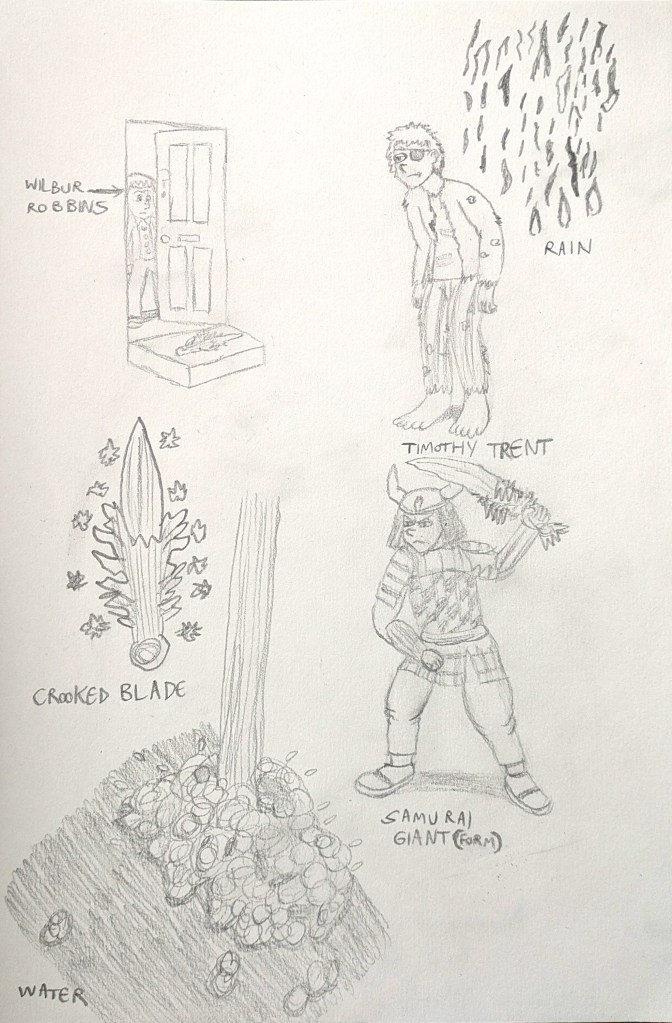
Concept art of Wilbur Robbins, the crooked blade, Timothy Trent and his samurai giant form.
My first Seimatz design.
Traced hands taken from a photograph shoot of my own hands.
My first Seimatz design with a sword and shading.
My second Seimatz design (alternative final outcome).
My third Seimatz design (alternative final outcome).
My fourth Seimatz design (alternative final outcome).
My fifth Seimatz design (alternative final outcome).
My first Ourantopia concept art and hue/saturation experiment (alternative final outcome).
My second Ourantopia concept art and hue/saturation experiment (alternative final outcome).
My third Ourantopia concept art and hue/saturation experiment (alternative final outcome).
My fourth Ourantopia concept art and hue/saturation experiment.
My first Aetroot concept art and blur/smudge experiment (alternative final outcome).
My second Aetroot concept art and blur/smudge experiment (alternative final outcome).
My third Aetroot concept art and blur/smudge experiment.

In September 2025, I decided to research artists and their sketchbooks. Artists draw concepts and ideas in sketchbooks to practice their skills and develop them over time. Thus, the sketchbook is the starting point for an artist’s career.[257] The artists that I researched included Leonardo da Vinci,[257] J.M.W. Turner,[258][259] Grayson Perry,[260][261][262] David Hockney[263][264][265] [257] and Mark Powell.[266][267] Following the research, I was inspired by Leonardo, Perry and Hockney to do 51 out of 70 sketches, experimenting with materials such as Graphite HB, 8B Wash, Caran Dache colouring pencils, Global biro, edding 1880 Drawliner 07, GALAXY fineliners, et cetera. What made this project successful for me was that I had a wide range of materials to make as many drawings as I could. The subjects included objects, food, buildings, animals, birds, people, and organic forms.
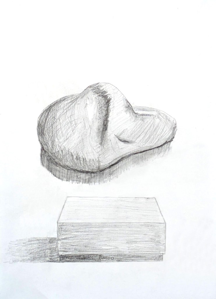
Objects (still life): Pencil sketches 1-2 (rock and MOO box, inspired by Leonardo da Vinci).
Objects (still life): Colouring pencil sketch 3 (plant, inspired by David Hockney).
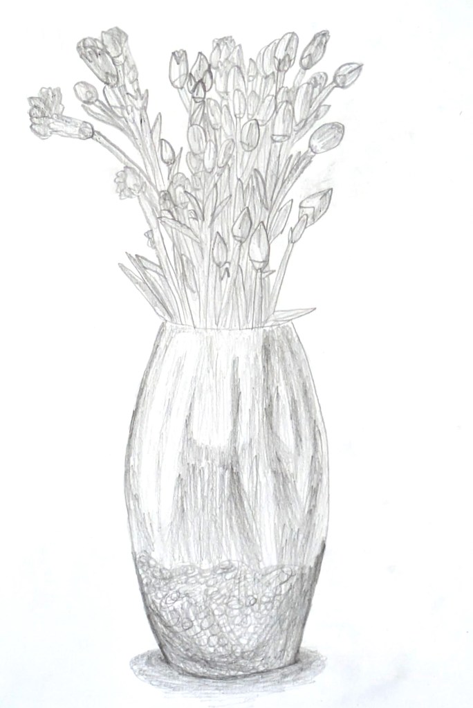
Objects (still life): Pencil sketch 4 (flowers in vase, inspired by Leonardo da Vinci).
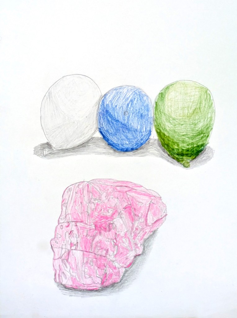
Objects (still life): Watercolour pencil sketches 5-6 (balloons and rose quartz crystal, inspired by David Hockney).
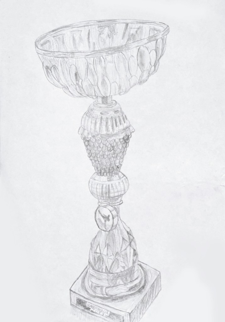
Objects (still life): Pencil sketch 7 (karate trophy won in 2019).
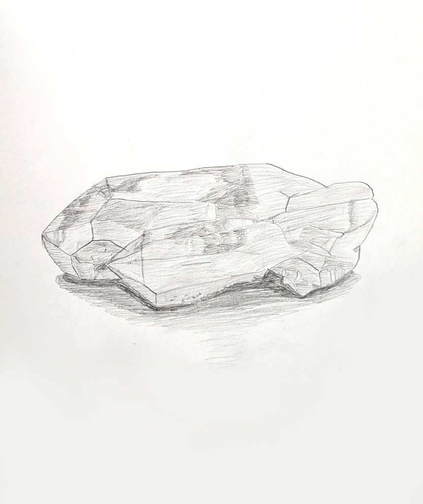
Objects (still life): Pencil sketch 8 (clear quartz crystal).
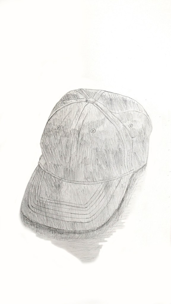
Objects (still life): Pencil sketch 9 (cap).
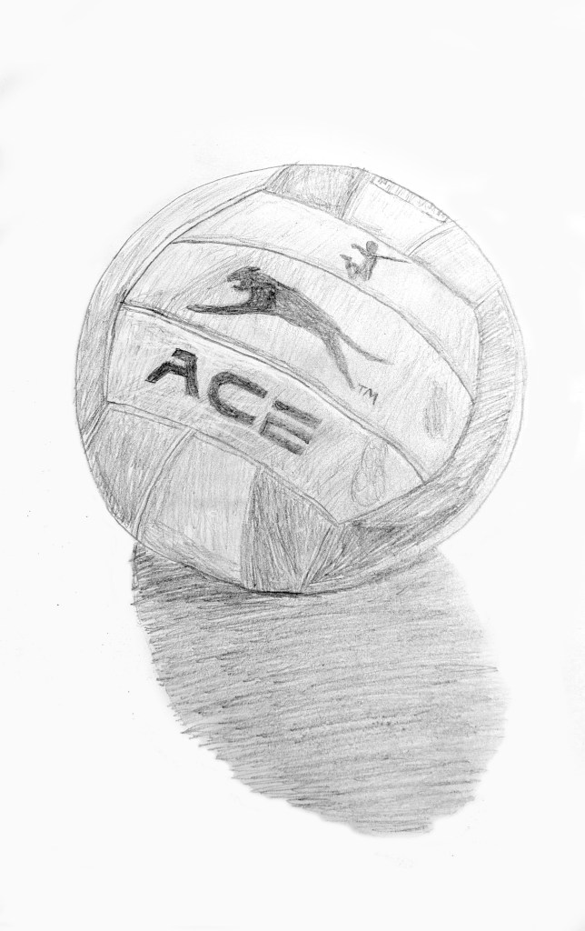
Objects (still life): Pencil sketch 10 (volleyball).
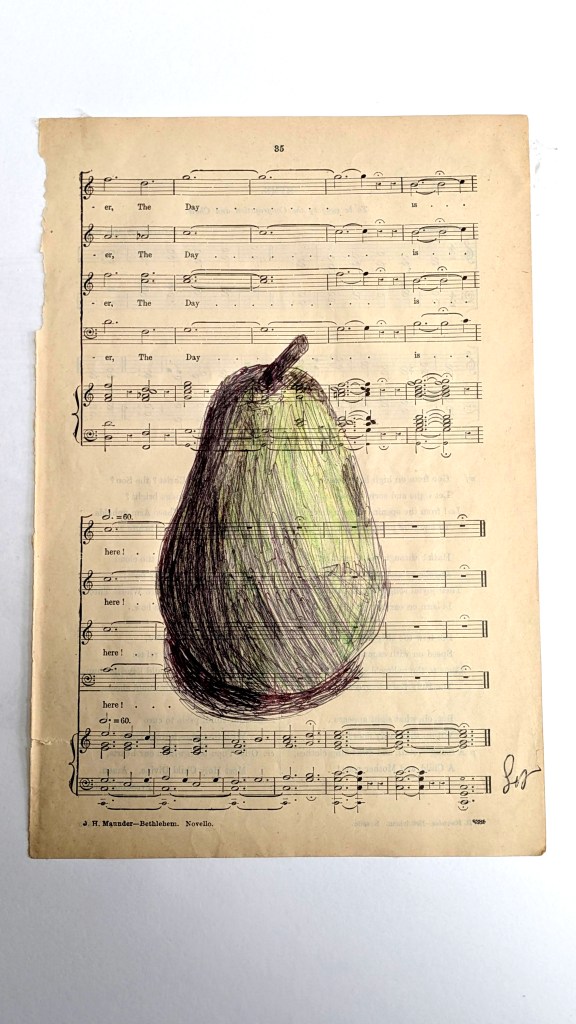
Food: Biro and watercolour pencil sketch 1 (pear, inspired by Mark Powell).
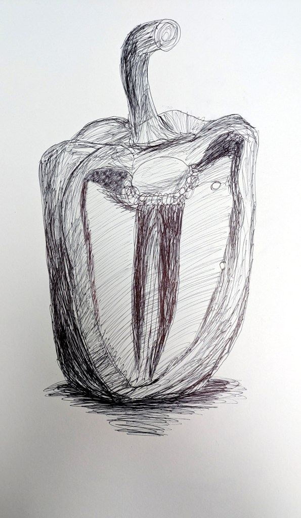
Food: Biro sketch 2 (pepper).
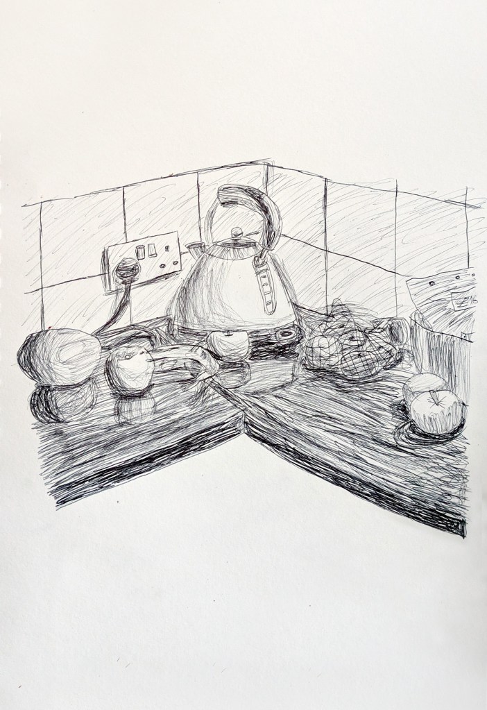
Food: Biro sketch 3 (kitchen fruit, inspired by David Hockney).
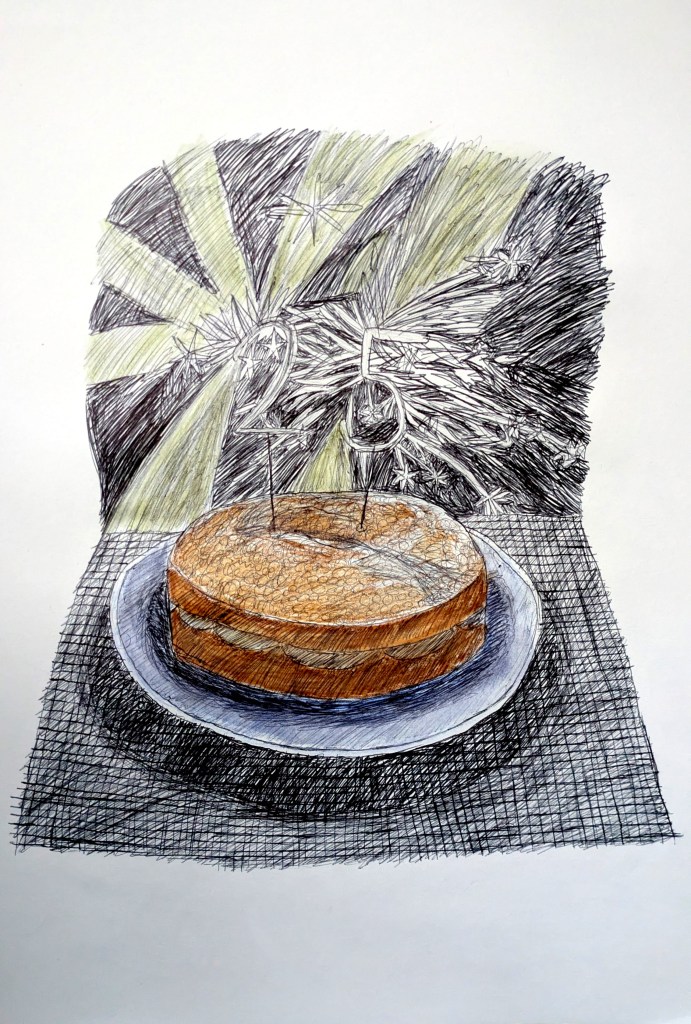
Food: Biro and watercolour pencil sketch 4 (birthday cake, inspired by David Hockney and Grayson Perry).
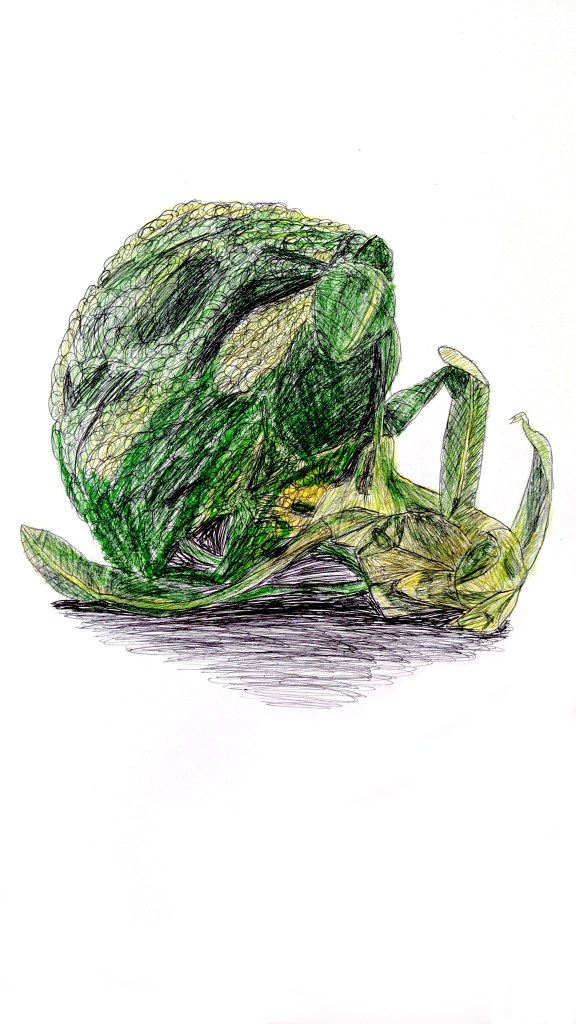
Food: Biro and watercolour pencil sketch 5 (broccoli).
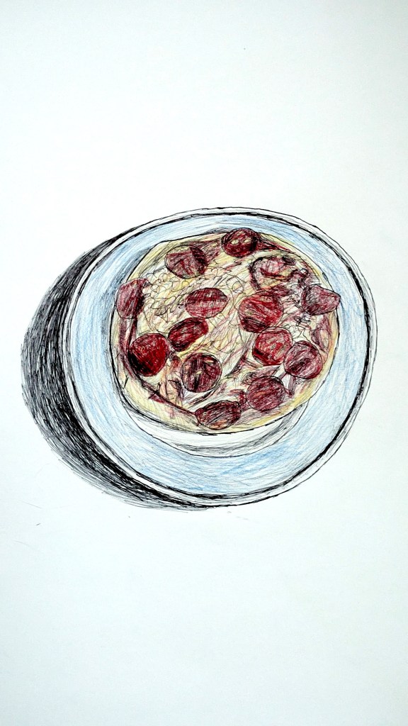
Food: Biro and watercolour pencil sketch 6 (pizza).
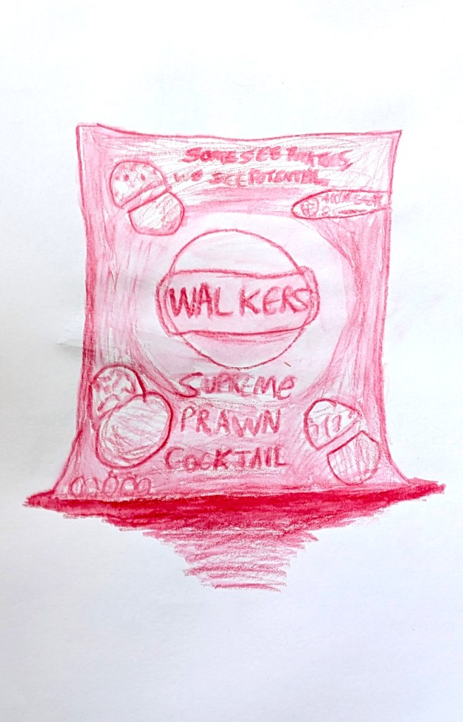
Food: Watercolour pencil sketch 7 (Walkers crisps).
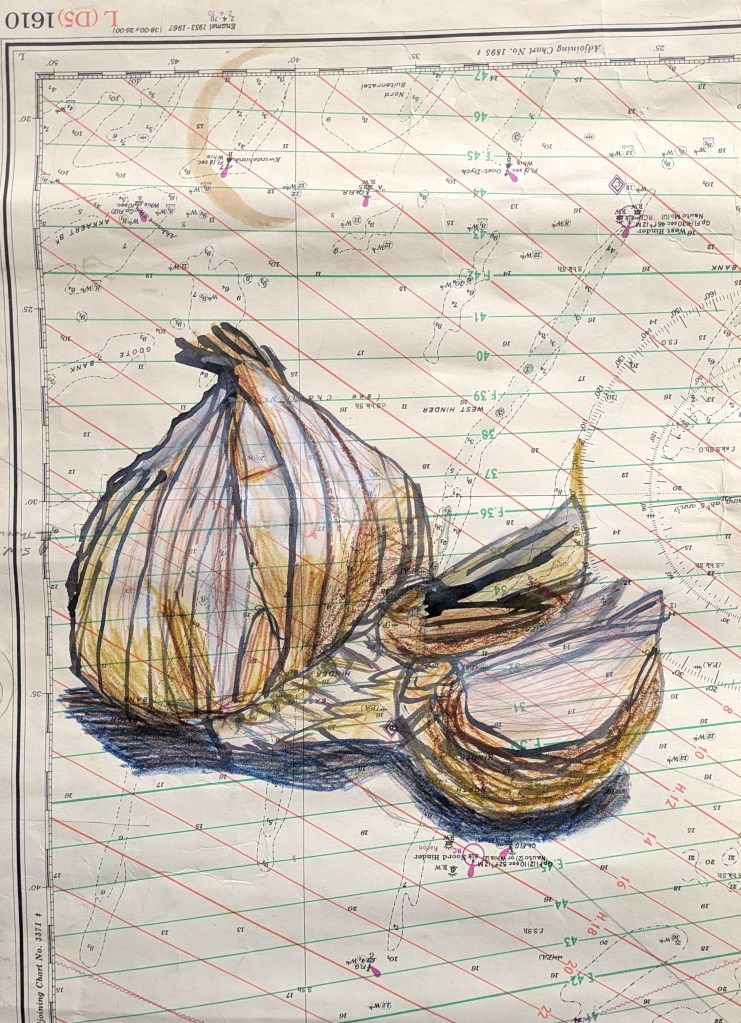
Food: Indian ink sketch 8 (garlic).
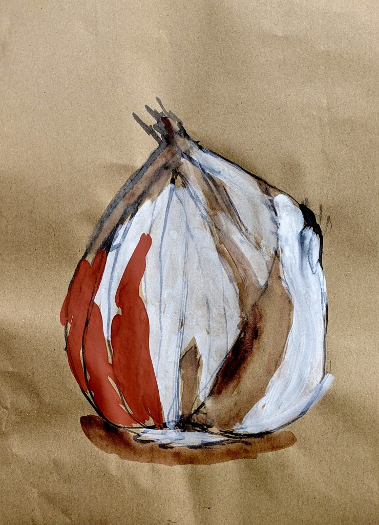
Food: Indian ink and poster/gouache paint sketch 9 (garlic).
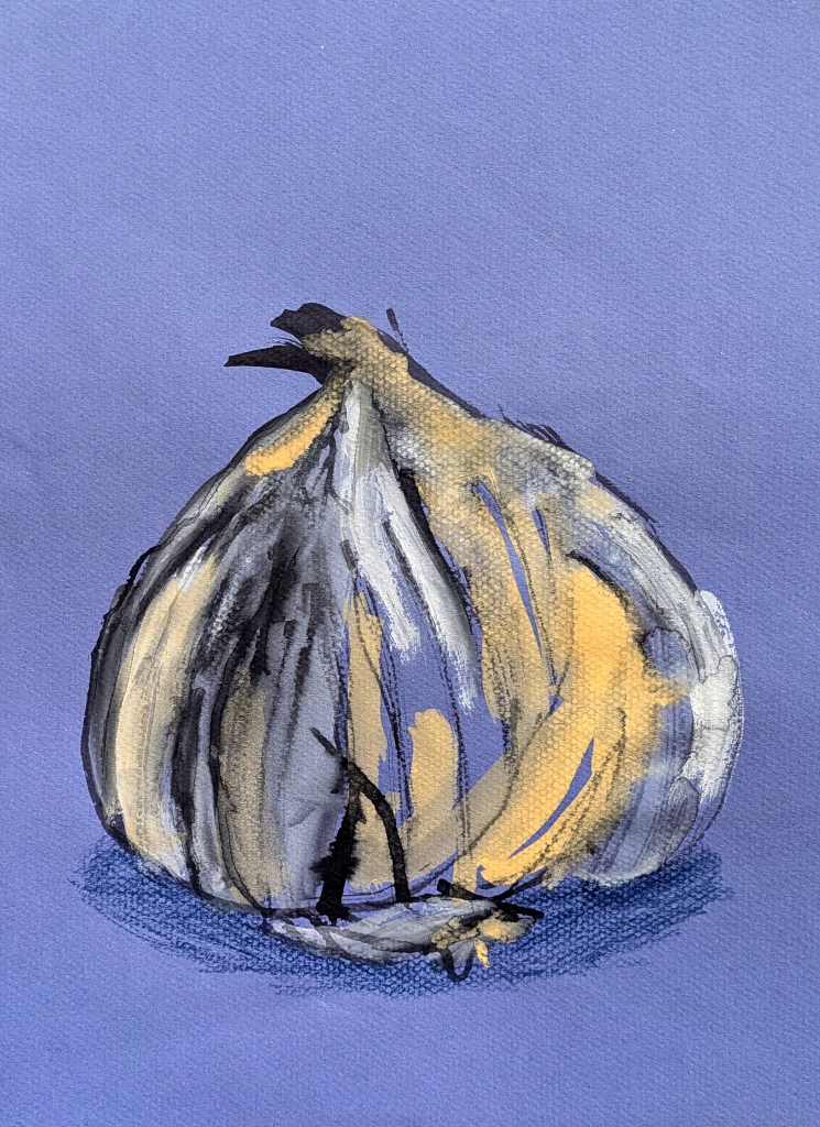
Food: Indian ink, colouring pencil, gouache paint and oil pastel sketch 10 (garlic).
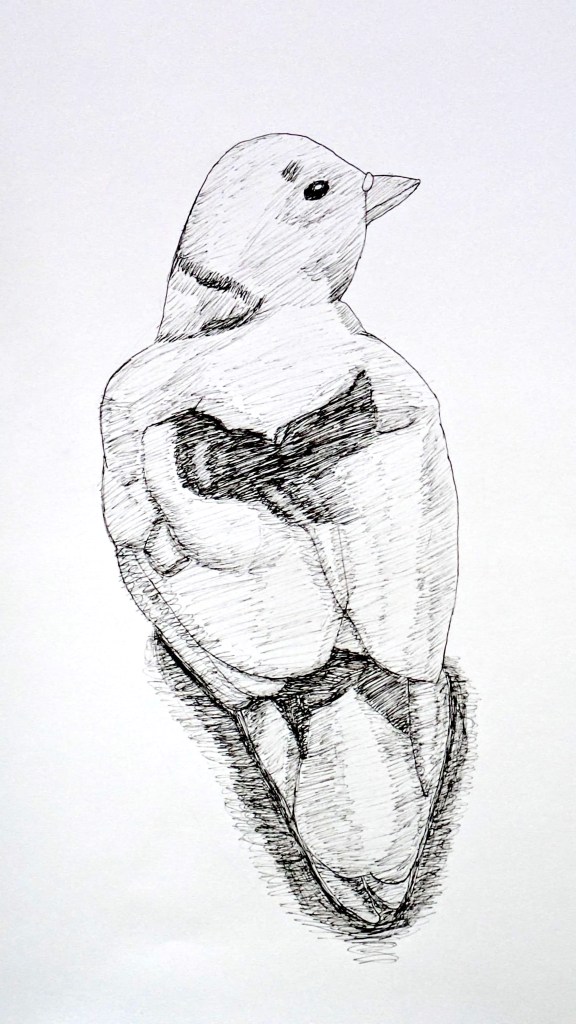
Birds and Animals: Fineliner pen sketch 1 (white pigeon).
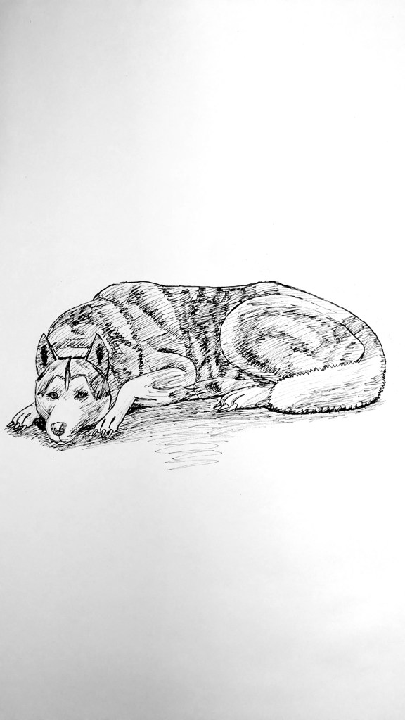
Birds and Animals: Fineliner pen sketch 2 (my dog).
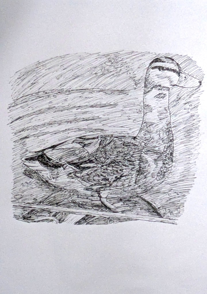
Birds and Animals: Fineliner pen sketch 3 (duck).
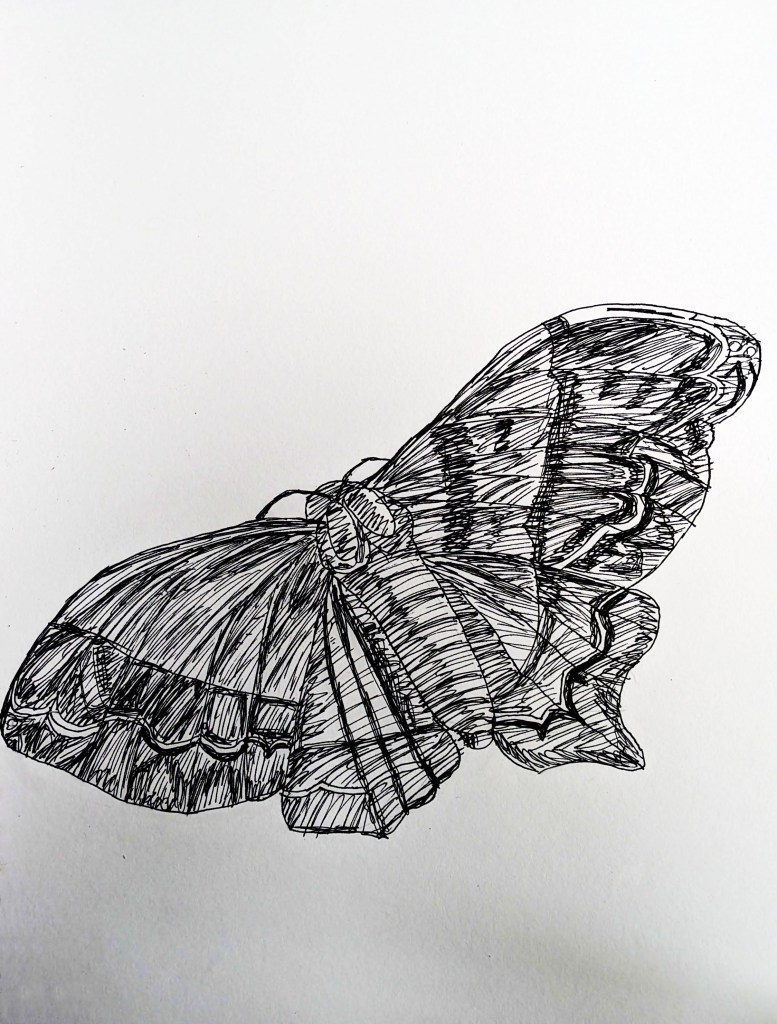
Birds and Animals: Fineliner pen sketch 4 (moth, referenced from the book Art of Nature).
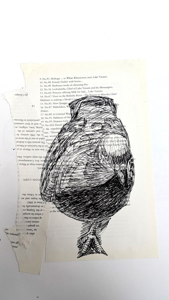
Birds and Animals: Fineliner pen sketch 5 (pigeon, inspired by Mark Powell).
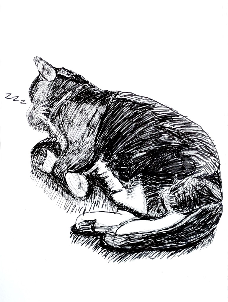
Birds and Animals: Fineliner pen sketch 6 (cat).
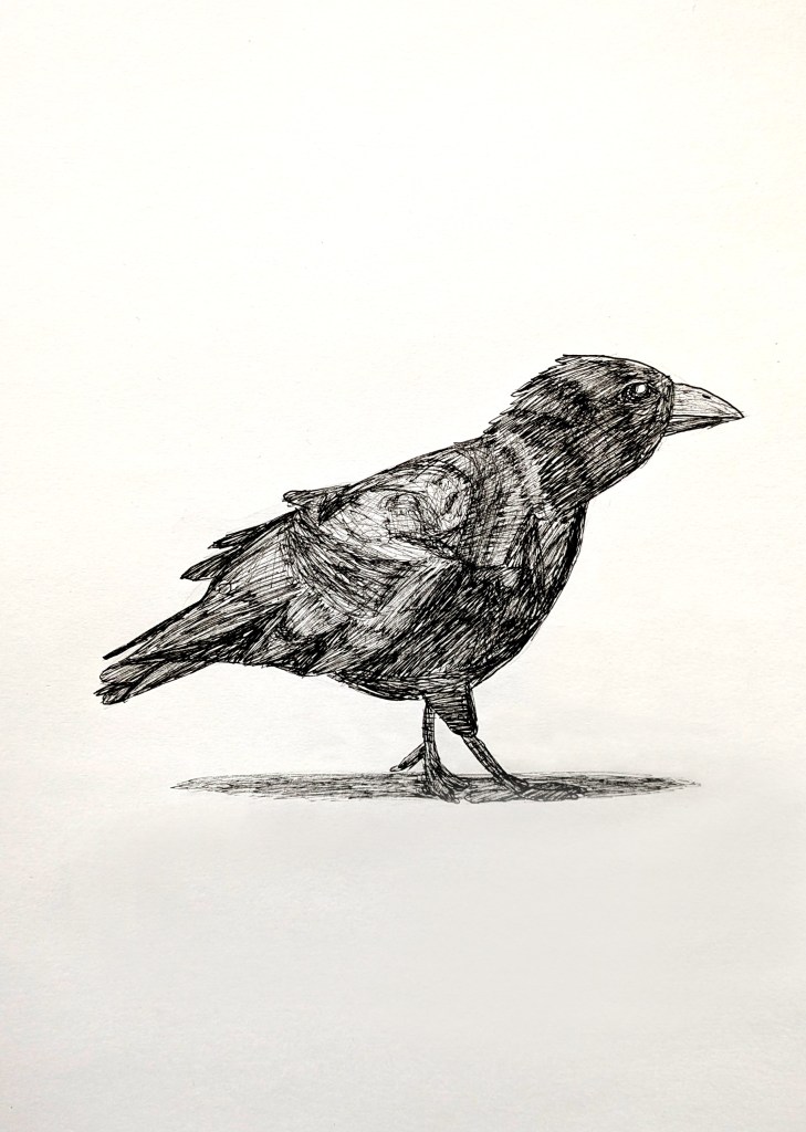
Birds and Animals: Fineliner pen sketch 7 (crow).
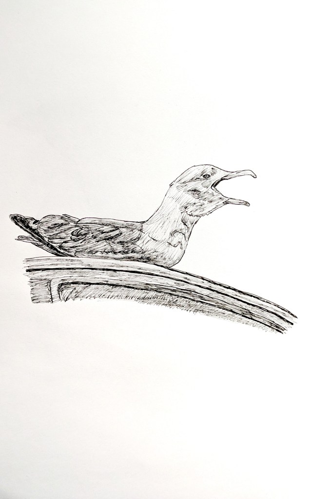
Birds and Animals: Fineliner pen sketch 8 (seagull).
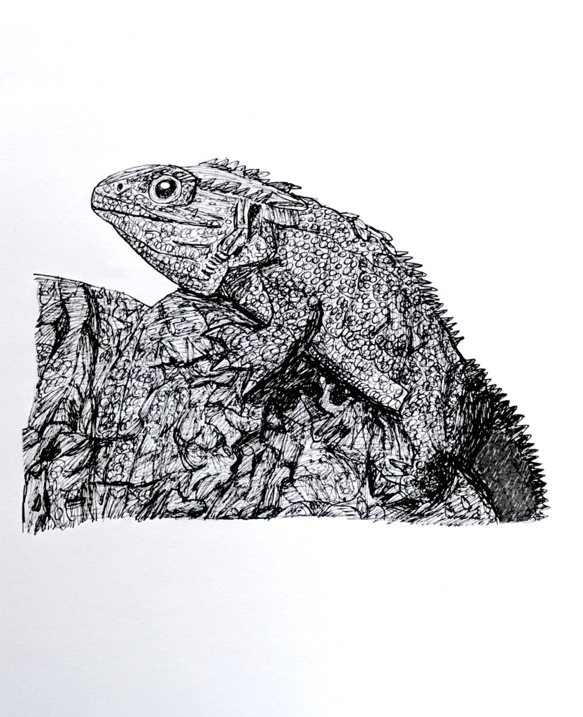
Birds and Animals: Fineliner pen sketch 9 (tuatara, referenced from Guinness World Records 2011).
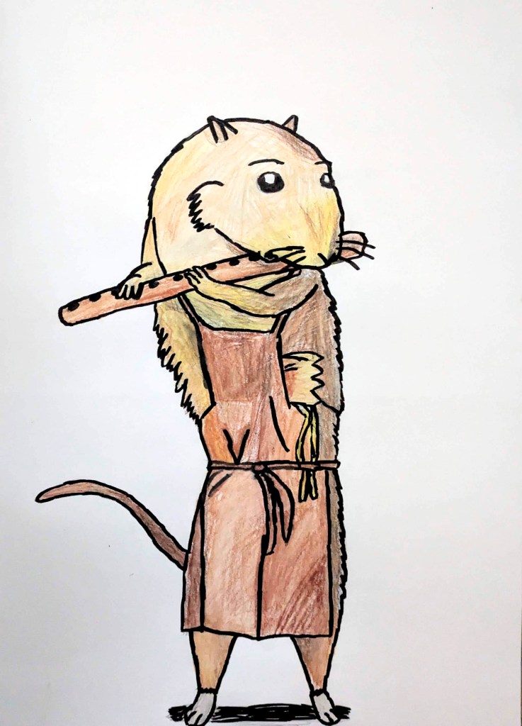
Birds and Animals: Fineliner pen and watercolour pencil sketch 10 (Ratty from the Deal Museum).
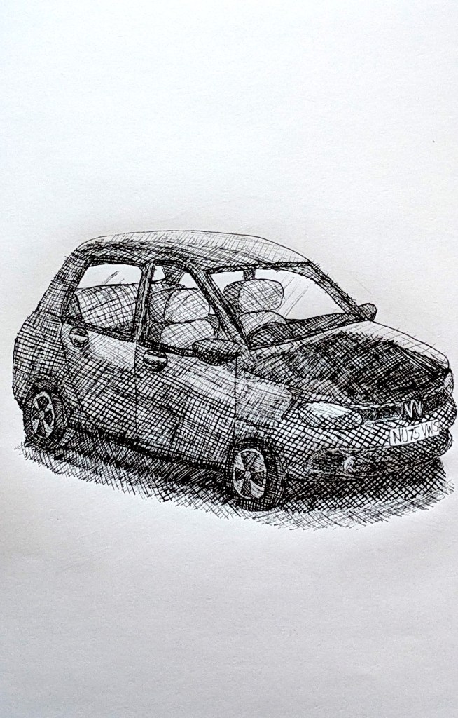
Vehicles: Fineliner pen sketch 1 (Volkswagen).
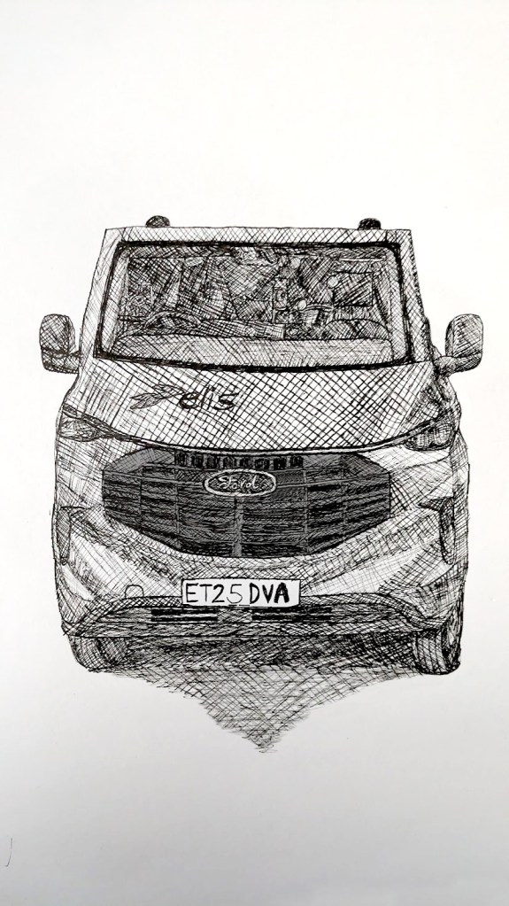
Vehicles: Fineliner pen sketch 2 (Elis Ford).
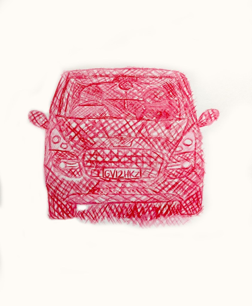
Vehicles: Watercolour pencil sketch 3 (Peugeot).
Buildings: Watercolour pencil sketch 1 (Hever Castle).
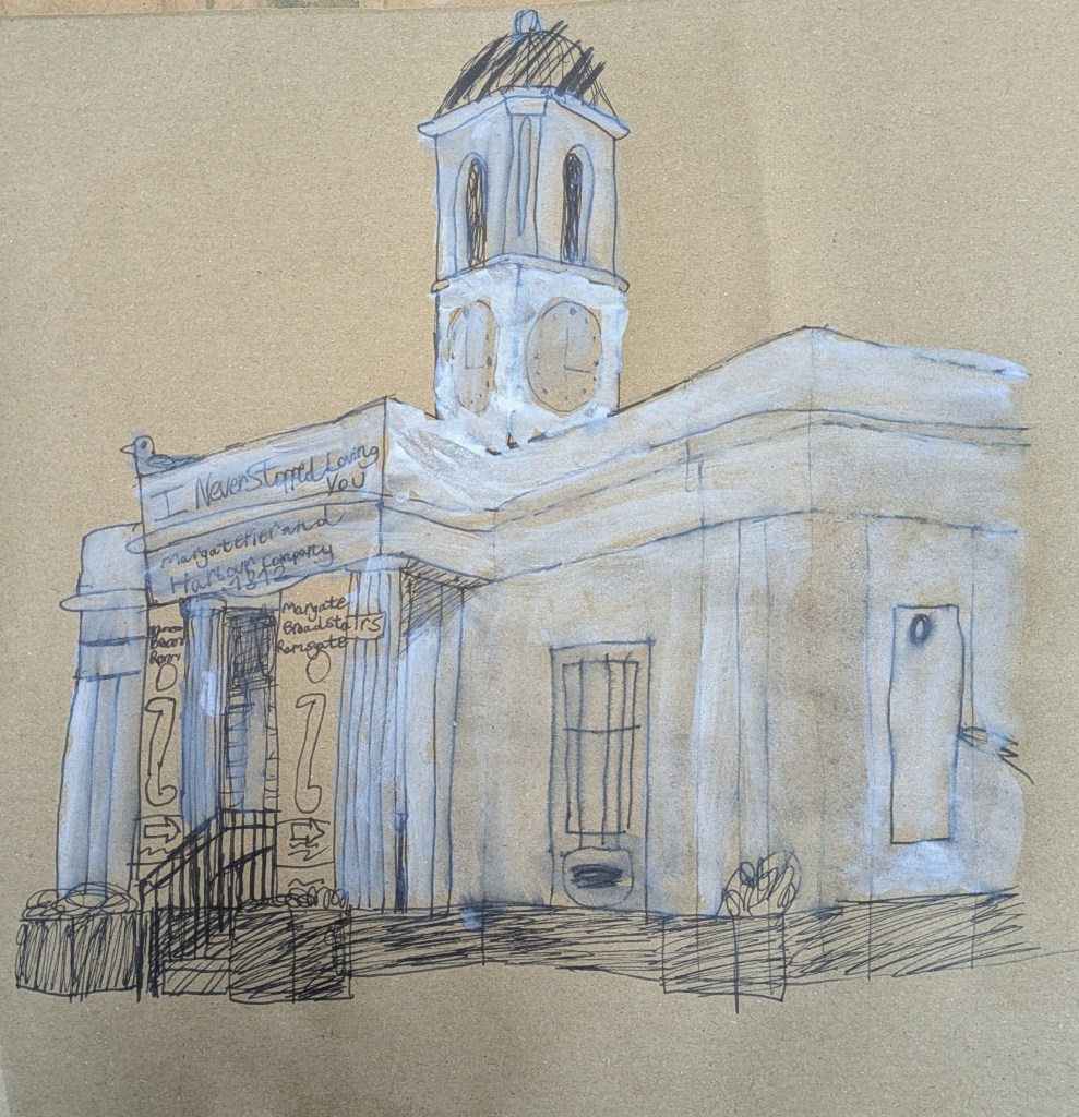
Buildings: Felt tip and gouache paint sketch 2 (Droit House).
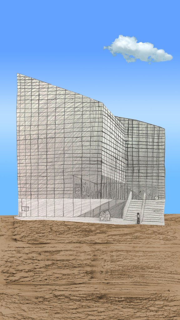
Buildings: Pencil, digital frottage and gradient sketch 3 (Turner Contemporary).
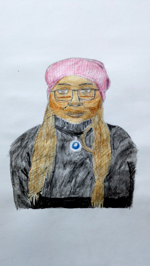
Portraits: Permanent marker and watercolour pencil line drawing sketch 1 (my mother, art inspired by Grayson Perry).
Portraits: Permanent marker and watercolour pencil line drawing sketch 2 (Elyse, art inspired by Grayson Perry).
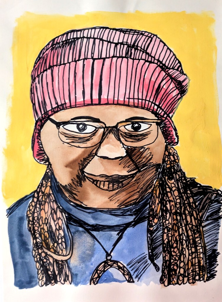
Portraits: Permanent marker and paint sketch 3 (my Tai chi teacher Tamar, art inspired by Grayson Perry).
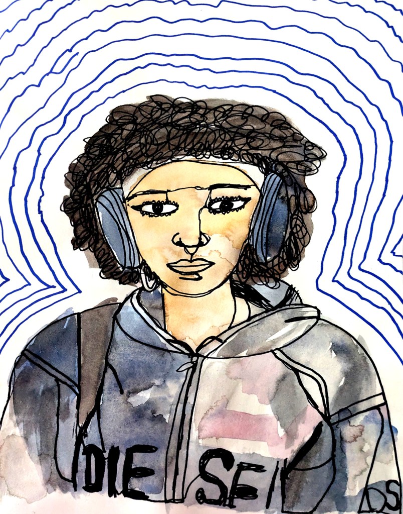
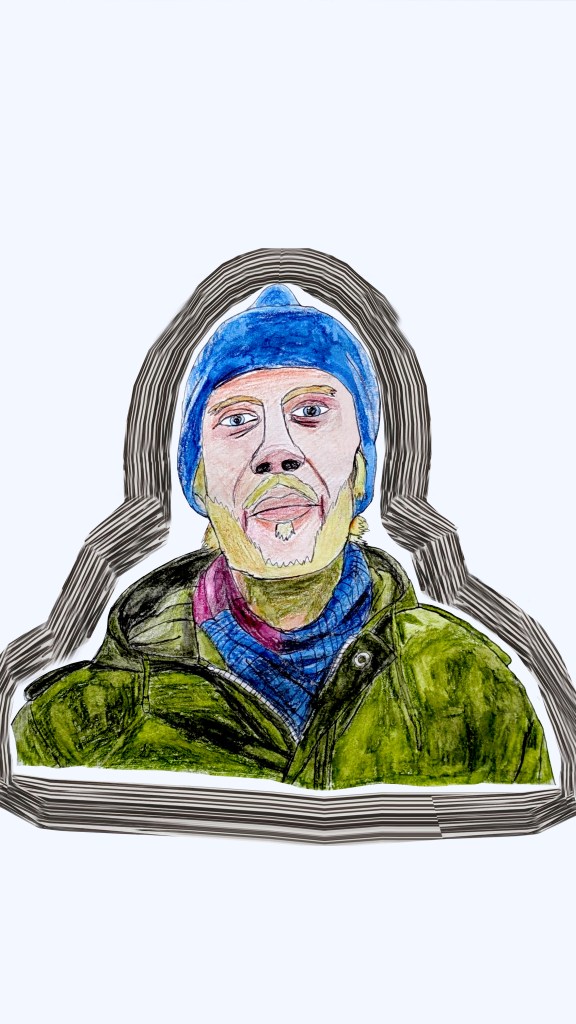
Portraits: Fineliner pen and watercolour pencil sketch 4 (Ivan, art inspired by Grayson Perry).
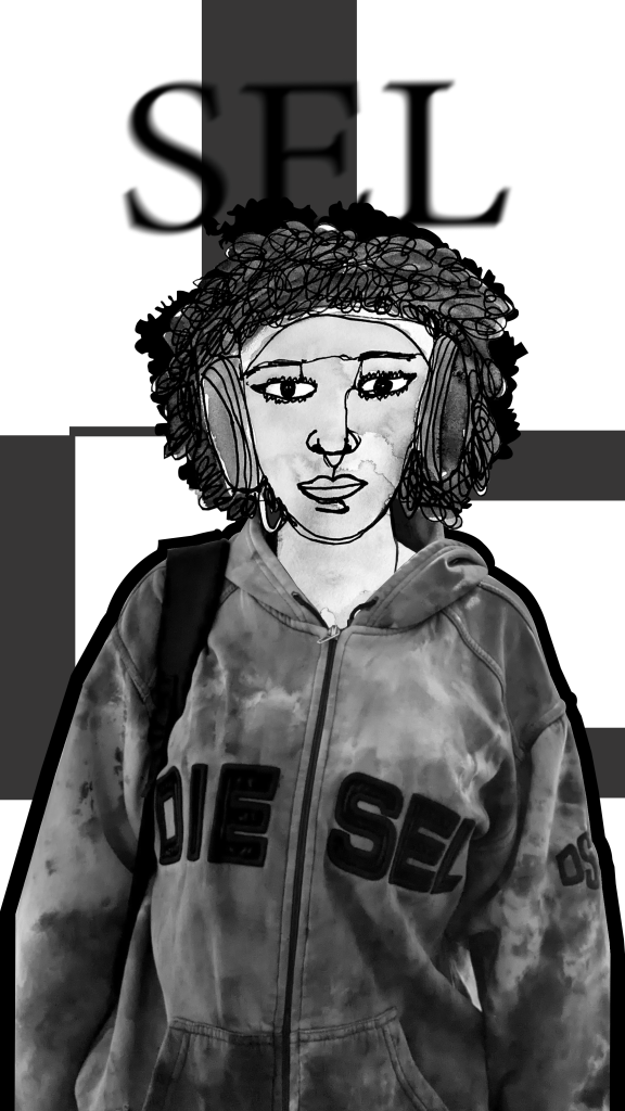
Portraits: Fineliner pen, watercolour pencil and digital frottage sketch 5 (me, art inspired by Grayson Perry).
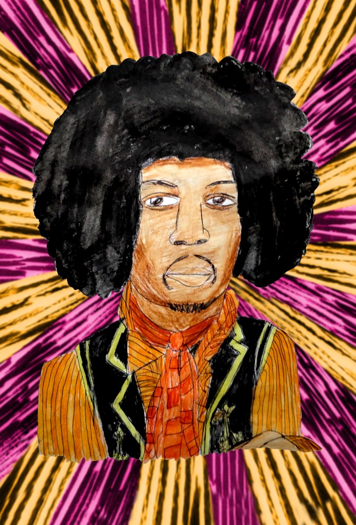
Portraits: Biro, watercolour pencil and digital texture sketch 6 (Jimi Hendrix).
Portraits: Biro, watercolour pencil and digital texture sketch 7 (Vincent van Gogh).
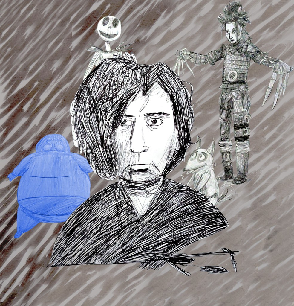
Portraits: Biro, pencil and digital texture sketch 8 (Tim Burton). Jack Skellington and Sparky Frankenstein © The Walt Disney Company. Violet Beauregarde © Roald Dahl/Warner Bros. Entertainment Inc. Edward Scissorhands © 20th Century Studios.
Portraits: Biro, watercolour pencil and digital texture border sketch 9 (my father).
Portraits: Watercolour pencil sketch 10 (my mother).
Organic form: Watercolour pencil sketch 1 (tree).
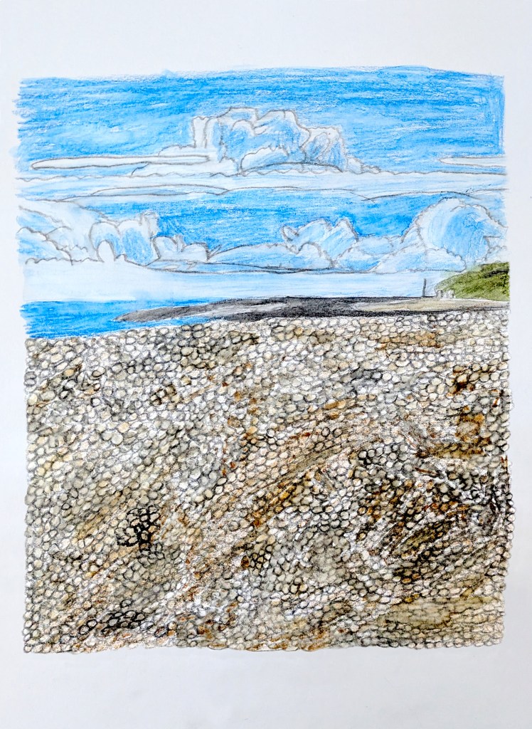
Organic form: Watercolour pencil sketch 2 (seaside clouds).
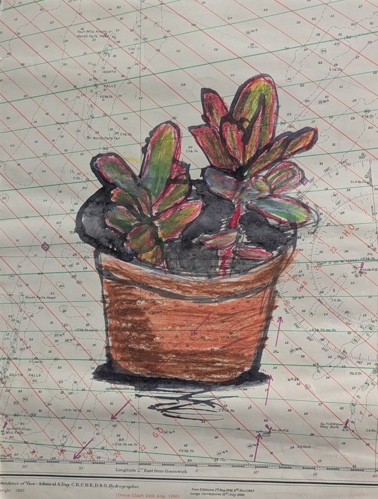
Organic form: Indian ink, graphite and chalk pencil and permanent marker sketch 3 (plant).
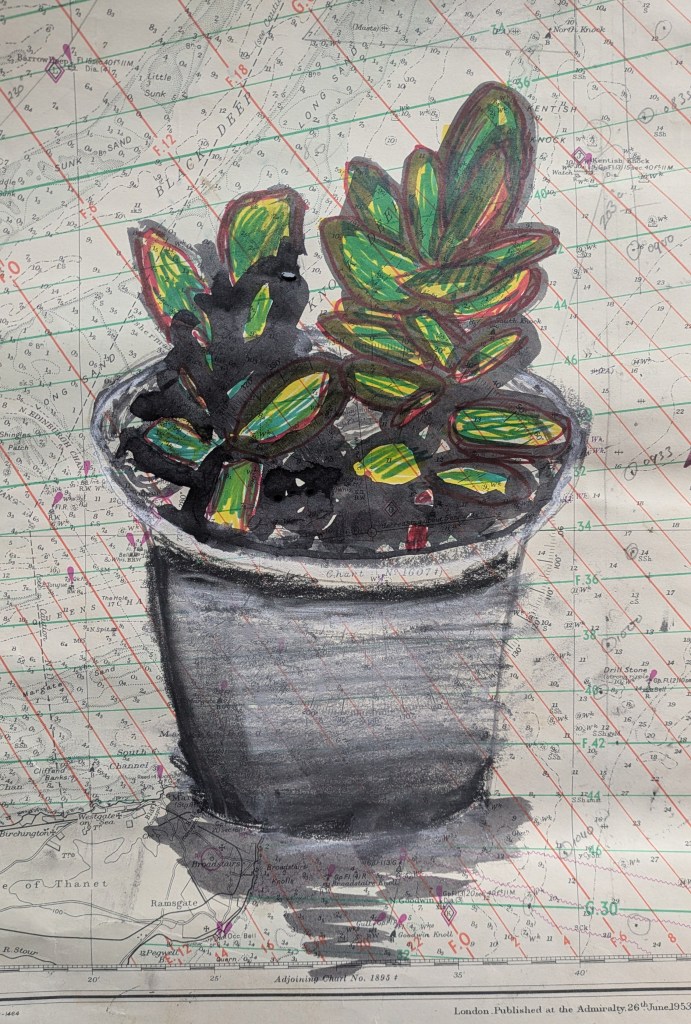
Organic form: Indian ink, oil pastel and gouache paint sketch 4 (plant).
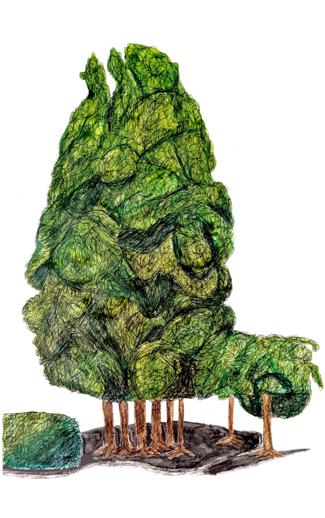
Organic form: Biro and watercolour pencil sketch 5 (cypress tree, inspired by David Hockney and referenced from Guinness World Records 2011).

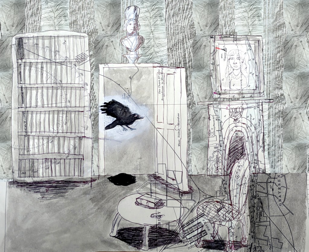
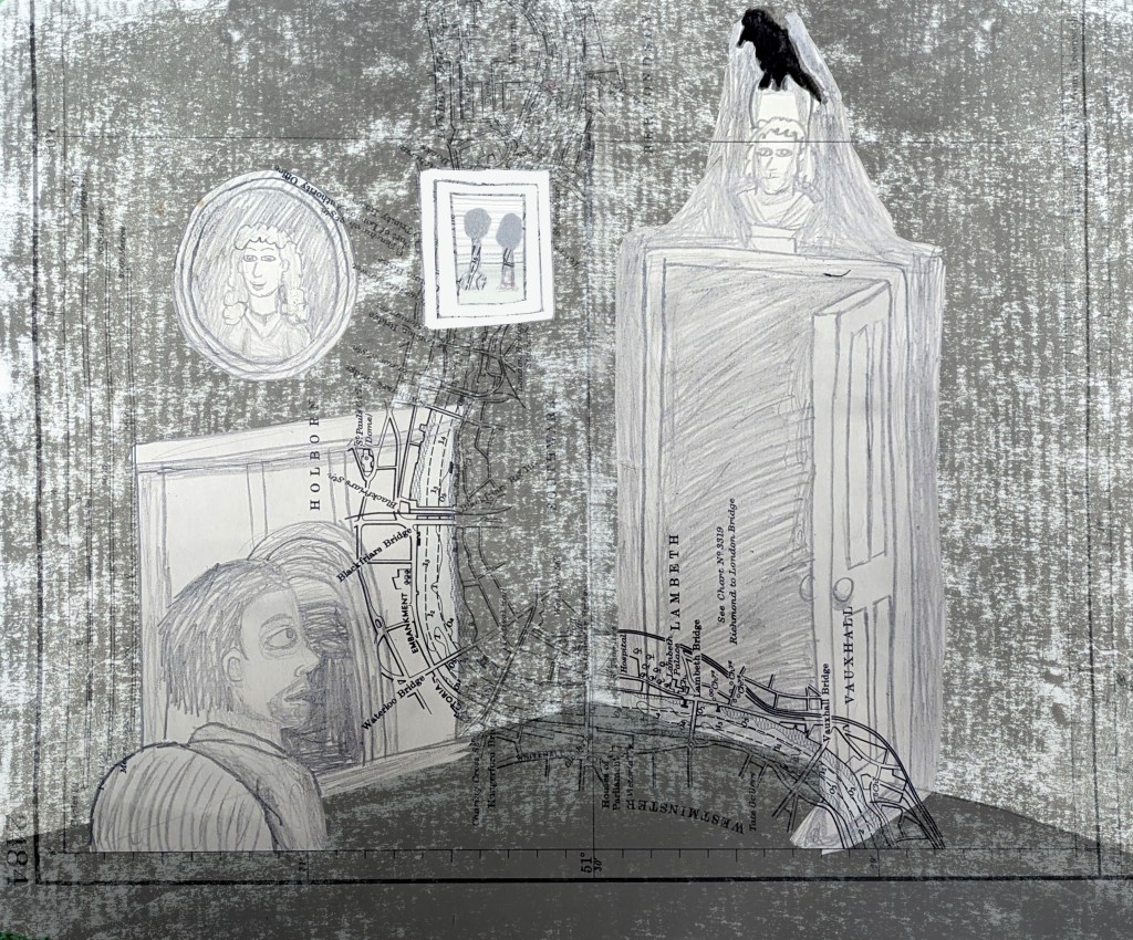
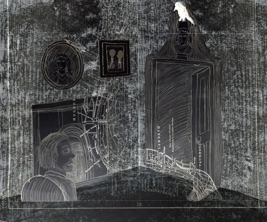
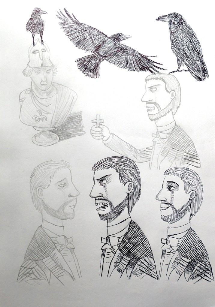
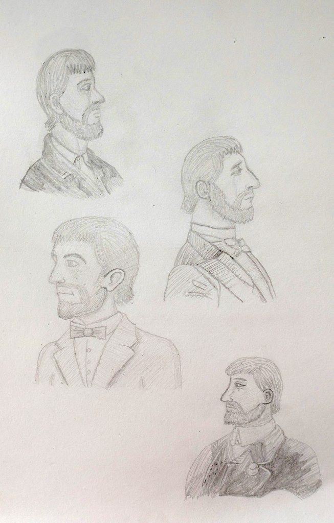
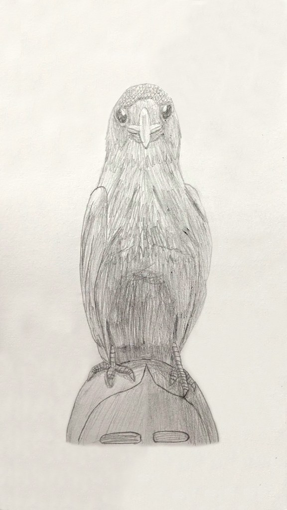
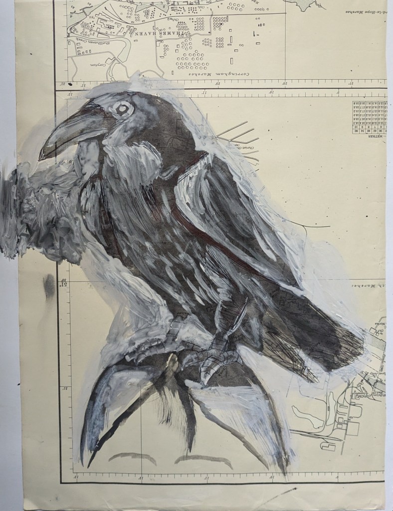
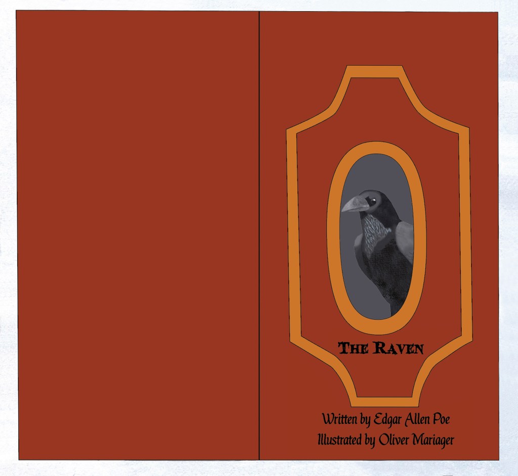
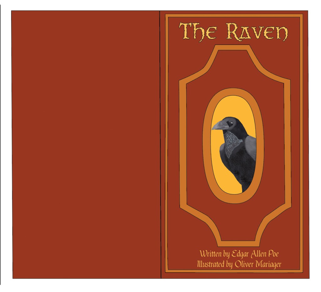
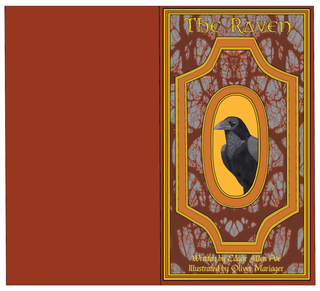
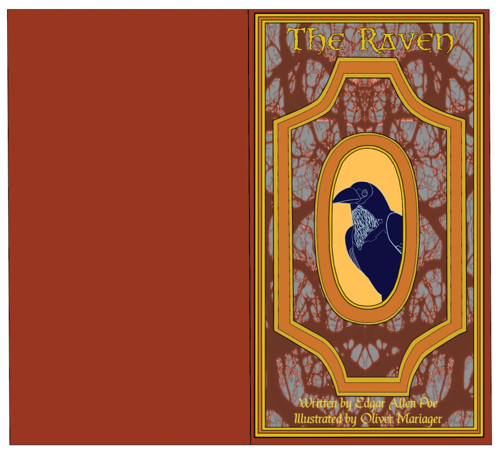
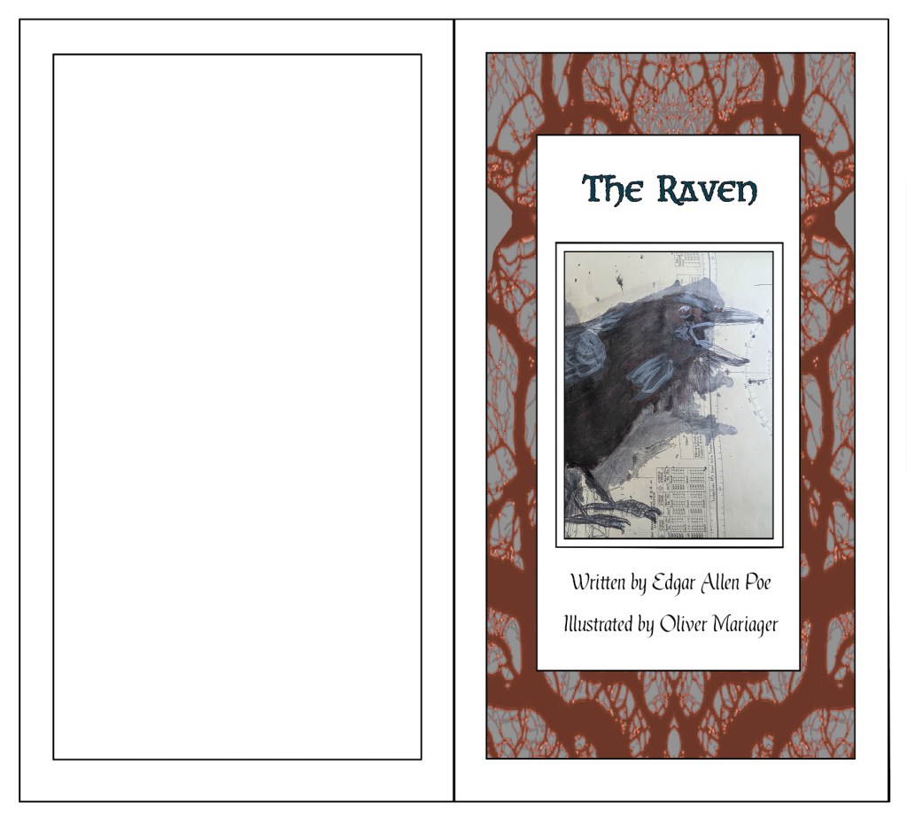
Then there was my Illustrations for Poems project. I researched Ellie Lee,[268][269] William Kentridge,[270][271][272][273] Jim Woodring,[274][275][276] Lynda Barry,[277][278][279][280][281][282] Paul Glabicki[283][284] and Satyajit Ray.[285][286][287][288][289][290][291][292][293][294] Using materials like gouache, Victorian maps, ink, squirters, sponges, fineliners, pencils, paper cutouts, et cetera, I produced different concept art and illustrations for Edgar Allen Poe’s The Raven.[295] I experimented and played around with different elements to make them stand out and/or tie into the poem’s Gothic horror theme. For example, I painted the titular raven with black ink and added shading, lighting and details using layers of black ink and some white ink, changed the levels of the floor and walls in Photoshop, and added frottage textures and lowered their opacity to make the map visible. I also researched Victorian book cover designs and typefaces and created early and finalised book covers and pages in Photoshop and Adobe Illustrator, and linked my illustrations to sentences from the poem. I found creating the page layouts (with the illustration and text on different reflecting pages) difficult, so I had to make three drafts and choose the one that was the most accurate.

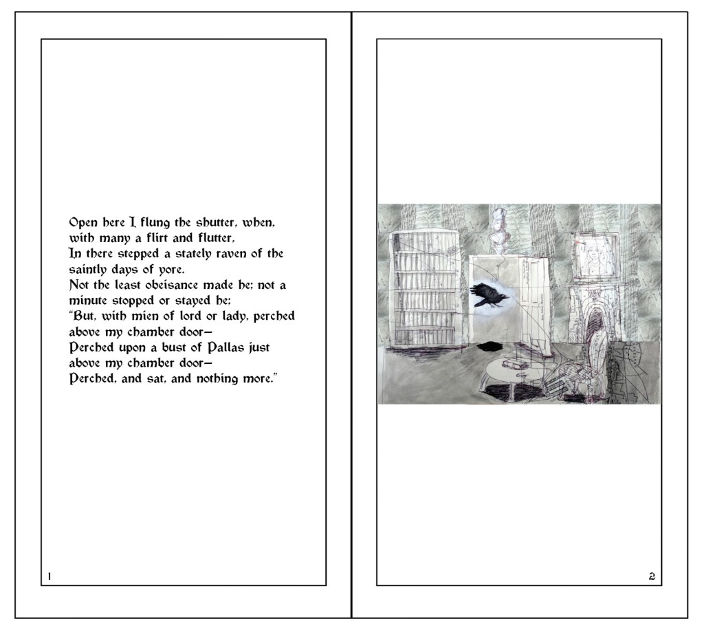
Illustration 1: “Open here I flung the shutter, when, with many a flirt and flutter,
In there stepped a stately raven of the saintly days of yore.
Not the least obeisance made he; not a minute stopped or stayed he;
But, with mien of lord or lady, perched above my chamber door—
Perched upon a bust of Pallas just above my chamber door—
Perched, and sat, and nothing more.”
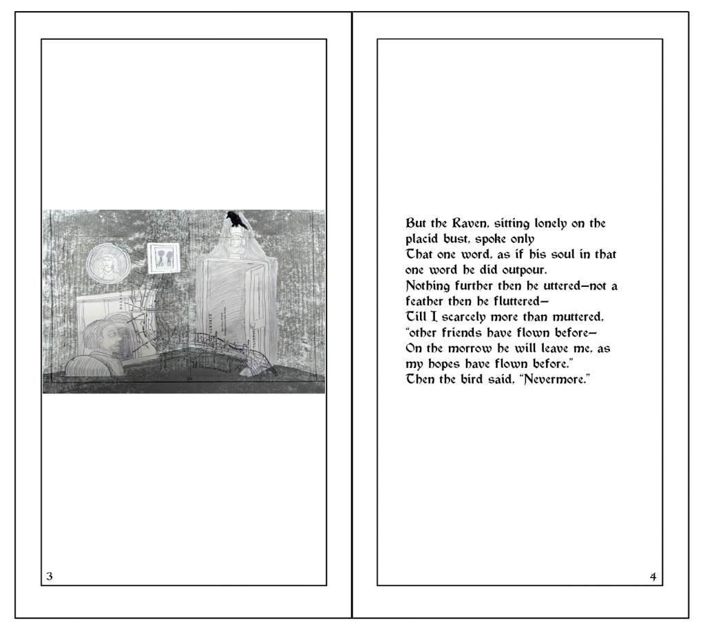
lllustration 2: “But the Raven, sitting lonely on the placid bust, spoke only
That one word, as if his soul in that one word he did outpour.
Nothing further then he uttered—not a feather then he fluttered—
Till I scarcely more than muttered, “other friends have flown before—
On the morrow he will leave me, as my hopes have flown before.”
Then the bird said, “Nevermore.””
Illustration 2 (inverted).
Early pencil and pen concept art for the raven and narrator (referenced from images, photographs and art by MutualArt, Frank Lospalluto, Bill Bouton and Emile Bayard).
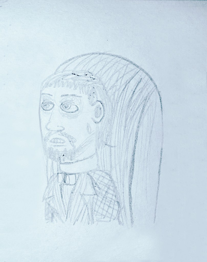
Finalised, realistic pencil concept art for the narrator (referenced from images and art by August von Platen/Gustav Adolf von Klöden, Emile Bayard, Adamk32321 and Olga Rutko).
Pencil concept art for the raven perching (referenced from photographs by T.T. Jaguar and The Urban Nature Enthusiast).
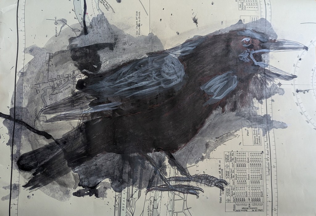
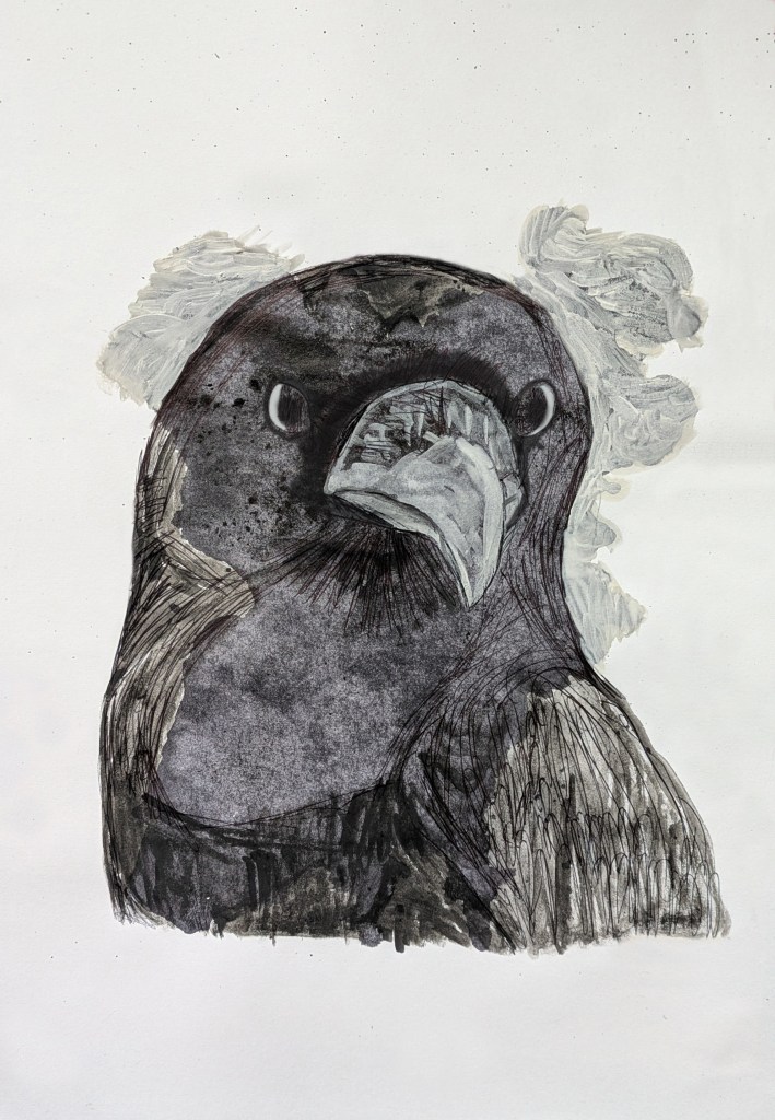
Paint/ink, gouache and watercolour paint and biro drawing of the raven perching (referenced from photograph by wirestock).
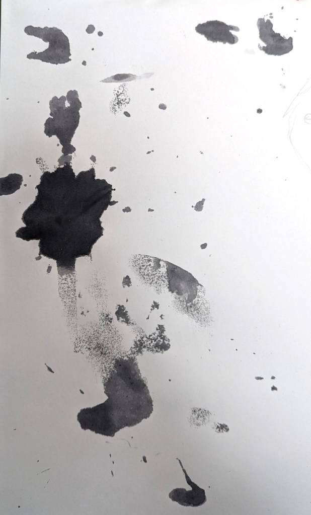
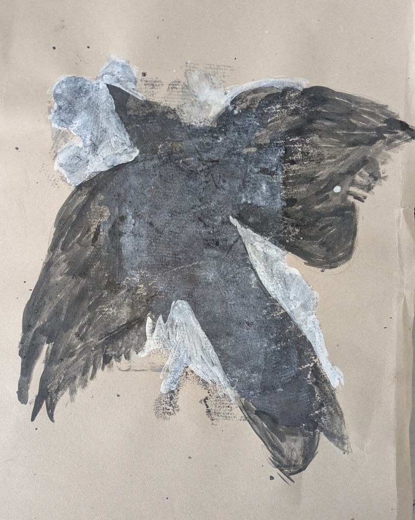
Black paint/ink blob marks.
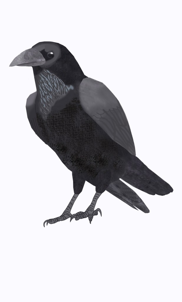
Digital raven art made using the paint/ink marks in Adobe Photoshop.
Illustration 3 (early).
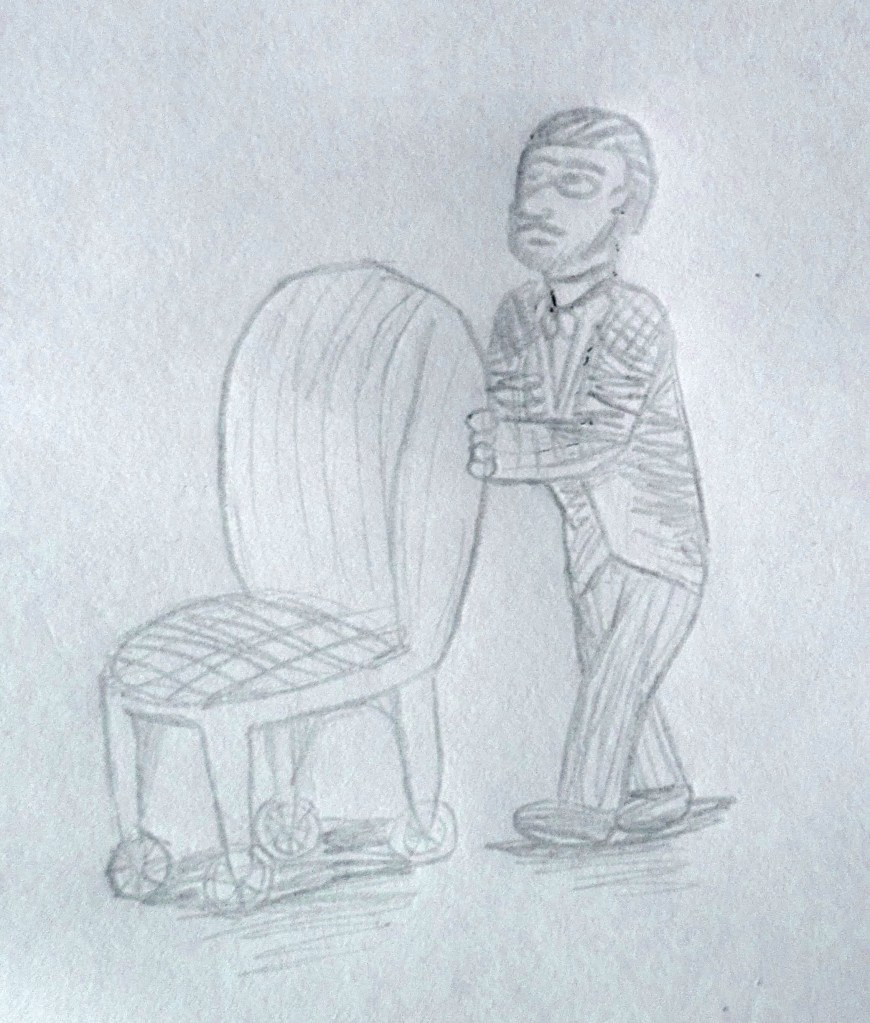
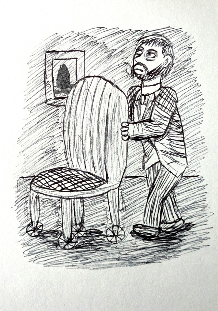
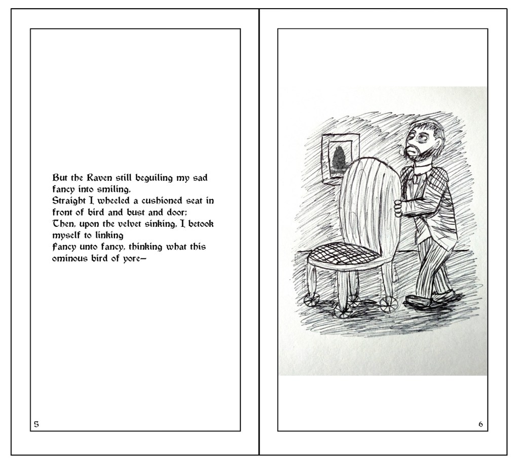
Illustration 3: “Straight I wheeled a cushioned seat in front of bird and bust and door…”
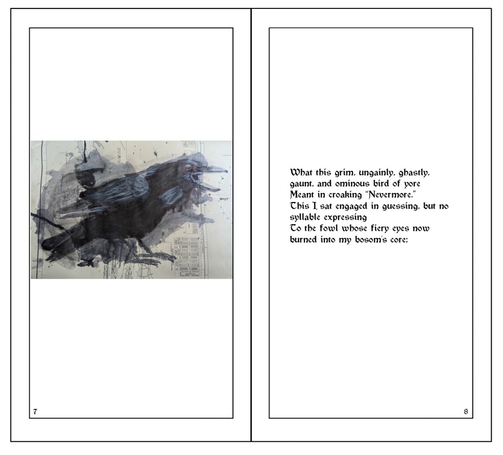
Illustration 4: “What this grim, ungainly, ghastly, gaunt, and ominous bird of yore…
To the fowl whose fiery eyes now burned into my bosom’s core…”
(Made with ink, gouache paint and biro, inspired by William Kentridge and referenced from photograph by AlexSava.)
Illustration 5 (early).
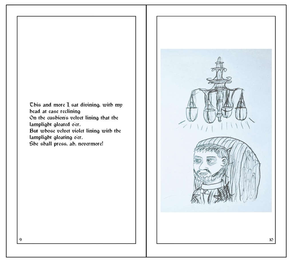
Illustration 5: “This and more I sat divining, with my head at ease reclining
On the cushion’s velvet lining that the lamplight gloated o’er…”
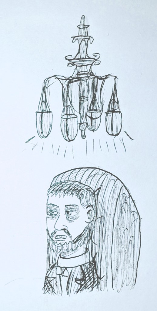
(Ceiling lamp referenced from image by LASSCO.)
Illustration 6 (early).
Illustration 6 (digital).
Illustration 6 (digital, with Lenore’s hair and hue and saturation changed to make her look more Victorian).
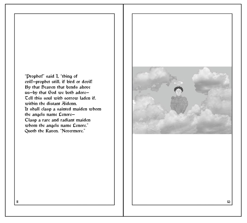
Illustration 6: “It shall clasp a sainted maiden whom the angels name Lenore—
Clasp a rare and radiant maiden whom the angels name Lenore.”
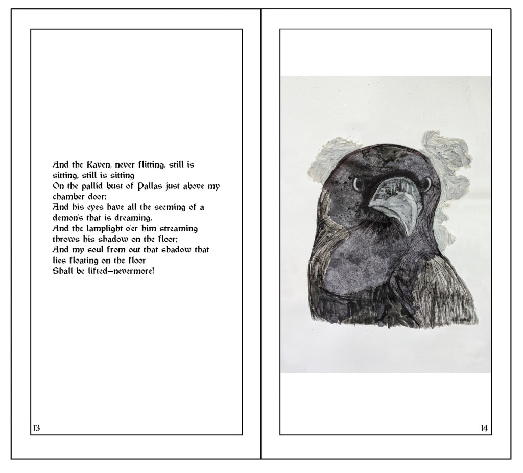
Illustration 7: “And his eyes have all the seeming of a demon’s that is dreaming,
And the lamplight o’er him streaming throws his shadow on the floor…”
(Made with paint/ink, gouache and watercolour paint and biro, and referenced from photograph by The Urban Nature Enthusiast.)
Paint/ink, gouache and watercolour paint drawing of the raven’s flying shadow (referenced from “Crow” by Mark Bradford).
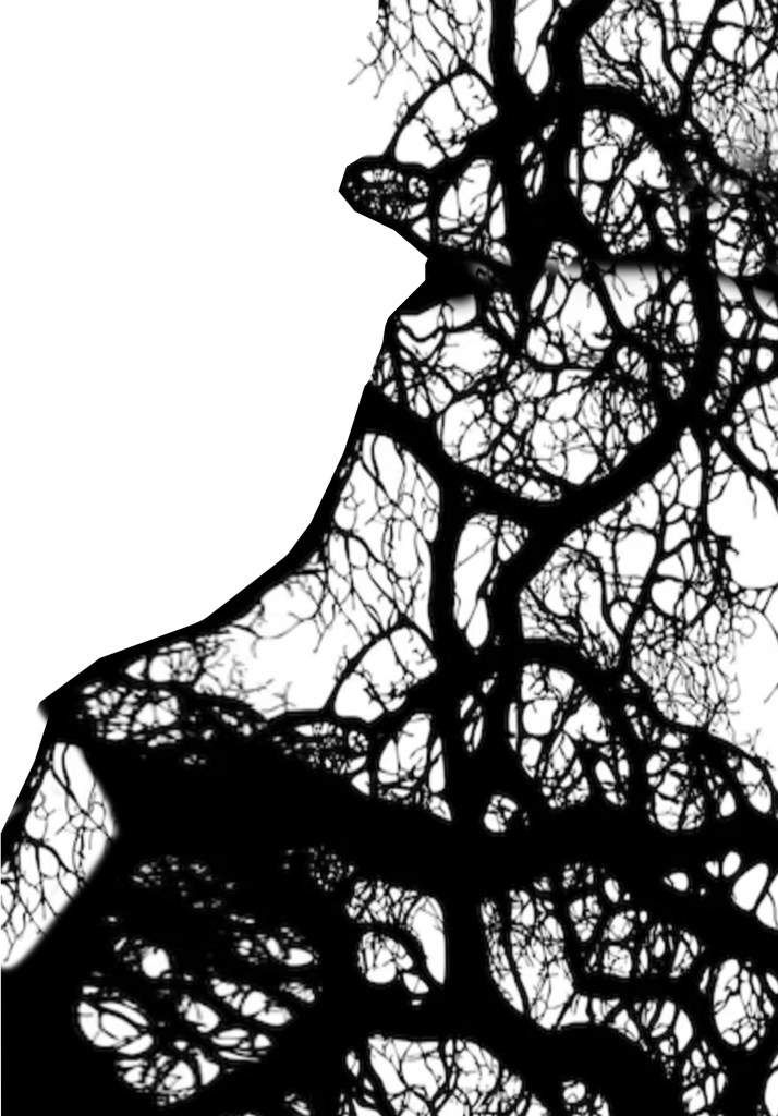
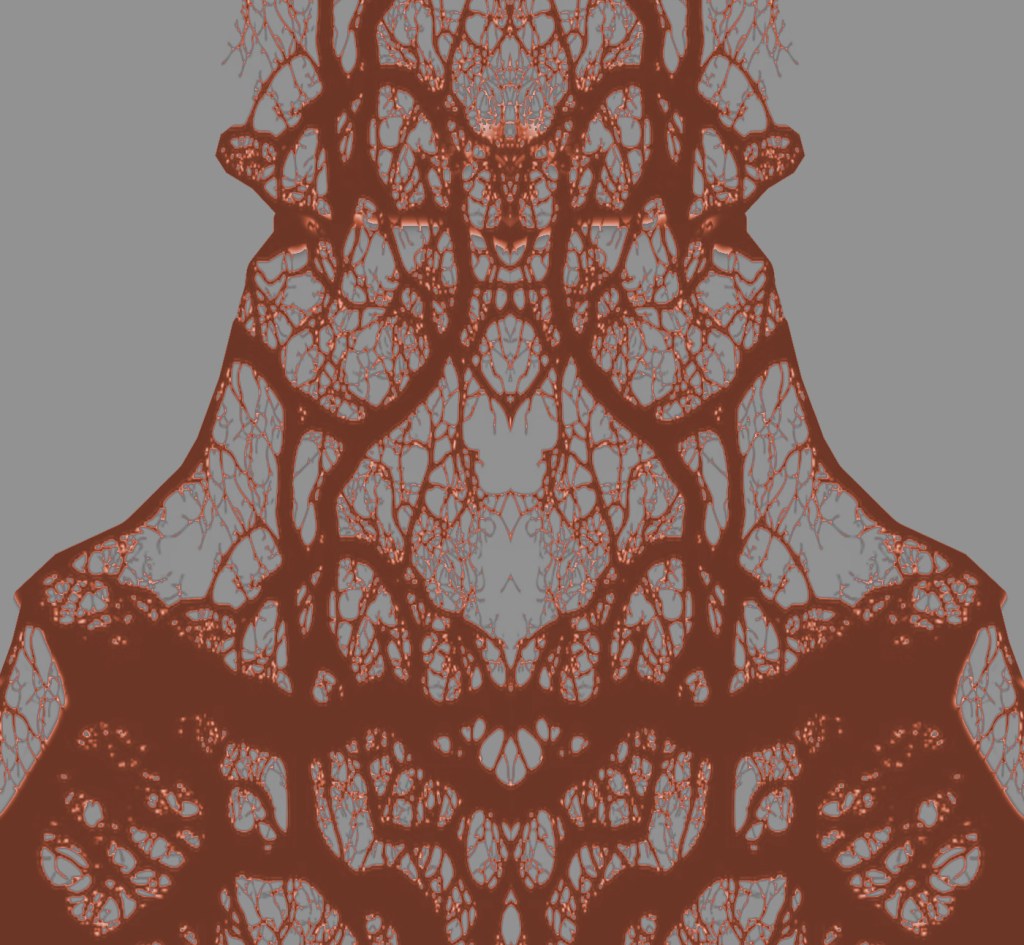
Early tree branch pattern for The Raven book cover (taken from image by vector_corp).
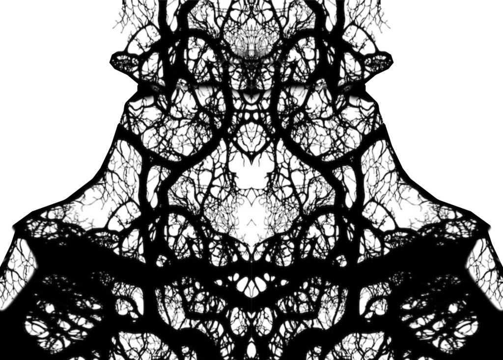
Symmetrical tree branch pattern for The Raven book cover.
Finalised, hue/saturation edit of tree branch pattern for The Raven book cover.
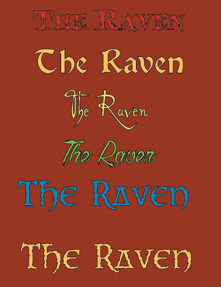
Victorian/gothic typefaces for The Raven book cover (Blood Crow, Vinque, Alleghieri Demo, Chardons Brush, CCNearMyth).
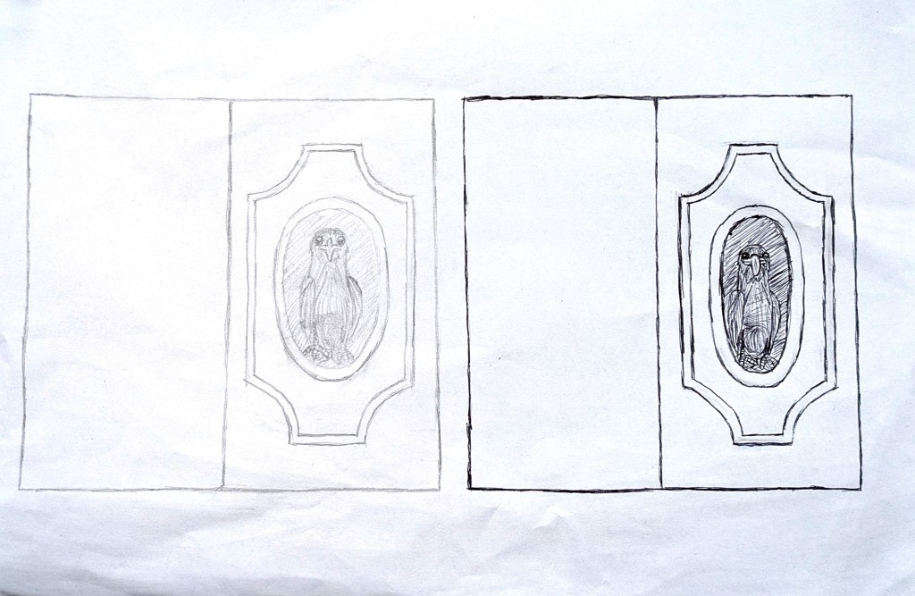
Early concept art for The Raven book cover layout.
My first The Raven book cover layout.
My second The Raven book cover layout.
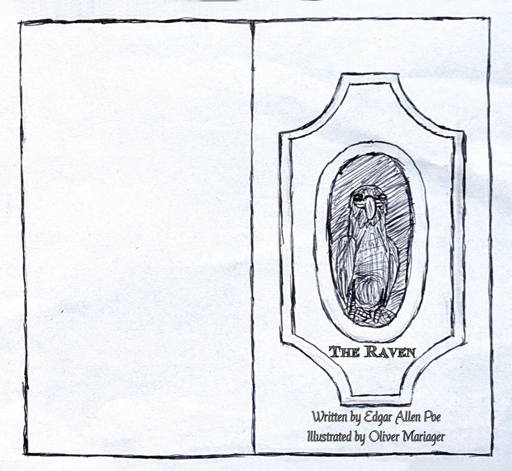
My third The Raven book cover layout.
My fourth The Raven book cover layout.
My fifth The Raven book cover layout.
My sixth The Raven book cover layout.
Pages 1-2 of my chosen third page layouts.
Pages 3-4 of my chosen third page layouts.
Pages 5-6 of my chosen third page layouts.
Pages 7-8 of my chosen third page layouts.
Pages 9-10 of my chosen third page layouts.
Pages 11-12 of my chosen third page layouts.
Pages 13-14 of my chosen third page layouts.

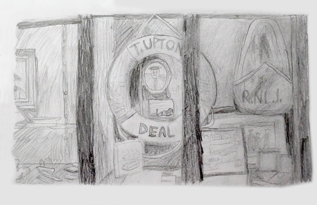
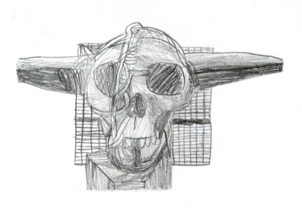
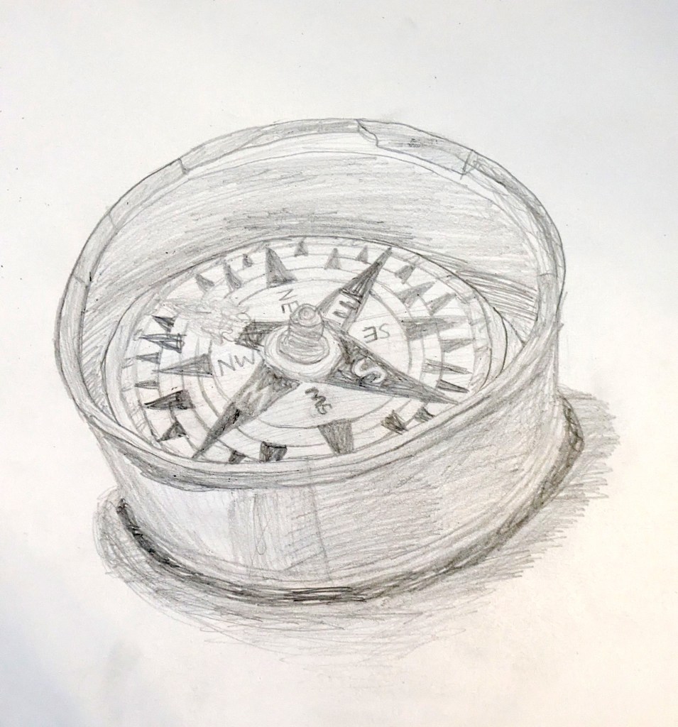
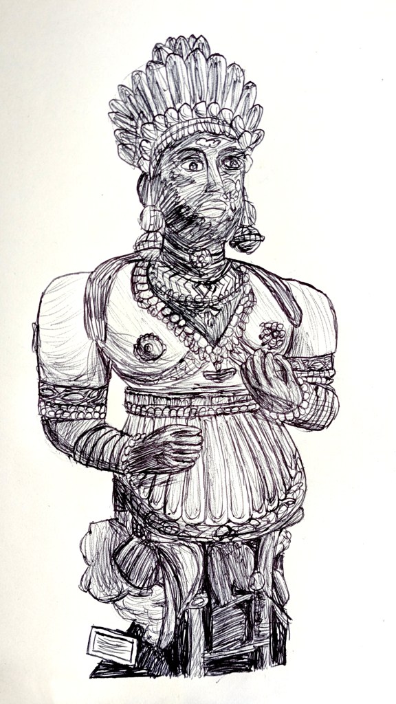
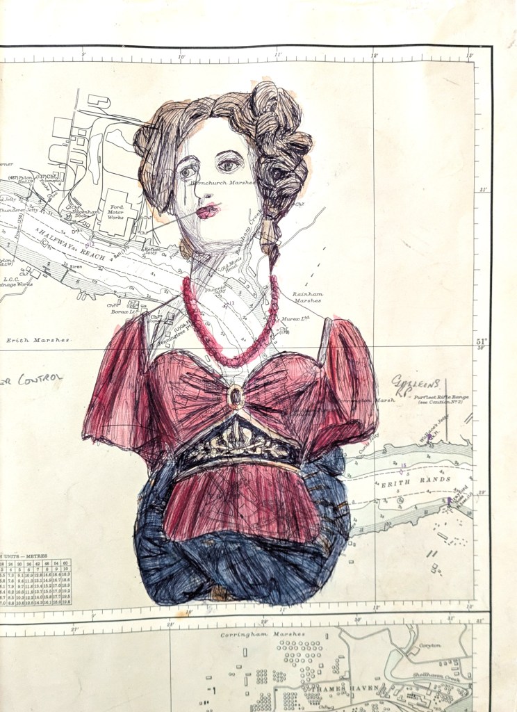
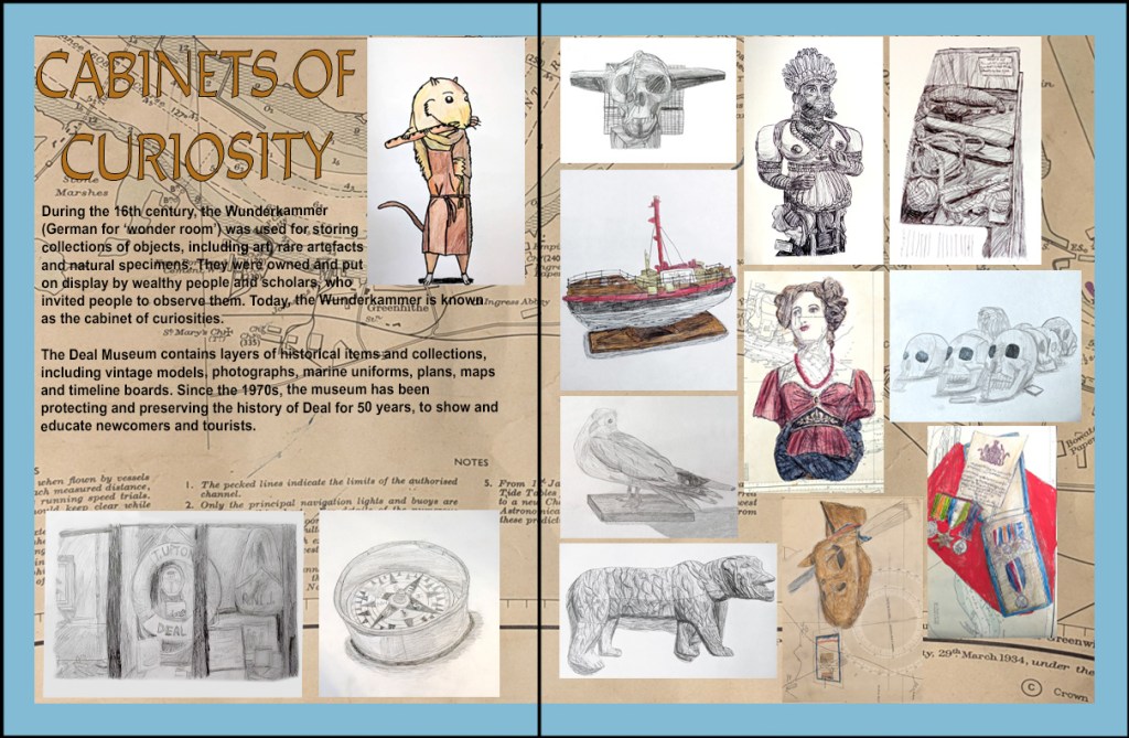
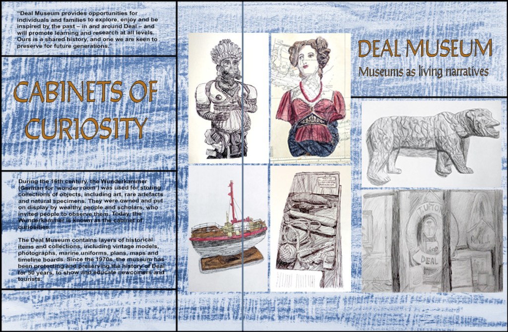
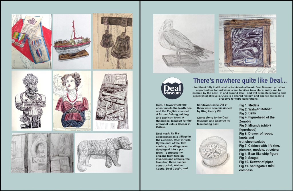
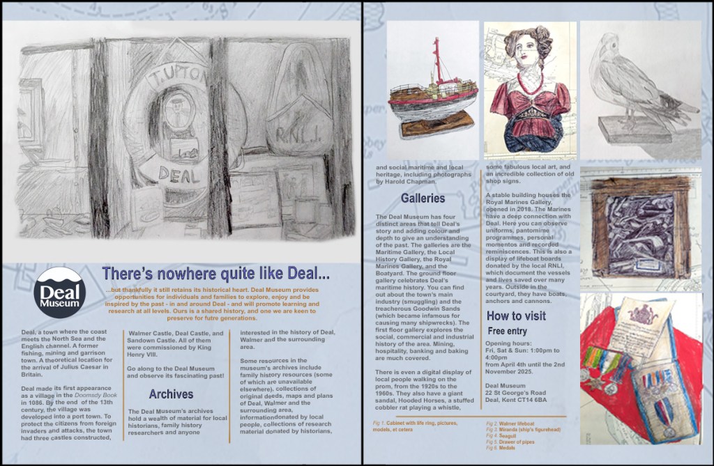
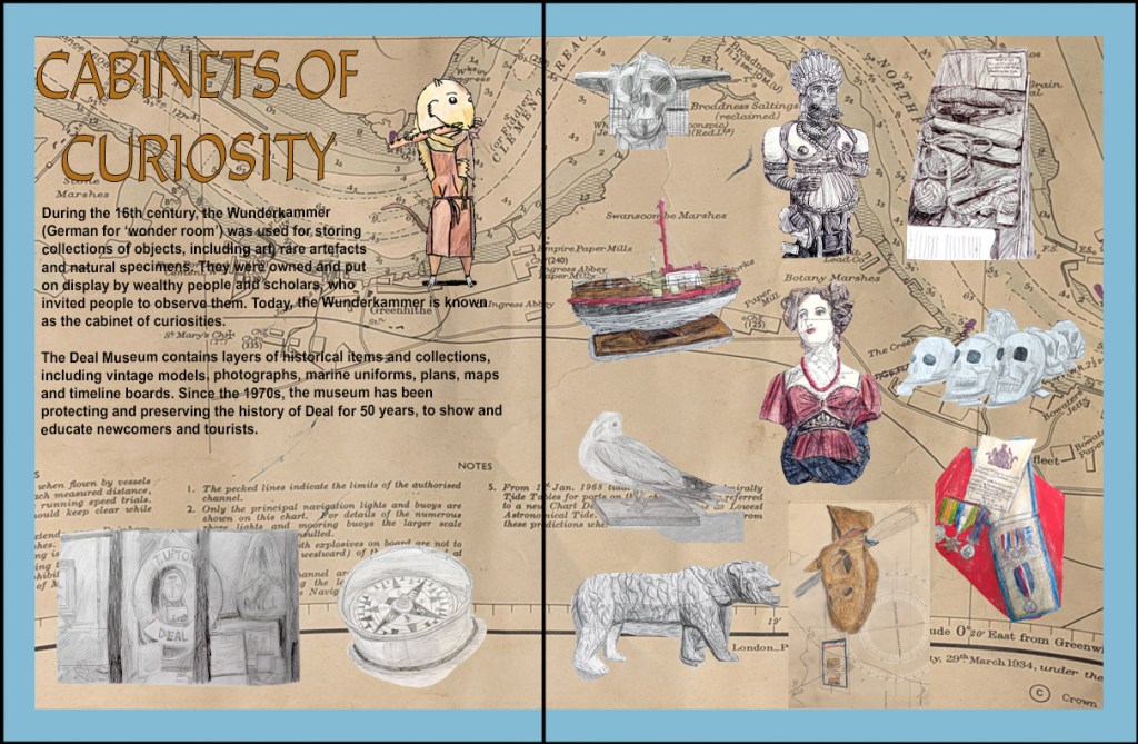
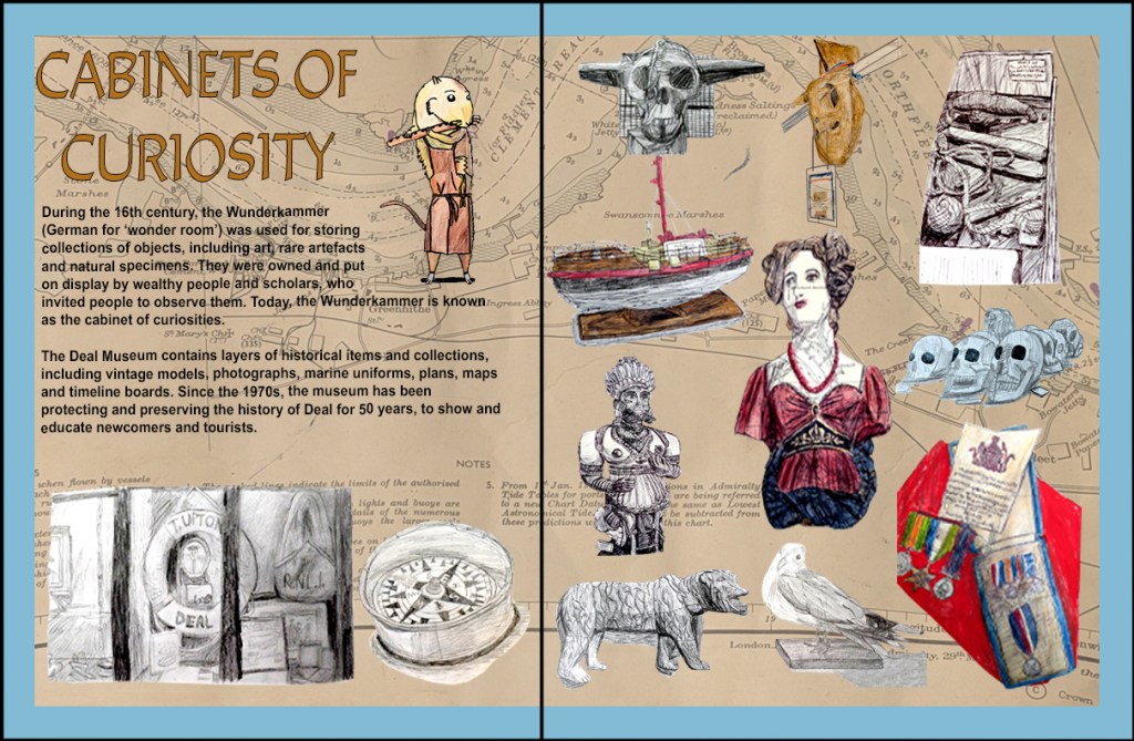
Finally I did my Collections project. I looked at a list of museums that I could visit, eventually choosing to visit the Deal Museum. I learned that the museum contained layers of historical resources, archives and collections. The items in the collections ranged from vintage models (for example, typewriters, compasses and boats), plans and maps of the Deal and Walmer areas, photographs, H.M. Royal Marine uniforms, and timeline boards describing events in the town’s history (for example, pirates and smugglers). I visited the museum in September, and took photographs of most of the objects. The only object that I both photographed and drew was the stuffed taxidermy cobbler rat, Ratty. I used a uni PIN 01 Fine Line drawing pen and Mogyann Brush/Fine pen to draw the rat in real time in 20 minutes, then coloured him in with Stabilo Aquatico watercolour pencils. This process allowed me to capture the texture of the fur. Two months later, I learned about the cabinet of curiosities and what inspired its creation.[296][297][298][299] I researched collections at art galleries and museums, including the Deal Museum, the Victoria and Albert Museum,[300][301][302][303][304][305] the British Museum,[306][307][308] the Pitt Rivers Museum,[309] The Museum of Palazzo Poggi,[310] the Oxford University Museum of Natural History,[311] and the Ashmolean Museum.[312] Following this, I was introduced to Joseph Cornell’s boxed assemblages[313][314] and Domineco Remps’ Trompe-l’œil paintings.[315][316] I enjoyed looking at Cornell’s work, and his utilisation of collage and maps in the box interiors inspired me to use maps in my backgrounds, because I felt that they added colour, texture and a sense of place. This fitted well with the museum. Remps’ paintings drew my attention with their realism, and I wanted to try to capture this in my own sketches.

Collections: Fineliner pen, felt tip and watercolour pencil sketch 1 (Ratty from the Deal Museum).

In November, I visited the Deal Museum again to take some more photographs from an observational perspective, basing most of my sketches on these primary sources. They were drawn in pencil, biro, fineliner pen, Zebra Z-Grip biro, BIC biro, and watercolour pencils on sketchbook pages and vintage maps of Deal. I also chose to use Ratty for my double-page spread. Then, I used printscreens from Finder and Photoshop to make contact sheets with green circles around the sketch photographs that I would use in my double-page spread. When it came to making the spread itself, I used magazine templates[317][318][319][320] as secondary references to properly construct four magazine layouts for Deal Museum, and inserted the sketches, removing the background from some of them in one layout. This was the part of doing the collections layouts that I enjoyed, more so than the poem book layouts. I could incorporate the techniques that I had learned into my final project.

Collections: Pencil sketch 2 (cabinet with life ring, pictures, models, et cetera from the Deal Museum).
Collections: Pencil sketch 3 (skull from the Pitt Rivers Museum).
Collections: Pencil sketch 4 (Santagata’s mini compass from the Deal Museum).
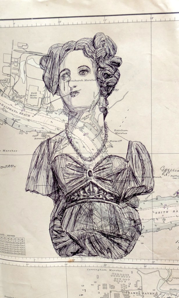
Collections: Biro and fineliner pen sketch 5 (Zenobia figurehead from the Deal Museum).
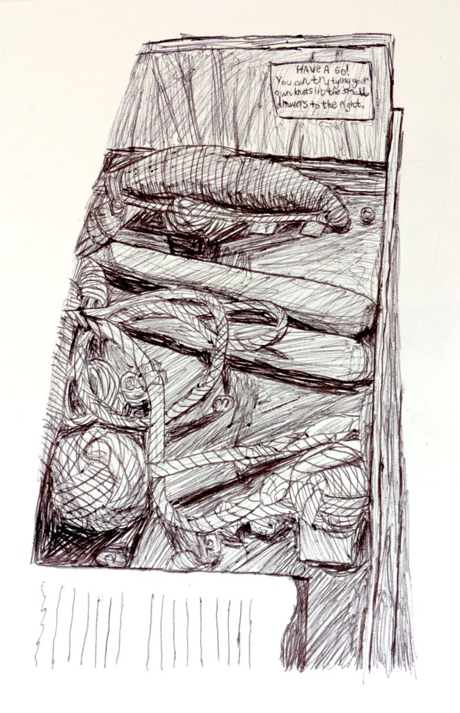
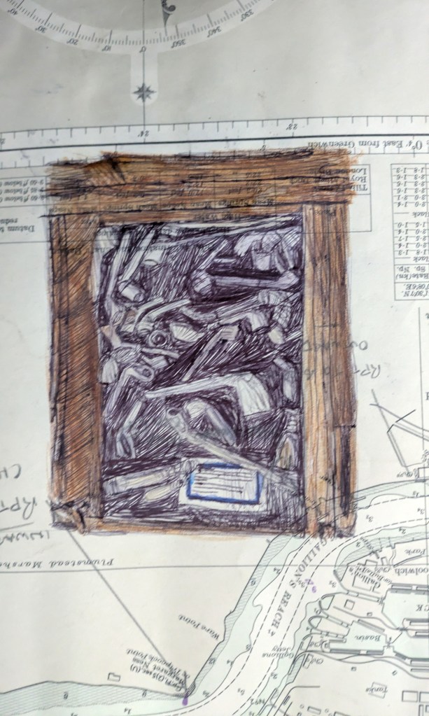
Collections: Fineliner pen sketch 6 (drawer of ropes, knots and truncheons/clubs from the Deal Museum).
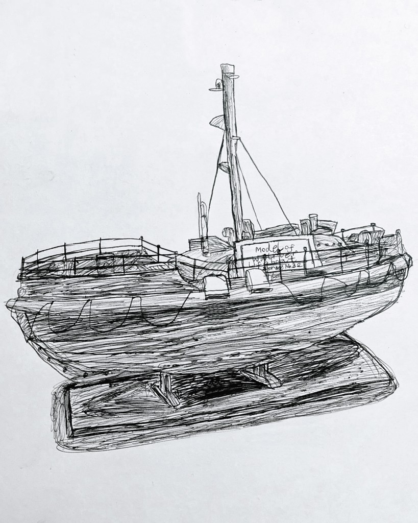
Collections: Fineliner pen sketch 7 (Walmer lifeboat from the Deal Museum).
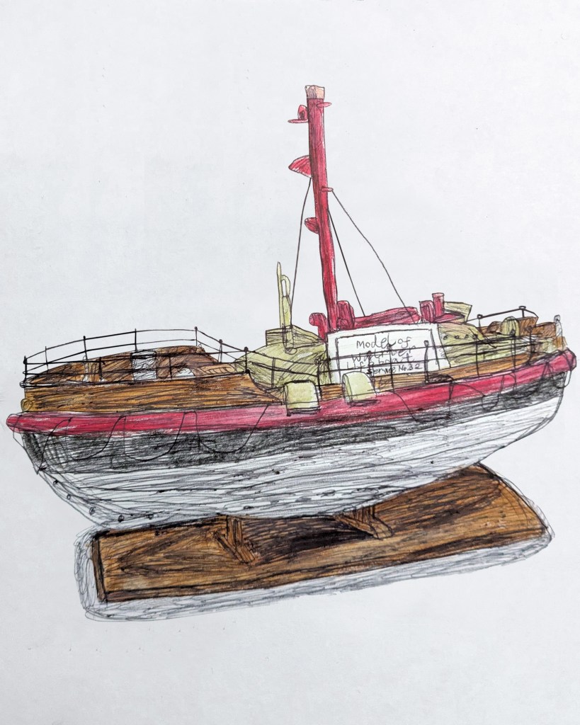
Collections: Fineliner pen and watercolour pencil sketch 7 (Walmer lifeboat from the Deal Museum, colourised).
 Collections: Biro sketch 8 (Miranda (ship’s figurehead) from the Deal Museum).
Collections: Biro and watercolour pencil sketch 8 (Miranda (ship’s figurehead) from the Deal Museum, colourised).
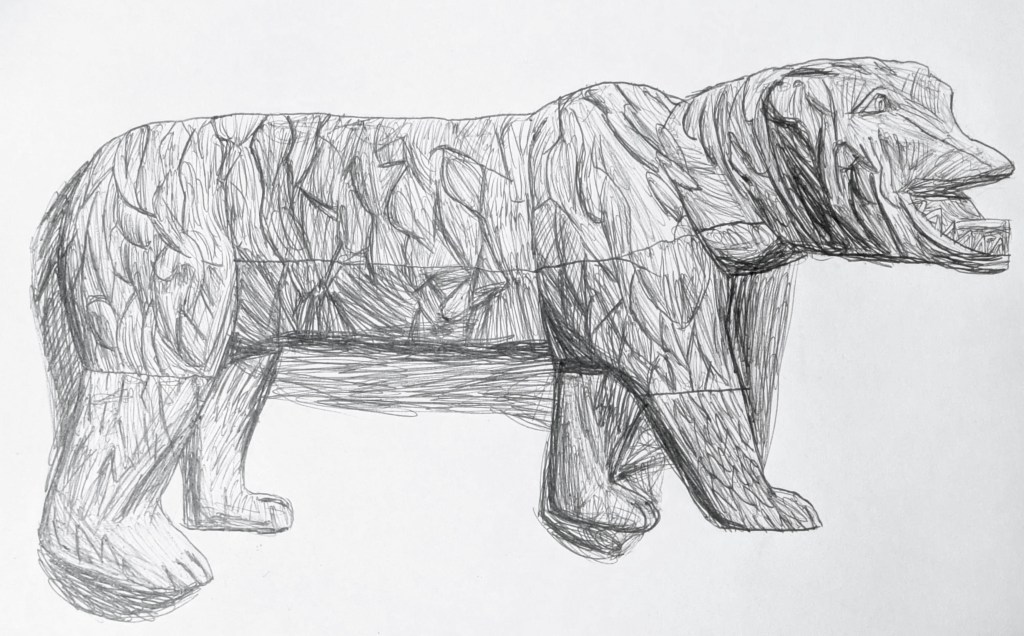
Collections: Fineliner pen sketch 9 (bear-like ship figure from the Deal Museum).
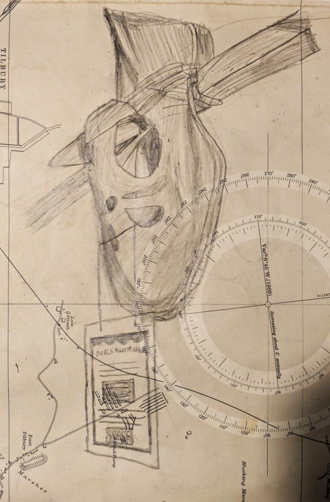
Collections: Pencil sketch 10 (Deal’s Biggest Shoe from the Deal Museum).
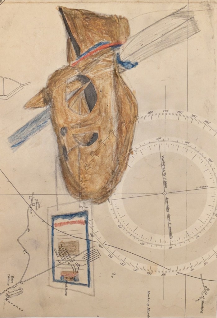
Collections: Watercolour pencil sketch 10 (Deal’s Biggest Shoe from the Deal Museum, colourised).
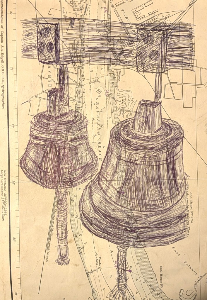
Collections: Biro sketch 11 (bells from the Deal Museum).
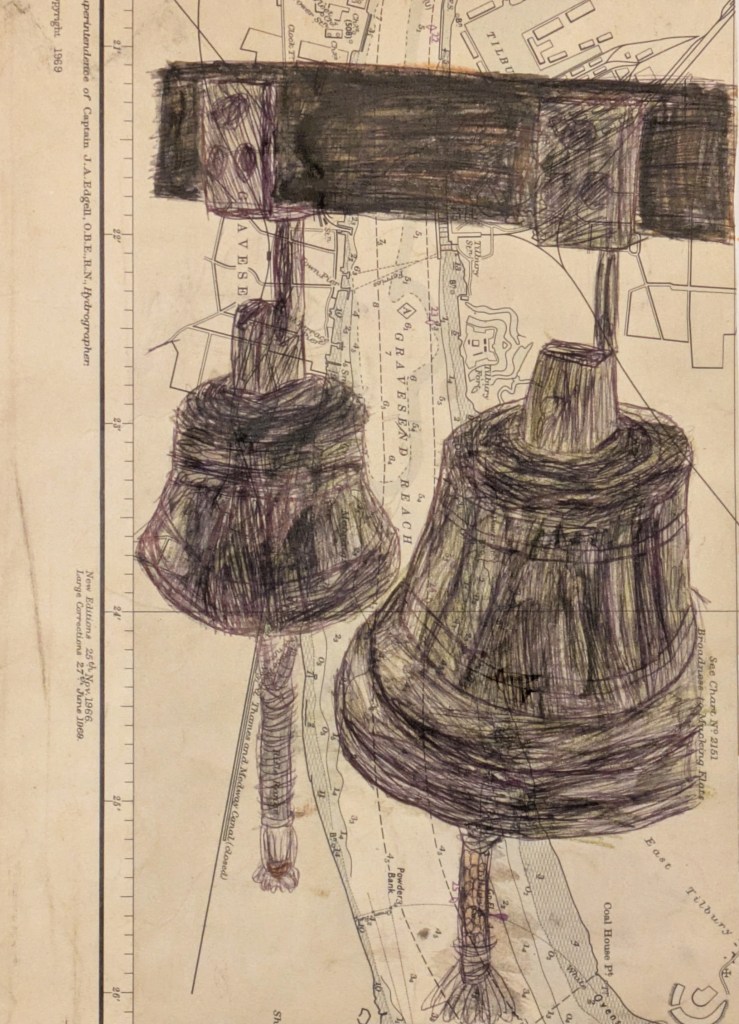
Collections: Biro and watercolour pencil sketch 11 (bells from the Deal Museum, colourised).
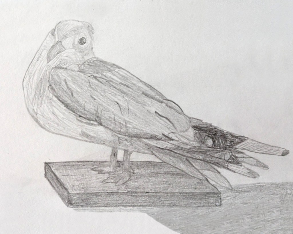
Collections: Pencil sketch 12 (taxidermied seagull from the Deal Museum).
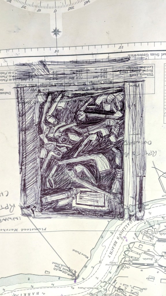
Collections: Fineliner pen sketch 13 (drawer of pipes from the Deal Museum).
Collections: Fineliner pen and watercolour pencil sketch 13 (drawer of pipes from the Deal Museum, colourised).
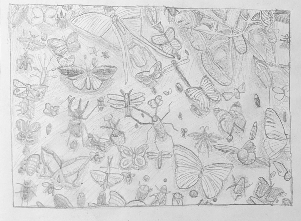
Collections: Pencil sketch 14 (insect collection from the Oxford University Museum of Natural History).
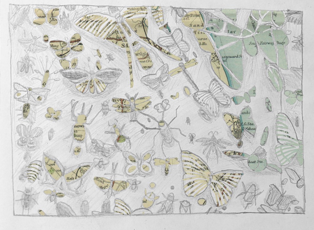
Collections: Pencil sketch 15 (insect collection from the Oxford University Museum of Natural History, layered on top of a map of Deal).
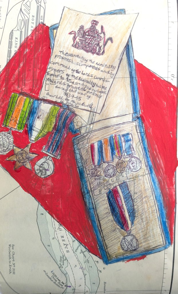
Collections: Fineliner pen, watercolour pencil and gouache paint sketch 16 (medals from the Deal Museum).
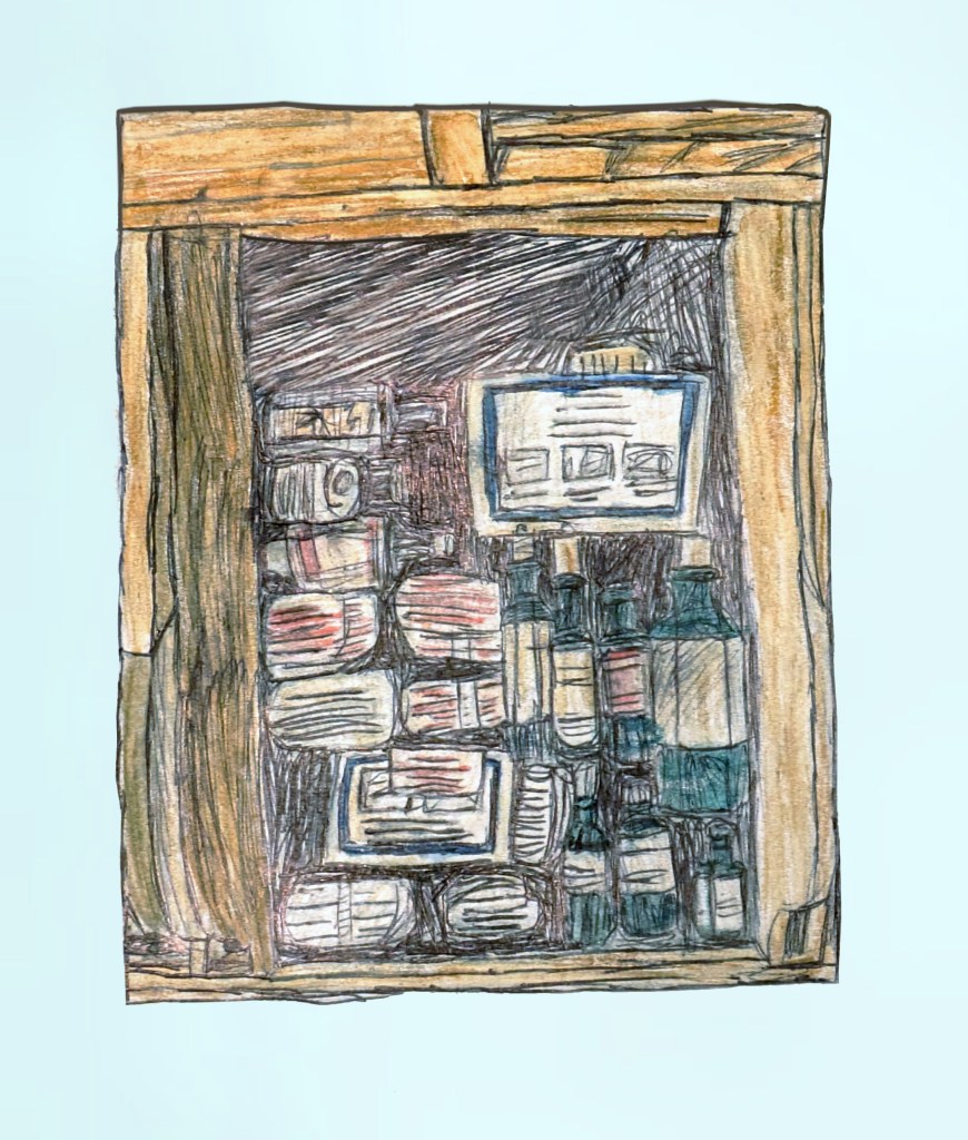
Collections: Fineliner pen and watercolour pencil sketch 17 (drawer of bottles from the Deal Museum).
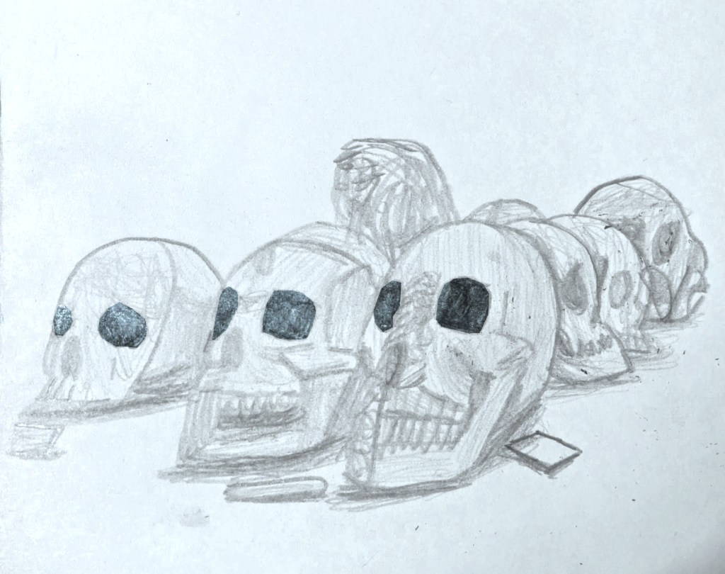
Collections: Pencil sketch 18 (skulls from the Pitt Rivers Museum).
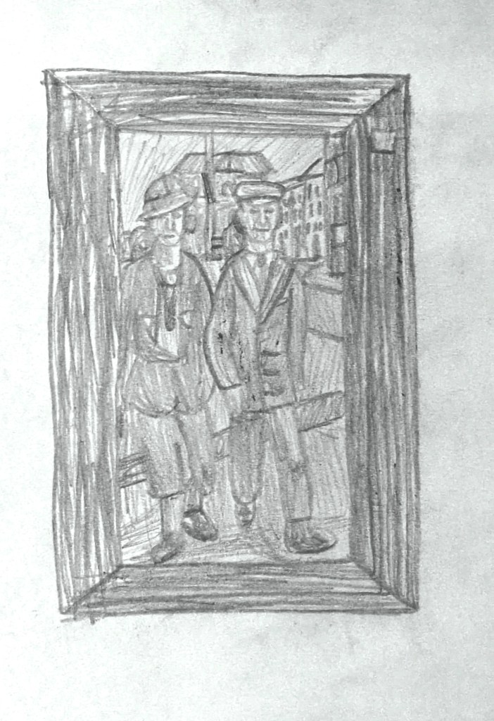
Collections: Pencil sketch 19 (picture frame with couple from the Deal Museum).
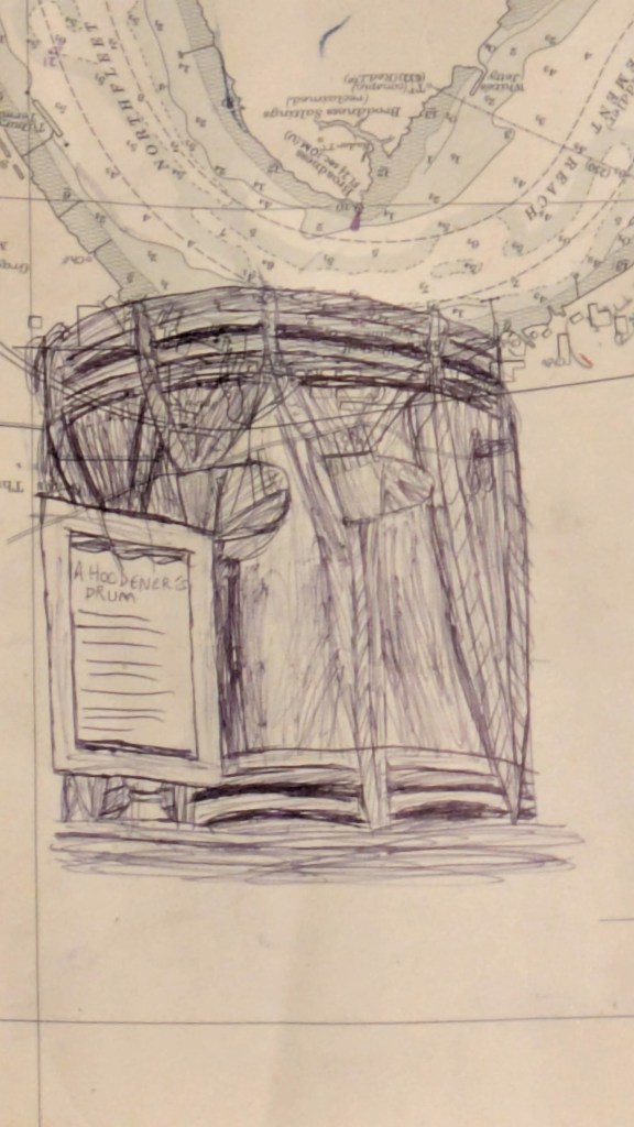
Collections: Fineliner pen sketch 20 (Hoodener’s drum from the Deal Museum).
First double-page spread layout.
Second double-page spread layout.
Third double-page spread layout.
Fourth double-page spread layout.

After I had explored four different layouts for the final double-page spread, I decided to develop the first idea further. I already liked the layout of the sketches and the use of a map, adding texture to the background, but I had problems making the sketches stand out. In order to make this work, I added a beige rectangle layer under the map and turned its opacity down 65%. This enabled me to reduce the contrast between the linear elements of the map and its background, helping it to recede in the composition. Next, I adjusted the contrast levels of each sketch, knowing that bigger contrast would help them stand out. Finally, I felt that the sketches would have a much greater impact if I varied the scale of some of them, in order to draw people’s attention to the bigger ones. Out of the four layouts, I liked this developed first one as it felt the least corporate-looking and the most creative, which I felt reflected the feeling of the Deal Museum.

First double-page spread layout, with white backgrounds in sketches removed.
First double-page spread layout, with enlarged and rearranged sketches with adjusted contrast levels.

My strengths for this project include my improving digital computer art skills (working in Photoshop and Illustrator) and doing observational sketches in pencil. I explored a wide range of materials, techniques and surfaces. Thus, this helped to improve and expand my illustration skills and use of materials and techniques, and develop my observational drawing skills to a higher standard. This has led to more interesting outcomes within an illustration pathway. I learned about new drawing techniques like ink and stick and gouache, developing and matching an illustration style to match a brief, and book and magazine layouts.

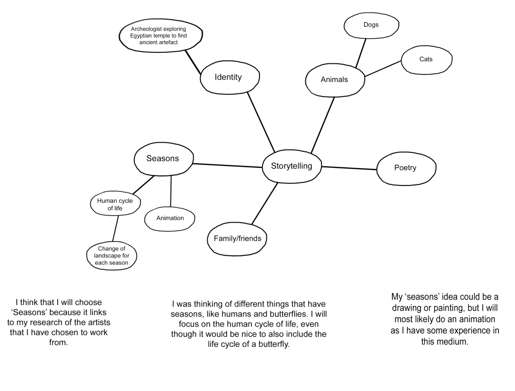
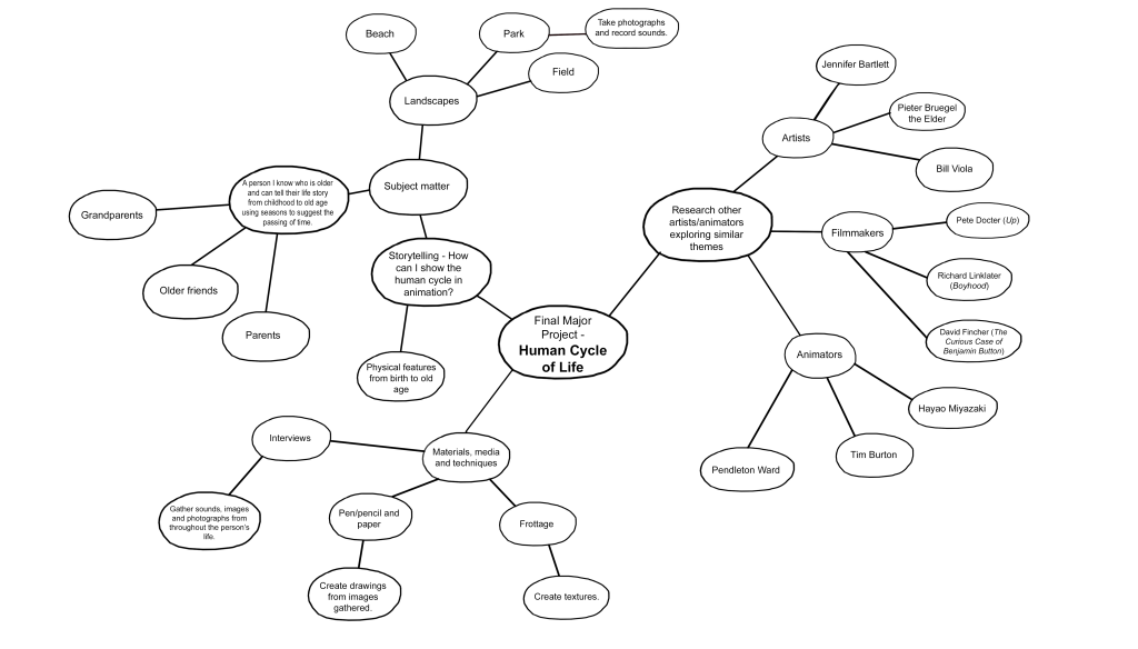
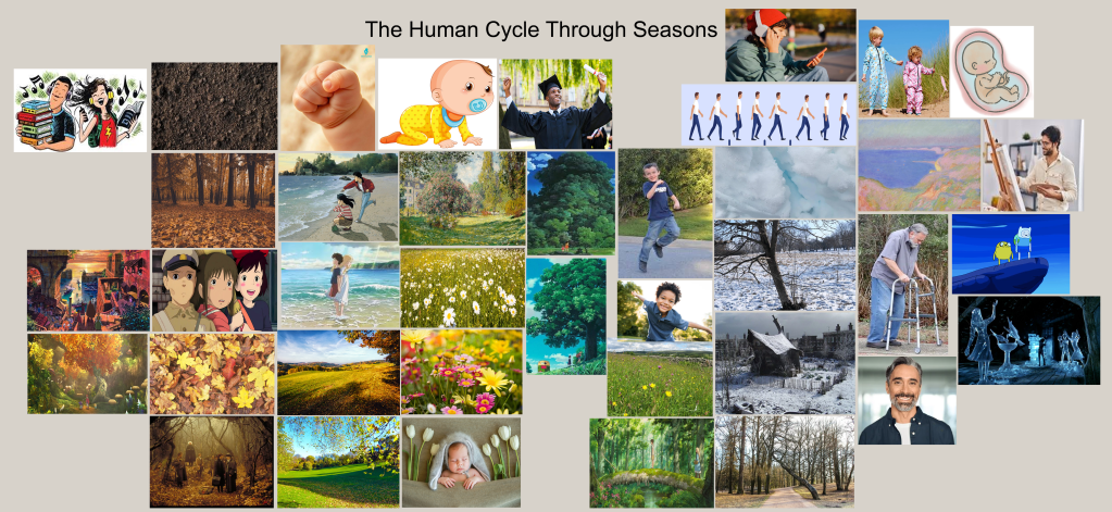
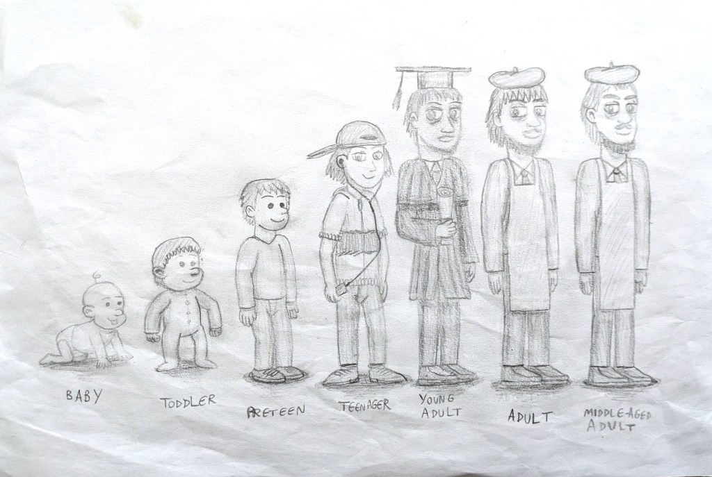
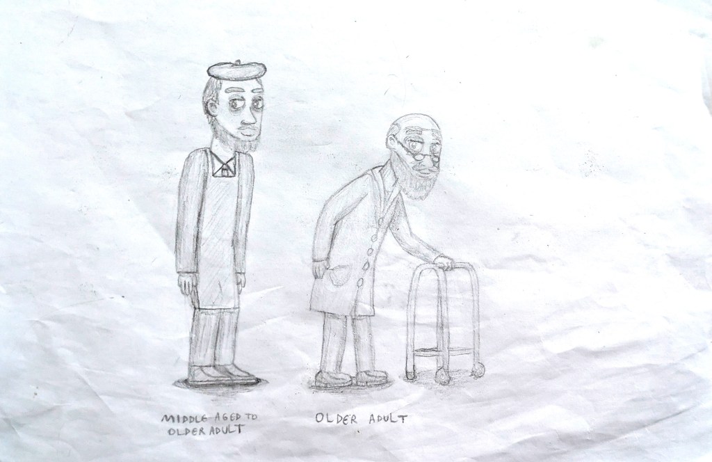
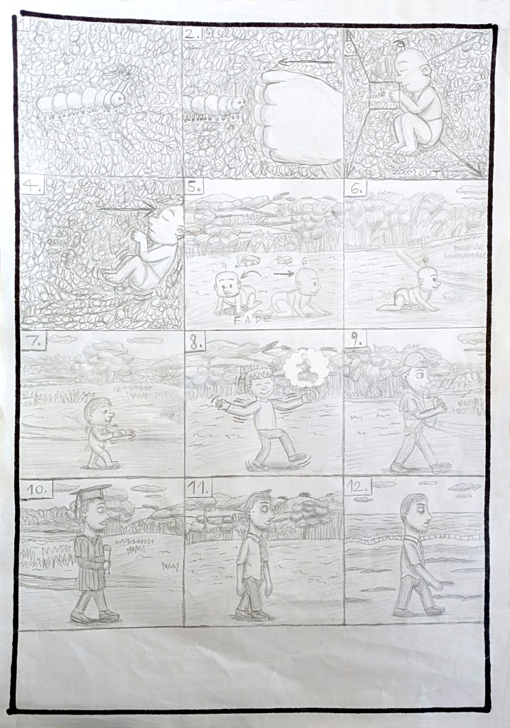
In December 2025, I chose to make an animated short film about the theme of aging and seasons for my Final Major Project. I called it Of Seasons and Skin, naming it in reference to John Steinbeck’s Of Mice and Men, which was referenced in cartoons, particularly Looney Tunes and Tex Avery. I researched other animators, artists and filmmakers who also tackled these themes, gathering information about their processes and methods. They included Pete Docter,[321][322] Richard Linklater,[323] Hayao Miyazaki,[324] F. Scott Fiztgerald and David Fincher,[325][326][327][328] Jennifer Bartlett,[329] and Bill Viola.[330] After analysing their work, I was inspired to develop a storyboard and character designs for a central character walking through the seasons as they age. I based the simplified facial features of the baby, toddler and preteen on Pendleton Ward, the design of the teenager on Hayao Miyazaki, and the young, mature and older adult designs on both Tim Burton and Miyazaki. I did a rough storyboard, researched age groups to understand their appearances and movements,[331][332][333][334][335][336][337][338][339][340][341] and did an interview with my older friends about their stages of life for inspiration on the character’s life events. This helped me identify the stages of life that I wanted to include. Even though I did not create the young adult’s design without the graduation hat and gown for the character design lineup, I included the design in the storyboard itself. Interestingly, on the day that I finished my initial storyboard (28 March 2026), the British weather in real life was changing constantly (from windy to cold to sunny to raining to hailing).[342][343][344][345] It felt like my project was coming to life in real time, even though I had not begun animating it yet.

Brainstorming ideas for my Final Major Project.
Mind map of ideas for my Final Major Project.
Moodboard of images showing the stages of life. Images © Missouri Secretary of State or Harford County Public Library/The Grounds Guys/Fitpage/MomJunction/Water Babies/The Sleepy Company/Claude Monet/Studio Ghibli/Level-5/Bandai Namco Entertainment/Shutterstock/janstria/Forestry and Land Scotland/Cartoon Network/Warner Bros. Entertainment Inc./Paramount Pictures/20th Century Studios/brgfx/Ashley Cooper/Barcroft Media/Saint Christopher’s/kali9/Romper/G-Stock Studio/iSkip/kate_sept2004/R Barret/magnific/CBS News/Alex Damansky/alenka2194/Kraken Images/Steven Frame/insta_photos.
Character designs for my project. Image © Oliver Mariager.
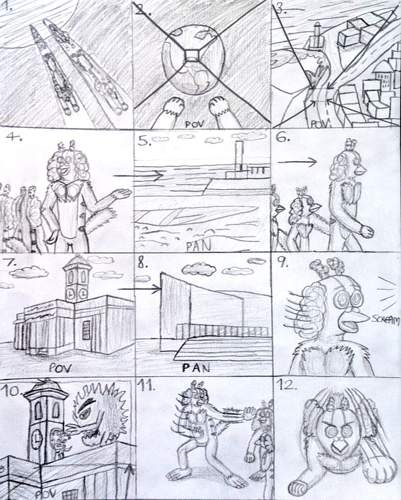
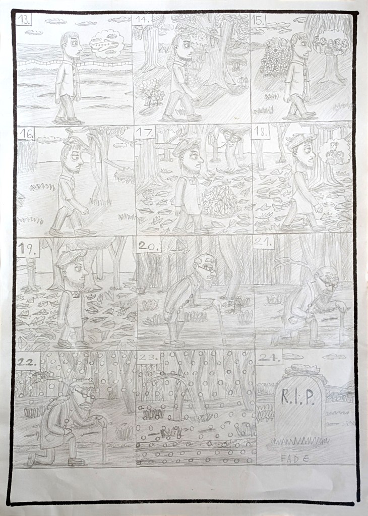
Initial storyboard (panels 1-12). Image © Oliver Mariager.
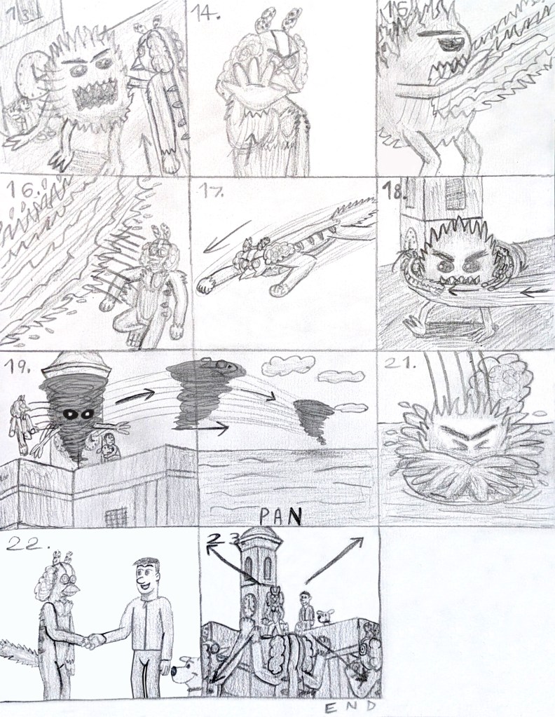
Initial storyboard (panels 13-24). Image © Oliver Mariager.
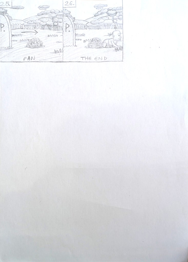
Initial storyboard (panels 25-26). Image © Oliver Mariager.
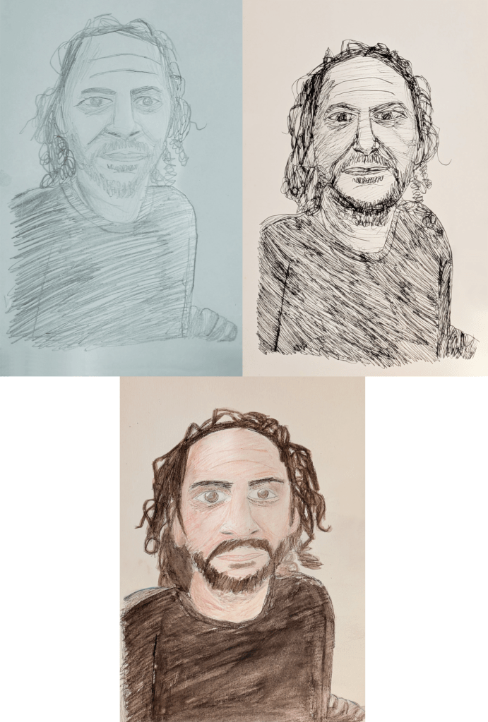
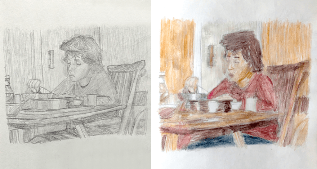
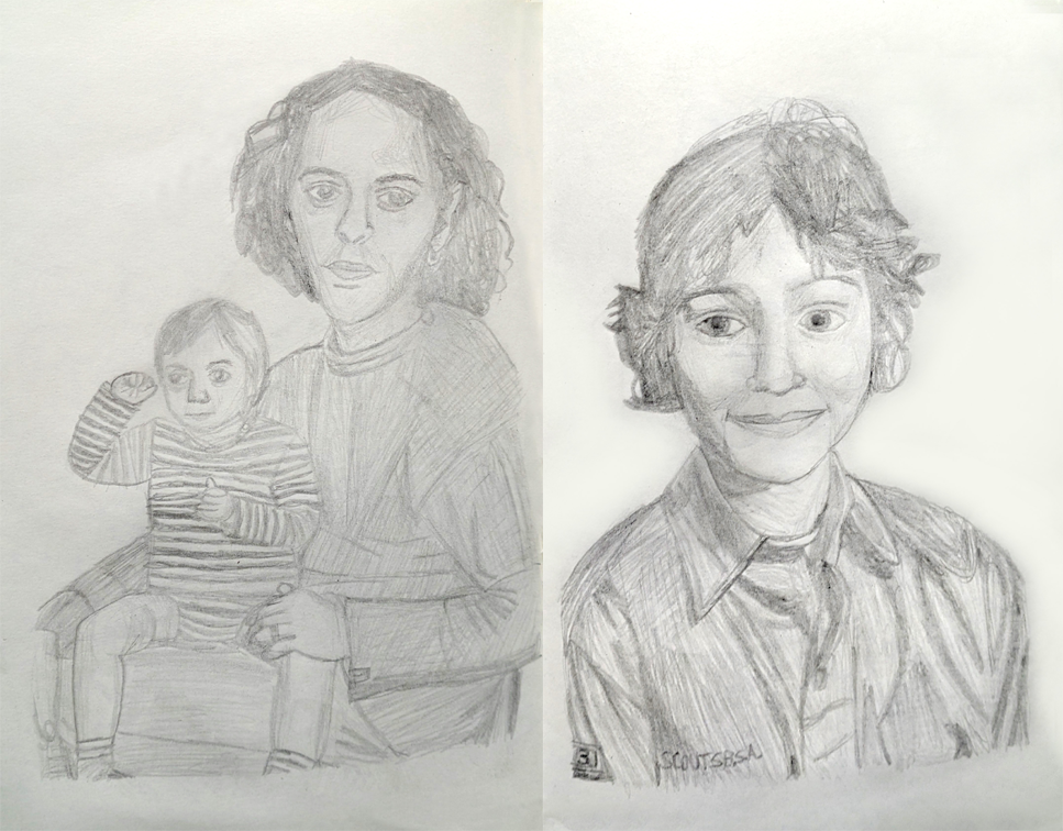
Pencil, fineliner pen and watercolour pencil sketches of Ivan.
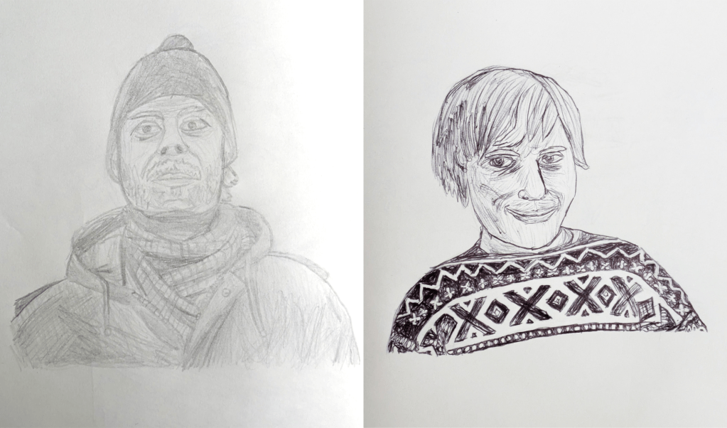
Pencil and fineliner pen sketches of my father.
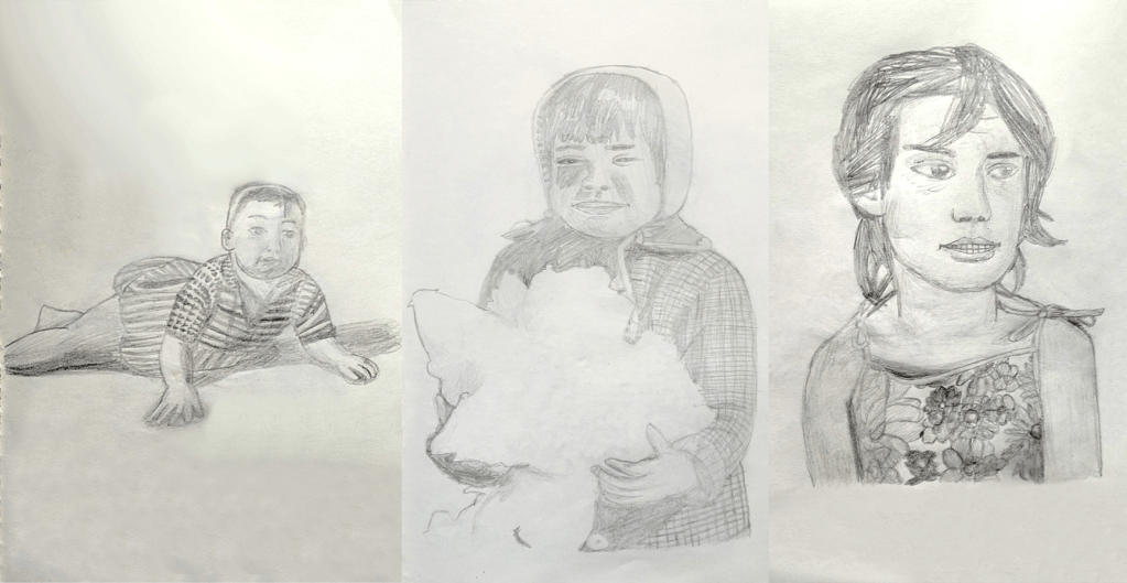
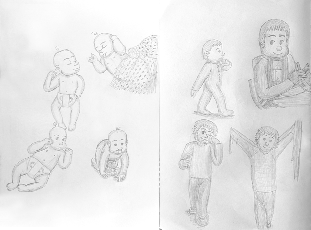
Pencil sketches of Tamar as a baby, toddler and child.
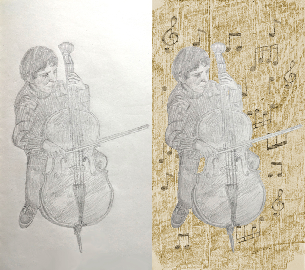
Pencil and digital sketches of a young Ivan playing the cello.
Pencil and watercolour pencil sketches of young Ivan.
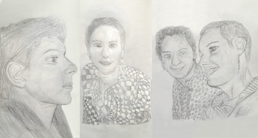
Pencil sketches of Ivan as a teenager and adult and with Tamar.
Pencil sketches of Ivan and Mio as a baby and child.
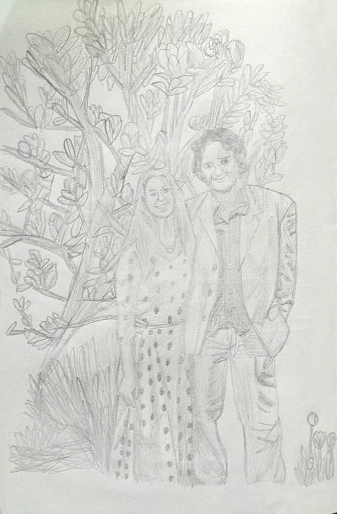
Pencil sketch of Tamar and Ivan on their 25th wedding anniversary in 2019.
Pencil sketches of my character as a baby, toddler and preteen, based on my parents’ photographs of me and Elyse and Pendleton Ward. Image © Oliver Mariager.
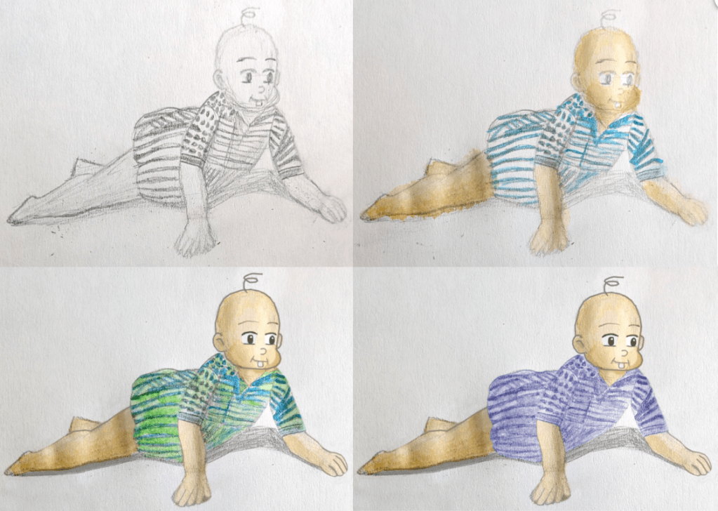
Digital pencil and watercolour sketches of a baby (based on Tamar’s baby photograph and inspired by Hayao Miyazaki and David Hockney; before and after). Image © Oliver Mariager.
 Pencil and watercolour sketches of my character as a preteen (based on my mother’s photograph and inspired by Pendleton Ward and David Hockney; before and after). Image © Oliver Mariager.
Pencil and watercolour sketches of my character as a teenager (based on my father’s photograph and inspired by Hayao Miyazaki and David Hockney; before and after). Image © Oliver Mariager.
Pencil, watercolour pencil, and early and final digital developmental sketches of my character as a mature adult (based on Ivan’s photograph and inspired by Tim Burton and David Hockney; before and after). Image © Oliver Mariager.
Pencil, watercolour pencil, and digital developmental sketches of my character as an older man (based on The Curious Case of Benjamin Button and inspired by Tim Burton and David Hockney; before and after). Image © Oliver Mariager.
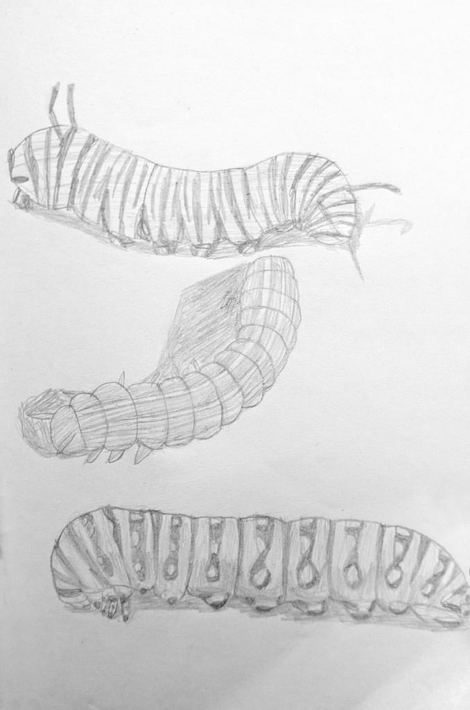
Pencil sketches of caterpillars. Image © Oliver Mariager.
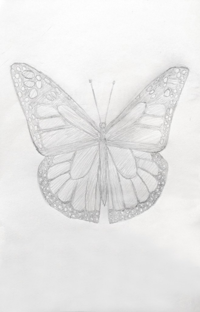
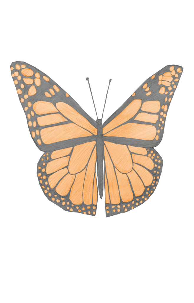
Pencil sketch of a butterfly. Image © Oliver Mariager.

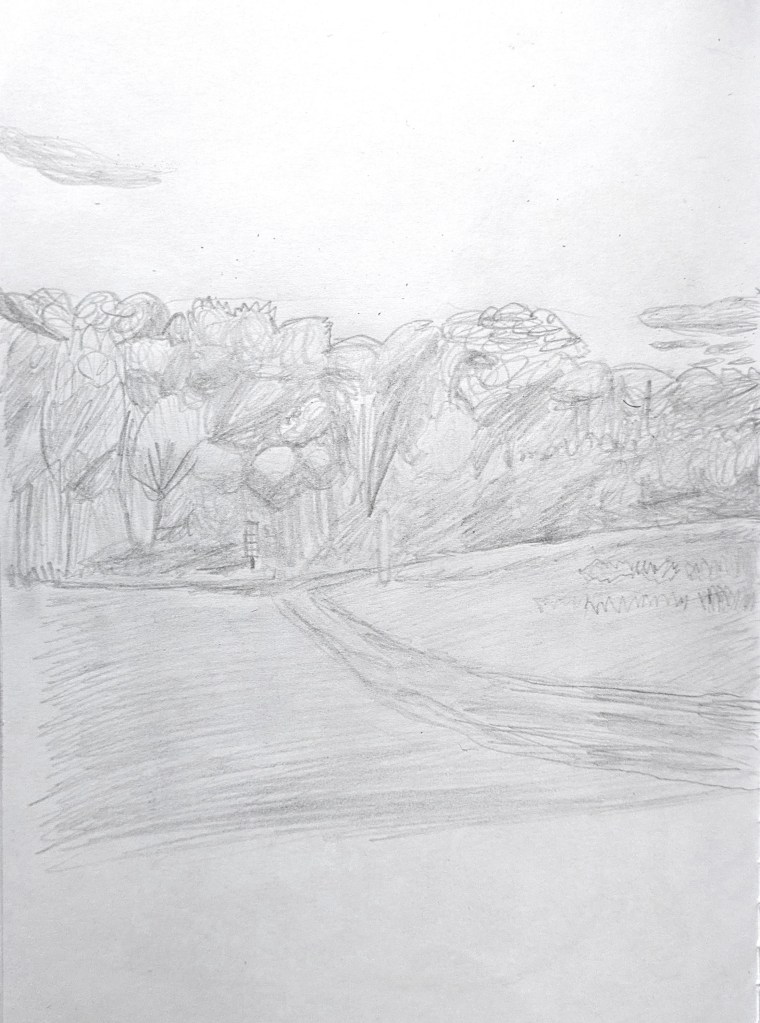
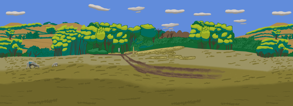
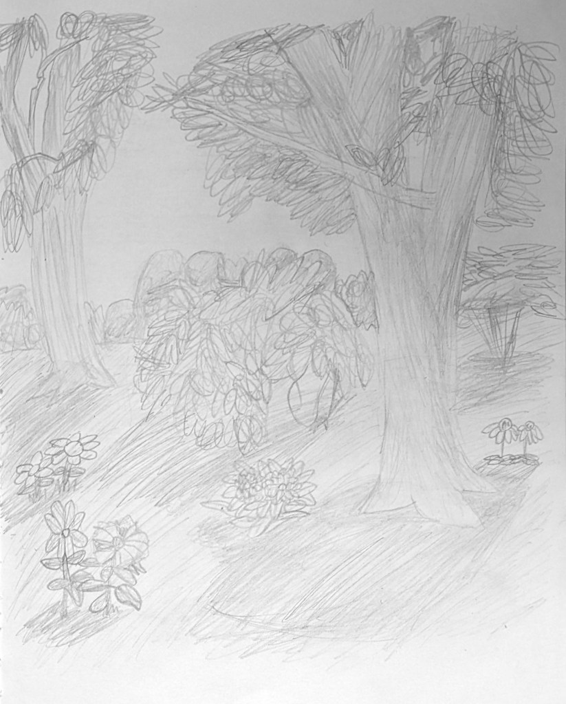
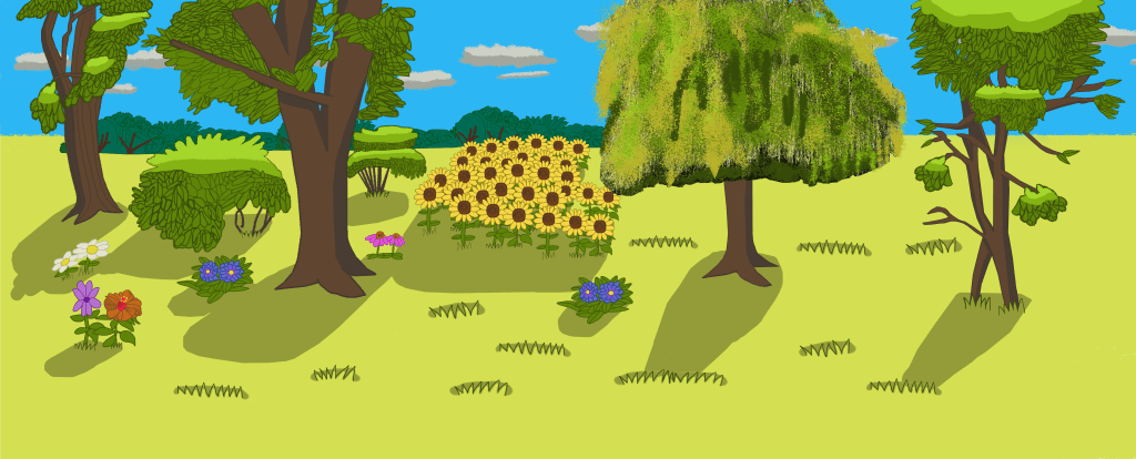
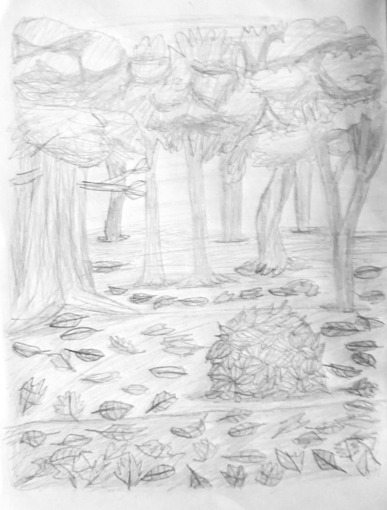
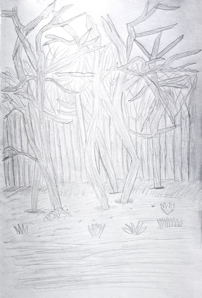
For the seasonal landscapes, I researched Pieter Bruegel the Elder,[346][347] Claude Monet,[348][349][350][351][352][353] Miyazaki,[354][355][356] Burton,[357][358][359] and Ward.[360][361][362] This gave me valuable insights on colour, texture and subject matter, which later helped to inform my own sketches developed from primary resource photographs, including ones taken during a walk at Betteshanger County Park. Although not mentioned in my Statement of Intent, I also researched another favourite artist of mine, David Hockney.[363][364][365][366] I drew inspiration from his landscapes and decided to use frottage textures. Adding the textures into the landscapes completely transformed the look of the scenes, giving them greater visual depth. In iPad drawing No. 2 from The Arrival of Spring in Woldgate, Hockney used an iPad to digitally draw the landscape, and created layers of colourful marks and textures, capturing a sense of light.[363] I created my winter landscape in the same manner, but with a colder colour scheme instead of warm, vibrant colours.

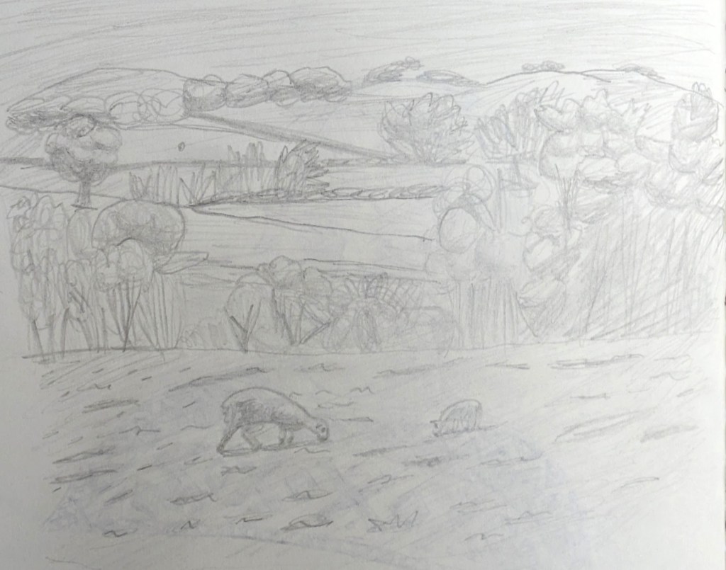
Pencil sketch of meadow. Image © Oliver Mariager.
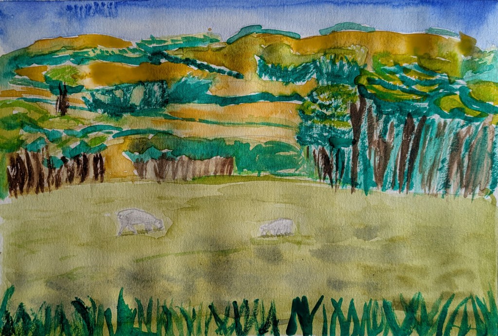
Watercolour pencil sketch of meadow. Image © Oliver Mariager.
Pencil sketch of meadow with trees and bushes. Image © Oliver Mariager.
Finalised full digital meadow landscape. Image © Oliver Mariager.
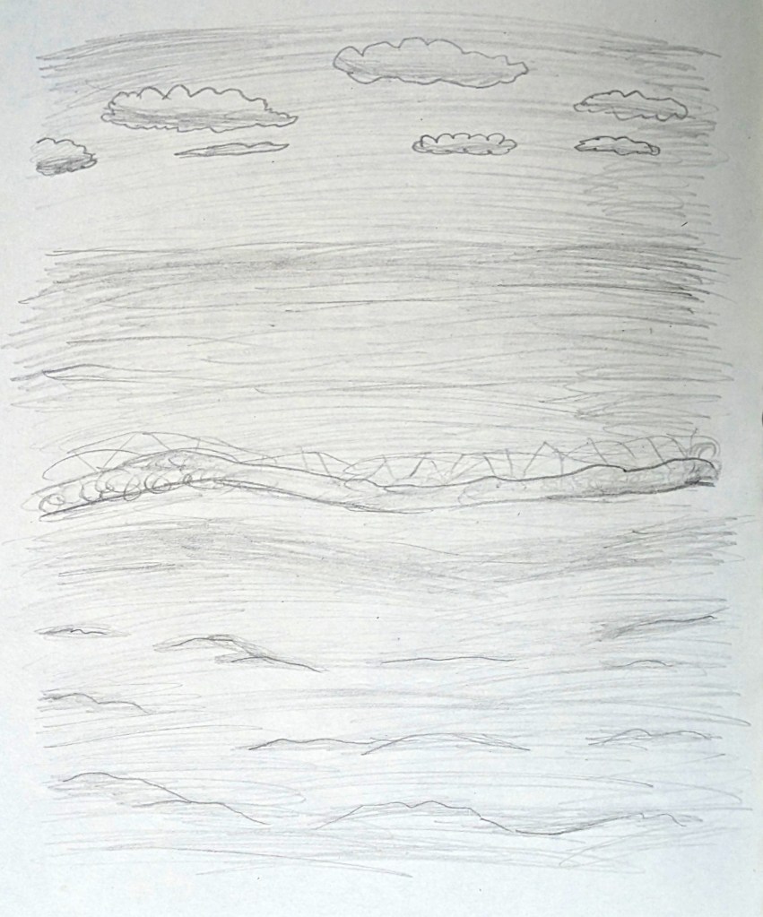
Pencil sketch of seaside. Image © Oliver Mariager.
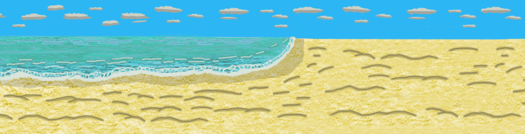
Finalised full digital seaside landscape. Image © Oliver Mariager.
Pencil sketch of summer trees, bushes and flowers with shadows.
Finalised full digital summer park landscape, with willow tree edited from a photograph taken at Hever Castle. Image © Oliver Mariager.
Pencil sketch of autumn trees and leaves. Image © Oliver Mariager.
Finalised full digital autumn leaves landscape. Image © Oliver Mariager.
Pencil sketch of winter trees. Image © Oliver Mariager.
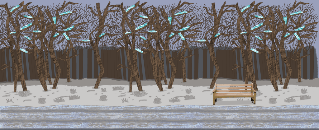
Finalised full digital winter trees landscape. Image © Oliver Mariager.

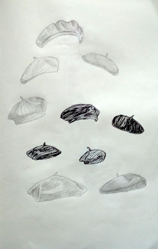
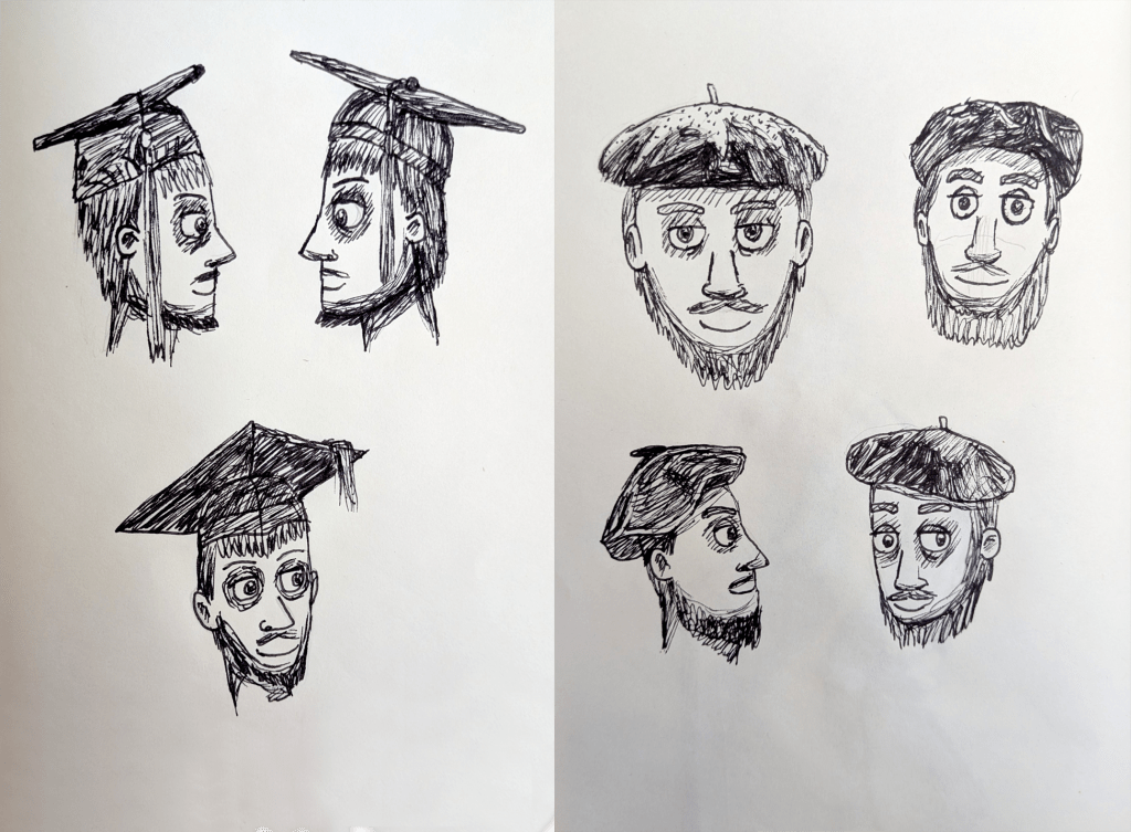
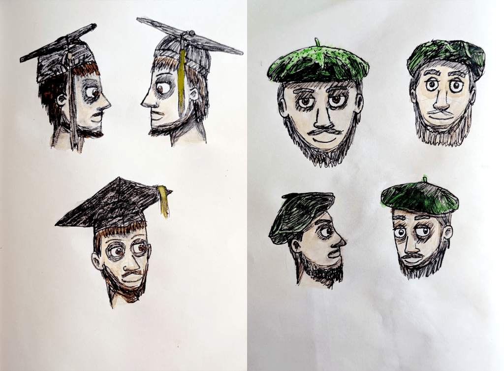
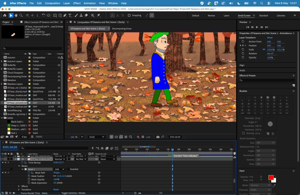
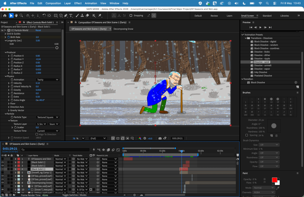
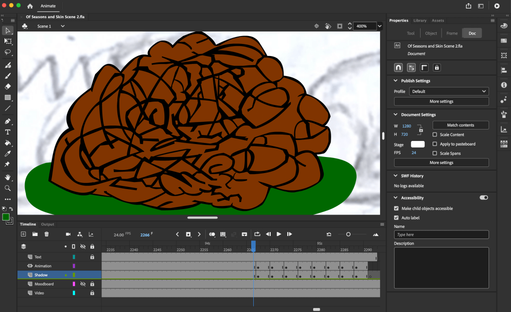
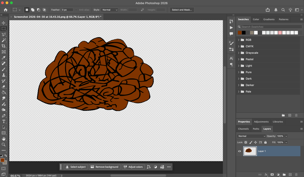
I used Adobe Animate to produce the project. Throughout the project, I encountered different challenges in the animation process. I had to refine some of my character designs. This included more research, which led to me adapting the baby’s face to look younger and removing the codpiece-like fly from the young adult’s trousers. I further researched berets in order to draw the mature adult’s one accurately, and gradually slowed down the transformation from a mature adult to an older adult. I changed the colour of the butterfly from orange to blue to make it stand out from the autumn landscape. I encountered a problem with Animate crashing three times; the first time this involved a heavy amount of strokes on soil. I printscreened the soil, created and exported a transparent .png file of said soil from Photoshop, and imported the file into Animate to prevent any future issues. Editing and special effects were done in After Effects and Adobe Premiere Pro. In After Effects, I added a text layer for the project’s title, using the font “Snell Roundhand” against a frottage earth texture, and added the “Dissolve – Sand” effect to make it appear and disappear. I chose this effect because the project’s opening scene takes place in earth soil. I watched a tutorial on title animations by Smertimba Graphics,[367] which inspired me to create animation effects and the position for my director credit. I later added a triskelion symbol in the background for the end credits, because in my family, it is thought to represent the cycle of life.

Pencil and fineliner pen sketches of berets. Image © Oliver Mariager.
Fineliner pen sketches of mortarboards and berets on heads (before). Image © Oliver Mariager.
Fineliner pen and watercolour paint sketches of mortarboards and berets on heads (after). Image © Oliver Mariager.
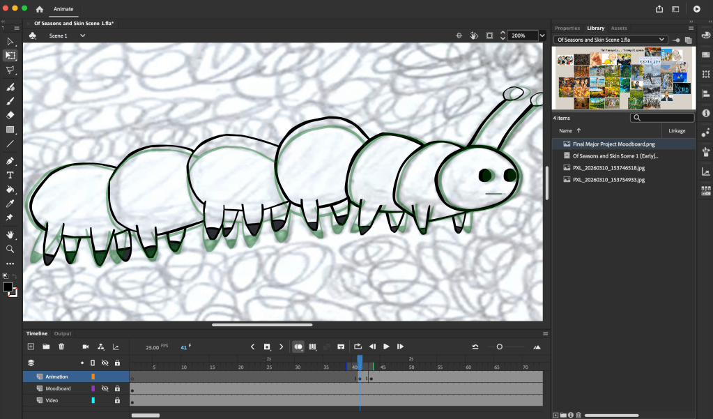
Screenshot of animation process (caterpillar crawling through soil in spring). Image © Oliver Mariager.
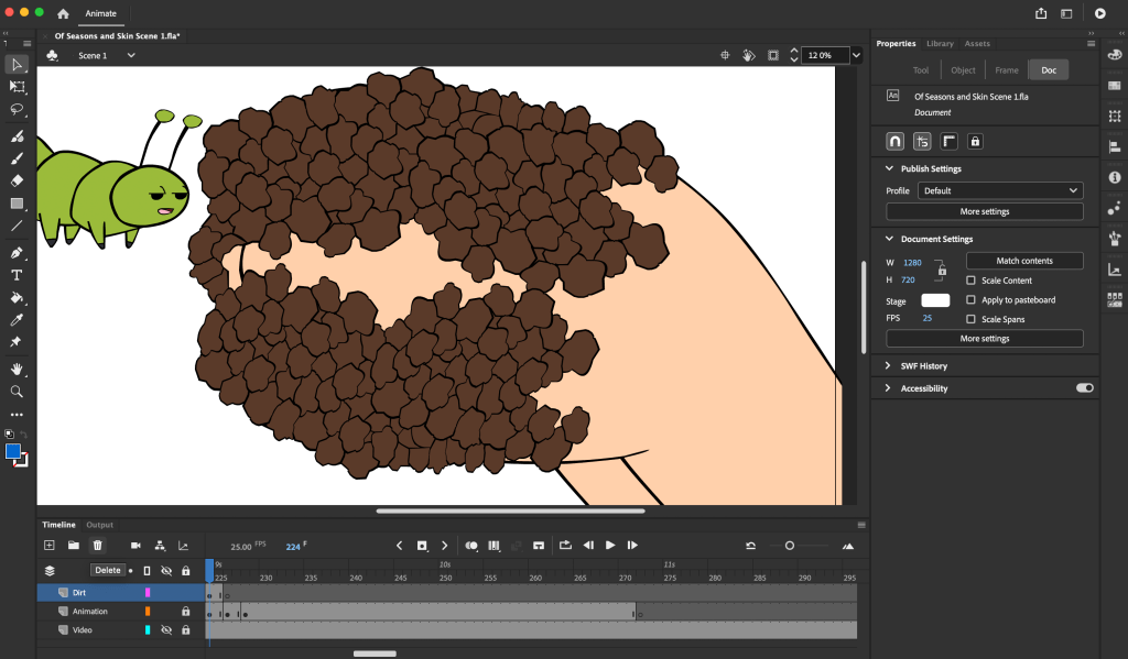
Screenshot of animation process (initial, hand-drawn dirt coverage of the baby’s hands in spring; before). Image © Oliver Mariager.
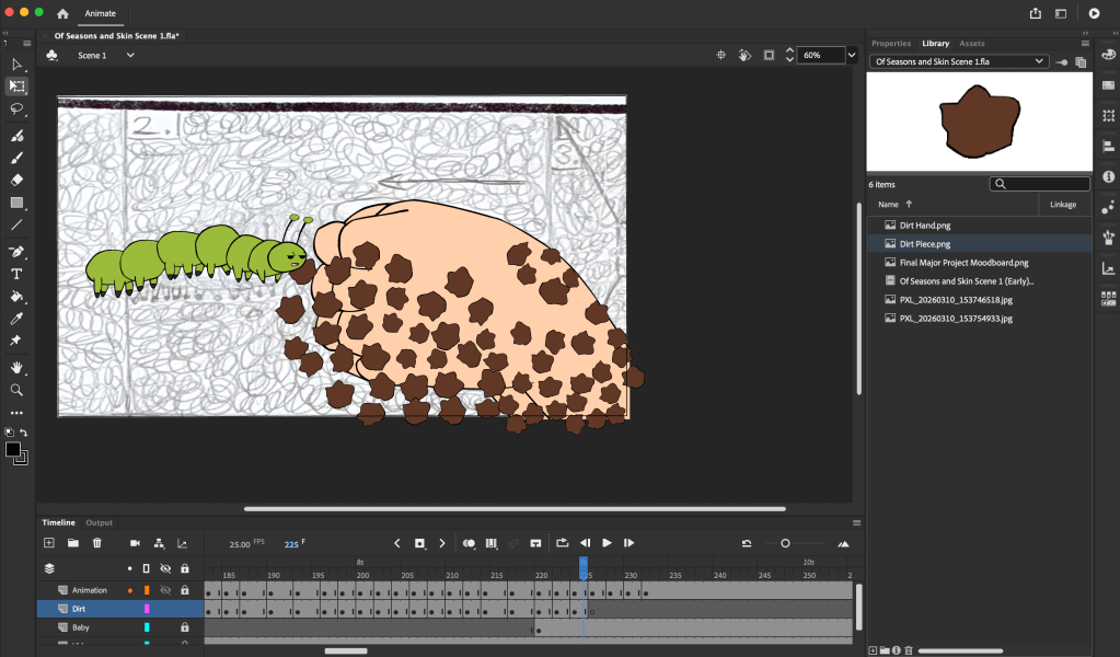
Screenshot of animation process (.png dirt falling from the baby’s hands in spring; after). Image © Oliver Mariager.
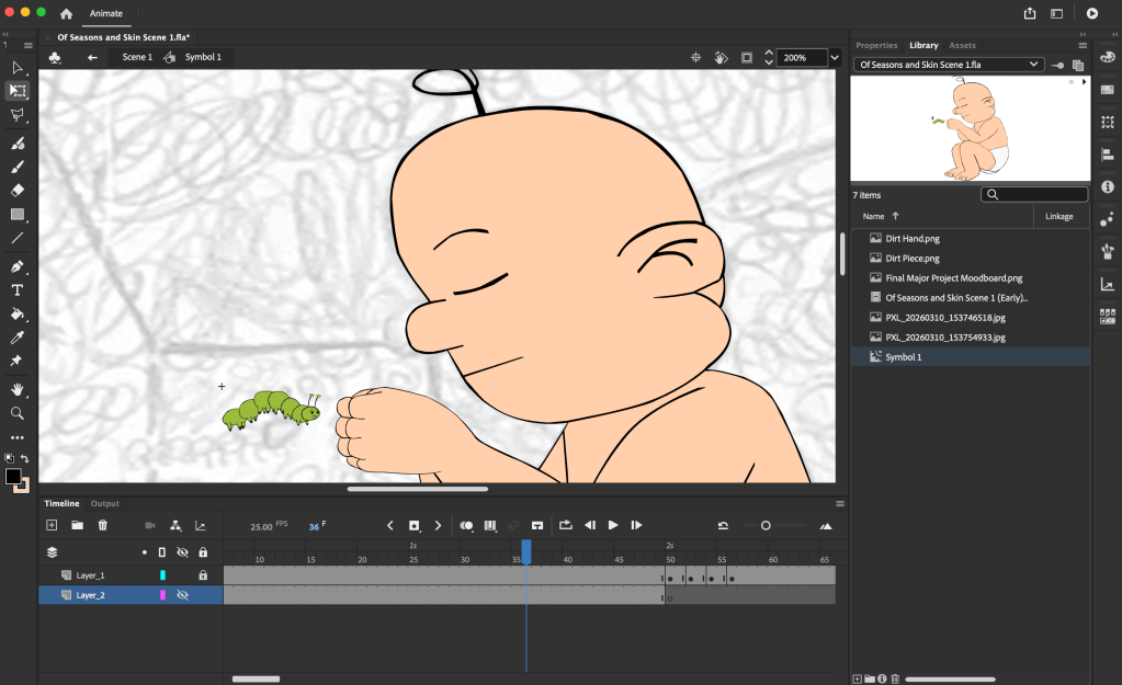
Screenshot of animation process (shrinking the baby’s nose to make him younger in spring). Image © Oliver Mariager.
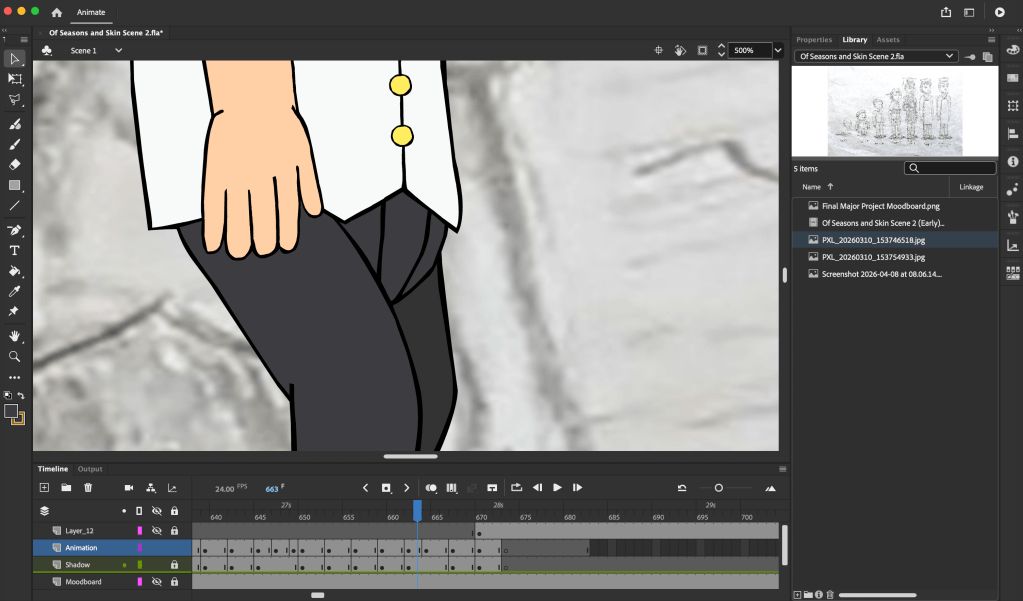
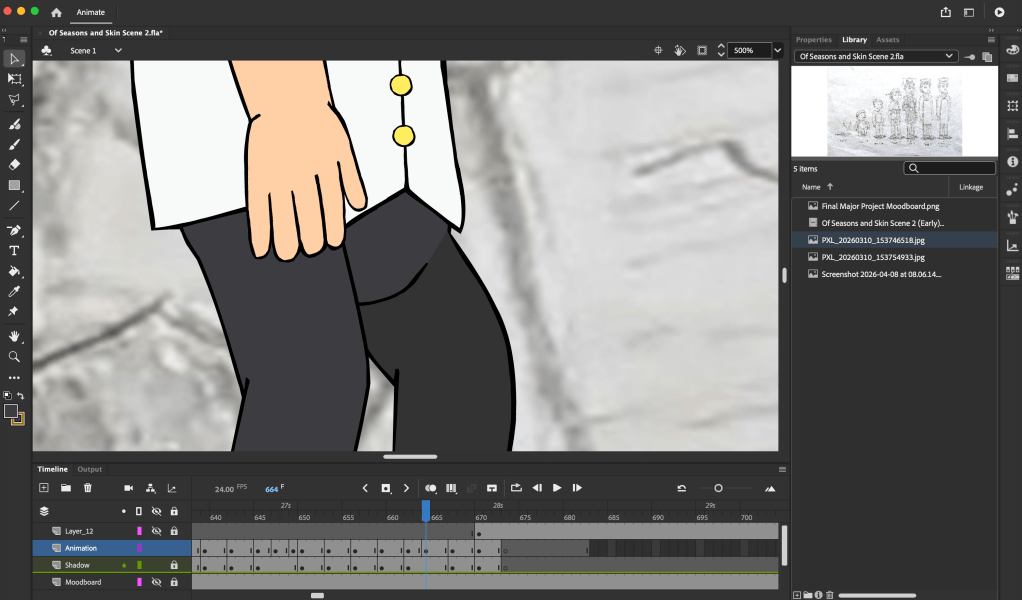
Screenshot of animation process (young adult’s fly in spring and summer; before). Image © Oliver Mariager.
Screenshot of animation process (removing the young adult’s fly in spring and summer; after). Image © Oliver Mariager.
Screenshot of animation process (mature adult changing into older adult in autumn). Image © Oliver Mariager.
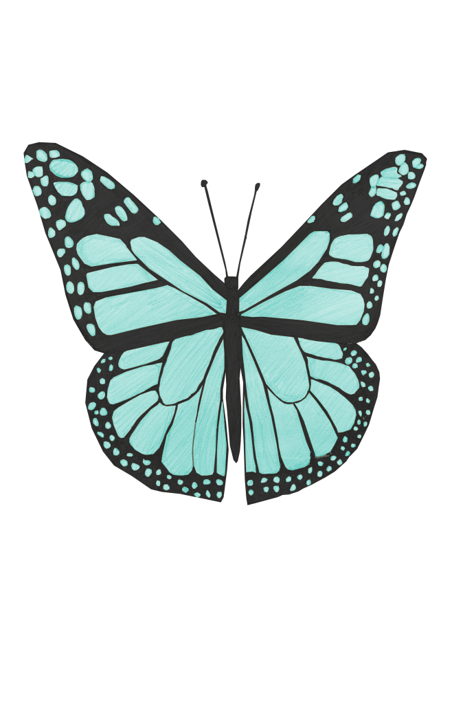
Initial orange butterfly for the autumn scene. Image © Oliver Mariager.
Finalised blue butterfly for the autumn scene. Image © Oliver Mariager.
Screenshot of my animation process (animating snowfall in winter). Image © Oliver Mariager.
Screenshot of my animation process (drawing pile of soil for the baby to emerge from in spring). Image © Oliver Mariager.
Screenshot of my animation process (creating .png edit of soil in spring). Image © Oliver Mariager.
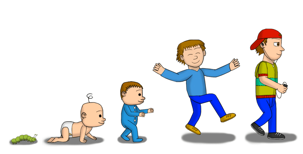
Character lineup for my finalised project (caterpillar, baby, toddler, preteen and teenager). Image © Oliver Mariager.
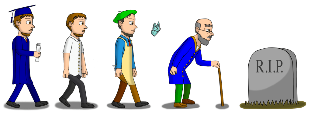
Character lineup for my finalised project (young adult (graduation gown and casual), mature adult, butterfly, older adult and gravestone). Image © Oliver Mariager.
Triskelion symbol used in end credits. Image © Oliver Mariager.

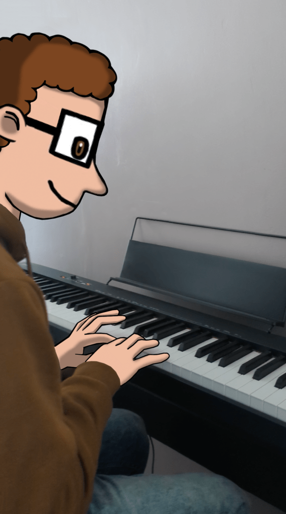
When it came to the soundtrack and sound design, I wanted to use this to further illustrate my idea of seasonal changes. I made recordings of what the footsteps would sound like in different conditions, and combined this with sound recordings of me playing the keyboard/piano, alongside my custom-made electronic music tracks. This was successful since it enhanced the ambience of the different seasons.

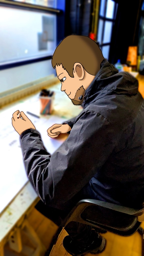
Me composing the music for the winter scene.

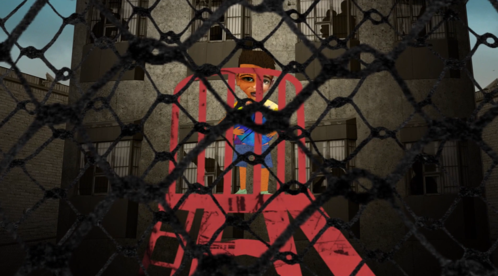
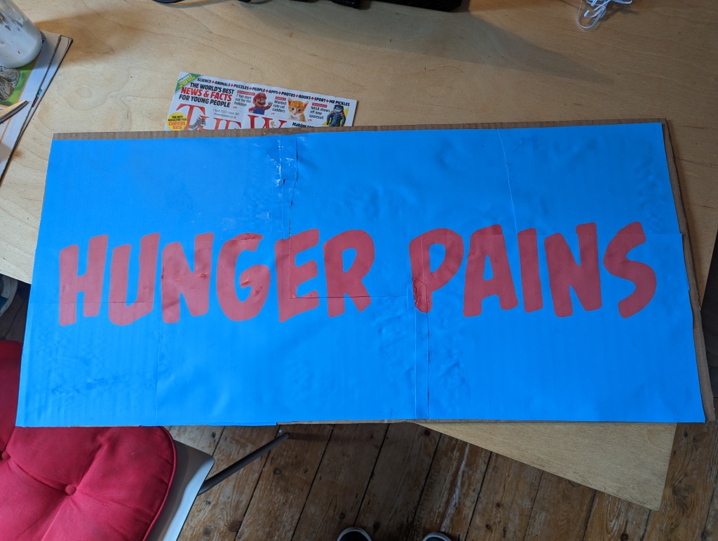
I had a good understanding of how to use animation software and produced my own short animated films (Sensory Chaos, Hunger Pains, Breathe, Real Take) before I started this course. During the past two years on the course, I have expanded my repertoire of different media, refined my observation skills, learned how to analyse the work of others, and used this research to make decisions on how to develop my own personal ideas. I have also learned how to manage my time to develop my ideas in answer to a brief and a set deadline. I completed everything that I committed to in my Statement of Intent on time. During the planning phase, I broke down my tasks into a framework that I was able to manage and reflect on every week. By analysing my work weekly, I was able to address any feedback and issues with timing and consistently find effective solutions to the design development of the characters and the seasonal landscapes. The final look of the characters and landscapes demonstrates my commitment and the level of development involved in my project from the initial pencil-sketched ideas in the research phase through to the finished product.

Overall, the film was intended to run for one minute, but ended up running for two minutes and 20 seconds. This longer duration is a testament to my original aim to broaden my understanding of storytelling through animation. I have demonstrated this understanding in my thorough research of the human aging process, including stance and movement. The medium of animation allowed for the visual storytelling, which involved adding more frames, and therefore more time to the film. I am happy with the final outcome; I showed it to different test audiences at different stages in its development, to which they gave positive feedback. They immediately understood the themes of the project and enjoyed it. I also had the pleasure of seeing and watching projects by some of the other OCAD students, including Bo Burnham, MeiyiOtaku, Joanne McKeown, Beatrix Finch, et cetera. If I had more time, I could have developed the musical score further, taking inspiration from my research on “The Four Seasons” by Antonio Vivaldi.[368] As the deadline was short, I made the right decision to focus my time on the visual storytelling of the theme within the time parameters, completing the project on time and to a high standard. My favourite scene was the autumn scene, because it encapsulated everything that I wanted to visually achieve in perfect harmony with the storytelling of the theme. Going through this process has reinforced my love of animation and has inspired a further study in illustration, which I hope to embark on at Falmouth University. To celebrate my graduation from OCAD and the completion of my project, my mother and I went on holiday to Crete, Greece for a week. After the holiday, I joined OCAD’s End of Year Summer Show on 3 July 2026, where we entered a virtual exhibition.[369] My project was on display at the exhibition (1:12), and after we watched it, Matt Theodore praised the film. He described the film and the amount of work that I had put into it as “amazing, really fantastic work” and “a huge undertaking, a project of that size and incredibly ambitious and beautifully produced”. On 27 July 2026, I got my Diploma in Art and Design results. It was a Distinction, which gets me into university. I would not learn of this until 10 August 2026.

I had a personal bereavement this week, because one of my grandfathers, Kjeld (18 March 1942-3 August 2026[370][371]), died in peace after my father visited him in his care home in Denmark. Kjeld was a local historian and author who documented the cultural, architectural, and environmental history of the cities of Aalborg and Nørresundby.[372][373][374][375][376][377] He wrote the 1999 book Det grønne Aalborg: Historien gennem 200 år (The Green Aalborg: The History Through 200 Years),[372] and hosted slideshow presentations in the North Jutland Region.[375] When I was a child, I would always mistakenly think that Kjeld was much younger, with brown hair and a moustache and beard, and imagined him as such. His death reminded my father of a scene in my project, where my character dies as an older adult before the cycle of life begins anew in spring.

In memory of Kjeld, my grandfather, and David Hockney, who passed away one month after I completed my project.

R.I.P. Rachael Lillis

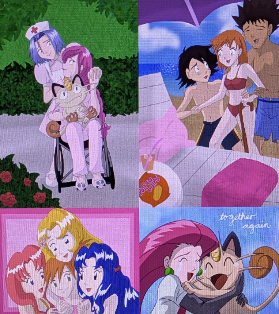
James, disguised as a nurse, takes care of Jessie and takes her for a long walk, while Ash Ketchum and Brock take Misty to the beach, thinking and hoping that her being near water would help her feel better and recover. Daisy, Violet and Lillie show support for Misty. Following Rachael Lillis’ death, Jessie reunites with Meowth in Heaven. Image © Stardust-Phantom. Pokémon characters © The Pokémon Company/Nintendo Company, Limited/Game Freak/Creatures/TV Tokyo/ShoPro/JR Kikaku. Edit © mysuperendeavour@WordPress.
A crying Togepi holds a Cascade Badge, its tears having formed a puddle with a reflection of Misty holding it. Image © Boss Logic. Misty, Jessie and Togepi © The Pokémon Company/Nintendo Company, Limited/Game Freak/Creatures/TV Tokyo/ShoPro/JR Kikaku.
Misty and Jessie’s souls watch their grieving friends from Heaven. Image © ShortyDante. Pokémon characters © The Pokémon Company/Nintendo Company, Limited/Game Freak/Creatures/TV Tokyo/ShoPro/JR Kikaku.

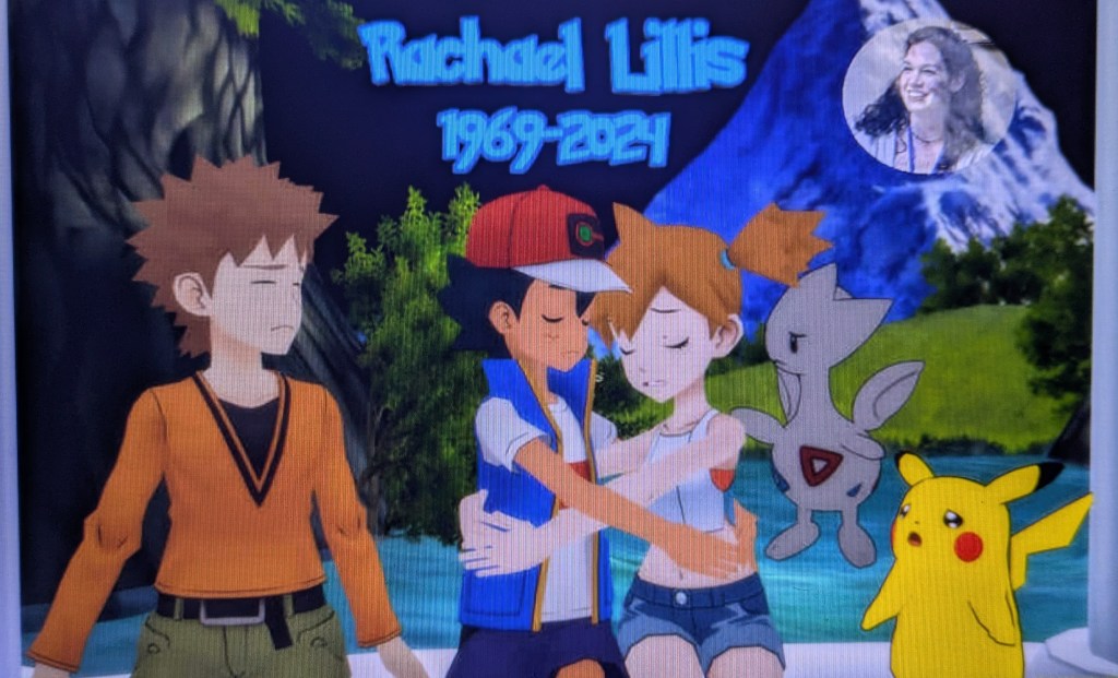
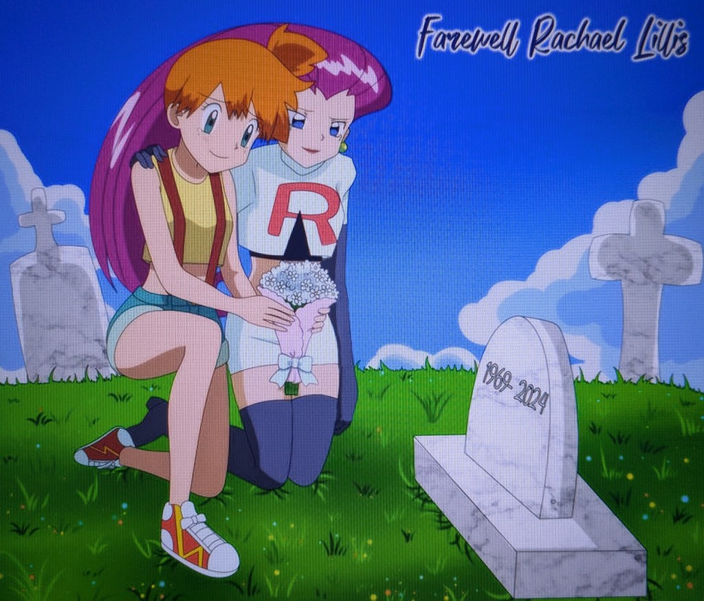
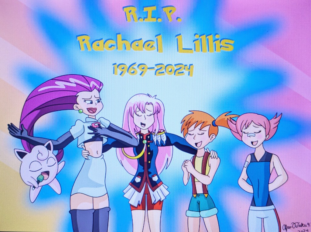
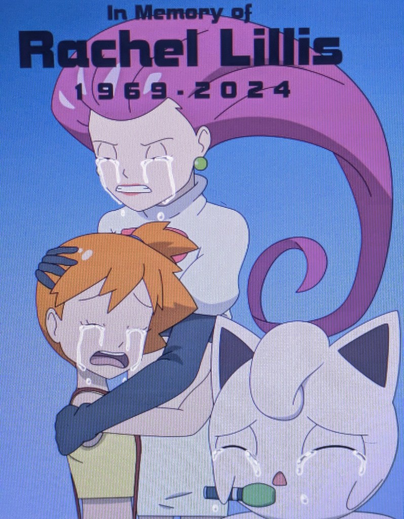
In May 2024, Rachael Lillis, best known for voicing Misty, Jessie, Jigglypuff and other characters in the original English dub of Pokémon, was announced by her sister, Laurie Orr, to have been diagnosed with breast cancer. The cancer had spread to her spine, which left her barely able to walk. Her insurance company put her in a hospital to receive care in January, but the noise in the hospital made it difficult for her to rest, and she was placed in a nursing home. Not helping was that at one point her doctor discontinued her treatment without explanation. Orr set up a GoFundMe campaign to help raise money for the cost of treatment. Several of Lillis’ fellow actors shared the campaign to help raise money for her care, and people around the world donated toward the cause, even just a few dollars. In a very short amount of time, the campaign had raised over $67,000. Orr would forward emails and comments to Lillis. When she saw the GoFundMe page with the comments and kind thoughts, she was moved to tears, comparing the response to the fund to It’s A Wonderful Life, when George Bailey learns just how much he is loved by his caring friends. She remembered many of the fans that she met at conventions, and related stories to them about the experience and all the people that she appreciated meeting. Plans were made to give Lillis better care and get her into rehabilitation to help regain muscle that was lost while she was in the nursing home due to the neglect that she experienced.[1][2] People on Twitter and DeviantArt did “Get Well” fanart in hope that Lillis would make a full recovery in future; some artists like Stardust-Phantom, Steamerthesteamtrain (a fan of Misty since 2008[3]) and Taipu556 depicted Misty and Jessie as suffering from cancer like her,[4][5][6][7][8] whereas _fairybees, Ultra-Shounen-Kai-Z, NintendoStar28 and streetgals9000 did art of Misty and Jessie posing and holding cancer awareness ribbon badges,[9] Jigglypuff giving a message to help Lillis,[10] Misty and her friends praying for Lillis’ recovery,[11] and Misty fighting Lillis’ cancer to save her life.[12] Unfortunately, on the night of August 10, 2024, shortly after moving out of the nursing home, Lillis passed away “peacefully, without pain” at the age of 55. The sad news was revealed by Orr and Veronica Taylor (the voice of Ash Ketchum in the original English dub) two days later on August 12, 2024. As news of Lillis’ passing spread online, Pokémon fans and other voice actors paid tribute to her with posts of their own, recounting how her work contributed to their childhood memories of watching the early seasons of the anime. Eric Stuart (the voice of Brock and second voice of James in the original English dub), called Lillis “his comedic partner in crime”, and told people to watch the original dub to celebrate her life. Michele Knotz (the current voice actress of Misty, Jessie and Jigglypuff) said that she never got to meet Lillis, but grew up with the latter’s “wonderful performances” as Misty and Jessie, and extended her “deepest condolences” to Lillis’ family. Knotz also stated that she and Lillis met on a gig together, recording voices for The World of Narue, and she was a fan of a few of her roles, mostly Utena Tenjou from Revolutionary Girl Utena. The Pokémon Twitter account posted a memorial message, which stated that her talent and work in the anime brought the characters to life, and that people will remember her for generations to come. It ended with thoughts and condolences for her friends and family. The campaign raised $98,000 by the time that Lillis died, with the money going toward her remaining bills, a memorial service and cancer research.[13][14][15][16][17][18] Lillis’ passing led to fans revisiting the ending of the English dub of Gotta Catch Ya Later! (which focused on Ash and Misty instead of the latter’s accomplishments as a Pokémon Trainer and friend in the original Japanese),[19][20] “Misty’s Song” from Pokémon 2.B.A. Master, “Under the Mistletoe” from Pokémon Christmas Bash, and Pokémon Ruby and Sapphire‘s promotional “It Takes Two” cover; ScorbunnyDream and MASTEROFEVIL commented, “This episode hits harder now that Misty’s original English voice is no longer with us,”[21][22] while Myles Wesley Kent posted, “Ash’s true love…is finally gone.” (As explained here by Zactoshi, the Japanese version had hints to PokéShipping, the romantic pairing of Ash and Misty, but 4Kids Entertainment made it a lot more obvious, sometimes adding suggestive shipping dialogue when there was not any to begin with. Former head writer Takeshi Shudo stated that there was never any “romance” intended in the anime, as Misty does not have romantic feelings for Ash and Shudo felt that it would be too distracting, but the other writers could not resist adding it anyway.[23][24][25][26][27] James Dorn of Expert Beacon stated that even though Ash and Misty have a close friendship with signs of mutual affection, their relationship remains strictly within friend territory.[28]) Several fans, including Kisaramoon,[29] SkylanderGuy2005,[30] Fre4k4life,[31] BunnyHeadproductions,[32] Boss Logic,[33][34][17][35] MysteryArt901,[36] Lapisfan2055,[37] Stardust-Phantom,[38] StuAnimeArt02,[39][40] Elfilinfan,[41] thebestmlTBM,[42] DoraeArtDreams-Aspy,[43] Rakuneuro40,[44] Umbramatic,[45][46] TheAppleWing,[47] danielwartist,[48] still-a-fan,[49] NoahTigerDragon,[50] ShortyDante,[51] TheDborden,[52] CanyonCoyote/Gullfriend31,[53][54] MarioStrikerMurphy,[55][56] Miss-Barker,[57] ArtisticalManiac,[58] Rawshaw,[59] PSYLOD V and FlareVortex_,[60] TheMrRamonlle,[61] Diamond Dubs/ToniVA,[62] ImNotAllieZ,[63] FrankiLew,[64] PokeSonikkugirl12,[65][66] professoroak,[67] Lontoon22,[68] nijakingofhearts,[69] DojoAceFox,[70] Chris-theKid,[71] AelitaPandaZ,[72] ElijahDMGZ,[73] and Supersonia[74] did tribute art and animations in memory of Lillis, which depicted Misty, Jessie and Jigglypuff (and sometimes Utena[75][76][77]) as having passed away, with Steamerthesteamtrain commenting, “I’m sorry, but… Michele Knotz is #NotMyMisty. I know there is nothing we can do about Rachael, but Misty sadly died with her.”[78][79] On September 27, 2024, a memorial send off with Lillis’ sisters Brenda and Laurie and trumpet player Chris Tedesco was uploaded to YouTube,[80] in which her ashes were scattered in the ocean in Los Angeles. The video feels a lot like two scenes in Pokémon Shipwrecked; one where Ash and his friends (including Misty) and Team Rocket (including Jessie) are presumed by Officer Jenny to have died and “Taps” is played, and another where they find Team Rocket’s “drowned corpses” and, out of respect, decide to bury them at sea. On March 15, 2025, Lillis was posthumously included by the Children’s and Family Emmy Awards in its “In Memoriam” section.[81] On May 19, 2025, Brenda Lillis died of colon cancer.[82] On June 25, 2025, Taylor posted on Twitter that she, Tara Jayne Sands and Lisa Ortiz had been working with the Central Park Conservancy to dedicate a bench in Lillis’ honor in New York City.[83] On September 5, 2025, Knotz described experiencing a “bittersweet moment” while thinking about Lillis, and dedicated a post about a Hallmark Keepsake Singing Jigglypuff ornament that she had voiced to the latter, acknowledging her as the original voice of Jigglypuff.[84] On October 8, Taylor shared a closer look at the tribute and its inscription, “In honor of Rachael Lillis, whose iconic voice filled Saturday mornings, inspiring generations to come,” on Instagram.[85] On October 10, 2025, Steamerthesteamtrain said that when the bench was placed in Central Park, he received a thank-you letter from the American Cancer Society for a gift that he made in memory of Lillis in 2024.[86]

Ash Ketchum and Misty hug each other as the latter grieves the loss of Rachael Lillis. Image © BeeWinter55. Ash Ketchum, Pikachu, Misty, Brock and Togetic © The Pokémon Company/Nintendo Company, Limited/Game Freak/Creatures/TV Tokyo/ShoPro/JR Kikaku.
Rachael Lillis’s soul stands in the foreground, while Misty, Jessie and Jigglypuff look on in the background, seeing her off. Image © AwesomeCraft. Misty, Jessie and Jigglypuff © The Pokémon Company/Nintendo Company, Limited/Game Freak/Creatures/TV Tokyo/ShoPro/JR Kikaku.
Misty and Jessie lay a small bouquet of flowers at Rachael Lillis’ grave. Image © StarMVenus. Misty and Jessie © The Pokémon Company/Nintendo Company, Limited/Game Freak/Creatures/TV Tokyo/ShoPro/JR Kikaku.
Misty, Jessie, Jigglypuff, Utena Tenjou and Maylene come together to sing in memory of Rachael Lillis. Image © AfroOtaku917. Misty, Jessie, Jigglypuff and Maylene © The Pokémon Company/Nintendo Company, Limited/Game Freak/Creatures/TV Tokyo/ShoPro/JR Kikaku. Utena Tenjou © Be-Papas/Chiho Saito/Shogakukan/Shokaku/TV Tokyo.
Misty, Jessie and Jigglypuff hug each other as they grieve over Rachael Lillis’ passing. Image © SmashArtPG. Misty, Jessie and Jigglypuff © The Pokémon Company/Nintendo Company, Limited/Game Freak/Creatures/TV Tokyo/ShoPro/JR Kikaku.
Rachael Lillis’ smiling soul is surrounded by her characters, all of whom bow their heads in memory of her. Image © JeenTheDrawing. Misty, Jessie, Jigglypuff, Torchic and Maylene © The Pokémon Company/Nintendo Company, Limited/Game Freak/Creatures/TV Tokyo/ShoPro/JR Kikaku. Utena Tenjou © Be-Papas/Chiho Saito/Shogakukan/Shokaku/TV Tokyo. Danny © SONIC Project. Ursula © SEGA Corporation. Tomoe Ame © Stan Sakai/Dark Horse Comics. Micott Bartsch © Sotsu/Sunrise. Amy © Tsugumi Ohba/Takeshi Obata/Shueisha/NHK/NEP/ShoPro.

On the other hand, there were some people who did not like the tributes, with Redditor MetaGear005 commenting on Boss Logic’s tribute, “No hate to the artist, but I really don’t like the art coming out that makes Misty (and Jessie) dead…”[35] otnesse commented, “Rachael Lillis falling to cancer was definitely a terrible thing to happen. Well, at least Misty got a dang good send-off ultimately by being allowed to resume her goal prior to Rachael falling to cancer, much less dying.”[87] BeeWinter55 said, “Just because Rachael is gone doesn’t mean the character Misty will fade away. Like when Robin Williams passed away years ago, people still remember him and continued making fanart of the characters he voiced like the Genie from Disney’s Aladdin.”[88] That said, there was also fanart showing Misty, Jessie and Jigglypuff (and Utena) alive and well and cancer-free, grieving the loss of their former voice actress, done by artists like JAH99,[89] BeeWinter55,[90][91] Soraheartsforme,[92] RamosArtStation,[93][94][95][96] BenevolentBlonde,[97] animoatku85jr,[98] DarkEclipticHeART,[99] REDTAILS-97,[100] Tedster7800,[101] MSlash67-Production,[102] SidabaTheToonLord,[103] WebWalker756,[104] 2K11CiNCo,[105] ArellArtChannel,[106] VoreyUD,[107] ariannagirlfanatic14,[108] ardoplasma41,[109] AwesomeCraft,[110] bradders16,[111] NickyVendetta,[112] Toongirl18,[113] AmyandLuigifan,[114] rosolinio/Commander_Steel,[115][116] ChunkyLappy,[117] BellatrixETAoyama,[118] Ecreau,[119] TheFlittleOne,[120] MrNintMan,[121] vanillawaffer3000,[122] Sincity2100,[123] StarMVenus,[124] MaddiiCake,[125] SmashArtPG,[126] MirzaDoesArt2,[127] and Kswimmer93.[128] Some of the art had Lillis’ Pokémon characters losing their voices due to her death, in a manner similar to Ariel from The Little Mermaid (one could argue that the “dead” tribute art represents the characters’ voices dying with the actress and not the characters themselves),[129][130][131][132][133][134] while a few were based on Speechless, the lithograph done in tribute to Mel Blanc (whom Lillis cited along with June Foray as one of her influences[135]).[136][137][138] Other tributes saw the characters engaging in activities such as carrying MysteryArt901’s Lucas on their shoulders,[139] swapping attire and swimming,[140] having dinner together,[141] listening to James’ rambling about bottle caps,[142] cannonballing into a swimming pool while turning into a blueberry,[143] and taking a small dip underwater with their Water Pokémon.[144] Two tributes by OcaRockaRina and BeeWinter55 have them thanking Lillis for giving them (and other Pokémon) a voice.[145][146] While I understand why the “dead” tribute art was made, I personally lean towards the “grieving” tribute art. This is because 1) Misty, Jessie and Jigglypuff are seen alive in their final appearances in the anime, and Mayumi Iizuka, Megumi Hayashibara (their Japanese voice actresses), Michele Knotz (their current English voice actress), Ayane Sakura and Reba Buhr (Misty’s voice actresses in Pokémon Masters) could always reprise their roles, should the characters return; 2) they (and Utena) are accompanied in the “grieving” tribute art by other characters voiced by Lillis who are not shown dead, such as Maylene, Natalie from Ape Escape, Danny from Sonic X, and Tomoe Ame from Usagi Yojimbo and Teenage Mutant Ninja Turtles,[147][148][149] and 3) they still appear in fanart and fan comics to this day (done by artists like the aforementioned BeeWinter55,[150][151][152][153][154] TheBerryVoid,[155] Danthe25Man,[156][157][158] Monocromia01,[159] and vanillawaffer3000[160]), as well as fan animations and videos, including X-Rockets by ImNotAllieZ (voiced by her),[161][162][163] comic dubs by Diamond Dubs/ToniVA (voiced by her; Toni also did a cover of the Pokémon theme song as Misty and Jessie in tribute to Lillis[164])[165][166][167][168] Team Rocket is Blasting Back by Flaavii (voiced by Hannah Chapin),[169] Night of the Wild Gongachu by TheStupidHour (mentioned in the introduction as part of Team Rocket (Jessie only) and by James and Brock respectively, implying that they are alive within the video’s narrative),[170] How 4Kids Censored Pokémon by ChikoCheez (voiced by KittyHateMachineVA),[171] Ash Learns the Pokémon Leaks by Solid JJ (voiced by ValentinebabeVA),[172] and 2Snacks.[173] Some artists who previously did tribute art of Misty and Jessie suffering from cancer and/or dying would go on to do art where they are fine, portraying them as having gotten better and survived and/or been revived (something similar occurred when Dave Alvarez did tribute art of Granny rising to Heaven following the passing of June Foray in 2017,[174] yet in typical cartoon fashion she appeared fine two months later in New Looney Tunes, voiced by Candi Milo). For example, MysteryArt901 did art of Jigglypuff and Togetic mourning Lillis, Misty and Jessie while the former is comforted by Meowth and Pikachu,[36] and posted art of himself as a Majin from Dragon Ball comforting Misty and Jessie in September.[175] ImNotAllieZ did art of Misty, Jessie and Meowth in Heaven,[63] but would still upload X-Rocket episodes where they are alive. HollyLu uploaded an old drawing of Misty as an angel (made for McWizardX in 2002) after Lillis’ passing,[176] and did art and comics of her as an adult in the following months,[177][178] including the ongoing Christmas in Kanto.[179] After feeling that Misty died with Lillis, Steamerthesteamtrain posted art of his Pokésona Dennis and Misty as peasants in ancient Greece (although he would post art in 2025 of Dennis grieving Misty while imprisoned, the latter implied to have died trying to free him from the Roman tax collectors[180]),[181] being chased by Huggy Wuggy from Poppy Playtime during Halloween,[182] and on a date at McDonald’s to cope with the loss.[183] He would later post a Game Boy remake of MiyaToriyaka’s Returning on October 19, 2025, where Gary Oak finds Ash and Pikachu mourning Misty and comforts the former.[184][185] Taipu556 drew Ash tending to Misty and helping her recover,[8] then in the months following Lillis’ passing posted art of them surrounded by Ghost-type Pokémon during Halloween,[186] having a leaf fight during autumn,[187] and kissing each other during Christmas.[188] Flaavii did art of Jessie and Meowth walking to Heaven during the production of Team Rocket is Blasting Back, which was uploaded on August 29, 2024,[189][190] followed by art where Jessie is alive.[191] In an inversion of this, WumpaWebHead did art of Misty’s (accompanied by Togepi) “Get Well” card for Lillis,[192] but after Lillis died did art of his Spider-AU of the character, Aquatic Spinarak, mourning the original Misty.[193] Chris-theKid posted Poke Balls on November 20, 2024, where Team Rocket (including Jessie) meet Momo Ayase, Ken Takakura/Okarun and Turbo Granny from Dandadan,[194] and included Misty, Jessie and Jigglypuff in Media Memorial (2014-2024) the following month in December.[71] Bruedance uploaded an image named Silence, where Misty tearfully looks up at the sky, having lost her voice.[132] In December 2024, he posted Cerulean Winter Holidays Show, where Misty performs with Ash during the show, and Team Rocket (including Jessie) work on the lights and special effects from behind the stage; Misty performing and holding a microphone indicates that she got her voice back, albeit not done by Lillis.[195][196] MarioStrikerMurphy did art of Misty being welcomed to Heaven by Marge Simpson from The Simpsons and Mister Satan from Dragon Ball,[55] and her welcoming Bayonetta to Heaven,[56] but would bring her back to life for Meme: Rescatando A Pikachu (Meme: Rescuing a Pikachu),[197] Love Is In February 04 – PokéShipping,[198] Misty Training,[199] Living The Adventure Together (Pokémon 30th),[200] and Good Friends (where she, Ash, Pikachu, and Son Goku and Chi-Chi from Dragon Ball are walking together while talking).[201] StuAnimeArt02 did art of Misty as an angel and a ghost, who says goodbye to Ash before fading away.[39][40] On December 24, 2025, he posted art of Misty in her mermaid costume from The Misty Mermaid, hugging Chris Thorndyke from Sonic X.[202] On April 23, 2026, he posted art of Misty as an aquatic-themed Miraculous Heroine named Dolphina.[203] On August 9, 2026, he posted artificial intelligence art of Ash at Misty’s funeral, grieving her loss and comforted by Marinette Dupain-Cheng, Sabrina Raincomprix and Zoé Lee from Miraculous Ladybug.[204] NoahTigerDragon posted art of Misty and Jessie as angels in Heaven,[50] but drew weight gain art of them in March 2026, in which Misty has a doughnut break,[205] and Jessie lands on James and Meowth after they blast off, having eaten at the buffet and squashing them.[206] Stardust-Phantom posted art of Jessie reuniting with Meowth in Heaven,[38] followed by Mom and Jerry on April 9, 2026, where Dennis and Misty wait for breakfast and watch as the former’s mother Jennie chases Michael the rat, the latter feeling disturbed as she likes rodents.[207]

It is really tragic that Rachael Lillis had to go, having her life claimed by cancer at a young age. She may be gone, but her legacy and the characters that she voiced will live on. May she rest in peace.

Real Take

In his first sketch, Greg, accompanied by a barking Franky, nervously faces his ex-girlfriend, who criticises him for his inability to face conflict. Image © Oliver Mariager.
Greg reacts in response to the woman looking at him, before dropping his sketchbook. Image © Oliver Mariager.

Real Take is an animated short film about a young autistic adult who struggles with communication.

What is Real Take about?
The setting takes place in the park, in Greg’s sketchbook, outside the flower shop, and in his house. The characters in the film are Greg, his support dog Franky, his ex-girlfriend, the woman, the monster in Greg’s sketchbook, and the mugger.

Greg is a young man with autism. He lives alone with his support dog Franky. He uses a sketchbook to document moments and experiences in his life, as well as a calming tool. He looks back at sketches depicting his previous relationship with his girlfriend, the first of which has her telling Greg about his inability to face conflict. Responding to the ‘human’ call to be ‘better’, Greg tries to fit in with life around him. When meeting a woman in the park, he tries and tries again to navigate the moments and experiences of conflict and other strong emotions. He also confronts his difficulties regarding getting to know a new person. Can he be successful?

The film is about struggling to communicate and overcoming fear of conflict, and exposes misconceptions to do with neurodiversity. The main themes in Real Take are conflict, understanding, communication, empowerment, overcoming one’s fears, and standing up for others.

Realist elements:
Park.
Greg’s dislike of noise.
Greg’s fear of conflict.
Franky, the support dog.
Sketches depicting bad memories.
Greg’s ex-girlfriend.
Greg wanting things (such as a tub of soya spread in the refrigerator) to be in order.
Greg’s struggles to communicate.
Woman smiling and giving Greg’s dropped sketchbook to him.
Closed flower shop.
Greg’s house.
The mugger following and attacking the woman.
Franky’s confusion on whether to protect Greg or save the woman.
Franky biting the mugger’s leg.
Greg remembering his ex-girlfriend telling him about his inability to face conflict.
Greg gathering the courage to stand up to the mugger and take his knife away.
Greg’s sympathy towards the traumatised woman.

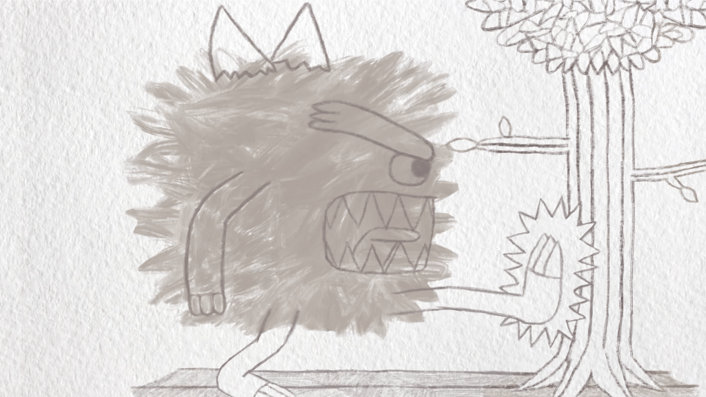
Greg draws a monster kicking a tree to express his anger over the closed flower shop. Image © Oliver Mariager.

Formalist elements:
Greg having a blue border outline around himself when having negative thoughts (fantasy).
Point-of-view shots with Greg looking at his sketchbook and the woman and walking towards the mugger.
Animated sketches playing through Greg’s mind (fantasy).
Point-of-view close-up shot of Greg’s ex-girlfriend’s mouth (fantasy).
Text saying, ‘Nervous’ and ‘Say something!’ forming in Greg’s head (fantasy).
Knot forming over Greg’s stomach to represent his fear and agitation (fantasy).
Monster sketch to represent Greg’s anger (fantasy).

Perspective:
The film uses a subjective perspective as it mainly focuses on Greg and not on the other characters. Examples include his animated sketches, the blue outline enclosing him, his various expressions, point-of-view shots where he looks at his ex-girlfriend’s mouth and the woman, and loud foley sound effects (such as turning a page, Greg’s stomach rumbling or building, emotional drum noises), all of which make the viewer feel close to him.

Colour:
At the beginning, the film mostly uses cold, less saturated colours for the park scenes and the animated sketches, fitting with Greg;s somber mood and giving the sketches the appearance of a distant memory and a dark past. As the film progresses, the interior of Greg’s house and the park scenes during the afternoon use warm, brighter, more saturated colours. This represents the rise of Greg gathering the courage and determination to face conflict and stand up to the mugger, and his sympathy towards the woman in a happy open ending.

Editing:
Camera zooms and pans are used throughout the film, such as the first scene with Greg and Franky on the bench (the focal point), Greg looking at his sketches before and after they play in his mind, the mugger following the woman outside Greg’s house, which he does not notice (mise-en-scène); Franky’s confusion on whether to protect Greg or save the woman, et cetera. Fades are used between scenes to show the passage of time and change in tone, such as when the film fades from Greg’s angry monster sketch to Franky sleeping peacefully in his basket in Greg’s house.

Greg draws a bouquet of flowers in his sketchbook, unaware of sinister activity from outside… Image © Oliver Mariager.
Franky rushes over to save the woman from the mugger. Image © Oliver Mariager.

Action scene:
Greg is safe in his home, drawing in his sketchbook.
But he is unaware of the mugger, whom Franky notices.
Therefore, he walks out of his house to the park without worry.
But he hears the woman scream.
Therefore, he looks around and sees the mugger attacking her.
But Greg is apprehensive.
Therefore, Franky is confused on whether to protect his master or save the woman.
But he sees Greg panicking.
Therefore, he springs into action, biting the mugger’s leg.
But meanwhile. the shocked Greg does not know what to do.
Therefore, he remembers his ex-girlfriend telling him about his inability to face conflict.
But rather than acting scared, he gets more determined to face his fears.
Therefore, he takes the mugger’s knife away, and the mugger runs off.
But the woman is left traumatised by the event.
Therefore, Greg sympathetically shows her his sketches.

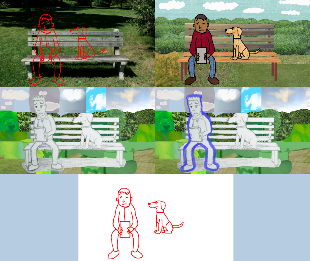
Test images, sketches and digital drawings of Greg and Franky on the bench. Image © Oliver Mariager.
Model sheet for Greg and Franky. Image © Oliver Mariager.
Concept art of Greg and Franky on the bench. Image © Oliver Mariager.
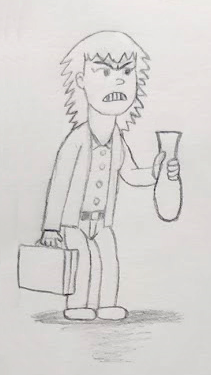
Concept art of Greg’s ex-girlfriend. Image © Oliver Mariager.
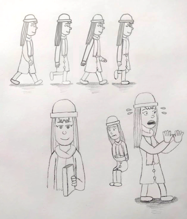
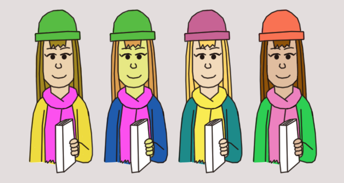
Model sheet, sketches and walk cycle for the woman. Image © Oliver Mariager.
Test colours for the woman (third one chosen). Image © Oliver Mariager.
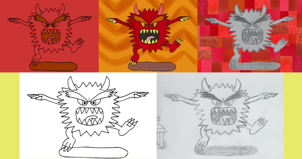
Test images, sketches and digital drawings of the monster in Greg’s sketchbook. Image © Oliver Mariager.
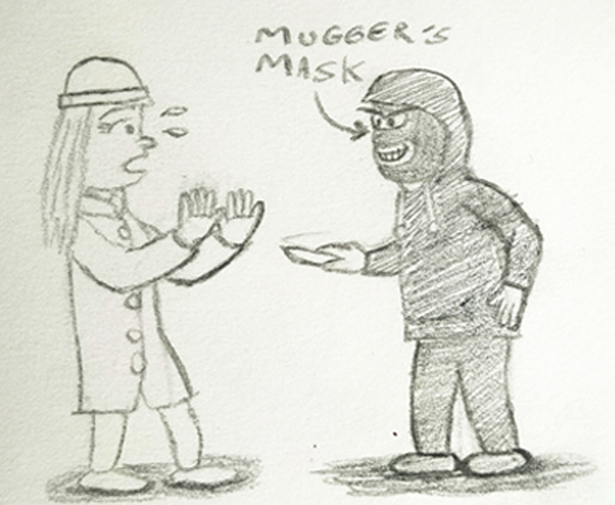
Concept art of the woman and the mugger. Image © Oliver Mariager.
Storyboard for in-between shot of Franky biting the mugger. Image © Oliver Mariager.
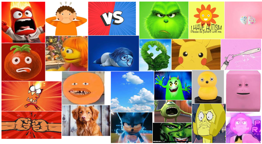
Moodboard of colour images representing autism. Images © The Walt Disney Company/Pixar Animation Studios/Cartoon Network/The Jim Henson Company/Xploshi/SEGA Corporation/Paramount Pictures/Dr. Suess/Universal Pictures/Illumination/Marvel Comics/The Pokémon Company/Nintendo Company, Limited/Game Freak/Creatures/TV Tokyo/ShoPro/JR Kikaku.

Why and how was the film made?:
Real Take was conceived in 2022 as an entry for Screen South’s Estuary on Film event. I did moodboards, concept art, the script and a schedule, and submitted them to Screen South. However, the idea was not chosen by the event, but I still wanted to make the film, so I continued. Production was part-time and lasted until this month. The film was made using Adobe Photoshop, Animate, After Effects and Premiere Pro.

Original photograph of the park bench used in the film.
Original photograph used when Greg stands up to the mugger.
Original photograph used as a background in the film (the trees and some houses).
Original photograph used when the woman hands Greg’s sketchbook to him.
Test images and colours for Greg’s sofa (fifth one chosen). Images © Adobe Inc.
Test/mockup images for the exterior of Greg’s house (fifth one chosen). Image © Oliver Mariager.
Test/mockup image for the exterior of Greg’s house, with adjusted afternoon lighting and shadow colours and a colour swatch for said exterior. Image © Oliver Mariager.

Inspired by live action-animation films such as Who Framed Roger Rabbit and a real life roller coaster scene from Wandaland by Richard Noble,
I took photographs in a park in Ramsgate and used them as background, experimenting with them to represent the contrast between Greg’s world and the outside world. Adobe Stock images were also used as backgrounds for the park the flower shop and Greg’s house, with some being used as props in the latter. I watched other films for inspiration. Feeling My Way by Jonathan Hodgson had scenes with coloured outlines around rubbish bins and a square order around a man sitting in a laundromat, which inspired me to give Greg is blue outline to represent his nervousness, sadness, loneliness, restrictiveness and separation from his surroundings. Scenes from Mary and Max in which Mx wants logic and order I his life were used as inspiration for Greg pushing down a crease on his trouser leg at the beginning, and his reactions to the misplaced tub of soya spread in one of his sketches and the closed flower shop. His internal struggles to communicate were based on Louis’ nervous introduction in Louis’ Shoes. I took inspiration from Lambert the Sheepish Lion for Greg’s ex-girlfriend’s criticism of his inability to face conflict, and his initial cautiousness and bravery when standing up to the mugger. The knot forming over Greg’s stomach when he struggles to communicate with the woman was inspired by a scene in Utopia Portals by Jessica Ashman.

The idea of using animated pencil sketch scenes to show Greg’s bad experiences with conflict came from a scene in Feeling My Way with a pencil-drawn bicycle and Louis’ Mind Palace in Louis’ Shoes. The look of the sketches was also inspired by Musical Traumas by Miloš Tomić. Greg’s point-of-view shots when looking back at his sketches were initially going to depict bordered eyes, inspired by Riley Andersen’s emotions watching her father feed her broccoli in Inside Out. The sketches were originally planned to be done in Photoshop, but were done in Procreate instead, and edited in After Effects. For the sketch were Greg’s ex-girlfriend misplaces a tub of soya spread in the refrigerator, I added text saying, ’15 minutes later…’ This was inspired by the “dialogue text” scenes from The Man With Beautiful Eyes by Jonathan Hodgson, as were the ‘Nervous’ and ‘Say something!’ texts that appear in Greg’s head when he struggles to communicate.

Test sketches of Greg’s nervous facial expressions and reference tracings of shocked, disbelieved, nervous and worried faces from films. Images © Oliver Mariager/Paramount Pictures/Warner Bros. Entertainment Inc./Focus Features.
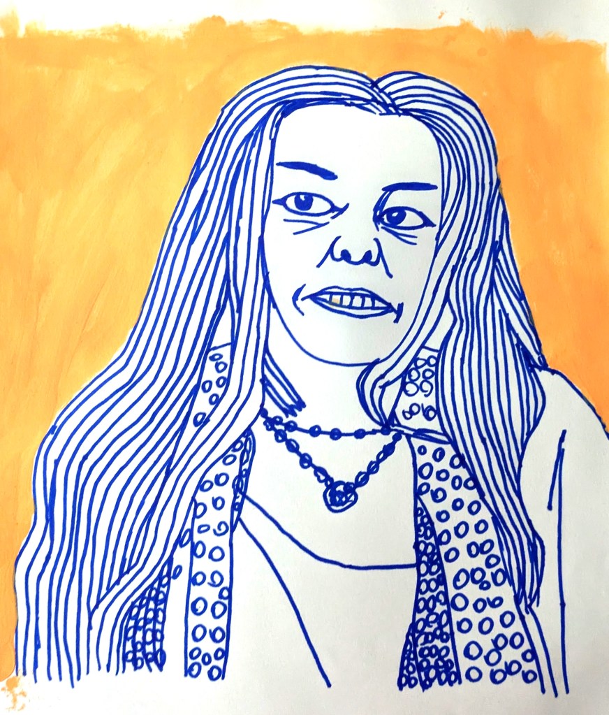
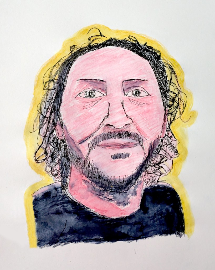
Natural walk cycle for Greg. Image © Oliver Mariager.
Confident walk cycle for Greg. Image © Oliver Mariager.
Cautious walk cycle for Greg (unused). Image © Oliver Mariager.
Test/reference sketches for Franky’s poses. Image © Oliver Mariager.
Model sheet for Franky, showing different expressions and poses for the character. Image © Oliver Mariager.

To create Greg’s nervous facial expressions in close-up shots, I traced shocked, disbelieved, nervous and worried faces from films such as Forrest Gump, Harry Potter and the Philospher’s Stone, Eternal Sunshine of the Spotless Mind and The Hobbit: An Unexpected Journey to use as reference. I used Richard Williams’ The Animator’s Survival Kit to creat neutral, calm/confident and cautious walk cycles for him. For Franky, I was inspired by Dug’s emotions from Up to depict Franky’s loyalty and care with wide eyes and a tilted head for his master Greg, and his uncertainty of whether to protect him or save the woman’ Carl’s sleeping pose in Despicable Me to fade from Greg’s monster sketch and animate Franky sleeping in his basket in Greg’s house; and Max’s confronting and shocked poses from The Secret Life of Pets and The Secret Life of Pets 2 to depict Franky’s alert when hearing the woman scream and deciding whether to protect Greg or save the woman, and his aggressive defence pose before charging over. When Franky bites the mugger’s leg, I used a scene from Animal Planet: Dog Bites Host as a reference when animating Franky moving his body forwards and around and wriggling his bottom. I also included the model sheet for Franky (based on reference sketches in the film’s title sequence. The music for the film was composed by Kate Wintie in Logic Pro X, with the addition of stock music provided by Randolph Matthews. I looked t film scenes where the music and sound effects build to add to the tension, like Anxiety by Mayshan Kelishadi and Joker. The technique of rotoscoping was used for three scenes that were difficult to animate: the woman’s arm handing Greg’s sketchbook to him, the mugger running away, and Greg kneeling down before calling Franky.

Genres:
The genres used in Real Take are realist-fiction (Greg’s dislike of noise and fear of conflict, Franky being Greg’s support dog, the sketchbook drawings showing Greg’s bad relationship with his ex-girlfriend, his struggles to communicate with the woman, et cetera) and fantasy (the sketches being animated, the monster sketch representing Greg’s anger).

Release:
The film was submitted to the Oska Bright Film Festival to be screened in 2026, but was not selected. It was selected as a finalist at the French Duck Film Festival, and selected by the Together! Disability Film Festival. As of 6 November 2025, the film is available on the Creative Foundation’s website.

*Written in Notepad.

Breathe

The film’s title card.

From December 2023 to 2024, I was producing animated sequences for a short film named Breath or Breathe. I downloaded and installed Blender, where I started to familiarise myself with the layout of the software. First, I learned how to add an object and move it around, modify objects, and render a scene, and tried some modelling and sculpting tools. Next, I loaded my reference artwork in a new window, and used “Sculpt Mode” to create a sculpted fox head to animate at a later date. I then looked at some processes to help refine the features on the fox character. I added colour and material behaviours to the head and face, and briefly looked at the “Node” editing space. I learnt how to unwrap my model and was ready to paint, but there were problems with the addition of textures. Because of this, I decided to move on to making stop motion breath animations, using sand-on-glass, ink, chalk and watercolour paint. During walks in Folkestone, I took photographs of surfaces with relaxing, calm textures to use in my sequences, and recorded the tide in Folkestone Beach coming in. I worked on timing ‘in’, ‘hold’ and ‘out’, and repeated the breathing sequences for 10 breaths, each one treated slightly differently with effects such as “Bulge”. After that, I watched some footage of murmurations. For the tide, I created “Time Remap” keyframes for it coming in for 2 seconds, held for 4 seconds and out again for 2 seconds, and applied different colours to it using “Hue/Saturation”. Next, I created some particle swarms by using motion paths, inspired by the murmuration footage. I used bubbles and flying fish textures for mine. I even did an animation where I used the Geometry Options “Curvature” and “Segments” to make the texture background bulge out and in to simulate breathing, gave a “3D Text” animation effect to ‘Breathe’, and made it three-dimensional by extending the “Extrusion Depth”.

My first scene render in Blender. Blender © Blender Foundation.
Reference artwork for my fox head. Blender © Blender Foundation.
Sculpting the fox head. Blender © Blender Foundation.
My fox head in “Object Mode”. Blender © Blender Foundation.
My sand-on-glass breath animation.
My ink breath footage.
My watercolour paint breath animation.
My chalk breath animation.
One of my surfaces with relaxing, calm textures.
Another of my surfaces with relaxing, calm textures.
My breathing background, which made use of the “Bulge” effect.
My breathing montbretia petal animation.
Botanical montbretia illustration used in my animation.
My test particle effect with bubbles.
My test particle swarm and motion path with flying fish.
Flying fish textures used in my particle swarm.
My first coloured breathing tide footage.
My second coloured breathing tide footage.
My third coloured breathing tide footage.
My three-dimensional ‘Breathe’ title animation.
My three-dimensional breathing texture background, which made use of the Geometry Options “Curvature” and “Segments”.

In late February, Lydia Hibbert and I began coming with ideas for the breath film’s introduction: narration, text, diagrams, a growing and shaking animated brain with eyes (visual representation of tension building), multiple layers and colours. We watched I Am Here by Eoin Duffy, Detention by Elle-Máijá Tailfeathers and David Seitz, Focus by Alex Boya, and The Fake Calendar by Meky Ottawa as research, and I made a moodboard of brain images in different art styles (illustrations, vector graphics, abstract, lineart, et cetera). Then I used different brush techniques in Photoshop (“Roundness”, “Hardness”, “Opacity”, “Flow”, “Spacing”, “Size”, “Angle”) to create early sketch designs for the brain. We returned to my Blender fox head, where I unwrapped the textures of the eyes, mouth and the head itself, added shading and experimented with “Noise”, “Voronoi” and “Gradient Textures” and the “Color Ramp”, and painted the model in “Texture Paint”. The next day, I experimented with some advanced brush settings, “Shape Dymanics”, “Scattering” and “Texture”, and did some drawings focusing on the shape of the object (brain) rather than the outline, using the “Layer Mask”.

In I Am Here, an abstract explorer realizes that ultimate meaning does not exist. Image © National Film Board of Canada.
In Detention, the camera zooms out to reveal a young boy locked behind the real walls of the Immigration Holding Centre and its imaginary borders, represented by different layers such as a slide and a fence, and thus gradually building the tension. Image © National Film Board of Canada.
In Focus, strange intestinal creatures slither toward each other in the mind of a girl, whose ordinary narration of her time at the shopping mall juxtaposes the surreal action occuring within, and, along with it, visually represents her attention deficit hyperactivity disorder. Image © National Film Board of Canada.
Reference diagram of brain. Image © BestChapter.com.
My brain reference moodboard.
Concept sketches for my brain, made using different brush techniques.
My shape-focused-instead-of-outline brain drawing, using the “Layer Mask”.
My fox head in “Viewport Shading Method/Material Preview Mode”. Blender © Blender Foundation.
First texture experiment on my fox head. Blender © Blender Foundation.
Second texture experiment on my fox head. Blender © Blender Foundation.
Third texture experiment on my fox head. Blender © Blender Foundation.
Fourth texture experiment on my fox head. Blender © Blender Foundation.
Unwrapping the fox head’s textures. Blender © Blender Foundation.
My fox head with painted textures (except for the mouth). Blender © Blender Foundation.

Between March and April, I looked at texture and colour. I experimented with “Color Dynamics”, “Shape Dynamics”, “Foreground Colors”, “Background Colors”, “Shading”, “Lighting”, the “Mixed Brush” (“Wet”, “Load” “Mix” and “Flow”), the “Paint Bucket”, “Gradients” and “Brush Modes”, using them to create some more designs for the brain. Next, I made notes on how the brains would be animated to convey emotion. For example, the blue brain in my “Color Dynamics” drawing would be for sadness and shake and wobble as if it were crying, and the “Shading and Lighting” brain would slowly grow and shrink to simulate breathing. Later in March, I added armatures to my Blender fox head’s ears, eyes, mouth and nose, and came up with the idea of having the brain fade into the background just before the breath sequences begin. I started creating and adding effects for the introduction’s poem, using “Particle Systems”, “Expressions” and “Linear Wipe”. The poem is:

‘I breathe to help calm my mind.
It dissipates stress and tension.
I fill my lungs through my nose to the count of four,
hold for the count of eight,
and release to the count of four.
As I release my breath, it liberates me from my fears.
It evaporates stress,
defuses anger,
decomposes sadness,
and resolves the frustration of being unable to solve a problem.’

We watched War Is Over! Inspired by the Music of John and Yoko by Dave Mullins and Brad Booker, Letter to a Pig by Tal Kantor and Amit R. Gicelter, Ninety-Five Senses by Jerusha Hess and Jared Hess, Our Uniform by Yegane Moghaddam, Pachyderme by Stéphanie Clément and Marc Rius, Kindness by Naomi Shihab Nye, Singularity by Marissa Davis, Un Corpo/A Body by Milena Tipaldo, Afterimages by Mackenzie Duan, Crossing to Ireland by Jean Maskell, The World by Jalal ad-Din Rumi, and If You Feel Terrible by Rebecca Wadlinger as research to get ideas for the introduction, such as isolating irrelevant parts, moving poems, dialogue, lip-syncing an animated mouth to dialogue (made using the “Slider Control” effect), transitions from text to imagery, filling the screen, repetition, morphing and deconstructing, overlays, and reversing footage. I made two breath sequences in Procreate to use in the film, one of which is used in the introduction.

My “Color Dynamics” drawings.
First “Color-Shape Dynamics” drawing.
Second “Color-Shape Dynamics” drawing.
My “Shading and Lighting” drawing.
My “Mixed Brush” and “Paint Bucket” drawing.
My gradient drawings.
My “Brush Mode” drawing.
My fox head in “Viewport Shading Method/Material Preview Mode” with painted textures. Blender © Blender Foundation.
My fox head in “Wireframe Mode” with armatures. Blender © Blender Foundation.
Opening verse of my introduction poem with fading text.
Animation frames for my lip-sync mouth.
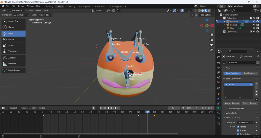
A grey cloud floats in front of a shrinking turquoise triangle before turning brown.
The triangle turns into a sea to simulate breathing.
An abstract yellow and brown circle is squashed by a shrinking room.
The circle turns into a revolving breath cloud to simulate breathing, accompanied by the walls’ orange, waving lines.
Fourth verse of my introduction poem with scattered text.

In May, I included my ink breath animation in my film’s introduction, where I used the “Posterize” effect and scattered text. Next, I made a sequence in Procreate where the text ‘evaporates’, changing brushes between frames, and gave it a “Shatter” effect on the second to last frame. Behind the text is a transparent boiling animated texture background, inspired by watching How to Be Alone by Pádraig Ó Tuama and My Mother’s Coat by Marie-Margaux Tsakiri-Scanatovits. I designed a red grass background with a large hole in Photoshop and added footage of the fire in Lydia’s wood stove in After Effects, making a sequence where the fire shrinks into the hole. The shrinking fire represents defusing anger. Then I did a sequence where my botanical montbretia illustration’s petals shrivel up and the plant’s colour changes to blue, and the petals fall off as the plant withers and dies before they decompose. This represents decomposing sadness. Finally, I animated a sequence in Procreate and After Effects, with the three-dimensional camera zooming and passing through saturated, dissipating, layered clouds, which represents resolving the frustration of being unable to solve a problem. Near the end of the month, I learned how to rig the armature’s bones to the parts of my fox head with ‘Ctrl+P’, had a look at “Weight Paint” where the amount of different coloured paint depended on the weight influence on the bone, and pressed the ‘I’ key to add keyframes for moving, rotating, squashing and stretching the head in the timeline. We then went to record sound effects for my film, such as fans, outside ambience, birdsong and running tap water, and played around with them in Adobe Audition, giving them effects such as filters, pitch-shifting and reverbs.

My “Posterized” ink breath animation with scattered text.
My ‘evaporating’ text and transparent boiling animated texture background.
My ‘defusing anger’ fire animation.
My ‘decomposing sadness’ plant animation.
My ‘resolving frustration’ cloud animation.
My fox head’s armature in front of it in “Shaded Mode”. Blender © Blender Foundation.
My fox head in “Weight Paint” mode with blue and green paint. Blender © Blender Foundation.
Adding keyframes for my fox head’s movements. Blender © Blender Foundation.
Playing around with squash-and-stretch physics. Blender © Blender Foundation.

In June, I worked with Randolph Matthews, composing music for my film. I also added inhaling and exhaling keyframes to my fox head and exported the rendered animation as a PNG sequence. Next, I animated the fox’s eyes and mouth closing and opening when he inhales and exhales in Photoshop, and also began doing the end credits. The fox animation and end credits were finished in July. At the end of the month, Breathe was submitted to the Folkestone Documentary Festival. The film can be watched here (original link).

Rendering my fox head animation. Blender © Blender Foundation.
My finished breathing fox head animation.

In August, we designed nine different posters for the film in Adobe Illustrator. Breathe was submitted to the Margate Film Festival, along with Sensory Chaos.

My first poster for Breathe.
My second poster for Breathe.
My third poster for Breathe.
My fourth poster for Breathe.
My fifth poster for Breathe.
My sixth poster for Breathe.
My seventh poster for Breathe.
My eighth poster for Breathe.
My chosen ninth poster for Breathe.

Folkestone Living Advent Calendars 2022-2023

The Folkestone Living Advent Calendar’s logo. Image © JimJam Arts.

In November 2022, I did some animations for the Folkestone Living Advent Calendar. They include: a boy putting tinsel over Cornelia Parker’s Folkestone Mermaid’s neck like a scarf to invite her to the festive holiday fun and keep her from feeling left out; the Crowned Death skull’s crown changing into a Santa Claus hat with Christmas lights as children (named Jimmy, Joanne, Robert and Kimiko) run past him; Mark Dion’s Giant Seagull on Wheels parking near a street art seagull on a house to keep his company, before they watch a fireworks display and the children celebrate; and Jimmy giving Sophie Ryder’s Standing Lady-Hare and Dog a present, which brightens up their colours. The animations were made using Adobe After Effects, Photoshop and Character Animator (children walking and running).

Robert runs past the Folkestone Mermaid, who sits alone staring at the sea.
A boy gives the Folkestone Mermaid some tinsel to wear as a scarf, turning her frown upside down.
Jimmy runs past the rotating Crowned Death skull.
The Crowned Death skull’s crown changes into a Santa Claus hat with Christmas lights.
The Giant Seagull on Wheels parks near the surprised street art seagull as Joanne skips across the car park.
Jimmy, Joanne, Robert and Kimiko celebrate the fireworks display.
Jimmy, Joanne and Kimiko walk and run past an old brick building.
The Standing Lady-Hare and Dog gloomily hang their heads as they watch the children from the shadows.
Jimmy kindly gives the Standing Lady-Hare and Dog a present…
…brightening their spirits and colours!

In November 2023, I produced three animations for an exhibition/live performance for the Folkestone Living Advent Calendar, named The Trial of Jack Frost. I used Procreate to make a mugshot turnaround of four characters (a grumpy alien picking his nose, a goofy mummy with vampire fangs, a Boris Johnson-caricatured Frankenstein’s monster and a robot rabbit), and did a stop motion laser cutout silhouette segment of Jack Frost stealing a stocking full of presents. The cutouts were drawn in Procreate and edited in Adobe Illustrator. They were then exported separately as a layered rig with labeled layers from Photoshop to be used in a title sequence for the exhibition, made using After Effects. In it, Jack drops down from above, bouncing on the spot when he lands. He points at his name, ‘Jack Frost’, in the title, its cutout-style letters flying and rolling into place. Then his name moves down a little to make way for ‘The Trial of’, much to Jack’s displeasure. I was given instructions on how to animate Jack and the letters. First, I set the anchor point for each body part in After Effects using the “Pan Behind Tool”. Next, I made an image sequence for the head positions and Time Remapped them. After that, I arranged and imported all the assets (including the letters). We downloaded Duik and installed the plugin to After Effects, and learned how to create arms and set up the armature for both arms, set up and saved workspaces that best suited the task. Then, I used the “Shy” switches to clean up my timeline and keyframed my “C” layers. I animated the rigged two-dimensional puppet, added the animated letters and used the “Posterize Time” effect to give the effect of a stop motion sequence, before exporting the film and uploading it to Dropbox. The exhibition opened today at 5:30pm, and was open between 6pm-7pm.

Concept art/designs for my mugshot turnaround characters.
First mugshot turnaround frame.
Second mugshot turnaround frame.
Third mugshot turnaround frame.
Fourth mugshot turnaround frame.
Fifth mugshot turnaround frame.
Jack Frost steals a stocking full of Christmas presents and sneaks away.
Jack Frost grins and points at his name in the exhibition’s title card…
…only to become cross upon learning that the title says that he is on trial!

Haunted House Experience

The exhibition’s title card.

From September 2023 to October 2023, I was at Young Animators Club doing projected animations for use in a walkthrough exhibition named Haunted House Experience. Using Adobe After Effects, Photoshop and Procreate, I produced Grincha Lisa, in which Lisa del Giocondo (the Mona Lisa) does a Grinch smile for a few seconds after sporting her usual calm expression; a William Kentridge-style stop motion chalk animation of a shadowy, Tasmanian Devil-like monster, known as the Psyclone Ghoul, who grows and leaps out at the viewer before disappearing; a dancing stop motion Irish spider and a brown claymation spider, the confused ghost of Boris Johnson (a satirical symbolisation of the end of his position as Prime Minister of the United Kingdom), and spiders, skulls, ghosts (voiced by pitch-shifted archive recordings of Miranda Richardson as the mummy from the audiobook version of Horrid Henry and the Mummy’s Curse) and Johnson bursting through the doors, accompanied with smoke and lightning and followed by the claws of a growling werewolf. I also made a golden decorated picture frame using cardboard, spray paint, cutouts and small objects, and produced an advert for the exhibition in which someone approaches Block 67 as lightning flashes and thunderclaps are heard, and waits outside the doors before the werewolf’s claws appear.

Grincha Lisa. Image © Leonardo da Vinci. Edit © mysuperendeavour@WordPress.
In-progress Psyclone Ghoul drawing.
Behind-the-scenes work on the Psyclone Ghoul.
My Psyclone Ghoul emerges from behind the Grincha Lisa.
My dancing stop motion Irish spider puppet.
Concept art for my ghost, skull and spider decorations for my picture frame.
In-progress decorated picture frame.
Nearly completed decorated picture frame.
Finished decorated picture frame.
In-progress claymation spider.
Finished claymotion spider.
Boris Johnson rises from his grave outside Block 67, confused about his ghostly appearance, how he died and how he ended up here.
A person approaches Block 67 during a dark, stormy night…
…and is greeted by the hairy, razor-sharp claws of a werewolf!
Projection test with four spiders entering the haunted house.
Seven spiders, a chattering skull, two wailing ghosts and Boris Johnson make their smoky entrance in the haunted house…
…followed by the ferocious werewolf!

I attended the exhibition today between 2pm and 6pm. There I saw most of my animations, except my Psyclone Ghoul and claymation spider and Grincha Lisa, due to time and problems with setting up the laptops and projectors.

A white-outlined ghost with magic powers pokes his head round the door.
A green, hostile ghost appears, lunging towards the attendees.
A chilling message, ‘You will be terminated,’ flashes on the doors.
A hand washes the blood on the floor away with a hose.
A tall, swirling ghost floats around for the attendees.
The spiders and wailing ghosts emerge from the doors…
…followed by the chattering skull and Boris Johnson.
The werewolf snarls and shows his claws from behind the door.
A red-eyed mummy pokes his head round the door before vanishing.
A creepy, green owl with black, bleeding eyes gives a disturbing message on the television, “Hola, mi chicos. Beg for your life in Spanish.” Image © Harry Markwell.
Luigi appears in the darkness, holding his hands on his cheeks in horror. Luigi © Nintendo Company, Limited.
A fallen wardrobe distracts Luigi (with a blue-and-green color scheme), before a ghost laughs (like the Skull Kid) and captures him, dragging the screaming plumber away. Luigi © Nintendo Company, Limited.
Projected haunted painting animation of American Gothic in my decorated picture frame. Image © Grant Wood.
Projected haunted painting animation of Mary, Princess Royal and Princess of Orange (before).
Projected haunted painting animation of Mary, Princess Royal and Princess of Orange with a creepy smile (after).
Projected haunted painting animation of Juan de Pareja (before).
Projected haunted painting animation of Juan de Pareja with no face (after).
Pepper’s ghost projection of Boris Johnson.
The Mouth, as viewed from a peephole. Image © Oliver (different person).
A peephole jumpscare from a vampire rat.
Black and brown spiders scuttle across the floor.
More spiders emerge from the shadows to join in.
Three spiders dance around in a circle, while a red spider arrives on the scene.

The Wascawwy Wagnewian: An Analysis of What’s Opera, Doc?

Bugs Bunny gestures toward Elmer Fudd as he talks to the audience about the latter’s magic helmet. Image © Warner Bros. Entertainment Inc.

The Success of Bugs Bunny
Since his debut in Tex Avery’s A Wild Hare in 1940, Bugs Bunny has entertained audiences with his clever trickery and ability to take the moral high ground and stand up for himself against whoever antagonizes him. The rabbit’s foes include Daffy Duck, Elmer Fudd, Yosemite Sam, Marvin the Martian, the Tasmanian Devil, Wile E. Coyote, et cetera. He has become less of a bully and more of a smart confident hero with superhuman strength who outsmarts his enemies.

Poster for Jailhouse Rock. Image © Metro-Goldwyn-Mayer Studios, Inc.

Satire Season, Tragedy Season: The Historical Context of What’s Opera, Doc?
The United States of America and Britain were still recovering from World War II, the former country being full of political unrest. The Civil Rights Act of 1957 came into force that year. The most popular films of the 1950s that people saw were The Ten Commandments (an epic religious drama directed by Cecil B. DeMille and starring Charlton Heston), Around the World in Eighty Days (a light-hearted adventure film directed by Michael Anderson), 12 Angry Men, Jailhouse Rock (an underdog film based on the song of the same name by and starring Elvis Presley), The Bridge on the River Kwai and The Three Faces of Eve. These films are relevant and contextualize What’s Opera, Doc? as the audience would be going to see the cartoon’s screening before these feature films, in which we recognize a recurring theme of the underdog triumphing over the more controlling figures. This reflected the mindset of Americans at the time.

At Warner Brothers, Chuck Jones (who had been working at the studio since the 1930s) was directing a lot of Looney Tunes and Merrie Melodies cartoons around 1957, including Scrambled Aches, Ali Baba Bunny, Go Fly a Kit and Boyhood Daze, most of which involved underdog characters taking the mickey out of the people supposedly in charge and making them look like fools. This is relevant today, because political figures, such as Donald Trump and Boris Johnson, are vulnerable to being satirized by comedians and artists.

Scene from Siegfried. Image © Seattle Opera.

Humor has been used in narrative-based, sequential cartoons since the invention of the printing press. Thanks to artistic processes such as engraving and carving, the printing process was exposed to the masses, For example, William Hogarth used engraving and printing in his work to tell stories and make un of the upper class and politics. The Walt Disney Company’s Fantasia is a 1940 musical anthology film in which different animated segments are set to classical tunes, with the actions in sync to the music. In response to this, Warner Brothers decided to compete with them, producing and releasing shorts like Bunny of Seville and What’s Opera, Doc? to focus more on parody than pomp, with Jones as the director. During the six minutes of What’s Opera, Doc?, Jones also satirizes the contemporary style of ballet, Richard Wagner’s ponderous operatic style, and the standard Bugs-and-Elmer formula, which was clichéd at the time.

Michael Maltese wrote the cartoon’s story and the lyrics to Wagner’s music to create Bugs and Elmer’s song “Return My Love”, while Maurice Noble devised the stylized backgrounds. The voices were provided by Mel Blanc (Bugs Bunny, Elmer Fudd yelling, “SMOOOOOG!!!”) and Arthur Q. Bryan (Elmer Fudd).

Jones’ production staff spent six times the amount of labor working on the cartoon, with him telling them to cheat on their time cards in order to convince the higher-ups that they were making Road Runner cartoons.[1]

What’s Opera, Doc? was released on July 6, 1957, and has been praised by many animation historians as one of Warner Brothers’ best animated short films and one of The 50 Greatest Cartoons of all time.[2]

A Labor of Love
“This 1957 epic satirizes the grand tradition of Viking opera and also manages to rib an entire century of ballet in the process.” – quote from Warner Brothers Animation Art by Jerry Beck and Will Friedwald.

“In 1943, while the classical music and animation communities were still buzzing about Walt Disney’s Fantasia, Warner Brothers decided to tilt that conversation in their favor; they began to release animated shorts parodying Fantasia‘s use of classical music.”[3]

Fantasia is serious, beautiful and artistic, in contrast to What’s Opera, Doc?, which is comedic, stylized and exaggerated.

Themes:
Music: Action synchronized to music.
Conflict: Elmer hunting Bugs.
Power: Elmer controlling the weather, Bugs’ power to stop Elmer in his tracks.
Control: Elmer controlling the weather.
Slapstick
Topical satire
Love: Elmer’s weakness to Bugs’ mock lust.
Color: Action (Elmer’s demigod powers) and emotion (example: Elmer’s rage when controlling the weather to kill Bugs and his grief and regret when he thinks that has done so).

A Romantic Tragicomedy
The genres used in What’s Opera, Doc? are drama (Elmer’s demigod powers and Bugs’ “death”), comedy (Siegfried’s gigantic, strong silhouette being revealed to be that of the underwhelming Elmer, Bugs and Elmer’s rhymes and “spear and magic helmet” repetitions, Bugs’ reaction to Elmer singing, “Kiww da wabbit!” and his demigod power demonstration, Valkyrie disguise, and revelation at the end that he is playing dead, et cetera), romance (Elmer falling for Bugs’ Valkyrie disguise and dancing with him) and horror (Elmer’s “Siegfried” silhouette when controlling the weather and his furious wrath).

In the Eyes of the Hunter
The cartoon uses an objective perspective since it shows the action happening onscreen and does not have a narrator or the characters telling the story. It also uses a subjective perspective for some scenes, such as Elmer (as Siegfried) and Bugs breaking the fourth wall (looking at the camera, Bugs’ “Magic helmet!” and “Well, what did you expect in an opera, a happy ending?”, Elmer’s “Dat was da wabbit!”), point-of-view shots of the Brünhilde-disguised Bugs following a zooming medium shot of Elmer feeling dumbfounded upon seeing him, a zooming shot of Bugs singing their duet, and some zooming medium shots of Elmer during his wrath. The backgrounds and foregrounds are also warped and exaggerated in appearance and height to create unrealistic spaces that “play” with perspective and space, depending on the importance of the subject, such as Elmer standing atop a cliff when demonstrating his demigod powers, or Bugs’ appearance in his Valkyrie disguise.

Friend or Foe?
The narrative is about conflict, with one side winning over another, and regretting it immediately after. This is funny because Bugs is revealed to have faked his death, thus making him a champion underdog. Elmer lost because he had been tricked and made to look foolish all along.

Bugs and Elmer’s relationship draws parallels with the Civil Rights Movement. African-American people wanted to have equal rights because without them, America would be weak. Elmer thinks that he has killed Bugs and feels like he loses his purpose to pursue him.

Dark Humor/Light Humor
Exaggerated scale and control is used for Elmer’s huge demigod shadow and himself defying the law of physics by putting his strength into controlling the weather. It takes a jab at inflated egos in politics and authoritative people thinking that they are in the right.

Elmer stabbing his spear into Bugs’ hole and singing, “Kiww da wabbit, kiww da wabbit, kiww da wabbit!” is an exaggerated emotion, since he is singing to the tune of “Ride of the Valkyries”, while Bugs emerges from another hole.

Bugs is a rabbit who reacts to Elmer’s “kiwwing” of him and sings to him, speaking in rhyme. This is an exaggerated emotion since he is generally a trickster underdog character in a series of comedic animated shorts, in contrast to the authoritative Elmer, and rabbits do not speak in real life.

Elmer uses his strength to control the thundercloud, using their rain and lightning to strike the tree that Bugs stands under. An exaggerated perspective is used for the dark colors of the sky and the warped clouds to symbolize Elmer’s authority-centered dominance over Bugs, whose shocked expression after the attack before running away is an exaggerated emotion.

The Valkyrie-disguised Bugs rides down toward Elmer on a horse. This is an exaggerated scale because the path that the horse is riding on is small, whereas the horse is huge. The horse’s height is ridiculous since he would be too big to run on the small path. It is also a reference to “It ain’t over till the fat lady sings,” and a subversion of the stereotypical “fat opera lady on a horse”.

Exaggerated perspective is used for the backgrounds during Bugs and Elmer’s love dance and duet, which is an exaggerated emotion.

Elmer becomes enraged and controls the weather in order to kill Bugs, and he also at one point screams, “SMOOOOOG!!!” This is exaggerated emotion because color is used to symbolize Elmer’s overactive, childish rage, poking fun at the fact that authoritative people can be immature.

When Elmer thinks that he has killed Bugs, he grieves and carries him to Valhalla, unaware that Bugs faked his death and breaks the fourth wall. This is an exaggerated emotion, due to Elmer instantly switching from anger to sadness once he sees Bugs’ seemingly dead body.

Kiww da Wabbit, Kiww da Wabbit, Kiww da Wabbit!
“Chuck had always intended that those plates fell, inverted, fell on Elmer Fudd’s skirt. That they would go ‘dink, dink, dink, dink, dink, dink, dink, dink, dink’, but Treg Brown, the sound editor responsible for the short, forgot to put the sound effects in. He would watch it, and every time he would watch it, he’d give a ‘hurgh’. Sort of like, ‘ Darn it. I can’t believe that happened.’ It was quite remarkable.”[4]

“The surreal masterpiece, which pokes fun at Fantasia, ballet. Wagner, as well as opera…”[1]

“We are assaulted with a lexicon of timbres suddenly freed from the customary requirements of cohesion and climax: percussive outbursts, lightning glissandi, momentary dissonance, frenzied scales, and a host of other musical figures that verge on the avant-garde.”[5]

Lights, Shading, Color, Action!
“Maurice Noble contrived a unique color scheme for the cartoon, dousing Elmer in bright shades. Ken Moore developed a technique to highlight the meeting on the top of the tower by cutting holes in specialty set-design materials.” – quote from The 50 Greatest Cartoons: As Selected by 1,000 Animation Professionals by Jerry Beck.

“Siegfried’s” huge, muscular shadow controls the weather, posing to the dramatic music and lightning clashes. Image © Warner Bros. Entertainment Inc.

The rule of third composition, vertical lines and a contrasting, dramatic tonal range with strong, saturated, depressing, domineering bright green and blue analogous colors and pink flowers are used to focus on and symbolize Elmer’s mighty demigod shadow (the focal point) and powers.

Bugs Bunny emerges from his hole, surprised about Elmer Fudd’s singing about killing him. Image © Warner Bros. Entertainment Inc.

Curved and diagonal lines and a small tonal range with saturated yellow, bright green and blue analogous colors and a less saturated dark green color are used to emphasize Bugs’ heroic trickster, with Bugs framed in a lead room/rule of third composition as the focal point.

Elmer Fudd stands at the top of a cliff to give Bugs Bunny a display of his demigod powers. Image © Warner Bros. Entertainment Inc.

Vertical lines and a strong, saturated, dramatic, depressing, domineering bright green and blue analogous colors and pink clouds are used to symbolize Elmer’s demonstration of his mighty powers, in a wide lead room shot with leading lines pointing on him (the focal point).

Elmer Fudd controls the thunderclouds, using their rain and lightning to strike Bugs Bunny. Image © Warner Bros. Entertainment Inc.

Negative space, a golden triangle and a contrasting, dramatic tonal range with domineering, dark blue and purple analogous colors and hues and white raindrops are used to symbolize the strength that Elmer puts into the weather to strike Bugs and indicate the thunderclouds’ direction.

Disguised as Brünhilde, Bugs Bunny rides down the path toward Elmer Fudd on a large horse. Image © Warner Bros. Entertainment Inc.

A lead room composition consisting of a golden triangle, diagonal lines and a small tonal range with saturated orange, blue and yellow triadic colours and playful pink and green colors is used to symbolize Bugs’ (the focal point) mock lust and innocence, and indicate the direction that his horse is going (toward the lovestruck Elmer).

Elmer Fudd follows and searches for Bugs Bunny during their ballet dance. Image © Warner Bros. Entertainment Inc.

A lead room shot with vertical and curved lines in the background and a small tonal range with a saturated pink hue are used to emphasize Bugs’ mock lust and innocence and the dumbfounded Elmer losing his domineering power and falling for Bugs’ disguise.

Elmer Fudd climbs the staircase as he proclaims his love for Brünhilde (Bugs Bunny). Image © Warner Bros. Entertainment Inc.

Curved lines are used to give the background a graceful appearance, while horizontal, vertical and diagonal lines are used for the staircase that Elmer walks up to draw the viewer’s attention to where Bugs is lying in the chair (the focal point). The shot uses a contrasting tonal range with dramatic, saturated blue, purple and pink analogous colors and yellow-brown colors.

Bugs Bunny and Elmer Fudd embrace each other as they sing their love duet. Image © Warner Bros. Entertainment Inc.

Curved lines are used to give the background a graceful appearance, while a contrasting tonal range with dramatic, saturated blue, purple and pink analogous colors and yellow-brown colors is used to focus on Bugs and Elmer’s love duet (the focal point), framed in a lead room/rule of third composition.

Upon discovering Bugs Bunny’s true identity, Elmer Fudd becomes enraged and screams that he will “kiww da wabbit”. Image © Warner Bros. Entertainment Inc.

A rule of third composition, mostly vertical lines and contrasting tonal range with dramatic dark blue and red complementary colors are used to emphasize Elmer’s rage and incoming wrath.

Elmer Fudd screams in rage, “SMOOOOOG!!!” as he controls storms, winds, typhoons, hurricanes, earthquakes and lightning to kill Bugs Bunny. Image © Warner Bros. Entertainment Inc.

A head room composition and small tonal range with dramatic, saturated red and purple analogous colours are used to symbolize Elmer’s rage and wrath.

A heavenly light from Valhalla is shone on Bugs Bunny’s dead body, which lies in the middle of the torn-apart mountains. Image © Warner Bros. Entertainment Inc.

A lead room composition, vertical lines and a contrasting dramatic tonal range with strong, saturated dark blue and yellow complementary colors are used to focus on Bugs’ seemingly dead body (the focal point) as if he were on stage.

Regretting his wrath, a grieving Elmer Fudd carries Bugs Bunny off to Valhalla. Image © Warner Bros. Entertainment Inc.

Vertical lines and a small tonal range of black, dark blue, brown and yellow complementary colors are used to give a harmonious appearance and emphasize entering the afterlife as the grieving Elmer carries Bugs’ body to Valhalla. The characters and Valhalla are framed in a lead room/rule of third composition as the focal point.

*Written in Notepad.

The Pigeon Theory

The film’s title card.

From April 2023 to July 2023, I was at Young Animators Club doing animations for use in a film named The Pigeon Theory, as part of an exhibition named Big Folkestone Doodle. Written, animated, narrated and scored by the other young animators and myself and edited by Lydia Hibbert, the film is about the pigeons’ takeover of the world and has interviews with different people in Folkestone giving their thoughts and theories about them based on their actions. It was made using Adobe After Effects, Character Animator, Premiere Pro, Google Maps and Procreate. I made a pigeon puppet for a stop motion scene in which a flock of pigeons (the other young animators’ pigeons) fight over breadcrumbs and have a party, and did three hand-drawn animations: one of a squirrel running and jumping across some Folkestone buildings’ walls and windows to reach an acorn (named Squirrel Climber made using markers, a plastic sheet and a photograph), another of a pie on a window sill growing legs and standing up, and one of a rotoscoped pigeon looking back before turning into a seagull and flying towards the screen, eating the camera. All three animations were photographed in Procreate, which I also used to do an animated advertisement for the exhibition itself.

My marker-drawn squirrel animation.
My three-frame boil window animation.
Turnaround of my pigeon puppet.
My rotoscoped pigeon turns around to see if anyone is watching him…
…before turning into an attacking seagull and flying towards the screen!
My animated advertisement for the exhibition.

On 22 July 2023, the exhibition opened at 4pm, and I attended it at 3:30pm. There I watched the film and saw my animations, though the one with the squirrel did not play due to the interview featuring it being shortened before the squirrel could move. The film was later uploaded to YouTube under the name The Pigeon Problem. My pigeon is seen at 3:45, and my animations are at 6:07, 9:17 and 10:42.

The film’s YouTube upload.
Advertisement for the exhibition.
My projected animated advertisement for the exhibition.
The Earth.
The pigeons’ invasion causes the Earth to blow up.
The film’s title card.
A pigeon walks across the grass in the middle of a park, enveloped in a fiery-red aura.
My pigeon puppet joins the pigeon party, looking for breadcrumbs.
A terrified person hides from the pigeons’ takeover inside a post box.
My transforming pigeon stands atop a drainpipe.
A pigeon watches hijinks occurring in a building’s windows.
Two red-eyed pigeons walk around before talking about their love for food.
My marker-drawn squirrel runs and jumps across buildings to reach his acorn, while a woman expresses her love for pigeons and hails them.
My inverted three-frame boil window animation.
A ‘fat pigeon’ pecks away at the ground before another pigeon gobbles him up.
Seeing the Titanic, a pigeon prepares to use his telekinesis powers to sink the ship.
Three monstrous pigeons stand against a dark, brown, stormy background, their mouths and sharp teeth drooling with saliva.
A pigeon transforms into a mushroom bottle before falling over and exploding.
A pigeon stands and looks at the camera, confused about the film ending and the pigeons’ invasion being cut short.

Hunger Pains and Young Animators Arcade

After losing his French fries to the seagull, the squirrel angrily chases after him along the beach. Image © Oliver Mariager.

From September 2021 to July 2022, I worked on a short film named Hunger Pains. Written and directed by myself and produced by Lydia Hibbert, the film was made using Adobe Animate for the animation, Adobe Photoshop for the backgrounds, and Adobe After Effects and Premiere Pro for compositing and effects (hand-drawn animation, photography, masking, scaling, rotation, puppet pins, textures, et cetera). A freelance three-dimensions modeller named Laura Boots (who I met at the United Kingdom Creative Festival in September 2021) was originally going to do models and effects for the film, but she was unavailable, so I had to do the effects myself. Music direction was done by Kate Wintie. An arcade platformer video game based on the film was also made from February 2023 to March 2023, using Construct 3 and Photoshop. The cabinet was designed using cardboard, printed Adobe Illustrator cutouts and glue. The game was part of an exhibition at Young Animators Club called Young Animators Arcade, and was also used as a template for the other young animators’ Construct 3 games (a tutorial for making the games can be watched here). I was told by Lydia that they had played my game and enjoyed it. It was decided that the film would be shown at the exhibition as well. We even designed two logo animations (both in two dimensions in Procreate, Illustrator and After Effects and in augmented reality using Adobe Aero), one for Hunger Pains, and another depicting Ferguson the Fox bouncing past and behind the ‘Young Animators Arcade’ logo on a pogo stick. A video of the exhibition (with footage from Hunger Pains) can be watched here.

A hungry squirrel walks along the seaside towards a food stall. He has come from the forest to the seaside due to the other squirrels laughing at him for not having a stump full of stored nuts for the winter. Desperate for sustenance, he spots a pack of French fries. He rushes over to them and is about to eat them, when a seagull swoops down, swiping the squirrel’s snack. Enraged by the loss of his food, the squirrel chases after the feathered thief. Will the squirrel retrieve his food, or will he get a surprise?

Watercolour painting background for someone’s Construct 3 game.
In-progress left side of my arcade cabinet.
Nearly completed left side of my arcade cabinet.
My printed cutouts.
Reference/concept art for my arcade cabinet.
In-progress right side of my arcade cabinet.
Finished right and left sides of my arcade cabinet.
In-progress space sketches on someone’s arcade cabinet.
Finished space sketches on someone’s arcade cabinet.
In-progress arcade cabinet sign.
Finished arcade cabinet sign with border.

On 2 April 2023, the exhibition opened between 1pm and 4pm, and I attended it at 12:30pm. There I saw my animation projected on the wall and my game projected on transparent paper in my arcade cabinet.

My projected Young Animators Arcade logo.
Ferguson the Fox bounces behind the Young Animators Arcade logo. Ferguson the Fox © Oliver Mariager.
Onion Boy in Space/Turnip Adventure © Elana. Tyler, Rose, Aurora and Zac © Ambeelou Animation.
Hunger Pains arcade game.
Left side of my arcade cabinet.
The hungry squirrel thinks about his empty stump. Image © Oliver Mariager.
The seagull swipes the squirrel’s French fries. Image © Oliver Mariager.
Determined to retrieve his French fries, the squirrel runs down the rocket’s corridor. Image © Oliver Mariager.
The seagull catches the squirrel in his food room, furious about the latter’s intrusion. Image © Oliver Mariager.
Cornered and sweating, the squirrel stares at the glaring seagull. Image © Oliver Mariager.
My space sketches. Dino Game. Image © Daniel.
Blob Game. Image © Jake.

Chaos Cards 2022

From November 2022 to December 2022, I was at Young Animators Club doing two animations for an exhibition at the Chaos Cards Tabletop Gaming Centre. One was a stop motion animation of a yeti and an arctic fox brawling in an ice cave, made using Dragonframe, After Effects and Premiere Pro. The puppets were made using felting wool, aluminium wire, polymorph, upholstery foam, liquid latex, foot magnets for the stage, dragon eyes and glass eyes, while the cave was created using chicken wire, newspaper, rocks, Modroc, bicarbonate soda, shaving foam and a steel sheet. The other was a hand-drawn logo animation for the word ‘Chaos’, with the letters forming from metal, straw, fire, wood and stones.

My arctic fox puppet.
My yeti puppet.
My ‘Chaos’ logo animation drawings.
My ‘Chaos’ logo animation.

On 20 December 2022, the exhibition opened between 5pm and 6pm, and I attended it. There I saw my stop motion animation projected on the wall and ceiling, used along with the other young animators’ animations as part of a film named CHAOS!, and entered a room with the ice cave set and puppets amongst the young animators’ sets and puppets. CHAOS! was uploaded to YouTube on 22 December 2022, and can be watched here (my animation is at 2:10).

Tyler transforms into his bird superhero outfit in The Door. Tyler © Ambeelou Animation.
My projected ice cave animation.
My ice cave set and puppets.
My yeti and arctic fox puppets.