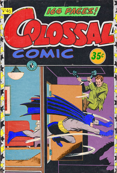
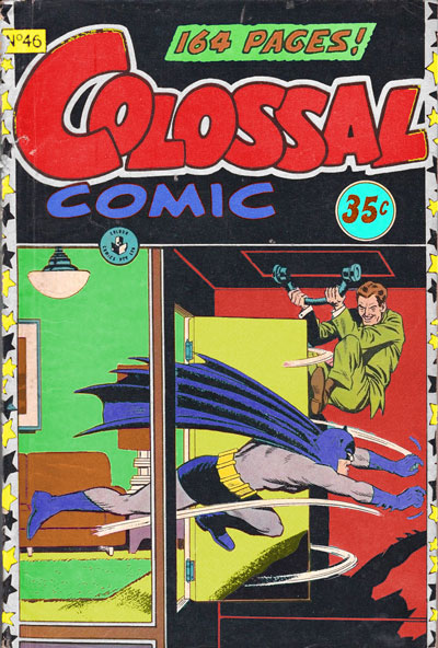

In September 2021, I had a Zoom session where I learned about changing the hue, saturation and value in images and saving copies of them, using Adobe Photoshop. I used Colossal Comic Issue 46 (1958). One version of the cover uses a split complementary colour scheme consisting of blue for the first wall and rug (emphasising action and the fact that Batman is a superhero running out of the room in pursuit of a criminal), purple for the second wall (emphasising that the villain is hiding behind the room’s door), and orange for the carpet and door (emphasising Batman’s surprise at the criminal’s presumed trap and the reader’s surprise upon seeing the events occur). With this one I did not stick to any colour rules. Another version uses an analogous colour scheme consisting of red for the second wall, yellow for the couch, picture and lamp, and green for the first wall and rug, with the same emphasis as the first version. The third version uses a triadic/analogous colour scheme consisting of blue for the couch, picture and lamp, purple for the first wall and rug, magenta for the stars on the cover’s border, orange for the carpet and door, and green for the second wall. I think that the first edit would work best, because of its alternate colours, including blue for the room’s first wall and rug, which fits with Batman’s hero status, since he is shown running out of the room into the villain’s trap. In comparison to the original, the blue colour has a bigger emphasis on action, in contrast to the yellow colour in the original.
