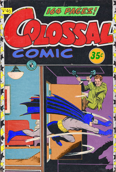
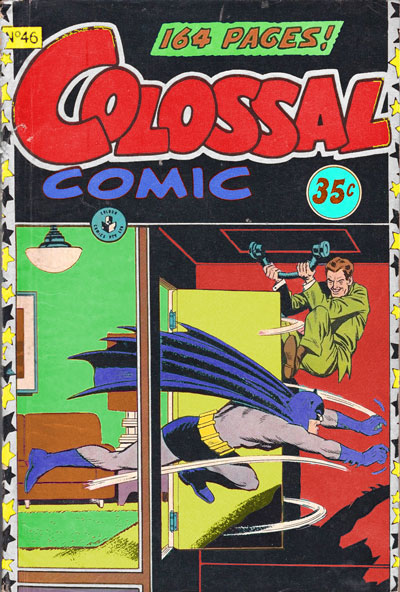
In September 2021, I had a Zoom session where I learned about changing the hue, saturation and value in images and saving copies of them, using Adobe Photoshop. I used Colossal Comic Issue 46 (1958). One version of the cover uses a split complementary colour scheme consisting of blue for the first wall and rug (emphasising action and the fact that Batman is a superhero running out of the room in pursuit of a criminal), purple for the second wall (emphasising that the villain is hiding behind the room’s door), and orange for the carpet and door (emphasising Batman’s surprise at the criminal’s presumed trap and the reader’s surprise upon seeing the events occur). With this one I did not stick to any colour rules. Another version uses an analogous colour scheme consisting of red for the second wall, yellow for the couch, picture and lamp, and green for the first wall and rug, with the same emphasis as the first version. The third version uses a triadic/analogous colour scheme consisting of blue for the couch, picture and lamp, purple for the first wall and rug, magenta for the stars on the cover’s border, orange for the carpet and door, and green for the second wall. I think that the first edit would work best, because of its alternate colours, including blue for the room’s first wall and rug, which fits with Batman’s hero status, since he is shown running out of the room into the villain’s trap. In comparison to the original, the blue colour has a bigger emphasis on action, in contrast to the yellow colour in the original.
In September 2021, I had a Zoom session where I learned about the use of colour in visual communication. I learned about primary colours and complementary colours from looking at a colour wheel.
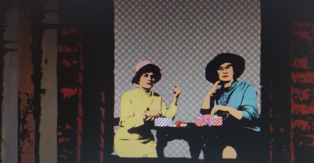
The first image from Yellow Submarine (1968) uses an analogous colour scheme, consisting of bright and cheerful, saturated colours like yellow, orange, red and pink for the submarine, and darker colours like brown, grey and desaturated blues and greens for the buildings, street lamp and man. The second image uses a complementary colour scheme consisting of a dark green for the football grounds and red for the football players to emphasise action, excitement and participation, against the dull, grey sky. The submarine’s inclusion in the first two images makes it feel like it is from a different world, opposite the subdued, moody landscape. The third image uses a triadic colour scheme consisting of enthusiastic yellow and blue colours for the ladies’ clothes to illustrate confidence and friendship as they look at the person taking a photograph of them, in contrast to the supposedly ‘dull and grey’ background, and red for the building.
The first image from What’s Opera, Doc? (1957) uses a triadic color scheme consisting of blue-green for the small hill, yellow for Elmer Fudd’s Wagnerian Viking armor, and pink for the sky and Bugs Bunny’s sleeves and skirt, emphasizing love, playfulness and innocence. The second image uses a complimentary (initially thought to be analogous) color scheme consisting of black, blue-green and brown for the sky and shadows and a bright yellow for the mountain, stairs and shining sun, giving it a harmonious appearance and emphasizing entering the afterlife.
This image of Colossal Comic Issue 8 (1958) uses a triadic colour scheme consisting of blue for ‘COLOSSAL’, red for ‘148 PAGES!’ and ‘COMIC’, and yellow for the background, emphasising that Superman, Batman and Robin are all superheroes, with the reader’s eye being drawn around the cover’s composition in a bit of a spiral, which consists of Superman holding a camera and flying (emphasising action), Robin taking a photograph of Superman with a camera, Batman taking a photograph of Robin with a camera, and the comic’s title ‘COLOSSAL’. The artist specifically guides the reader to look at the whole of the design in that order.
This image of The Three Month Rule uses a split complementary colour scheme consisting of a bold red colour for the woman’s shirt and earring, orange for the skin and green for the background. These three primary colours, along with the woman being on her own on the cover, compliment to the book’s title, suggesting and emphasising strength and determination to follow the rule.